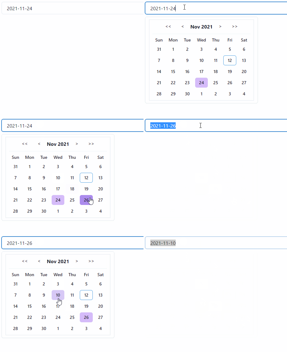
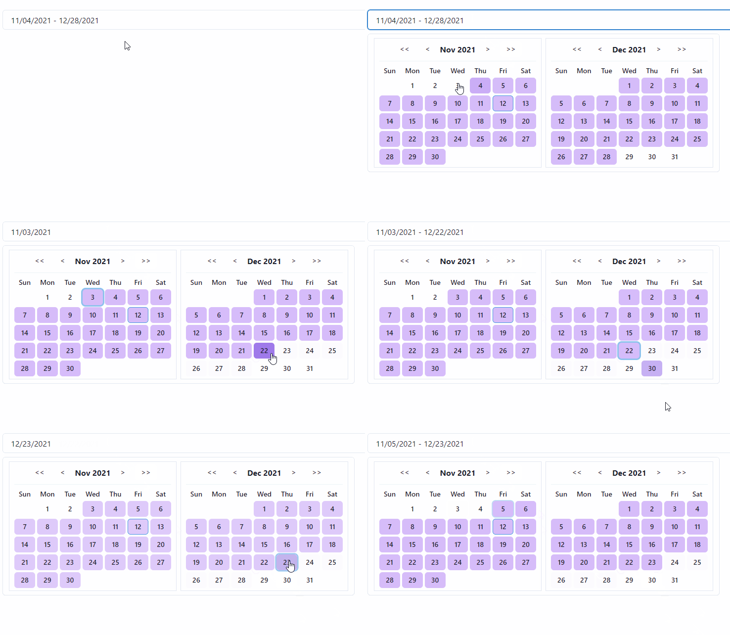
Every individual component is using Chakra UI. So it should respect all Chakra UI Configs without problem.


The componenent itself has to use some date library
Highly recommend just copy/paste the source code from /src to customize however you want.
Npm
npm i date-fns dayzed
npm i chakra-dayzed-datepicker
Yarn:
yarn add date-fns dayzed
yarn add chakra-dayzed-datepicker
  import { SingleDatepicker } from "chakra-dayzed-datepicker";

  const [date, setDate] = useState(new Date());

  <SingleDatepickername="date-input"date={date}onDateChange={setDate}
/>Note that this list will have one value during the selection process. Your system won't work if you try to control this directly as [startDate, endDate] because we'll try to set selectedDates to [intermediateSelection] and the length of the resulting selectedDates is meaningful to the datepicker.
  import { RangeDatepicker } from "chakra-dayzed-datepicker";

  const [selectedDates, setSelectedDates] = useState<Date[]>([new Date(), new Date()]);

  <RangeDatepickerselectedDates={selectedDates}onDateChange={setSelectedDates}
/>dateNavBtnProps extends from ButtonProps of Chakra-UI
This allows you to override the default behavior however your want as long as supported by Chakra-UI.
dayOfMonthBtnProps = {
  defaultBtnProps,
  isInRangeBtnProp,
  selectedBtnProps,
  todayBtnProps}
dayOfMonthBtnProps allows you to customzie date btn style based on the state.
Style precedence: default < isInRange < seleted < today.
popoverCompProps might be useful when you want to setup some simple styles like text color globally
popoverCompProps = {
  popoverContentProps,
  popoverBodyProps}
To sum them up:
  propsConfigs={{dateNavBtnProps: {},dayOfMonthBtnProps: {  defaultBtnProps: {},  isInRangeBtnProps: {},  selectedBtnProps: {},  todayBtnProps: {}},inputProps: {},popoverCompProps: {  popoverContentProps: {},  popoverBodyProps: {}},calendarPanelProps: {  wrapperProps: {},  contentProps: {},  headerProps: {},  dividerProps: {},},weekdayLabelProps: {},dateHeadingProps: {}
  }}
Example:
  propsConfigs={{dateNavBtnProps: {  colorScheme: "blue",  variant: "outline"},dayOfMonthBtnProps: {  defaultBtnProps: {borderColor: "red.300",_hover: {  background: 'blue.400',}  },  isInRangeBtnProps: {color: "yellow",  },  selectedBtnProps: {background: "blue.200",color: "green",  },  todayBtnProps: {background: "teal.400",  }},inputProps: {  size: "sm"},popoverCompProps: {  popoverContentProps: {background: "gray.700",color: "white",  },},calendarPanelProps: {  wrapperProps: {borderColor: 'green',  },  contentProps: {borderWidth: 0,  },  headerProps: {padding: '5px',  },  dividerProps: {display: "none",  },},weekdayLabelProps: {  fontWeight: 'normal'},dateHeadingProps: {  fontWeight: 'semibold'}
}}Non Chakra-related configurations :
  configs={{
    dateFormat: 'yyyy-MM-dd',
    dayNames: 'abcdefg'.split(''), // length of 7
    monthNames: 'ABCDEFGHIJKL'.split(''), // length of 12
    firstDayOfWeek: 2, // default is 0, the dayNames[0], which is Sunday if you don't specify your own dayNames,
}}| Name | single/range | Type | Default value | Description |
|---|---|---|---|---|
| name | both | string | undefined | name attribute for <input /> element |
| usePortal | both | boolean | undefined | to prevent parent styles from clipping or hiding content |
| defaultIsOpen | both | boolean | false | open the date panel at the beginning |
| closeOnSelect | both | boolean | true | close the date panel upon the complete selection |
| minDate | both | Date | undefined | minimum date |
| maxDate | both | Date | undefined | maximum date |
| disabledDates | single | Set | undefined | for single datepicker only, uses startOfDay as comparison, e.g., disabledDates={new Set([startOfDay(new Date()).getTime()} |
For version < [email protected]:dayOfMonthBtnProps extends from ButtonProps and has only selectedBg support,
  dayOfMonthBtnProps: {borderColor: "red.300",selectedBg: "blue.200",_hover: {  bg: 'blue.400',}
  },