front end
1.0.0
Preparation : For this content, the student must have a computer with internet access, a web browser with HTML 5 support (Google Chrome, Mozilla Firefox, Microsoft Edge, Safari, Opera, etc.), a text editor (VSCode, etc.) .) and a hosting platform (free or paid).
When we talk about website, we can notice that this term is the combination of two words in English: “web”, which means network and refers to the world wide web, and “site”, which means place. In this sense, a website or site is a place that can be accessed on the internet, through a URL, and has a set of pages programmed in some language.
To better understand this subject, let's look at an example: when you type the address blog.betrybe.com into your internet browser to access Trybe's blog, the browser will look for where this website is located on the internet. Then a request will be made to the server.
All the text, image and style files that make up the web page are stored on this server. Then, the server will return this set of documents to the browser so it can display the content as you see it on your screen.
Websites can present different forms and contents. Some of the options include: virtual stores, such as Mercado Livre and Amazon, where products can be purchased and sold; institutional websites and portfolios, used by companies and people to present themselves and be found by clients; and blogs, like the one you read.
Furthermore, websites can also be classified as static or dynamic. Static websites are generally developed using HTML, CSS and JavaScript. Its content is simpler and there is no interaction with a database.
Dynamic websites, in addition to taking advantage of HTML, CSS and JavaScript, also use more robust programming languages, such as PHP. These sites have functionality connected to a database. This way, each page accessed can bring specific data.
With Web Design you need to observe the importance of the interface for website development, evolution of technologies used in the construction of rich web pages (web 1.0, web 2.0, web 3.0 and web 4.0), evolution of interfaces (aesthetic, functional and structural).
Therefore, you need to understand the importance of creating rich interfaces for building a website, aiming for the best navigation and usability experience for the end user, knowing some technologies used in the past to build online sites. From this vision, observe old market trends, as well as see new trends in the development of interfaces.
Color palette:
Gradients:
Basically, web development means coding pages for the internet. However, this task goes beyond the use of HTML and CSS, the basic tools for creating a static page — which presents information that can only be modified by editing the source code.
Conversely, pages on a website can be dynamic. This means that the displayed content can be changed without interfering with the source code. To make this possible, the dynamic parts of the website are stored in a database, which is accessed whenever it is necessary to retrieve this content.
This feature allows the development of complex applications, which use business rules, APIs — Application Programming Interface — and much more. Therefore, there is a division in activities focused on web development, client-side coding (front-end) and server-side coding (back-end).
API example with, the most used structure currently for Web and Mobile Applications, REST API also called RESTful API .
Web applications are the growing number of sites on the Web; that is, they mimic desktop applications rather than the traditional documents and static links of text and images that make up the majority of the Web. As an example, we have online word processors, photo editing tools, mapping websites, etc. Powered heavily by JavaScript, they pushed HTML4 to the brink of its capabilities. HTML5 specifies new APIs (Application Programming Interface) for DOM (Document Object Model), which is a cross-platform, language-independent convention for representing and interacting with HTML, XHTML, and XML objects and documents.
These new APIs help you drag and drop objects sent by the server, such as drawings, videos and the like.
These new interfaces that HTML pages expose to JavaScript via objects in the DOM make it easier to write applications using highly specified patterns, rather than just poorly documented gimmicks.
Even more important is the need for an open standard that is free (to use and to implement) that can compete with proprietary standards like Adobe Flash or Microsoft Silverlight. Regardless of what you think of these technologies or companies, we believe that the Web is a vital platform for society, commerce and communications to be in the hands of a manufacturer.
There are millions of Web pages already in use out there, and it is imperative that they continue to be reproduced. So, HTML5 is mostly a derivative of HTML4 that continues to define how browsers should handle old markup like <font> , <center> , and other new ones as millions of web pages use them.
The term interface can have several meanings depending on the area in which it is studied. In the area of Information Technology, interface means the possibility of communication between two systems that could not communicate naturally without some external help .
HCI is the study of the interaction between people and computers. It is an interdisciplinary subject that relates computer science, arts, design, ergonomics, psychology, sociology, semiotics, linguistics, and related areas. The interaction between humans and machines takes place through the user interface, made up of software and hardware.
Human-computer interaction is a discipline concerned with the design, evaluation and implementation of interactive computing systems for human use and the study of the main phenomena surrounding them.
<a href="mailto:[email protected]">Send email</a>
The term digital media is the opposite of analogue media, which was configured by a material base: the sound was recorded in small grooves, on a vinyl surface and, when a needle passed through these grooves, the sound was reproduced. In digital media, physical support practically disappears, and data is converted into numerical or digit sequences - hence the use of the term digital. In this way, sounds, images, texts are actually sequences of numbers, which allows data sharing, storage and conversion. In the broadest sense, digital media can be defined as the set of communication vehicles and devices based on digital technology, allowing the digital distribution or communication of written, sound or visual intellectual works. Means of electronic origin used in brands' communication strategies with their consumers, generally called digital media.
Flash has always been the most viable alternative for those who needed to add videos and music to Web pages. It was and still is present in almost all browsers and we had a format that could be used without any major problems.
Just add a call to the plugin and it works.
<object width="426" height="240"><param name="movie" value=" https://youtu.be/S2Vty9srpFw"></param><param name="allowFullScreen" value="true"></param><param name="allowscriptaccess" value="always"></param><param name="allowscriptaccess" value="always"></param> <embed src= https://www.youtube.com/embed/S2Vty9srpFw type="application/x-shockwave-flash" allowscriptaccess="always" allowfullscreen="true" width="426" height="240"></embed></object>
Due to browser inconsistencies, it was necessary to add both the <object> ; as for the <embed> ; command, specific commands for using the plugin, duplicating many attributes. Not to mention that plugins like Flash cause a lot of instabilities, causing errors that even lead to the browser closing.
Due to all this, HTML 5 comes with new support, native to the language, to avoid the use of unnecessary plugins and commands. Currently, just place the simple call, as if it were an image and the file is triggered.
<video controls src="video.mp4" width="426" height="240"></video>
The problem presented by the new command is the use of the src attribute which does not work well in some browsers. And if we want everyone to be able to open the page, with any browser, it is necessary to use another type of attribute. Therefore, it is common to use the <source> attribute in the <video> tag.
The <source> element can be used multiple times and allows you to define a video format for each browser, giving you a greater reach.
 < video width =" 426 " height =" 240 " controls >
  < source src =" video.mp4 " type =" video/mp4 " >
  < source src =" video.webm " type =" video/webm " >
  < source src =" video.ogg " type =" video/ogg " >
</ video > < audio controls >
< source src =" audio.mp3 " type =" audio/mpeg " >
< source src =" audio.ogg " type =" audio/ogg " >
< source src =" audio.wav " type =" audio/wav " >
</ audio >There are several possible codecs and you will need to export at least two versions to have a greater reach.
Note : Codecs are programs used to encode and decode media files. They compress the original format, favoring storage, and decompress it during reproduction, transforming it back into image or audio.
All audio and video examples mentioned are imported via document in the directory. And the question is, how do I import a video already hosted on a site like YouTube or Vimeo? And which of the two solutions (Via document or via server) is the most advantageous?
Let's see how to import videos from YouTube and Vimeo, step by step!
Until the appearance of HTML5, tables were used as a resource for designing page layouts. Designers used tables as a grid to display images and text, and they were widely used, becoming the predominant form of website design, thus creating a rich look.
However, today, the use of tables is, in fact, interfering with the construction of better, more accessible, flexible and functional websites, especially for new media, such as cell phones, tablets, etc.
These tables still exist in HTML 5 as a resource for displaying tabular data, information coming from a database. With the new version of HTML, we can create websites made completely without tables, thus creating dynamic layouts that appear on large screens like on a computer and adapt well to a small smartphone screen. Later you will see how to build responsive layouts with HTML5 and CSS3.
The table command was not removed from the language, but its use was restricted. On the other hand, we still have several websites that use this resource, so it is important that we understand how it works so that we can, if necessary, maintain this type of page.
The command to insert a table is <table> . To start a line , we must introduce the <tr> tag and for a cell <td> , which divides the table row. <th> divides the table row by placing the content in bold. All these commands are terminated as </table> , </tr> and </td> respectively.
 < table >
  < tr >
    < td > </ td >
    < td > </ td >
  </ tr >
</ table >
The <table> command has a series of attributes that help with table formatting. The main ones are:
align="" | aligns the table in three positions: center , left , right and justify |
bgcolor="" | determines the color of the table |
border="" | determines the size of the border, if it is zero it does not show the border |
cellspacing="" | determines the spacing between cells |
colspan="" | determines the grouping between two or more table columns (sideways) |
rowspan="" | determines the grouping between two or more rows in the table. (down and up direction) |
cellpadding="" | determines the spacing between the text and the cell border |
<caption> displays text centered in relation to the table, as if it were a caption.
To choose the internal rows that will be shown within the table, we use the RULES attribute, within the tag. The complements of this attribute are:
none | no entire line. |
all | to show all rows between each column and row in the table (default) |
rows | for the horizontal lines between each row in the table. |
cols | for the vertical lines between each column of the table. |
groups | for rows between column groups and horizontal sections, defined by special tags such as <colgroup> and <thead> |
See some examples:
< table border rules =" all " 6 > <table border rules="none"6> <table border rules="cols"6> <table border rules="groups"6> <table border rules="rows"6>The HTML forms part is very important for filling in data that users enter into the HTML page. This data is collected by the back-end with a back-end programming language (PHP, JavaScript, Python, Java, etc.) that stores and queries this data in a database (MySQL, PostgreSQL, MongoDB, OracleDB, etc.). ). Let's look at form tags:
Login Form (boilerplate) :
 < html >
  < body >
     < h2 > Login </ h2 >
     < form >
	Login: < br >
	< input type =" email " name =" email " > < br >
	Senha: < br >
	< input type =" password " name =" senha " > < br >
	< input type =" submit " value =" Logar " >
     </ form >
  </ body >
</ html >
Through the type attribute we can define the type of our input used, the name='' attribute we can process the data sent through a programming language.
Login Form (boilerplate) - With PHP :
 < html >
  < body >
     < h2 > Login </ h2 >
     < form action =" processa.php " >
	Login: < br >
	< input type =" email " name =" email " required > < br >
	Senha: < br >
	< input type =" password " name =" senha " required > < br >
	< input type =" submit " value =" Logar " >
     </ form >
  </ body >
</ html >
Registration Form (boilerplate) :
 < html >
  < head >
    < title > Cadastro </ title >
  </ head >
  < body >
     < h2 > Cadastre-se </ h2 >
       < form action =" processa.php " >
	  Nome Completo: < br >
	  < input type =" text " name =" nome " required > < br >
	  <!-- <label for="email">Email:</label> -->
      Email: < br >
	  < input type =" email " name =" email " required > < br >
	  Senha: < br >
	  < input type =" password " name =" password " required > < br >
	  Repita a senha: < br >
	  < input type =" password " name =" password " required > < br >

	  Sexo: < br >
	  < input type =" radio " name =" sexo " value =" masculino " > Masculino < br >
	  < input type =" radio " name =" sexo " value =" feminino " > Feminino < br >

	  Interesses: < br >
	  < input type =" checkbox " name =" interesse " value =" futebol " > Futebol < br >
	  < input type =" checkbox " name =" interesse " value =" video-games " > Video-games < br >
	  < input type =" checkbox " name =" interesse " value =" academia " > Academia < br >

	  Estado < br >
	  < select name =" estado " >
	    < option value =" RJ " > RJ </ option >
	    < option value =" SP " > SP </ option >
	    < option value =" MG " > MG </ option >
	    < option value =" ES " > ES </ option >
	  </ select > < br >

	  Comente! < br >
	  < textarea name =" comentario " > </ textarea > < br >

	  < input type =" submit " value =" Cadastrar " >
       </ form >
   </ body >
</ html >
We will only be able to input between radios if the name is the same, this way we can group this information and only one of it will be marked.
With checkbox we can choose more than one option to select.
With
We can define the <input> types and their attributes:
buttonpasswordtext The <a> , <input> , and <button> elements are all used to create buttons on an HTML page, but each has slightly different purposes and is used in different contexts.
<a> anchor is used to create links in HTML. It is mainly used to navigate between different web pages or anchor to different sections of a page. When a user clicks on an <a> element, they are directed to the URL specified in the href attribute. <a> elements are often styled with CSS to look like buttons, but they have standard link behavior.
< a href =" pagina.html " > Link </ a > <input> is used to create input elements in an HTML form. While it is often used to create text input fields, it can also be used to create buttons. The button type is specified by the type attribute. Some common values for the type attribute are "button" , "submit" and "reset" . <input> buttons are useful when you need to send data from a form to a server or perform specific actions when a button is clicked.
< input type =" button " value =" Clique Aqui " > <button> is used to create buttons in HTML. It can contain text, image elements, or other HTML elements. Just like <input> buttons, <button> buttons can have a specific type specified by the type attribute, such as "button" , "submit" or "reset" . <button> buttons offer more flexibility in terms of content and behavior than <input> buttons, especially when it comes to styling and event handling using JavaScript.
< button type =" button " > Clique Aqui </ button > In short, if you are creating a button for navigation, use <a> . If you are creating a button to submit data from a form, use <input type="submit"> or <button type="submit"> . If you're creating a button to perform a specific action on the page (like showing or hiding content), use <button type="button"> .
Semantic HTML serves to organize and structure document elements into specific parts so that they do not run wild throughout the body in a disorganized and unreadable manner.
Until version 4 of HTML, divs were the main structuring semantics of the page, with the arrival of HTML5 new TAGs appeared with div functions that were created to structure the elements contained in the document, which made structuring the page much easier. Note that you can compare the structure of a web page with the layout of a newspaper page , as both contain headers, footers, articles and sections.
<section> element represents a generic section within a document. This element can contain a grouping of texts with several chapters, numbered sections, etc. In the following example, an article is presented containing a main subject and, within that subject, several sections with different subjects. 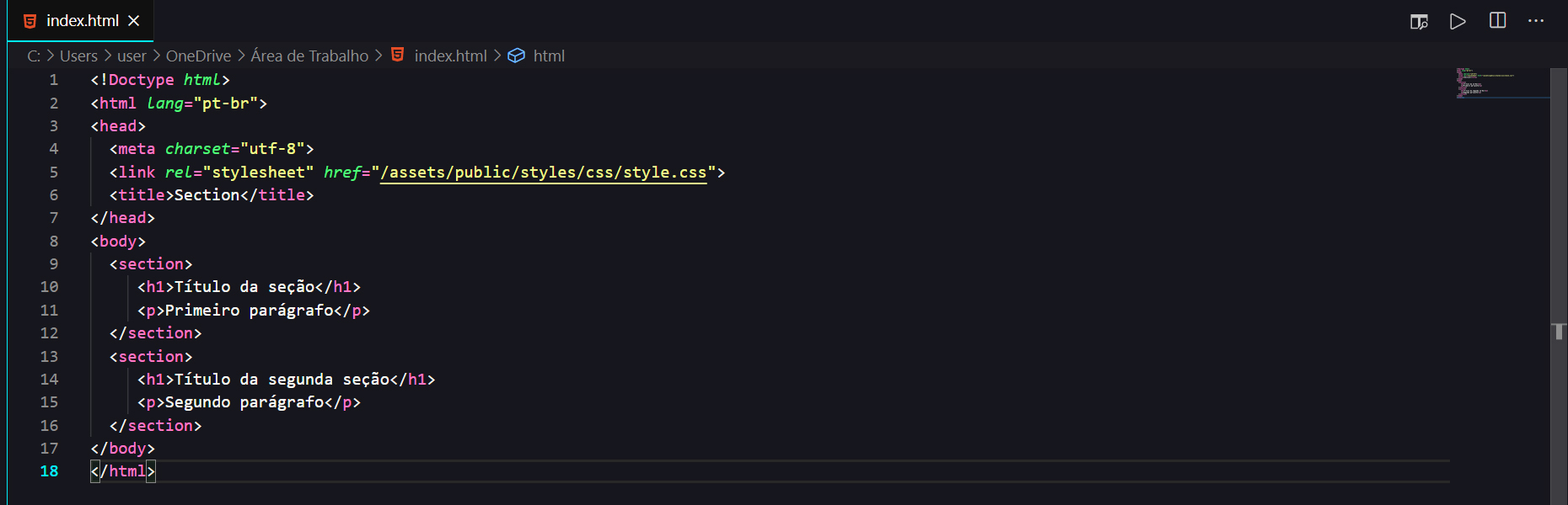
<header> element, also used to delimit the section title, works in conjunction with the previous elements, however, it is not mandatory. 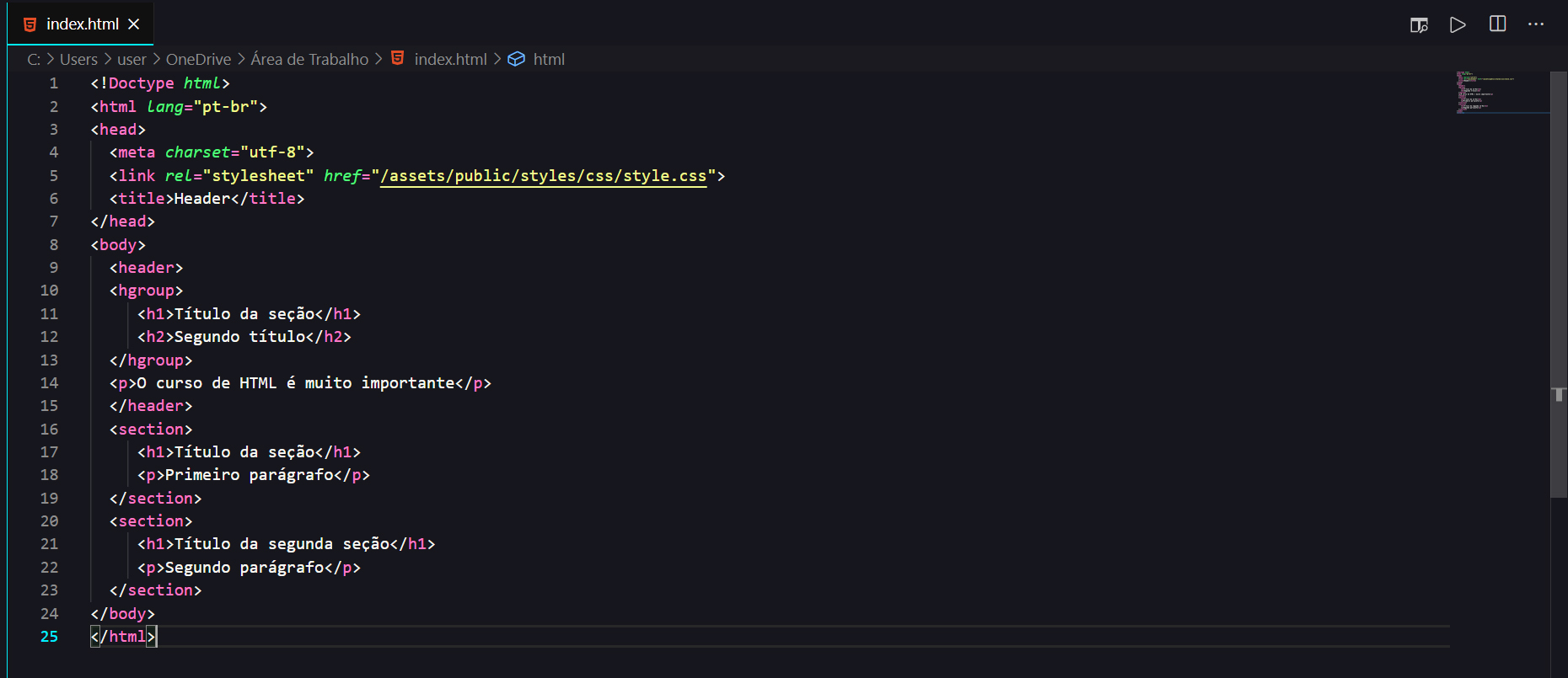
<nav> (navigation) this element is the section where the page information is located. Generally, links (internal links) to the page itself or external links to other pages on external websites are placed in this section. 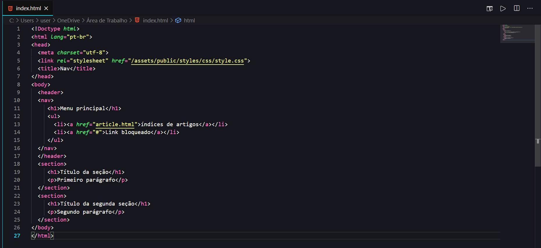
<article> (article) this element is an independent article within a text, this element may or may not be within a <section> element. Imagine a newspaper with sports, gossip, etc. sections. Within each section there are several articles about specific texts, for example, in the sports section there may be an article talking about team A, another about team B and another about team C. An article can contain a <header> element that is the title and a <footer> element which is the footer of the element. 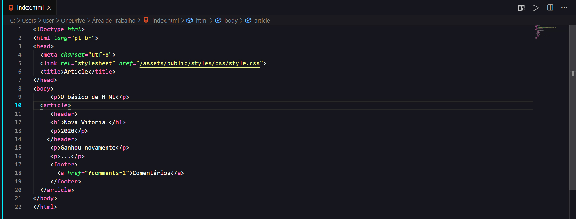
<footer> (footer) this element is one that basically contains information about the content of the section, such as the author, related links, etc. 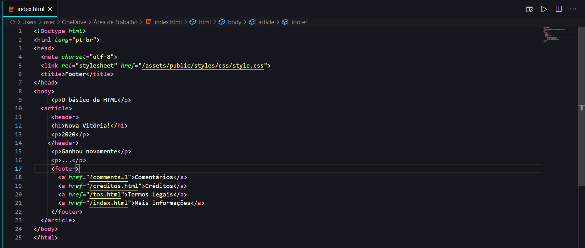
<aside> this element contains information that is not directly related to the text. For example: paid commercials, promotional links, etc. 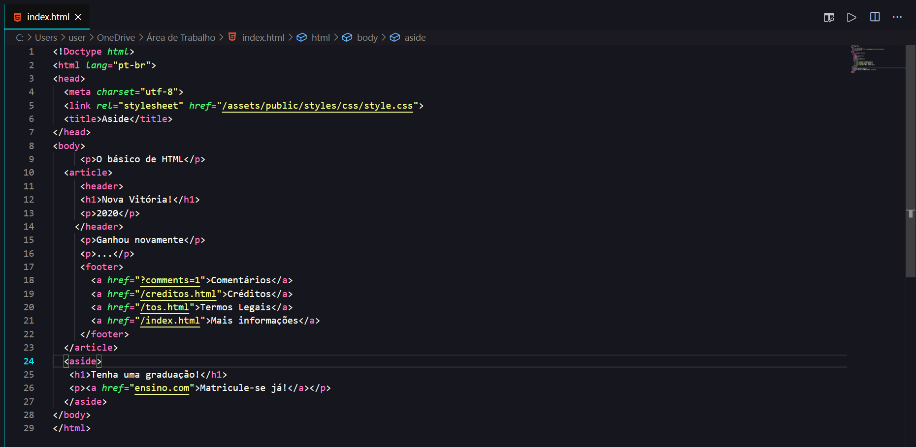
It is characterized by writing CSS code, using the HTML <style> command. This method is superior to the previous one, as all CSS rules are located at the beginning of the HTML5 code. However, these rules can only be used within this document, preventing sharing and reuse of the rules.
Usage example:
 < head >
  < style >
   * {margin: 0; padding: 0; box-sizing: border-box;}
   body {width: 100%; height: 100vh;}
  </ style >
</ head >The rules were written in a file with a .css extension and can be loaded into the HTML5 document in two ways:
 < head >
  < link rel =" stylesheet " href =" default.css " >
  < link rel =" stylesheet " href =" green.css " title =" Green styles " >
  < link rel =" alternate stylesheet " href =" contrast.css " title =" High contrast " >
  < link rel =" alternate stylesheet " href =" big.css " title =" Big fonts " >
  < link rel =" alternate stylesheet " href =" wide.css " title =" Wide screen " >
</ head > @import element in CSSAllows you to import style rules within other style rules. This method allows you to apply common rules to all HTML documents.
Usage example :
Within a .css document, we can apply the call to external files in the first lines to use existing commands.
 @import "mystyle.css" ;
@import url ( "mystyle.css" );
@import url ( "fineprint.css" ) print; /* mídia específica para impressão */
@import url ( "bluish.css" ) projection , tv; /* mídia específica grandes mídias*/
@import url ( "narrow.css" ) handheld and ( max-width : 400 px ); /* mídia específica mídias portáteis*/ CSS level 3 implemented the concept of modules, in which each module is developed independently, following its own schedule. The main advantage is independence in building new features.
After the creation of HTML, the need to format pages became evident, so in 1996, the style language we know as CSS was created.
The syntax is very simple and can be explained with the phrase "you create style rules for elements or groups of elements".
Let's use an HTML element we saw previously, the anchor, to exemplify.
A CSS rule is represented by a selector or a group of selectors , in our case it is a , so within a pair of braces we add the declarations , in the example below we are changing the color and font size of this title, the declarations are formed by a property and a value.
A CSS rule is represented by:
Example:
 a {
    color : # 000 ;
}In CSS, element selection can range from simplified to rich contextual patterns.
Selection types are very important, as their order changes depending on the page processing result.
CSS allows you to group repeated statements.
Example:
 h1 {font-family: sans-serif }
h2 {font-family: sans-serif }
h3 {font-family: sans-serif }
It is equivalent to:
 h1, h2, h3 {
font-family: sans-serif
}
NOTE: All h1, all h2 and all h3
An element can be contained within another element.
Example: <H1>This text is <EM>very</EM> important</H1>
 h1 { color: red } /* indicates that all h1 elements have the color red */
in { color: red } /* indicates that all elements in have the color red */
h1 in { color: blue } /* indicates that the elements contained in an h1 element have the color blue */
A child element is characterized when the elements are separated by “>”.
div ol > li p {color: green }In this example, all p elements will be colored green when they are inside an item <li> element, a child of a list <ol> inside a <div>.
An element by priority is characterized when the elements are separated by "+". That is, the first paragraph that comes after the div.
 div + p {
   color: red;
 }
Specifies rules for elements that have a certain attribute.
Example:
span[hello="Cleveland"][goodbye="Columbus"] { color: blue; }The rule will be applied to all span elements that have the hello="Cleveland" attribute and the goodbye="Columbus" attribute.
A class allows you to assign a set of rules to a given element. It is determined by asterisk dot (*.) or simply dot (.).
Example:
 .pastoral { color: green } /* all elements with class~=pastoral */
/*or*/
*.pastoral { color: green } /* all elements with class~=pastoral */
The ID attribute allows you to identify a unique element in the HTML document. To select this element, simply use the character “#” followed by the name of the element.
Example:
 h1#title1 { text-align: center } /* applies the rule to the h1 element with id=title */
*.pastoral { color: green } /* all elements with class~=pastoral */
In the previous example we created a rule that changes an HTML element directly, but this means that all elements will have that appearance, and we generally have more complex websites that need several different rules for the same elements.
To make it more tangible, let's remember a little about the website we started creating in the last module, it had several header elements, but we don't want the main header to have the same formatting as the header of a post, that's where the IDs and Classes.
The selector we saw in the first example is a type selector, as it represents an HTML element, and with IDs and Classes we can represent any type of element but there are some differences between them:
ID : is represented by the # (hash) symbol followed by a name for that ID. Can only be used once!
 #id{
  }
Class : the class is represented in a similar way to the ID, but is preceded by a period instead of the hash. Can be used more than once!
 .class{
  }
And the most important difference between them is the way they should be used: the ID can only be used once in an HTML page while the class has no restrictions.
And there is one last detail in this example: the pseudoclass . HTML elements undergo changes caused by user interaction, such as moving the mouse over or clicking on that element. Pseudo-classes are very similar to JavaScript events, but they do not have the same power to manipulate elements.
 selector:pseudo-class {
    property: value;
   }
The a:hover in the example means that the anchor will also look like this when the user hovers over a hyperlink.
| Pseudo-class | Definition |
:hover | It changes the element by hovering over it. |
:active | Change the element by clicking it. |
:link | Changes all unvisited links. |
:visited | Changes all visited links. |
:focus | Changes the <input> element that has focus. |
:checked | Changes all marked <input> elements. |
:disable | Changes all disabled <input> elements. |
:enabled | Changes all enabled <input> elements. |
:empty | Changes all <p> elements that do not have children. |
:first-child | Changes each enabled <input> element. |
:enabled | Changes each enabled <input> element. |
:first-child | Changes each <p> element that is the first child of the parent element. |
:first-of-type | It changes each <p> element that is the first <p> element of its parent element. |
:in-range | Changes <input> elements with a value within a specified range. |
:invalid | Changes all <input> elements to an invalid value. |
:lang(language) | Changes each <p> element with a lang attribute value starting with " it ". |
:last-child | It changes all <p> elements that are the last children of their parent element. |
:last-of-type | Changes every <p> element that is the last <p> element of its parent element. |
:link | Changes all unvisited links. |
:not(selector) | Changes every element that is not the <p> element. |
:nth-child(n) | Changes each <p> element that is ordered from its parent element. |
:nth-last-child(n) | Changes each <p> element that is ordered from its parent element, counting from the last child. |
:nth-last-of-type(n) | Changes each <p> element that is the second <p> element from its parent, counting from the last child. |
:nth-of-type(n) | It changes every <p> element that is the second <p> element of its parent element. |
:only-of-type | Changes the <p> element that is the only <p> element from its parent element. |
:only-child | It changes every <p> element that is the only child of its parent element. |
:optional | Changes <input> elements without "required" attribute. |
:out-of-range | Changes <input> elements with an atr
Expand
Additional Information
Related Applications
Recommended for You
Related Information
All
|


