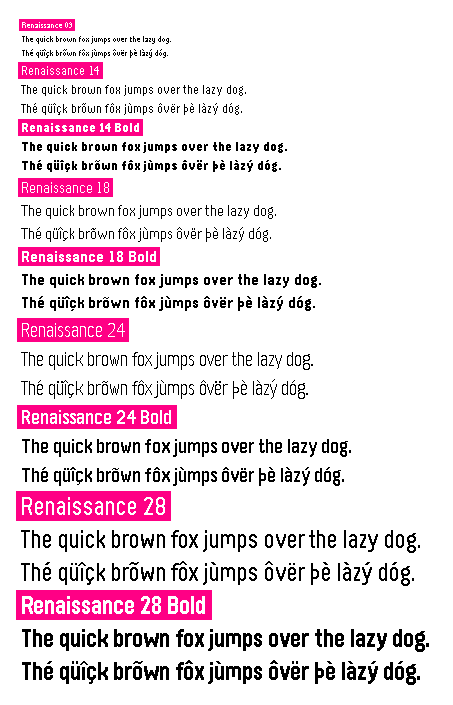
A (mostly) metrically compatible replacement for Raster Gothic Condensed in Pebble font format.
Please see the wiki for more information.
renaissance needs to be mostly metrically compatible. This means that the
entire basic ASCII set & symbols should have the same advance number and the
same baseline/x-height/etc. However, some Latin-extended characters, such as
those with certain diacritics, may be slightly different.
In order to improve legibility, renaissance 9 explicitly does not follow the goal of metrical compatibility.
I'm by no means a type designer. If you'd like to raise any concern about the font (especially concerning diacritics), please let me know!
Here are some guidelines for renaissance's design:
× character)
b in large
sizes, meaning that the curvature of the bowl should be the same on both sides.To my best understanding, only outline fonts are protected by US intellectual property law. Nevertheless, renaissance is a from-scratch remake of Gothic Condensed—not a simple copy of it. Either way, most characters will look similar, and others will even be the exact same: there simply aren't infinite ways to represent a given character within a given bitmap.