


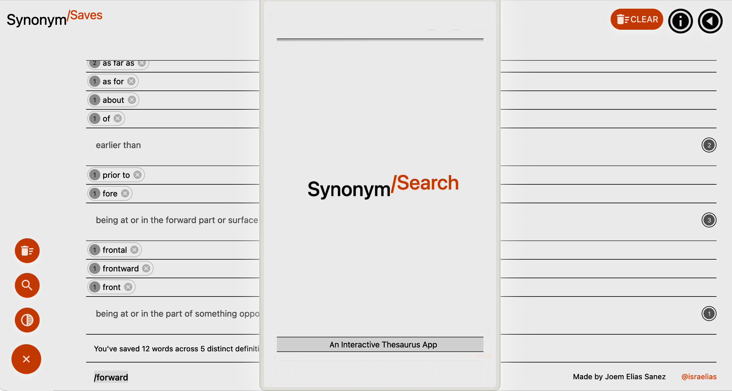
A meaningful thesaurus
Remember all the words you find when you use a Thesaurus.
SynonymSearch helps you to review what you've just learned (and might otherwise forget) by sorting a list of all your search queries by their shared definitions as you're finding them.
SynonymSearch lets you test the similarity of synonymous words by injecting them into a sentence whose meaning depends on the definition they share. The app helps you actively make sense of a definition and then review it against a repository of synonyms.
This project is developed as part of MS2 Interactive Front End module at Code Institute. It is written to work with Merriam-Webster's Collegiate® Thesaurus's JSON response format, and is developed with React via Next.js, bootstrapped with create-next-app and deployed with Vercel.
Please visit the project here: synonyms.vercel.app
Note for reference: Earlier scheme was named 'synonym-chaser'
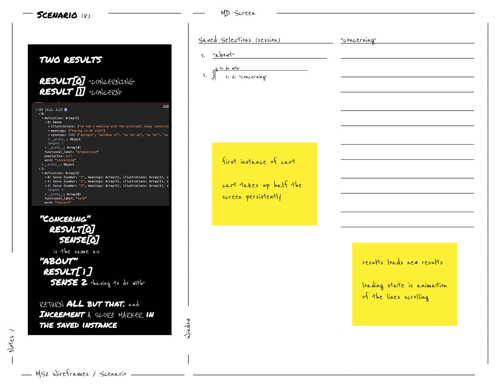
Schematic mockups commenced in early January 2021 to establish relationships between disparate components, and assign appropriate responsibilities.


This approach helped break-down the project scope, and, most importantly, afford a benchmark for references for development and troubleshooting.
see Thinking in React (Docs)


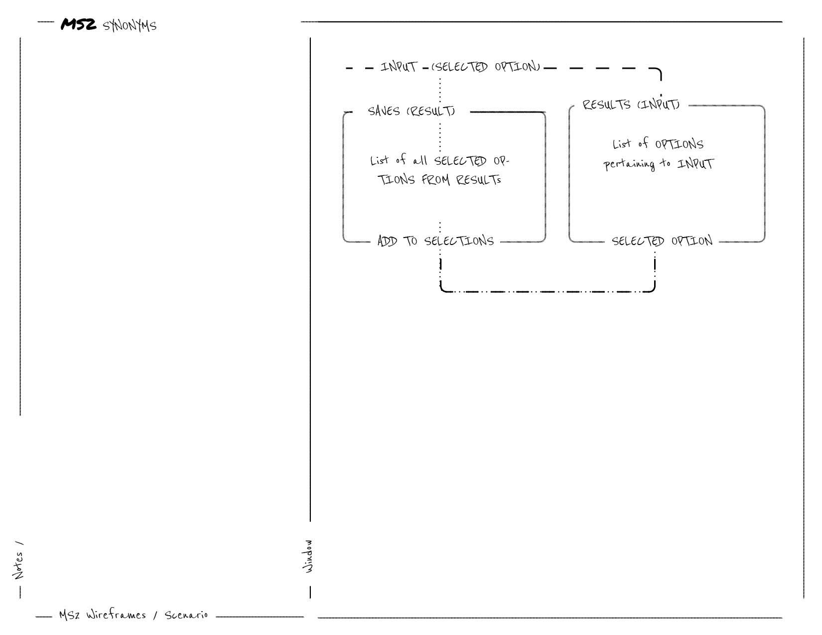
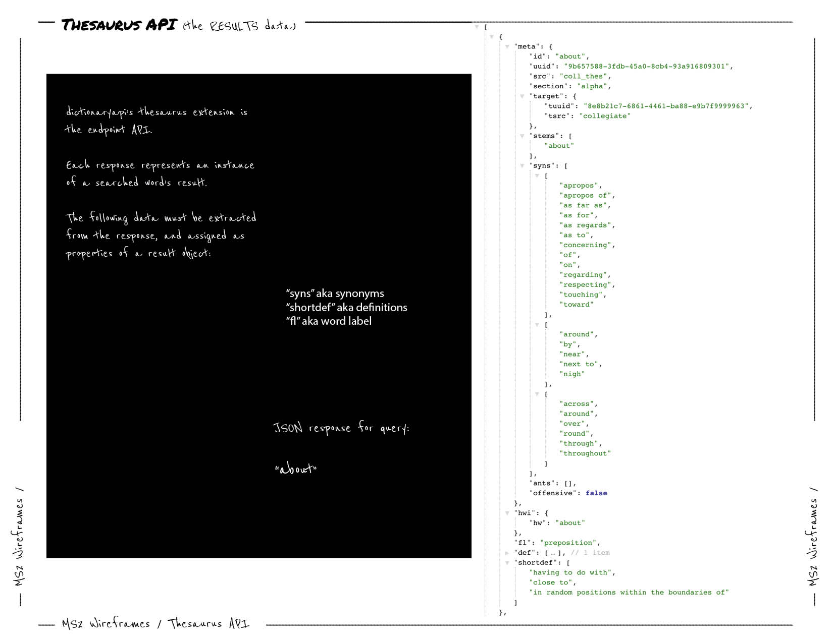
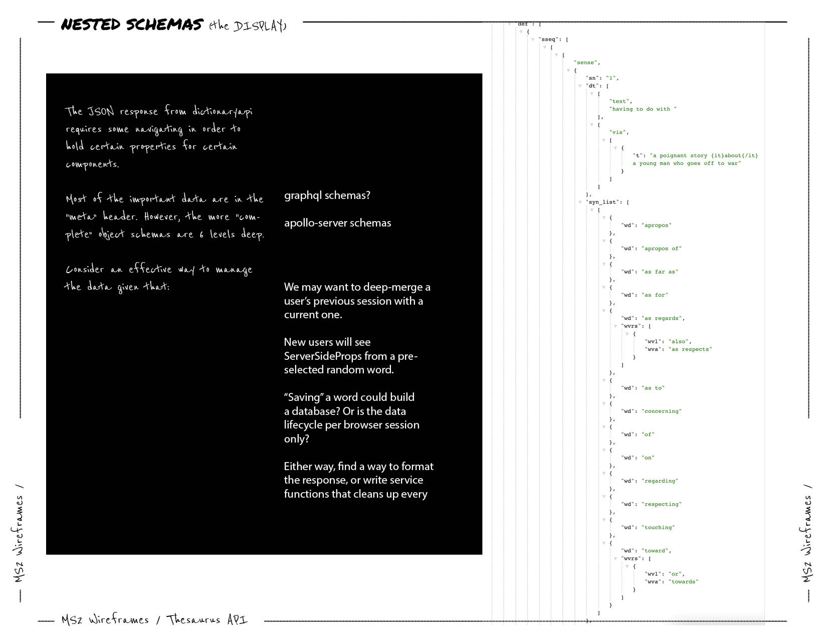
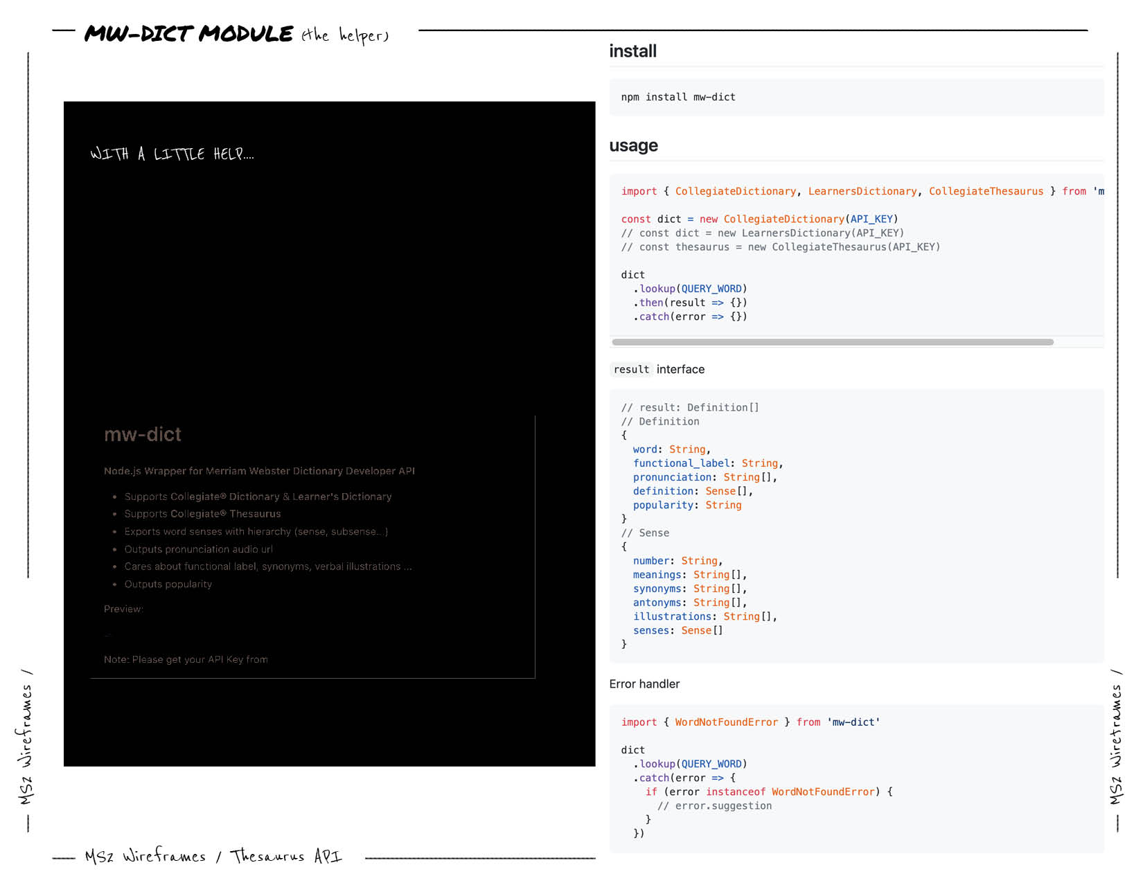

{Results} => {Root} => {Sense} => {Option}
(See results Directory)

{Saves} => {Selection}
(See saves Directory)
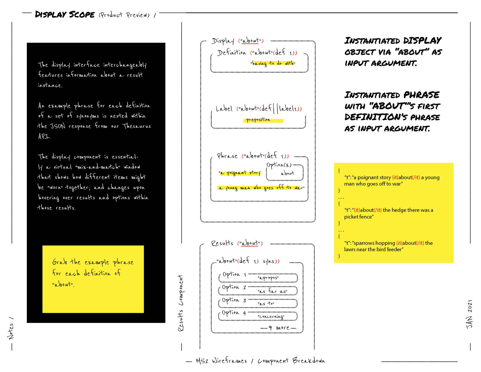
{Results} =>{Root} => {Sense} via {ReplaceSubStringNode} (see string.helper.js).
Now broken down to {Saves} => {Selection}
(See Display)

{Sense} => {Option} in Results tree (See results Directory)
A consistent top and bottom border is applied to all nodes with dynamic content. These discrete borders are designed to convey the material scale of a note pad as a familiar touchpoint to a user. These wordBoxes only vary in spacing and are responsible for visually conveying hierarchy in a the list of list of lists.

ThemeProvider wraps the app in order to pass styles down the component tree. See Material-UI Theming.The font family is set to an array of system fonts in order to adapt to device/platform/user configuration and avoid depending on an explicit typeface. A commonSettings object in theme.context.js contains a list of these overrides, which is merged with Material-UI's theme provider. See Material-UI Global-css
    export const commonSettings = {
     typography: {
       fontFamily: [
         '-apple-system',
         'BlinkMacSystemFont',
         '"Segoe UI"',
         'Roboto',
         '"Helvetica Neue"',
         'Arial',
         'sans-serif',
         '"Apple Color Emoji"',
         '"Segoe UI Emoji"',
         '"Segoe UI Symbol"',
       ].join(','),
     },
}The app features two sets of primary and secondary colors for a light theme and a dark theme configured via Material UI's palette configuration. Behaviors and states of colors rely on properties defined in Material-UI's Default Theme object. Secondary colors are set to neutral tone, while primaries are rendered as the singular "feature color". The minimal approach to color sets is to enhance a notepad
const lightTheme = createMuiTheme({
        palette: {
        type: 'light',
        primary: {
         main: '#ff3200',
       },
   secondary: {
         main: grey[900],
       },
   },
 ...commonSettings,
});const darkTheme = createMuiTheme({
palette: {
type: 'dark',
primary: {
main: lightblue[500],
},
secondary: {
main: '#fafafa',
},
background: {
default: '#151515',
},
},
...commonSettings,
});The website is modeled as a progressive web application to render a single-page-app's functionality without full page reloads and optimized to perform like a native app. Its framework ensures flexibility across browsers.
The website takes advantage of large floating action buttons (FAB) to quickly navigate between its three remote views: "Search", "Info", and "Saves". Visual metaphors are utilized to represent these view modes discretely and efficiently.
A floating "speed dial" button persists across views to quickly access the app's core actions: querying a term, clearing the saved history, and toggling light or dark mode.
The app features a custom launch screen on initial page load to succinctly describe its purpose: "An interactive thesaurus app".
jsx, jss js. (Bootstrapped with Nestjs)next to develop, next build to prep for production and next start to serve.commit to Git and push to GitHub.pushes via Git.Styles are written in jss syntax and follow the spec for Material-UI to play nicely with Nextjs Server-side rendering, which includes this logic of customizing pages/_document to to inject server-side rendered styles into the markup right before it's used. Note that this is an unofficial recommendation, and should be refactored if/when MUI releases an official plugin for Nextjs similar to the one for MUI/Gatsby.
All style objects are created with MUI's makeStyles hook and follow guidelines in MUI style Docs for theming. This includes CSS overrides and media queries. Style objects for main components are separated by scope in the styles Directory and imported in modules as required. However, some components, namely, Launcher, have all style props declared in the component file itself. Note that all styles should eventually be exported from one directory for consistency.
The results tree renders jsx components on every API call without initializing constants. Props and conditional expressions control the iteration of the response schema from MW-Thesaurus API. Note that values and Prop-Type verifications are specifically written to get the right data from this schema:
Each saved word instance retains properties of the Results family it is "taken" from -- such as the word's particular definition, label, root word -- to increment values of duplicates and group words by sense definitions while ensuring each instance, no matter identical at name value, is distinct if the definition and sense is different
React hooks useReducer, useContext, createContext are assembled together in context/words.context (see HistoryProvider) to provide a context wrapper for components to share and consume the same data. Note that this logic is directly modeled from the example set in next.js/examples/with-context-api.
Following what is achieved by HistoryProvider's exported context wrapper hooks useHistory and useDispatchHstory -- which are utilized across higher-order components, shared components and helper functions in helpers/* to radically manipulate the DOM -- the same logic is repurposed to ride multiple hooks along a custom wrapper with MUI's ThemeProvider the (see ThemeProvider). In this case, setting the the view value, allows any component to change the page from anywhere, to name a few. Note that the catch-all nature of this Context layout provider.
  export const ThemeContextProvider = ({ children }) => {
  // Sets the theme for MUI ThemeProvider to use
  const [darkMode, setDarkMode] = useState(false);
  // Sets the current view
  const [value, setValue] = useState('launch');
  // Hooks to set warning colors for searchText input
  const [meta, setMeta] = useState(true);
  const [root, setRoot] = useState('');
  // Rides an MUI hook to set a memoized theme
  const prefersDarkMode = useMediaQuery('(prefers-color-scheme: dark)');

  useMemo(
    () => (prefersDarkMode
      ? setDarkMode(true)
      : setDarkMode(false)),
    [prefersDarkMode],
  );

  // Provides all values and the hooks that control them

  return (
    <ThemeDispatchContext.Provider
      value={{
        darkMode,
        setDarkMode,
        value,
        setValue,
        meta,
        setMeta,
        root,
        setRoot,
      }}
    >
        <ThemeProvider
        theme={
            darkMode
              ? darkTheme
              : lightTheme
          }
        >
          {children}
        </ThemeProvider>
    </ThemeDispatchContext.Provider>
  );
};

// All state/hooks are accessible by importing
// a catch-all export below
// Example:
// // anyFile.js
// import { useDispatchTheme } from './../theme.context'
//
// const dispatch = useDispatchTheme()
//
// Change any/all states from any component
// dispatch.setDarkMode(false)
// dispatch.setValue('search')
//

export const useDispatchTheme = () => useContext(ThemeDispatchContext);
Using MW-Thesaurus is free for non-commercial and/or educational purposes. Featured brand logos in the info tab is to follow branding guidelines requested by but not limited to Merriam-Webster's Development center.
The registered Thesaurus API key linked to this project is currently public. Following this discussion, the effort to protect API calls on the client side is aimless as the private key will always be exposed. Further configuration to have an internal endpoint in /pages/api should be considered following Nextjs API routes. Note that the key has been exposed from .env.local for the reasons above and for the educational purposes of the project.
    const axiosConfig = { baseURL: 'https://dictionaryapi.com/api/v3/references/', };

    function searchThesaurus(searchText, selection) {
        const query = selection || searchText;

        // Key is processed from ignored env.local
        // use this method if API endpoint is set up in /pages/api/*
        const key = process.env.MW_THESAURUS_KEY;
        // @note Key is explicitly declared otherwise
        // for Production/submission

      return axiosGetCancellable(
        `/thesaurus/json/${query}?key=${key}`,
        axiosConfig,
      );
    }
Note: All descriptions of atypical methods can be found within comment blocks that follow jsDoc standards.
A user expects to see a description within a few seconds of arriving at the site
Launcher:useEffect with no dependencies allows Launcher to run once on initial page loaduseContext allows Launcher to set the current page view value to 'search' after a timeout.Synonym Search An Interactive Thesaurus App" for two and a half seconds upon arriving at the site. import React, { useEffect, useState } from 'react';
import { useDispatchTheme } from '../../context/theme.context';
const Launcher = () => {
const classes = useStyles();
const viewDispatch = useDispatchTheme();
const [open, setOpen] = useState(true);
const [showOpen, setShowOpen] = useState(true);
useEffect(() => {
setTimeout(() => {
setShowOpen(false);
setTimeout(() => {
setOpen(false);
viewDispatch.setValue('search');
}, 350);
}, 2500);
}, []);
return (
<>
<Backdrop
className={classes.backdrop}
open={open}
/>
<Grow
in={showOpen}
unmountOnExit
>
<Box className={classes.launch}>
{... excerpt ...}
Synonym
/Search
An Interactive Thesaurus App
{... excerpt ... }
</Box>
</Grow>
</>
);
};
A user wants to expediently navigate between views
Speed (Dial):onClick.FixedBottom(forked from FixedBottom) allows bottom Speed Dial to responsively move above the bottom bars on mobile when scrolling.useScrollTrigger allows Speed Dial to swap visibilities with ScrollTop, a floating action button that, when clicked, scrolls the window back to the top of the page via an anchor with id="back-to-top".Search are passed to Speed Dial to activate onSearchTextChange, a function that sends queries to the Thesaurus API.useState allows useEffect to always close SpeedDial whenever the page value via useDispatch changes, except when Search is active.ToggleTheme, Search, Clear
Saves View
SpeedDial
SpeedDial is openToggleTheme action
not this <mode>
SpeedDial is closedSaves ViewSpeedDial
SpeedDial is openSearch action
SpeedDial is still openSearch ViewSpeedDial disappearsScrollTop button appears
ScrollTop
SpeedDial appearsx and y dimensions (up/down in views, left/right between views) quickly by clicking SpeedDial actions for the views they represent. Additionally, button navigation per view is accessible in the page header. The other two views are Saves and Info, which are of the same floating-action-button family as the actions within SpeedDial. The consistency and singularity of theme, color and UI plays to a user's impulses and familiarity with the conveyed persistent touchpoint. import React, { useEffect, useState } from 'react';
import { useDispatchTheme } from '../../context/theme.context';
const Speed = ({
children,
value,
index,
searchText,
loading,
onSearchTextChange,
...other
}) => {
const trigger = useScrollTrigger();
const classes = useStyles();
const [open, setOpen] = useState(false);
const [direction, setDirection] = useState('up');
const matches = useMediaQuery('(min-width:600px)');
const viewDispatch = useDispatchTheme();
const view = viewDispatch.value ? viewDispatch.value : null;
const handleClick = (event) => setOpen(!open);
open && trigger ? setOpen(false) : null;
useEffect(() => {
setTimeout(() => {
if (viewDispatch.value !== 'search') {
setOpen(false);
}
}, 10);
}, [view]);
return (
<Slide appear direction="up" in={!trigger}>
<FixedBottom offset={matches ? 16 : 48}>
<SpeedDial
ariaLabel="actions"
className={classes.speedDialGroup}
FabProps={{
className: clsx(classes.speedDial, classes.bottom),
size: matches ? 'medium' : 'small',
style: { padding: matches ? '12px' : '8px' },
}}
onClick={handleClick}
open={open}
direction={direction}
>
{ ... Search action}
{ ... Toggle theme action}
{ ... Clear cache action}
/>
</SpeedDial>
</FixedBottom>
</Slide>
);
};
export default Speed;
A user wants to see reliable sources
Brands (Material-UI AvatarGroup):useEffect allows useState to flip margins when the page value is set to the current view => Info, which animates the avatars to expand as if to welcome a user to the info desk, while a short paragraph is featured to describe the "SynonymStory" behind "SynonymSearch"Logo instances, one for each: React, NextJS, MaterialUI, CodeInstitute and Merriam-Webster.Search View
Info
Info View
Brands appear
Merriam-Webster
Merriam-Webster Developer Center website
Info
import React, { useEffect, useState } from 'react';
import { useDispatchTheme } from '../../context/theme.context';

  const Brands = ({ children }) => {
  const classes = useStyles();
  const viewDispatch = useDispatchTheme();
  const [active, setActive] = useState(false);
  const { value } = viewDispatch;

  useEffect(() => {
    if (value === 'info') {
      setTimeout(() => {
        setActive(true);
      }, 750);
    }
  }, []);

  return (
    <AvatarGroup
      className={
        clsx(
          classes.avatarGroup, active
            ? classes.active
            : classes.inactive,
        )
      }
    >
      <Logo
        name="React"
        url="https://react.org/"
        path="/images/reactLogo.png"
      />
      <Logo
        name="Next JS"
        url="https://nextjs.org/"
        path="/images/nextJSLogo.svg"
      />
      <Logo
        name="Material UI"
        url="https://material-ui.com/"
        path="/images/materialUILogoLight.png"
        darkImage="/images/materialUILogoDark.png"
      />
      <Logo
        name="Code Institute"
        url="https://codeinstitute.net/"
        path="/images/codeInstituteLogo.png"
      />
      <Logo
        name="Merriam-Webster"
        url="https://dictionaryapi.com/"
        path="/images/merriamWebsterLogoLight.png"
      />
    </AvatarGroup>
  );
};
A user wants to search synonyms
Search:loading : whether results are loading,meta : whether a user's input produces a valid result,root: whether the first item in an array of result matches what the user has typed.useState allows these conditions to change dynamically.useRef is attached to the input component, and allow key and mouse events to conditionallyfocus the input prompt based on the above conditions.Field, Input.Search View
Search action in header
immediately successful word>immediately successful word
Search action in header
incomplete word>real word>real word
Search action in header
a word with no matches>good word>new word
const Field = ({
  label,
  onChange,
  placeHolder,
  helperText,
  loading,
}) => {
  const theme = useTheme();
  const trigger = useScrollTrigger();
  const [active, setActive] = useState(false);
  const textInput = useRef(null);
  const metaDispatch = useDispatchTheme();
  const { meta, root } = metaDispatch;

  const handleSearchButton = () => {
    setActive(true);
    setTimeout(() => {
      textInput.current && textInput.current.focus();
    }, 100);
  };

  const handleClickAway = () => setActive(false);

  const handleBackDrop = () => setActive(false);

  const onKeyPress = () => setActive(false);

  const match
      = textInput.current
      ? textInput.current.value === root
      : false;

  active && trigger ? setActive(false) : null;

  useEffect(() => {
    if (active && match) {
      setTimeout(() => {
        setActive(false);
      }, 2000);
    }
  }, []);

return (
    <ClickAwayListener
      onClickAway={handleClickAway}
    >
      <>
        <Backdrop
          open={active}
          onClick={handleBackDrop}
        />
        <Fab
          size="small"
          color="primary"
          aria-label="search"
          onClick={handleSearchButton}
          variant={active ? 'extended' : 'round'}
          style={active ? {
            backgroundColor:
                            loading
                              ? theme.palette.warning.main
                              : !meta
                                ? theme.palette.error.main
                                : meta && match
                                  ?theme.palette.success.main
                                  : theme.palette.primary.main,
          } : null}
        >
          <Input
            label={label}
            placeHolder={placeHolder}
            helperText={helperText}
            active={active}
            match={match}
            meta={meta}
            loading={loading}
            textInput={textInput}
            onKeyPress={onKeyPress}
            onChange={onChange}
          />
        </Fab>
      </>
    </ClickAwayListener>
      );
    };
A user wants to see searched history
useHistory is a Context hook to access the values stored in HistoryProvider.useReducer allows HistoryProver to group queried words by the definitions they share.SelectionA user wants to see a word used in a sentence
Display:Sense to pass a sampleString and optionWord prop, which activates an Intersection Observer and mouse events to dynamically change the optionWord prop.{it} {/it} and {lquo} {rquo} nodes. As they are open and close tags, regex replace functions prove reliable in consistently cleaning the example string when a definition happens to have it. (See example response from Theaurus API)A user wants to see a tag next to repeat results (a.k.a words already saved)
useReducer in HistoryProvider:HistoryProvider are saved with properties that allow verification by comparing these properties against new words:Counters:History
Saves view so a user can view the 'repeats' a.k.a. a user's saved words by the property definitions they share. const [savedWords, dispatch] = useReducer((state, action) => {
switch (action.type) {
case 'add':
const wordIndex = state.findIndex((word) => word.uuid === action.uuid
|| word.name === action.name
&& word.sense === action.sense);
if (wordIndex !== -1) {
return state.map((word, i) => ({
...word,
value: word.value + (wordIndex === i ? 1 : 0),
}));
}
return [
...state,
{
id: state.length,
name: action.name,
value: 1,
root: action.root,
label: action.label,
uuid: action.uuid,
sense: action.sense,
},
];
case 'remove':
return state.filter((word) => word.id !== action.id);
case 'clear':
return [];
default:
return state;
}
}, []);
A user wants to delete the saved search history
Clear:DeleteForever icon that is a dispatch function of useReducer from HistoryProvider which deletes everything from Context.Delete icon represented by a Material-UI Chip component. // clear.button.js
// excerpt
const wordsDispatch = useDispatchHistory();
const handleClick = (event) => {
wordsDispatch({
type: 'clear',
});
};
// words.context.js
// excerpt from reducer
// the above handler calls case 'remove'
case 'remove':
return state.filter((word) => word.id !== action.id);View Latest Results
Lighthouse via Vercel is used to test performace, which produces unique results on every git push. lighthouse-badges is used to generate new badges for every deployment by installing npm i -g lighthouse-badges and pushing the new hashed url to the array of urls:
lighthouse-badges
-o docs/badges -r
-u https://synonyms.vercel.app/ [... all other urls]

# Output to docs/badges
# Badges will contain the respective
  average score(s) of all the urls
  supplied, combined
Lighthouse's metrics, namely Accessibility and Performance generate specific flags on each audit. Adjustments are made on each push that specifically address any issues.
role clarity.Back to top
create-next-app and deployed with Vercel, which I achieved with the following steps:commit and push the code from my local IDE to Github via Git and my MacBook Pro's iTerm terminal.select input, located at the top-left of the immediate prompt."Your project has been successfully deployed."
Back to top
git clone https://github.com/israelias/synonym-chasercd to the name of this repo:cd synonym-chasernpm install npm run dev
# or
yarn dev open your browser to localhost:3000
info is via Merriam-Webster's Collegiate Thesaurus.Back to top