A tool focused on implementing circular progress bars in small programs
Mini programs currently have many third-party UI components, which are basically introduced and used in the form of components. If the project style is closer to the third party, then these complete sets of third-party component libraries are more convenient. However, if you only use certain components of the third-party UI library If so, it would not be reasonable to install a very large library.
The target file size of mp-progress is less than 7KB. The convenient js calling method and native canvas tag writing method are very suitable for projects that want to retain a high degree of control.
$ npm install mp-progress --save
According to the document requirements, basic library versions 2.7.0 and above are supported. The best effect is to use the latest basic library.
Using WeChat's native applet to introduce npm packages requires additional configuration. For details, please see https://developers.weixin.qq.com/community/develop/article/doc/0008aecec4c9601e750be048d51c13
Introduce components in the corresponding page, initialize data and use components in wxml
Due to differences in component implementation, this method is not applicable in wepy
 {
  "navigationBarTitleText": "首页",
  "usingComponents": {
    "mpProgress": "mp-progress/dist/component/mp-progress"
  }
}
...
// 参数使用方式相同,canvasSize默认是400*400
data = {
  config: {
    canvasSize: {
      width: 400,
      height: 400
    },
    percent: 100,
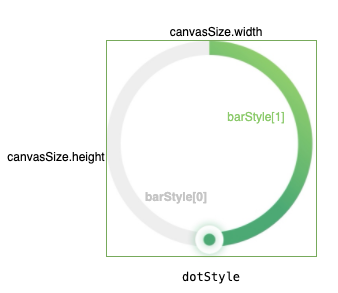
    barStyle: [{width: 20, fillStyle: '#f0f0f0'}, {width: 20, animate: true, fillStyle: [{position: 0, color: '#56B37F'}, {position: 1, color: '#c0e674'}]}],
    needDot: true,
    dotStyle: [{r: 20, fillStyle: '#ffffff', shadow: 'rgba(0,0,0,.15)'}, {r: 10, fillStyle: '#56B37F'}]
  },
  percentage: 10
}
...
<mpProgress config="{{config}}" percentage="{{percentage}}"></mpProgress>
This method follows the principle of two-way binding data. When the page changes percentage, mp-progress will automatically update the view.
This method is suitable for wepy, but it must be initialized in the onReady callback function.
The unit passed in is rpx , that is, if the canvas width is 400rpx, then 400 is passed in, and the real size will be automatically calculated later.
 import MpProgress from 'mp-progress';
...
// 初始化
// 注意:在wepy中必须在onReady里调用
const mprogress = new MpProgress({
  target: this,
  canvasId: 'progress',
  canvasSize: {width: 400, height: 400},
  barStyle: [{width: 12, fillStyle: '#f0f0f0'}, {width: 12, fillStyle: [{position: 0, color: '#56B37F'}, {position: 1, color: '#c0e674'}]}]
});

// 开始绘制进度,60代表60%
mprogress.draw(60);

...
<canvas class="canvas" type="2d" id="progress"></canvas>
| Effect | parse |
|---|---|
 | Normal mode (default) |
 | Percentage mode (you only need to pass in the percentage as required, see parameter description) |
| Parameter name | data type | Required parameters | parse | List |
|---|---|---|---|---|
| target | Object | yes | Page context | this |
| canvasId | String | yes | The id of the page canvas | progress |
| canvasSize | Object | yes | The size of canvas, the corresponding unit is rpx, you only need to pass in the number | {width: 200, height: 300} |
| percent | Number | no | By default, the circle is calculated and displayed according to 360 degrees. If 80% is passed in, the maximum semicircle arc will be automatically drawn based on the canvas size. The valid value is between 50% and 100%. | 100 |
| barStyle | Array | yes | The arc progress style is rendered according to the position order of the array elements. Generally, the first element configuration is the background color that covers the entire arc, and the second element configuration is to render the arc according to the progress percentage. fillStyle can be a normal color or a gradient color. To use the gradient color, you need to pass in the position and color information of each point in the format of an array. | [{width: 12, fillStyle: '#f0f0f0'}, {width: 12, animate: true, fillStyle: [{position: 0, color: '#56B37F'}, {position: 1, color: '#c0e674' }]}] |
| needDot | Boolean | no | Do you need to display progress points? | false |
| dotStyle | Array | no | Progress point style configuration supports up to two styles of overlay. To ensure the clear display of progress points, the first point adds a shadow by default. If the diameter of the first progress point is larger than the progress bar, in order to ensure that the progress point is completely displayed in the canvas, the drawn progress bar circle must be reduced by the corresponding difference, where shadow is an optional configuration, and the value of shadow is (0, 0, r/2, shadow) | dotStyle: [{r: 24, fillStyle: '#fff', shadow: 'rgba(0,0,0,.15)'}, {r: 10, fillStyle: '#56B37F'}] |
Considering that the progress bar may be updated multiple times on a page, after the component is instantiated, you need to manually call the draw method to draw the picture.
| Parameter name | data type | Required parameters | parse |
|---|---|---|---|
| percentage | Number | yes | Arc percentage, for example, if 60 is passed in, only the remaining 60% of the arc will be rendered counterclockwise. |
How to set arc endpoint style
The lineCap parameter can be added to any parameter item in barStyle , for example: barStyle: [{width: 12, lineCap: 'round', fillStyle: '#56B37F'}]. For the valid value lineCap , please see the document
Must run on SDK version 2.7.0 or above
The component has adopted WeChat’s latest same-layer rendering method, which requires the SDK version to be no lower than 2.7.0
dotStyle
If dotStyle contains shadow, in order to ensure that the shadow can be fully displayed in all areas of the circle, the radius of the progress bar will be automatically reduced.
progress animation
Currently animation only works in the definition of the last element of barStyle, and the animation of each frame is 2% of the total animation.
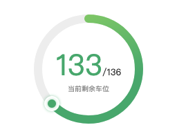
Text display effect

For implementation code, please refer to:
 <view class="garage-status">
  <canvas class="canvas" type="2d" id="progress"></canvas>
  <view class="status-ctn">
    <view class="status-count">127/127</view>
    <view class="desc-text">适用车位剩余</view>
  </view>
</view>
Problem feedback
