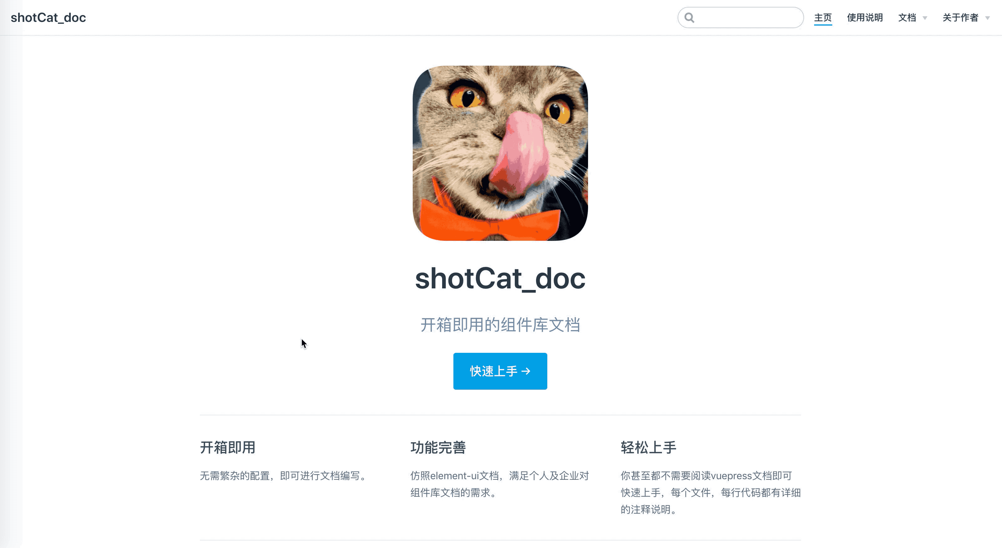
shotCat_doc
1.0.0

shotCat_doc can help you quickly build your own component library document, which is based on vuepress. It imitates the element-ui document and implements component display, code display, online operation, API table display, document version switching, support for comments, etc. It can help you quickly build a component document prototype from scratch. It has already done all the configuration work you need for you by default, making it truly usable out of the box.
If you like this project, welcome to star! Or if you have any usage problems or bugs, please submit issues and PRs.
Clone project
git clone https://github.com/1011cat/shotCat_doc.git
Enter the project directory
cd shotCat_doc
Install dependencies
npm install
It is recommended not to use cnpm to install dependencies directly, as there will be various weird bugs. You can solve the problem of slow npm download speed by doing the following
npm install --registry=https://registry.npm.taobao.org
Start service
npm run dev
Browser access http://localhost:6868
 |-- shotCat_doc
    |-- LICENSE
    |-- deploy.sh   //用于自动部署
    |-- package-lock.json
    |-- package.json
    |-- docs
    |   |-- README.md   //文档首页配置
    |   |-- .vuepress   //用于存放全局的配置、组件、静态资源等。
    |   |   |-- config.js   //文档配置文件
    |   |   |-- enhanceApp.js   //应用级别的配置 其实就是引入文档需要用到的第三方插件
    |   |   |-- components  //该目录中的 Vue 组件将会被自动注册为全局组件
    |   |   |   |-- baseComponent   //文档会用到的全局公共组件
    |   |   |   |   |-- apiTable.vue    //组件的参数表格
    |   |   |   |   |-- codeBox.vue     //包裹示例的组件
    |   |   |   |   |-- star.vue    //底部彩蛋组件
    |   |   |   |-- demo   //组件示例
    |   |   |       |-- catButton   //存放button组件相关示例
    |   |   |           |-- type_catButton.vue
    |   |   |-- dist    //存放打包后的文件
    |   |   |
    |   |   |-- public  //静态资源目录
    |   |   |   |-- favicon.jpeg
    |   |   |   |-- name.png
    |   |   |-- styles  //用于存放样式相关的文件
    |   |       |-- index.styl  //将会被自动应用的全局样式文件,会生成在最终的 CSS 文件结尾,具有比默认样式更高的优先级
    |   |       |-- palette.styl    //用于重写默认颜色常量,或者设置新的 stylus 颜色常量
    |   |-- components  //存放组件文档要用到的markdown
    |   |   |-- README.md
    |   |   |-- 1.0 //1.0 版本的文档 如果不需要版本管理,直接删除1.0这层文件夹即可
    |   |   |   |-- README.md
    |   |   |   |-- catButton.md
    |   |   |-- 2.0 //2.0 版本的文档
    |   |       |-- README.md
    |   |       |-- catButton.md
    |   |-- guide   //使用说明的文件夹
    |       |-- introduction.md
    |       |-- quickStart.md
    |-- src //存放你自己的ui组件库
        |-- index.js
        |-- components
            |-- catButton
                |-- catButton.vue
Put your own component library in the root directory, and then configure it in docs/.vuepress/enhanceApp.js
 //docs/.vuepress/enhanceApp.js

//引入你的组件库 确保你的组件库index文件有install方法
//如果不会,没关系,src目录里自带一个简单组件库示例,可供参考
import Cat from '../../src/index'

export default ( {
    Vue , // VuePress 正在使用的 Vue 构造函数
    options , // 附加到根实例的一些选项
    router , // 当前应用的路由实例
    siteData // 站点元数据
  } ) => {
    Vue . use ( Cat )
  }
Then configure your sidebar path. For detailed configuration, you can directly view the comments in docs/.vuepress/components/config.js.
 // docs/.vuepress/components/config.js

//这里配置的是button组件页面的路径
sidebar : {
    '/components/2.0/' : [
        {
            title : '基础组件' ,   // 必要的 配置侧边栏名称
            path : '' ,
            collapsable : false , // 可选的, 右侧侧边栏是否展开,默认值是 true
            // 如果组件很多时,建议将children配置单独放到一个js文件中,然后进行引入
            children : [
                {
                    title : 'Button 按钮' ,
                    path : 'catButton' , //在项目中对应的路径是 docs/components/2.0/catButton.md
                } ]
        }
    ]
} ,Now you can start writing your own component documentation. Here is an example of component display: take my cat-button as an example.
// docs/.vuepress/components/demo/catButton.vue

< template >
    <!-- 注意这段代码会放入slot里,所以必须再包裹一层div,否则会解析报错 -->
    < div >
        < cat-button text =" default " > </ cat-button >
        < cat-button text =" primary " type =" primary " > </ cat-button >
        < cat-button text =" success " type =" success " > </ cat-button >
        < cat-button text =" info " type =" info " > </ cat-button >
        < cat-button text =" warning " type =" warning " > </ cat-button >
        < cat-button text =" danger " type =" danger " > </ cat-button >
        < cat-button text =" text " type =" text " > </ cat-button >
    </ div >
</ template >

< script >
    export default {
    }
</ script >Create a markdown file in docs/components/2.0/catButton.md in the path configured above. Then you can happily write button component pages!
// docs/components/2.0/catButton.md

---
title: 2.0 Button 按钮
---

<!-- baseComponent-codeBox 组件即为.vuepress/components/baseComponent/codeBox文件,vuepress会默认把它解析为`baseComponent-codeBox`组件,这里我们如下对代码进行包裹,具体功能可以查看codeBox注释和页面效果 -->
< baseComponent-codeBox title ="按钮类型" description ="按钮类型通过设置type为primary、success、info、warning、danger、text创建不同样式的按钮,不设置为默认样式。 " onlineLink =" https://codepen.io/1011cat/pen/KjEOWO " >

    <!-- 同理demo-catButton-type_catButton即为我们step2编写的示例组件 -->
  < demo-catButton-type _catButton > </ demo-catButton-type _catButton >

    <!-- 这里highlight-code为引入的第三方代码高亮组件,里面包裹的就是上面示例组件的代码 -->
  < highlight-code slot =" codeText " lang =" vue " >
    < template >
      < div >
        < cat-button text =" default " > </ cat-button >
        < cat-button text =" primary " type =" primary " > </ cat-button >
        < cat-button text =" success " type =" success " > </ cat-button >
        < cat-button text =" info " type =" info " > </ cat-button >
        < cat-button text =" warning " type =" warning " > </ cat-button >
        < cat-button text =" danger " type =" danger " > </ cat-button >
        < cat-button text =" text " type =" text " > </ cat-button >
      </ div >
    </ template >
    < script >
        export default {
        }
    </ script >
  </ highlight-code >
</ baseComponent-codeBox >

<!-- 组件的参数表格,这里我没有使用自带的markdown表格,因为太丑,样式不好修改,有时参数描述较少时,不能自动撑满一行,所以自己写了一个组件;titile为表格标题,tableHead为表头,tableBody为具体参数设置,并且支持el-table的table参数 -->
< baseComponent-apiTable
  title =" Table Attributes "
  :tableHead = " tableHead "
  :tableBody = " tableBody " >
</ baseComponent-apiTable >

<!-- Vssue为引入的评论插件 -->
< Vssue title =" Vssue Demo " />

<!-- 其实在vuepress里的每个.md其实和.vue很像的,你基本可以按照vue组件模式来写 -->
< script >
    // 基本上和写vue一样
  export default {
    data ( ) {
      return {
          //表头为字符串,写法和md一样,中间以`|`间隔就行
        tableHead : `参数 | 说明 | 类型 | 可选值 | 默认值` ,
            //表格为数组,其中每一项为字符串,代表每一行要展示的数据,写法也和md一样,中间以`|`间隔就行
        tableBody : [
          `size | 尺寸 | String | medium / small / mini | —` ,
          `type |	类型 | string |	primary / success / warning / danger / info / text | —`
        ] ,
      }
    } ,

  }
</ script >

<!-- 和vue一样,也可以设置样式,并且这里style样式只对当前md有效,不需要加上scoped -->
< style >

</ style >
At this point, you have completed a simple button component display. In summary, it is:
More detailed configuration and instructions are in the corresponding code. Each code file has line-by-line comments and pitfall prevention instructions.


