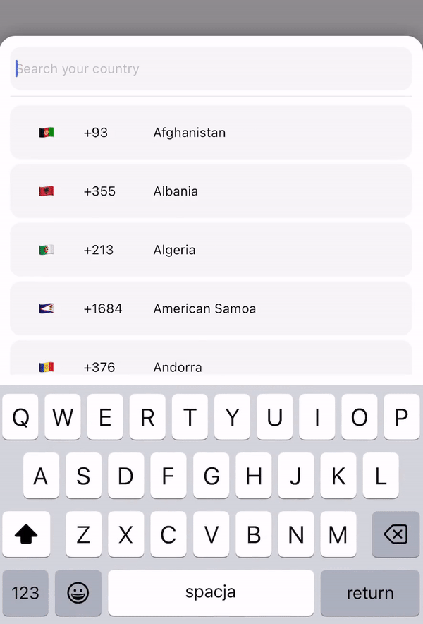
react native country codes picker
v2.3.2
⚡ ⚡ ⚡ このライブラリ。多言語を提供します。国ピッカーまたは検索機能を備えた国リスト。完全なクロスプラットフォームで、React-native と expo でサポートされています。あなたの国が見つかりませんでしたか?必要な国またはロケールを追加して PR を作成するだけです。 ⚡ ⚡ ⚡
私はこのライブラリを強化したいと考えており、次のバージョンにどのような機能が搭載されることを望んでいるのか、ご意見をお待ちしています。現在、react-native-country-codes-picker の次期リリースに向けたロードマップの草案を作成しています。
パフォーマンスを向上させるために次のバージョンは復活した v3 をベースにするべきか、それとも新しいコンポーネントの代わりに柔軟なフックを導入する方が良いかを検討します。開発を進める上で皆様のご意見は非常に重要ですので、最も価値のある追加点や希望する変更点についてのアイデアを共有してください。
何か面白いことがあれば!私たちに書いてください:)
expo: expo install react-native-country-codes-picker
npm: npm i react-native-country-codes-picker
糸: yarn add react-native-country-codes-picker
 import { CountryPicker } from "react-native-country-codes-picker" ;

export default function App ( ) {
  const [ show , setShow ] = useState ( false ) ;
  const [ countryCode , setCountryCode ] = useState ( '' ) ;

  return (
    < View style = { styles . container } >
      < TouchableOpacity
        onPress = { ( ) => setShow ( true ) }
        style = { {
            width : '80%' ,
            height : 60 ,
            backgroundColor : 'black' ,
            padding : 10 ,
        } }
      >
        < Text style = { {
            color : 'white' ,
            fontSize : 20
        } } >
            { countryCode }
        < / Text >
      < / TouchableOpacity >

      // For showing picker just put show state to show prop
      < CountryPicker
        show = { show }
        // when picker button press you will get the country object with dial code
        pickerButtonOnPress = { ( item ) => {
          setCountryCode ( item . dial_code ) ;
          setShow ( false ) ;
        } }
      / >
    < / View >
  ) ;
} import { CountryPicker } from "react-native-country-codes-picker" ;
function ListHeaderComponent ( { countries , lang , onPress } ) {
return (
< View
style = { {
paddingBottom : 20 ,
} }
>
< Text >
Popular countries
< / Text >
{ countries ?. map ( ( country , index ) => {
return (
< CountryButton key = { index } item = { country } name = { country ?. name ?. [ lang || 'en' ] } onPress = { ( ) => onPress ( country ) } / >
)
} ) }
< / View >
)
}
export default function App ( ) {
const [ show , setShow ] = useState ( false ) ;
const [ countryCode , setCountryCode ] = useState ( '' ) ;
return (
< View style = { styles . container } >
< TouchableOpacity
onPress = { ( ) => setShow ( true ) }
style = { {
width : '80%' ,
height : 60 ,
backgroundColor : 'black' ,
padding : 10 ,
} }
>
< Text style = { {
color : 'white' ,
fontSize : 20
} } >
{ countryCode }
< / Text >
< / TouchableOpacity >
// For showing picker just put show state to show prop
< CountryPicker
show = { show }
// when picker button press you will get the country object with dial code
pickerButtonOnPress = { ( item ) => {
setCountryCode ( item . dial_code ) ;
setShow ( false ) ;
} }
ListHeaderComponent = { ListHeaderComponent }
popularCountries = { [ 'en' , 'ua' , 'pl' ] }
/ >
< / View >
) ;
} import { CountryList } from "react-native-country-codes-picker" ;
export default function App ( ) {
const [ countryCode , setCountryCode ] = useState ( '' ) ;
return (
< View style = { styles . container } >
< View
style = { {
width : '80%' ,
height : 60 ,
backgroundColor : 'black' ,
padding : 10 ,
} }
>
< Text style = { {
color : 'white' ,
fontSize : 20
} } >
{ countryCode }
< / Text >
< / TouchableOpacity >
// All props the same as for picker
< CountryList
lang = { 'pl' }
pickerButtonOnPress = { ( item ) => {
setCountryCode ( item . dial_code ) ;
} }
/ >
< / View >
) ;
}以下は、React コンポーネントに渡すことができる props です。
| プロップ | タイプ | デフォルト | 例 | 説明 |
|---|---|---|---|---|
| 見せる | ブール値 | このプロップはモーダルを表示するために使用されます。ここにショーの状態を入力します。 | ||
| ピッカーボタンオンプレス | 関数 | (国) => setCode(国.ダイヤルコード) | ピッカーから国データを取得するための関数をここに配置します。 | |
| 入力プレースホルダー | 弦 | inputPlaceholder={'あなたのプレースホルダー'} | 入力にカスタム プレースホルダーが必要な場合は、このプロップが必要になる場合があります。 | |
| 検索メッセージ | 弦 | searchMessage={'ここに検索メッセージがあります'} | 検索メッセージをカスタマイズしたい場合は、このプロップを使用してください。 | |
| ラング | 弦 | 「えん」 | lang={'pl'} | 言語を変更する必要がある場合。サポートされている言語の 1 つを入力するだけです。または、必要な lang が見つからない場合は、それらを追加して PR を作成してください:) |
| 有効化モーダル回避 | ブール値 | 間違い | EnableModalAvoiding={true} | モーダルはキーボードを避けるべきですか? Android では、値パンを使用して androidWindowSoftInputMode を使用する必要があります。デフォルトでは、Android はキーボード自体を回避します。 |
| androidWindowSoftInputMode | 弦 | androidWindowSoftInputMode={'パン'} | 基本的に Android はキーボード自体を回避します。カスタム回避を使用したい場合は、このプロップを使用できます。 | |
| アイテムテンプレート | 反応ノード | 国ボタン | itemTemplate={ここのテンプレートコンポーネント} | このパラメーターは React Node 要素を取得して、リストの各項目のテンプレートとしてレンダリングします。これらのプロパティはアイテムに送信されます: key、item、style、name、および onPress |
| スタイル | 物体 | style={{あなたのスタイルはこちら}} | コンポーネントのスタイルを変更したい場合は、おそらくこの小道具が必要です。以下のスタイル部分を確認できます。 | |
| 背景を無効にする | ブール値 | 間違い | 背景を無効にする | モーダル背景を表示したくない場合は、このプロップを渡します。 |
| onBackdropPress | 関数 | ヌル | onBackdropPress={() => setShow(false)} | ユーザーがモーダルの背景をタップしたときにモーダルを閉じたい場合。 |
| 初期状態 | 弦 | 初期状態={'+380'} | このプロパティを使用できるように、ユーザーの現在地などによって国を事前に選択する必要がある場合があります。 | |
| 除外される国 | 配列 | 除外される国={['RU', 'BY']} | このプロップでは、コードを追加して削除する国のリストを定義できます。 | |
| 表示のみ | 配列 | showOnly={['UA', 'EN']} | このプロパティを使用すると、表示する国を構成できます。 | |
| 人気のある国 | 配列 | 人気のある国={['UA', 'EN']} | このプロパティを使用すると、人気のある国の配列を ListHeaderComponent に送信できます。 | |
| リストヘッダーコンポーネント | JSX.要素 | ListHeaderComponent={ListHeaderComponent} | このプロップを使用すると、人気のある国をリストの先頭に表示するヘッダー コンポーネントを作成できます。 ListHeaderComponent のサンプルセクションを確認してください |
❕ 必要に応じて、他のすべての FlatList および TextInput プロパティも使用できます。 ❕
 < CountryPicker
    show = { show }
    lang = { 'cz' }
    style = { {
        // Styles for whole modal [View]
        modal : {
            height : 500 ,
            backgroundColor : 'red'
        } ,
        // Styles for modal backdrop [View]
        backdrop : {

        } ,
        // Styles for bottom input line [View]
        line : {

        } ,
        // Styles for list of countries [FlatList]
        itemsList : {

        } ,
        // Styles for input [TextInput]
        textInput : {
              height : 80 ,
              borderRadius : 0 ,
        } ,
        // Styles for country button [TouchableOpacity]
        countryButtonStyles : {
              height : 80
        } ,
        // Styles for search message [Text]
        searchMessageText : {

        } ,
        // Styles for search message container [View]
        countryMessageContainer : {

        } ,
        // Flag styles [Text]
        flag : {

        } ,
        // Dial code styles [Text]
        dialCode : {

        } ,
        // Country name styles [Text]
        countryName : {

        }
    } }
    pickerButtonOnPress = { ( item ) => {
        setCountryCode ( item . dial_code ) ;
        setShow ( false ) ;
    } }
/ > "name" : {
"en" : "English" ,
"ru" : "Russian" ,
"pl" : "Polish" ,
"ua" : "Ukrainian" ,
"cz" : "Czech" ,
"by" : "Belarusian" ,
"pt" : "Portuguese" ,
"es" : "Espanol" ,
"ro" : "Romanian" ,
"bg" : "Bulgarian" ,
"de" : "German" ,
"fr" : "French" ,
"nl" : "Dutch" ,
"it" : "Italian" ,
"cn" : "Chinese" ,
"ee" : "Estonian" ,
"jp" : "Japanese" ,
"he" : "Hebrew" ,
"tr" : "Turkish"
} ,言語を追加できます。必要なら!!!ただし、その後に PR を行ってください。他の人の助けになります。
このパッケージを使用していて、自動テストのコンポーネントの 1 つをターゲットにする必要がある場合、現在、次のコンポーネントのtestIDが提供されています。
FlatListコンポーネント: 'countryCodesPickerFlatList'TextInputコンポーネント: 'countryCodesPickerSearchInput'TouchableOpacity ) コンポーネント: 'countryCodesPicker CountryButton'

