What is responsive layout?
Responsive layout means that the same page has different layouts on different screen sizes. Today, when the mobile Internet is highly developed, the web pages we develop on desktop browsers can no longer meet the needs of viewing on mobile devices. The traditional development method is to develop one set of pages on the PC side and another set of pages on the mobile side. But this is very troublesome. With more and more different terminals, you need to develop multiple different versions of the page. To use responsive layout, you only need to develop one set. EthanMarcotte proposed the concept of responsive layout in May 2010. In short, a website can be compatible with multiple terminals.
The difference between responsive development and separate development for mobile and PC: Responsive development only writes a set of interfaces, and displays different layouts and content by detecting the viewport resolution and doing code processing on the client for different clients. The mobile terminal and PC terminal are developed separately. By detecting the viewport resolution, it can determine whether the currently accessed device is a PC, tablet or mobile phone, thereby requesting the server and returning different pages.
What is the principle of responsive development?
The principle of responsive development is to use Media Query in CSS3 to set different layouts and styles for devices of different widths to adapt to different devices.
SS3 @media query definition and usage:
Using the @media query, you can define different styles for different media types. @media can set different styles for different screen sizes, especially if you need to set up a responsive page, @media is very useful. When you reset the browser size, the page will also be re-rendered based on the browser's width and height.
For example, if the screen width is less than 500 pixels, change the background-color to red.
To implement responsive layout, commonly used methods include the following:
(1) Use media queries in CSS (the simplest);
(2) Use JavaScript (the cost of use is relatively high);
(3) Use third-party open source frameworks (such as bootstrap, which can support various browsers).
Set meta tag
First, we need to set the meta tag to tell the browser to make the width of the viewport (the visible area of the web page) equal to the width of the device and prohibit the user from zooming in on the page, as shown below:
<metaname=viewportcontent=width=device-width,initial-scale=1,maximum-scale=1,user-scalable=no>
When setting the viewport, you need to pay attention. The viewport is the size of the visible area of the web page. When setting the viewport, just set the width. You don't need to care about the height. The specific height is automatically expanded by the web page content. The meaning of the content in the meta tag above is as follows:
● viewport: Viewport, which represents the visible area of the web page;
●width: Controls the size of the viewport. You can specify a specific value, such as 600, or a special value composed of keywords. For example, device-width represents the width of the device;
●initial-scale: indicates the initial scaling ratio, which is the scaling ratio when the page is first loaded;
●maximum-scale: Indicates the maximum ratio that the user is allowed to zoom in, ranging from 0 to 10.0;
●minimum-scale: Indicates that users are allowed to zoom to the minimum scale, ranging from 0 to 10.0;
●user-scalable: Indicates whether the user can manually zoom, "yes" means scaling is allowed, "no" means scaling is prohibited.
media inquiries
CSS media queries can define different CSS styles for different media types (screen print) based on specified conditions, so that users using different devices can get the best experience.
Use HTML as an example:
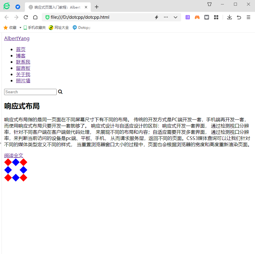
<!DOCTYPEhtml><html><head><metacharset=UTF-8><metaname=viewportcontent=width=device-width,initial-scale=1><title>Responsive page introductory tutorial: Albert Yang</title><linkrel =stylesheethref=style.css><linkre l=stylesheethref=https://stackpath.bootstrapcdn.com/font-awesome/4.7.0/css/font-awesome.min.cssintegrity=sha384-wvfXpqpZZVQGK6TAh5PVlGOfQNHSoD2xbE+QkPxCAFlNEevoEH3Sl0sibVcOQVnNcrosso rigin=anonymous></head><body><header><ahref=#>AlbertYang</a><ul><li><ahref=#>Homepage</a></li><li><ahref= #>Blog</a></li><li><ahref=#>Contact me</a></li><li><ahref=#>Message board</a></li><li> <ahref=#>About me</a> </li><li><ahref=#>Photo wall</a></li></ul><div><inputtype=textplaceholder=Search><iclass=fafa-searcharia-hidden=true></i ></div></header><div><div><h2>Responsive layout</h2><p>Responsive layout means that the same page has different layouts in different screen sizes. The traditional development method is to develop one set for the PC and another set for the mobile phone. However, when using responsive layout, you only need to develop one set. The difference between responsive design and adaptive design: responsive design develops a set of interfaces, and displays different layouts and content by detecting the viewport resolution and doing code processing on the client side for different clients; adaptive design requires the development of multiple sets of interfaces , by detecting the viewport resolution, it is determined whether the currently accessed device is a PC, tablet, or mobile phone, thereby requesting the service layer and returning different pages. CSS3 media queries allow us to define different styles for different media types. When the browser window size is reset, the page will also be re-rendered based on the width and height of the browser. </p><ahref=#>Read the full text</a></div><imgsrc=img.png></div></body></html>
Running results:

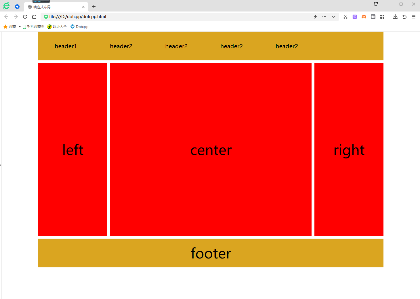
The following is a comprehensive example to demonstrate the implementation of responsive layout:
<!DOCTYPEhtml><html><head><metacharset=UTF-8><title>Responsive layout</title><metaname=viewportcontent=width=device-width,initial-scale=1.0,maximum-scale=1, user-scalable=no/><style>*{margin:0px;padding:0px;font-f amily:Microsoft Yahei;}#head,#foot,#main{height:100px;width:1200px;/*width:85%;*/background-color:goldenrod;text-align:center;font-size:48px ;line-height:100px;margin:0auto;}#headdiv{display:none;font-size:20px;h eight:30px;width:100px;background-color:green;float:right;line-height:30px;margin-top:35px;}#headul{width:80%;}#headulli{width:20%;float: left;text-align:center;list-style:none;font-size:20px;}#main{he ight:auto;margin:10pxauto;overflow:hidden;}.left,.center,.right{height:600px;line-height:600px;float:left;width:20%;background-color:red}.center{ width:60%;border-left:10pxsolid#FFF;border-right:10pxso lid#FFF;box-sizing:border-box;}@mediaonlyscreenand(max-width:1200px){#head,#foot,#main{width:100%;}}@mediaonlyscreenand(max-width:980px){. right{display:none;}.left{width:30%;}.center{width:70%;border- right:hidden;}}@mediaonlyscreenand(max-width:640px){.left,.center,.right{width:100%;display:block;height:200px;line-height:200px;}.center{border: hidden;border-top:10pxsolid#FFFFFF;border-bottom:10pxso lid#FFFFFF;height:600px;line-height:600px;}#headul{display:none;}#headdiv{display:block;}}</style></head><body><div><headerid=head ><ul><li>header1</li><li>header2</li><li>header2</li><li>header2</li>< li>header2</li></ul><div>icon</div></header><sectionid=main><divclass=left>left</div><divclass=center>center</div><divclass =right>right</div></section><footerid=foot>footer</footer></div></body></html>Running results:
