CSS 3D transformation In CSS, in addition to 2D transformation of elements on the page, you can also perform 3D transformation on object elements (think of the page as a three-dimensional space to move, rotate, scale and tilt elements on the page etc.). Like 2D transformations, 3D transformations do not affect surrounding elements and can overlap other elements. However, the transformed element will still occupy space in its default position (before the transformation).
Three-dimensional coordinate system
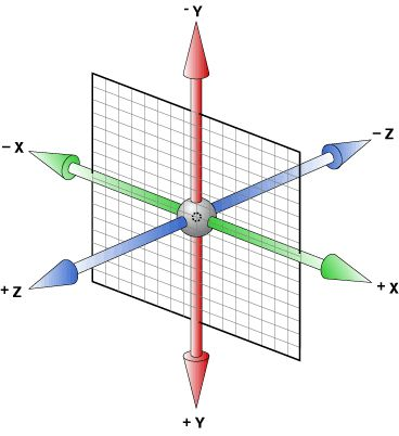
Let’s first understand the three-dimensional coordinate system. The so-called three-dimensional coordinate system adds a z-axis to the original two-dimensional coordinate system, thus forming a three-dimensional space, as shown in the figure below:

①x-axis: Horizontally to the right Note: The right side of x is a positive value, and the left side is a negative value
②y-axis: vertically downward. Note: y has positive values below and negative values above.
③Z-axis: Vertical screen Note: Positive values toward the outside and negative values toward the inside
Conversion properties
3D Transform method
1.translate3d()
The translate3d() function is used to move the position of an element in 3D space. The characteristic of this transformation is to define the offset of the element in each direction (X-axis, Y-axis, Z-axis) through three-dimensional vector coordinates. The syntax format of the function is as follows:
translate3d(tx,ty,tz)
Parameter description is as follows:
(1) tx: represents the distance the element moves in the horizontal direction (X-axis);
(2) ty: represents the distance moved in the vertical direction (Z axis) of the element;
(3) tz: Indicates the distance the element moves on the Z axis. Percentage values cannot be used for this parameter.
2. translateZ()
The function translateZ() is used to move elements along the Z axis of the three-dimensional coordinate system. The syntax format of the function is as follows:
translateZ(tz);
The parameter tz is used to set the distance the element moves on the Z axis.
Tip: translateZ(tz); is equivalent to the abbreviation of translate3d(0, 0, tz);.
3.rotate3d()
The rotate3d() function is used to set the angle of rotation of the element along the X-axis, Y-axis or Z-axis. This function will only rotate the element along the fixed axis and will not deform the element. The syntax format of the rotate3d() function is as follows:
rotate3d(x,y,z,a)
Parameter description is as follows:
x: Set the X-axis coordinate of the rotation axis;
y: Set the Y-axis coordinate of the rotation axis;
z: Set the Z-axis coordinate of the rotation axis;
a: Set the angle of rotation of the element. A positive angle means clockwise rotation, and a negative angle means counterclockwise rotation.
4. scale3d()
The scale3d() function can change the size (scaling) of elements. The syntax format of the function is as follows:
scale3d(sx,sy,sz)
Parameter description is as follows:
sx: represents the scaling ratio of the element in the X-axis direction;
sy: represents the scaling ratio of the element in the Y-axis direction;
sz: Indicates the scaling ratio of the element in the Z-axis direction.
5.matrix3d()
The matrix3d() function is very similar to the matrix() function we learned earlier, but the matrix3d() function can use a 4 × 4 matrix to describe a three-dimensional (3D) transformation. All 3D conversion operations can be performed at one time through the matrix3d() function. The syntax format of the function is as follows:
matrix3d(a1,b1,c1,d1,a2,b2,c2,d2,a3,b3,c3,d3,a4,b4,c4,d4)
Parameter description is as follows:
a1, b1, c1, d1, a2, b2, c2, d2, a3, b3, c3, d3, d4: used to describe various 3D transformations;
a4, b4, c4: Indicates the amount of element transformation.
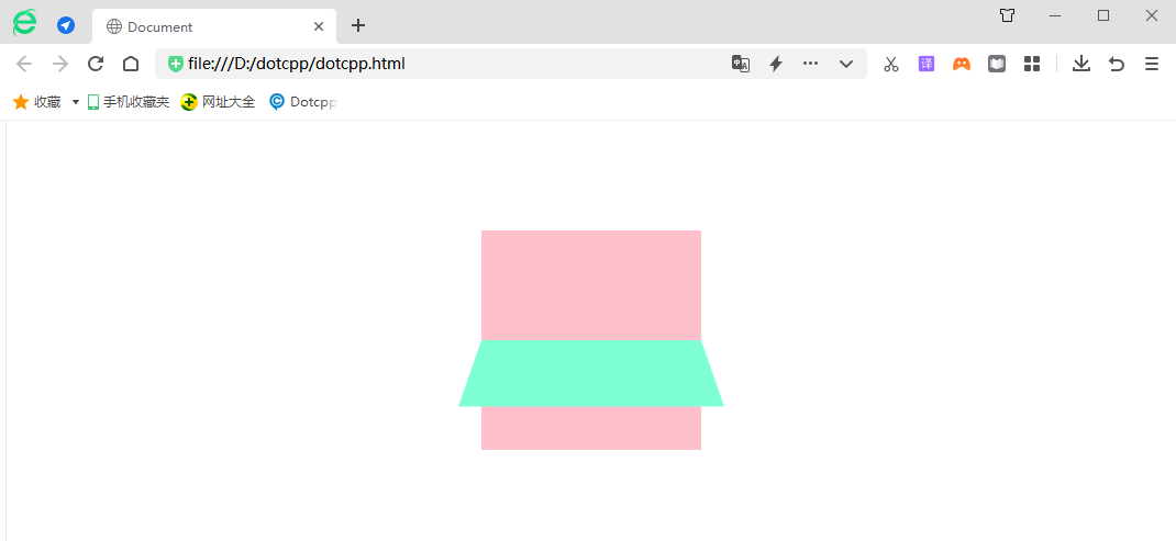
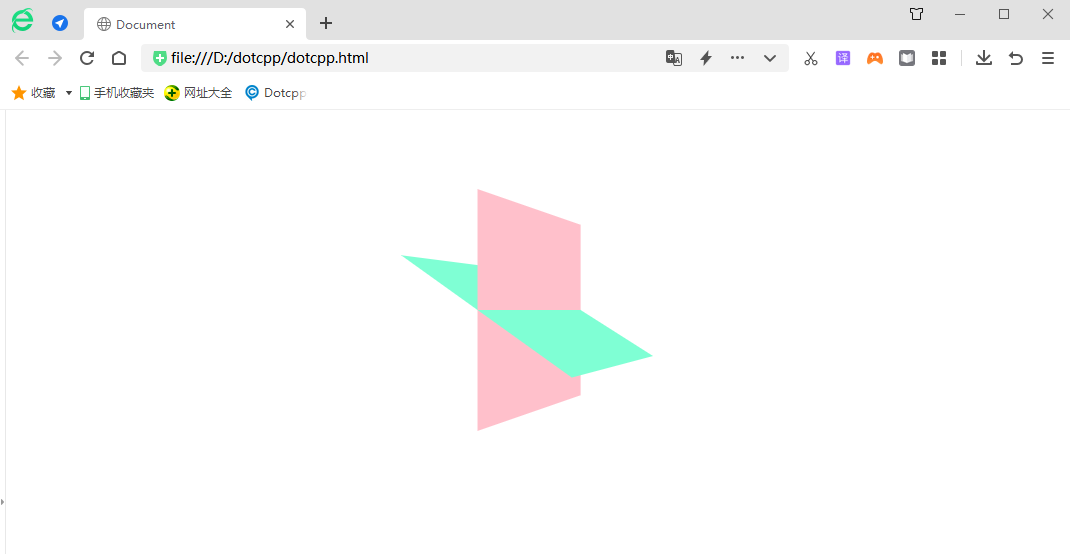
Example:
<!DOCTYPEhtml><html><head><metacharset=UTF-8><metahttp-equiv=X-UA-Compatiblecontent=IE=edge><metaname=viewportcontent=width=device-width,initial-scale=1.0>< title>Document</title><style>.box1{perspective:500px;}.box{position:relative;width:200px;height:200px;margin:100pxauto;transition:all2s;/*Let the sub-box maintain a 3D space Environment*/transform-style:preserve-3d;}.box:hover{transform:rotatey(60deg);}.boxdiv{position:absolute;top:0;left:0;width:100%;height:100%; background-color:pink;}.boxdiv:last-child{background-color:aquamarine;transform:rotateX(60deg);}</style></head><body><div><div><div></ div><div></div></div></div></body></html>Running results:

