The position property in CSS is used to set the position of an element on the page. Through this property, you can place any attribute wherever you think is appropriate.
The position attribute specifies the positioning type of the element. This attribute defines the positioning mechanism used to establish the layout of the element. Any element can be positioned, but absolute or fixed elements generate a block-level box, regardless of the type of the element itself. A relatively positioned element is offset from its default position in normal flow.
The position attribute specifies the type of positioning method applied to the element (static, relative, fixed, absolute, or sticky):
Elements are actually positioned using the top, bottom, left and right attributes. However, these properties have no effect unless the position property is set first. They work differently depending on the position value.
1. Static positioning: static
HTML elements are positioned static by default.
Static positioned elements are not affected by the top, bottom, left and right attributes.
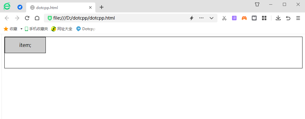
An element with position: static; is not positioned in any special way; it is always positioned according to the normal flow of the page:
Example:
<!DOCTYPEhtml><html><head><style>div{height:100px;border:1pxsolidblack;}div.static{width:130px;height:50px;background-color:#CCC;line-height:50px;text -align:center;position:static;top:50px;left:20px;}</style></head><body><div><divclass=static>item;</div></div></body ></html>Running results:
2. Relative positioning: relative
Example:
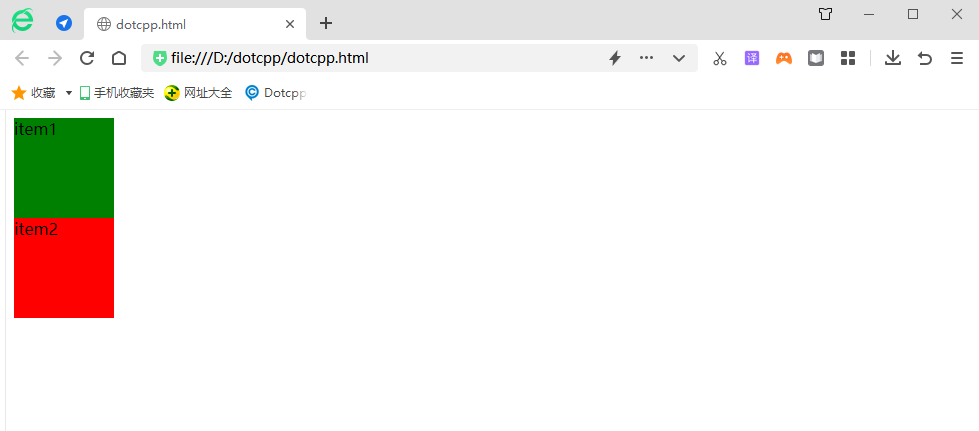
<html><head><styletype=text/css>#item1{width:100px;height:100px;background-color:green;}#item2{width:100px;height:100px;background-color:red;}< /style></head><body><divid=content><divid=item1>item1</div><divid=item2>item2</div></div></body></html>Running results:
If you change the CSS style file in the code as follows:
<html><head><styletype=text/css>#item1{width:100px;height:100px;background-color:green;}#item2{width:100px;height:100px;background-color:red;position: relative;left:20px;top:20px;}</style></head><body><divid=content><divid=item1>item1</div><divid=item2>item2</div></div ></body></html>Running results:
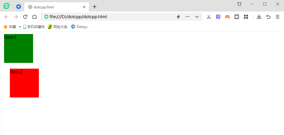
Summary: Relative is an offset relative to the position of the normal document flow. The originally occupied position still exists, which means that it will not affect the position of subsequent elements. Left means to offset relative to the right side of the original position, and top means to offset relative to the bottom of the original position. When left and right exist at the same time, only left is valid. When top and bottom exist at the same time, only top is valid. The relative offset is based on the upper left side of the object's margin.
3. Absolute positioning: absolute
Example:
<html><head><styletype=text/css>#item1{width:100px;height:100px;background-color:green;}#item2{width:100px;height:100px;background-color:red;}# content{margin-left:100px;margin-top:100px;}</style></head><body><divid=content><divid=item1>item1</div><divid=item2>item2</div ></div></body></html>Running results:
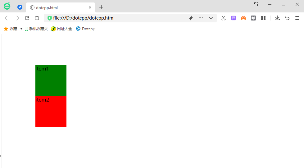
When modifying css style files:
<html><head><styletype=text/css>#item1{width:100px;height:100px;background-color:green;}#item2{width:100px;height:100px;background-color:red;position: absolute;left:20px;top:20px;}#content{margin-left:100px;margin-top:100px;}</style></head><body><divid=content><divid=item1>item1< /div><divid=item2>item2</div></div></body></html>Running results:
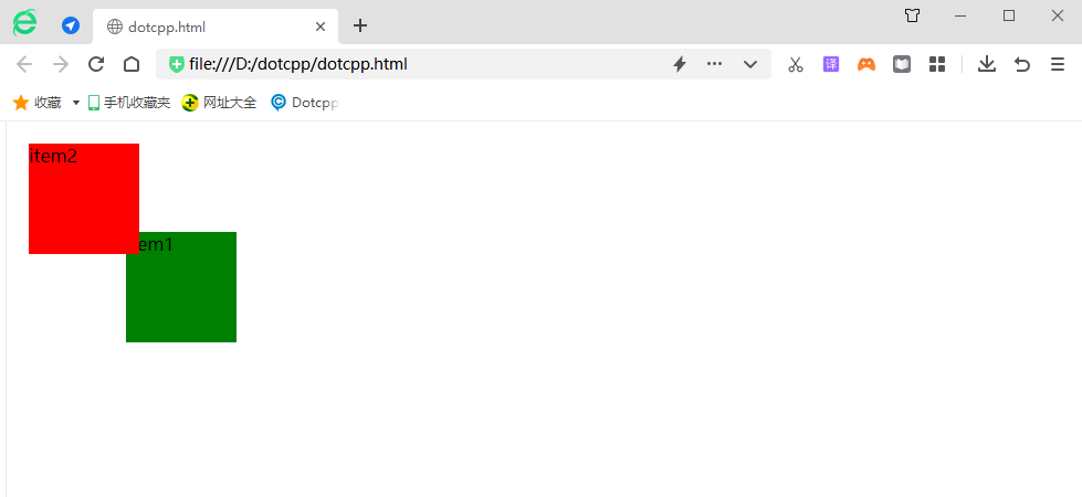
It can be seen that when the position attribute value of the parent element is the default value (static), absolute is positioned relative to the browser window.
If the value of the position attribute of content is set to a non-default value, then absolute is positioned relative to the parent element:
<html><head><styletype=text/css>#item1{width:100px;height:100px;background-color:green;}#item2{width:100px;height:100px;background-color:red;position: absolute;left:20px;top:20px;}#content{margin-left:100px;margin-top:100px;position:relative}</style></head><body><divid=content><divid=item1 >item1</div><divid=item2>item2</div></div></body></html>Running results:
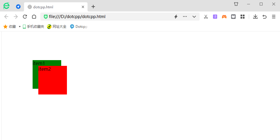
Continue to modify the css style:
<html><head><styletype=text/css>#item1{width:100px;height:100px;background-color:green;}#item2{width:100px;height:100px;background-color:red;}# content{margin-left:100px;margin-top:100px;position:absolute;padding:20px;border:10pxsolidblack;}</style></head><body><divid=content><divid=item1>item1< /div><divid=item2>item2</div></div></body></html>Running results:
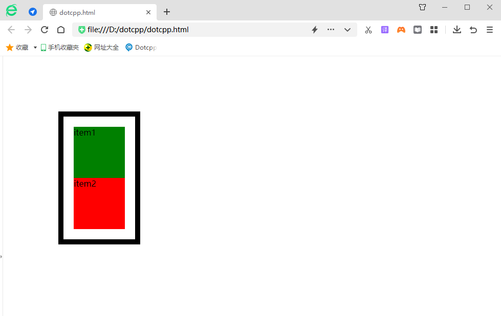
Have you noticed the change? When the outer div is set to absolute, the width of the outer div changes from 100% to auto.
When you set the position property of an element to absolute or fixed, three things happen:
(1) Move the element one layer to the Z-axis direction. The element is out of the ordinary flow, so it no longer occupies the space of the original layer and will cover the elements of the lower layer.
(2) The element will become a block-level element, which is equivalent to setting display: block; for the element (give an inline element, such as <span>, and after setting absolute, you will find that it can set the width and height).
(3) If the element is a block-level element, the width of the element changes from the original width: 100% (occupies one line) to auto.
4. Fixed positioning: fixed
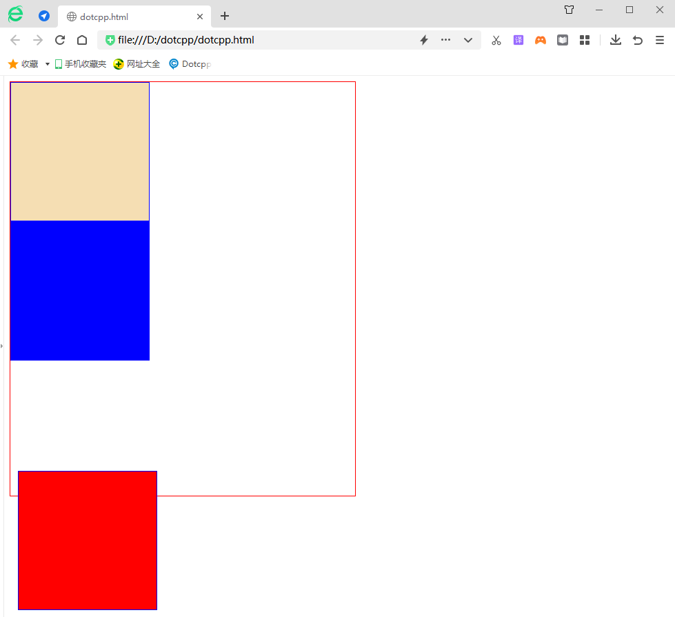
Fixed positioning is to position the element relative to the browser window. The element using fixed positioning will not move due to the scrolling of the browser window, as if it is fixed on the page. We often see the return to top button on the web page. This is achieved using fixed positioning.
Example:
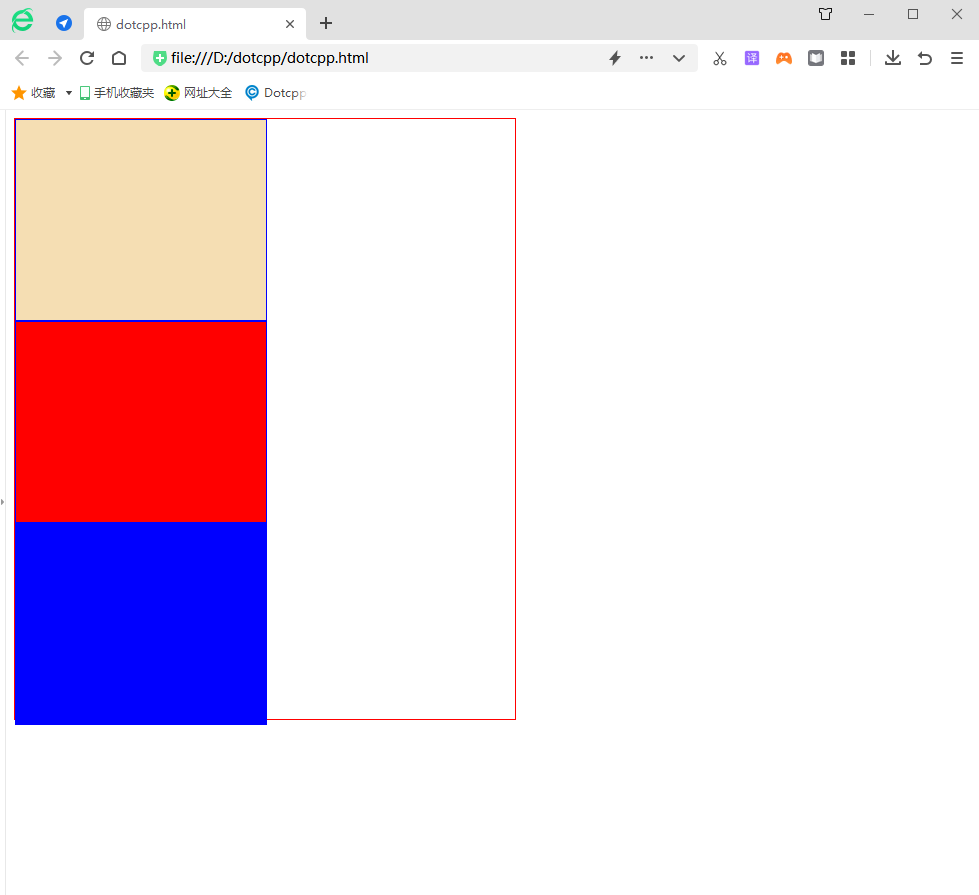
<!DOCTYPEhtml><html><head><metacharset=UTF-8><title></title><style>.out{border:red1pxsolid;height:600px;width:500px;}.in{border:blue1pxsolid; height:200px;width:200px;}</style></head><body><divclass=outstyle=position:relative;><divclass=instyle=background-color:wheat;></div><divclass=instyle =background-color:red;position:fixed;left:20px;bottom:10px;></div><divclass=instyle=background-color:blue;></div></div></body></ html>Running results:
5. Sticky positioning: sticky
Sticky positioning is different from the four positioning methods introduced earlier. It is like a combination of relative positioning and fixed positioning. When the page is scrolled, its effect is the same as relative positioning. When the element is scrolled to a certain extent, it will appear again. Fixed positioning effect. For example, the navigation menu on some web pages is in its default position when the page is loaded, and it is fixed at the top of the page when we scroll down.
Example:
<!DOCTYPEhtml><html><head><metacharset=UTF-8><title></title><style>.out{border:red1pxsolid;height:600px;width:500px;}.in{border:blue1pxsolid; height:200px;width:250px;}</style></head><body><divclass=out><divclass=instyle=background-color:wheat;></div><divclass=instyle=background-color: red;></div><divclass=instyle=background-color:blue;></div></div></body></html>Running results:
