The role of pseudo-class selectors in CSS can be said to be crucial. If CSS does not have pseudo-class selectors, many effects must be completed with the help of js. This will not only increase the amount of code, but also make it difficult to maintain. Such a heavy workload for programmers also goes against the purpose of CSS, which is to improve development efficiency and complete higher-quality development in the same world.
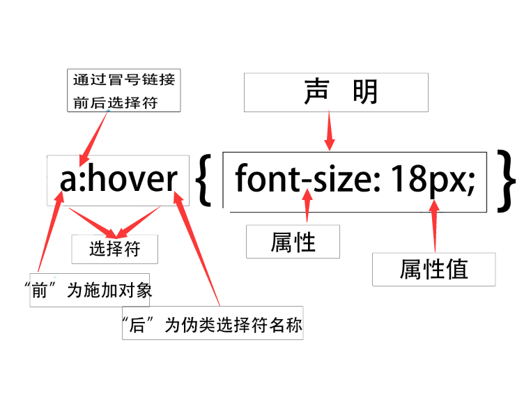
Pseudo-class selectors include pseudo-class and pseudo-class object selectors. Pseudo-class selectors use a colon (:) as a prefix identifier. You can add a selector before the colon to limit the scope of the pseudo-class application. After the colon are the pseudo-class and pseudo-class object names. There are no spaces before and after the colon, otherwise it will be considered a class selector, as shown in the figure.

The following table contains most of the pseudo-class selectors:
Dynamic pseudo-class
Dynamic pseudo-classes are a type of behavioral styles. These styles do not exist in HTML and can only be reflected when users interact with the page. Dynamic pseudo-class pseudo-class selectors include two forms:
Anchor pseudo-class, which is the most common style in links, such as :link, :visited.
Behavior pseudo-classes are also called user operation pseudo-classes, such as :hover, :active, and :focus.
For the sake of simplicity in teaching, I write it as inline. In actual applications, it is not recommended that you use inline.
:link
Set the style of the hyperlink before jumping. The usage is as follows:
<ahref=#target=_blank>Jump</a>
If you want to set the style before the hyperlink above to have a red font color and no underline, you can set it like this.
:visited
This pseudo-class is just the opposite of :link. :link is the style before the link, and :visited is the style after the link, that is, the hyperlink style after being visited.
<ahref=#target=_blank>Jump</a>:li
In daily learning, everyone may write the links before and after them together, which is convenient, fast and semantic; this leads to many students not knowing that these two pseudo-classes have a coverage effect. The following examples can help you have a general understanding:
<!DOCTYPEhtml><html><head><metacharset=utf-8><title></title><style>a:link{color:red;text-decoration:none;}a:visited{color:green; text-decoration:underline;}</style></head><body><ahref=login.htmltarget=_blank>Jump</a></body></html>The above code is the jump link from the HTML page to the login page. The rendering after running is as follows:

:hover
The :hover pseudo-class selector is used for styling effects when the user moves the mouse over the element. It is not only used for hyperlinks but can also be applied to many elements, such as buttons. When you move the mouse over it, you will find that the button's north background color becomes darker or changes color. This is done through:hover Of course, there are other ways to set it up, but there is no doubt: hover is the simplest and fastest way. Here I will first introduce the techniques for using hyperlinks, and then expand and use them to change the effect after the mouse moves over the element.
If you want to have the element change color when the mouse is hovering over a tag element, the code is as follows:
<!DOCTYPEhtml><html><head><metacharset=utf-8><title></title><style>a:hover{color:blue;}</style></head><body><ahref= #target=_blank>Jump</a></body></html> 
Expand
The structure code is as follows:
<!DOCTYPEhtml><html><head><metacharset=utf-8><title></title><style>div{width:100px;height:50px;line-height:50px;color:red;background:orange ;text-align:center;}</style></head><body><div>:hover</div></body></html>When the desired effect is that when the mouse moves over the div element, the background color is changed to black and the font is changed to white. The code is as follows:
<!DOCTYPEhtml><html><head><metacharset=utf-8><title></title><style>div{width:100px;height:50px;line-height:50px;color:red;background:o range;text-align:center;transition:all1s;}div:hover{background:black;color:white;}</style></head><body><div>:hover</div></body> </html>:active
:active is used for style effects when the user clicks on an element. It is mostly used in form controls. When the user clicks, it has the effect of pressing a button. For the same reason, I put this in the extension area.
When a hyperlink is clicked, I want to change the font color of the hyperlink. The implementation code is as follows:
<!DOCTYPEhtml><html><head><metacharset=utf-8><title></title><style>a{color:red;}a:active{color:blue;}</style></head ><body><ahref=#target=_blank>Jump</a></body></html>Expand
This example uses a div to imitate a button. The button style that comes with HTML is hard to describe in one word. It is easy to imitate and control the style.
<!DOCTYPEhtml><html><head><metacharset=utf-8><title></title><style>div{width:100px;height:50px;line-height:50px;text-align:center;background :green;font-size:24p x;font-weight:bold;border-radius:15px;margin:150pxauto;cursor:pointer;}div:active{background:orange;color:white;}</style></head><body><div> button</div></body></html>:focus
:focus is used to style the effect when a multi-purpose element becomes focus. This is often used on form control elements.
Structure code:
<!DOCTYPEhtml><html><head><metacharset=utf-8><title></title></head><body><formaction=#method=post><inputtype=text></form></ body></html>
When you want the input to gain focus, the background color is #CCC, and the implementation code is:
<!DOCTYPEhtml><html><head><metacharset=utf-8><title></title><style>forminput:focus{background:#CCC;}</style></head><body><formaction =#method=post><inputtype=text></form></body></html>You can see the style effect of changing the background color to the target color after the input gets focus.
Things to note:
(1) The above pseudo-class selector follows the order principle, that is, link to visited to hover and then to the active pseudo-class.
(2) Hover and active are included in the user behavior pseudo-category.
first-child
The pseudo-class first-child can match the first child element under the specified parent element. For example, ul li:first-child can match the first <li> element under the <ul> element. The sample code is as follows:
<!DOCTYPEhtml><html><head><style>ulli:first-child{/*Match the first <li>tag under <ul>*/color:red;}</style></head>< body><ul><li>dotcpp programming</li><li>dotcpp programming</li><li>dotcpp programming</li></ul></body></html>Running results:

ast-child
Similar to first-child, the pseudo-class last-child can match the last child element under the specified parent element. For example, ul li:last-child can match the last <li> element under the <ul> element. The sample code is as follows:
<!DOCTYPEhtml><html><head><style>ulli:last-child{/*Match the last <li>tag under <ul>*/color:red;}</style></head><body ><ul><li>dotcpp programming</li><li>dotcpp programming</li><li>dotcpp programming</li></ul></body></html>Running results:

nth-child
The pseudo-class nth-child is new in CSS3. It can match the nth child element under the specified element. For example, ul li:nth-child(2) can match the second <li> element under the <ul> element. The sample code is as follows:
<!DOCTYPEhtml><html><head><style>ulli:nth-child(2){/*Match the second <li>tag under <ul>*/color:red;}</style></ head><body><ul><li>dotcpp programming</li><li>dotcpp programming</li><li>dotcpp programming</li></ul></body></html>Running results:
