Gradient in CSS refers to a smooth transition between two or more colors. In the past, we had to use predefined images to achieve gradient effects. CSS3 provides a flexible solution for achieving gradient effects.
With CSS3 you can define three types of gradients, namely linear gradients (created through the linear-gradient() function), radial gradients (created through the radial-gradient() function) and conical gradients (created through the conic-gradient() function create). Additionally, you can create repeating gradients using the repeating-linear-gradient(), repeating-radial-gradient(), and repeating-conic-gradient() functions.
Gradients created through CSS are not only simple and flexible, but also save the loading time of web pages by eliminating the loading process required when using images. Additionally, gradient elements created with CSS can be scaled up or down at any scale without losing quality.
1. Linear gradient linear-gradient()
A linear gradient refers to a color gradient along a straight line (such as top right to bottom, left to right, etc.). To create a linear gradient, you need to define at least two color stops (the color stop refers to the color you want to smoothly transition) , to create more complex gradient effects, you need to define more color stops. The basic syntax for creating a linear gradient is as follows:
linear-gradient(direction,color-stop1,color-stop2,...);
Parameter description is as follows:
direction is an optional value that defines the direction of the gradient (for example, from left to right, from top to bottom). It can be a specific angle (for example, 90deg), or you can use to plus keywords such as left, right, top, bottom, etc. to indicate the gradient direction. ,For example:
● to left: means from right to left, equivalent to 270deg;
● to right: means from left to right, equivalent to 90deg;
● to top: means from bottom to top, equivalent to 0deg;
● to bottom: Default value, indicating from top to bottom, equivalent to 180deg;
● to right bottom: means from top left to bottom right;
● to right top: means from bottom left to top right;
● to left bottom: means from top right to bottom left;
● to left top: means from the lower right to the upper left.
color-stop1, color-stop2, ...: Indicates multiple defined color scales. In addition to defining the color in each color scale, the starting and ending positions of the color can also be defined by adding a value to a unit or a percentage.
[Example] Use the linear-gradient() function to define linear gradients:
<!DOCTYPEhtml><html><head><style>div{width:210px;height:50px;float:left;margin:10px;}.one{background:linear-gradient(torightbottom,red,blue70px);}. two{background:linear-gradient(190deg,#000,#FFF);}.three{background:linear-grad ient(red,green,blue);}.four{background:linear-gradient(toright,red,orange,yellow,green,blue,indigo,violet);}</style></head><body><divclass =one></div><divclass=two></div><divclass=three></div><divclass=four></div></body></html>Running results:

2. Radial gradient radial-gradient(); radiates from the center point
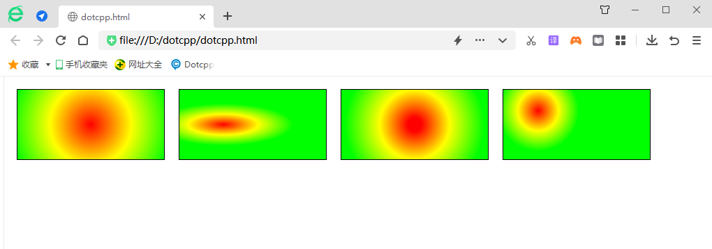
The difference between radial gradient and linear gradient type is that radial gradient is a gradient that extends outward from the center. You can specify the position of the center point and set the shape of the gradient. The basic syntax for defining a radial gradient is as follows:
radial-gradient(shapesizeatposition,color-stop1,color-stop2,...);
Parameter description is as follows:
(1) at: a keyword that needs to be placed in front of the parameter position;
(2) Position: Specify the coordinates of the starting point of the gradient. You can specify the coordinates of the starting point of the gradient using a value plus a unit, a percentage, or a keyword (such as left, bottom, etc.). If 2 parameters are provided, then the first parameter is used Represents the abscissa, and the second parameter is used to represent the ordinate. If only one parameter is provided, the second parameter will be set to 50% by default, which is center;
(3) shape: Specify the shape of the gradient. Optional values are circle (circle) and ellipse (ellipse);
(4) Size: Specify the size of the gradient shape. In addition to using specific numerical values to specify the radius of circle and ellipse, you can also use the keywords shown below to specify the size of the gradient shape:
●closest-side: Specify the radius length of the radial gradient from the center of the circle to the side closest to the center of the circle;
●closest-corner: Specify the radius length of the radial gradient from the center of the circle to the corner closest to the center of the circle;
●farthest-side: Default value, specifying the radius length of the radial gradient from the center of the circle to the side farthest from the center of the circle;
●farthest-corner: Specify the radius length of the radial gradient from the center of the circle to the farthest corner from the center of the circle.
(5) color-stop1, color-stop2,...: Indicates multiple defined color scales. In addition to defining the color in each color scale, the starting and ending positions of the color can also be defined in the form of numerical value plus unit or percentage. .
[Example] Use the radial-gradient() function to define a radial gradient:
<!DOCTYPEhtml><html><head><style>div{width:210px;height:100px;float:left;margin:10px;border:1pxsolidblack;}.one{background:radial- gradient(circleat50%,red,yellow,lime);}.two{background:radial-gradient(ellipse100px30pxat30%,red,yellow,lime);}.three{background:r adial-gradient(circle100pxat50%,red10%,yellow50%,lime100px);}.four{background:radial-gradient(circleclosest-cornerat50px30px,red,y ellow,lime);}</style></head><body><divclass=one></div><divclass=two></div><divclass=three></div><divclass=four>< /div></body></html>Running results:

3. Conic gradient conic-gradient(); rotate around the center point
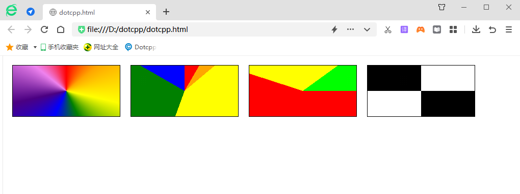
A conical gradient is similar to a radial gradient. Both have a center point as the source point of the color scale. The difference is that the conical gradient rotates around the center point (instead of radiating from the center point). The basic syntax for defining a conical gradient is as follows:
conic-gradient(fromangleatposition,start-color,...,last-color);
The syntax is explained as follows:
(1) from: a keyword that needs to be placed before the parameter angle;
(2) angle: defines the starting angle of the cone gradient, which can be empty, and the default value is 0deg;
(3) at: a keyword that needs to be placed before the parameter position;
(4) Position: Define the coordinates of the cone center of the cone gradient. You can specify the coordinates of the cone center using a value plus unit, percentage, or keywords (such as left, bottom, etc.). If 2 parameters are provided, then the first parameter Used to represent the abscissa, and the second parameter is used to represent the ordinate. If only one parameter is provided, the second parameter will be set to 50% by default, which is center;
(5) start-color, ..., last-color: Indicates multiple defined color scales. In addition to defining the color in each color scale, the starting position of the color can also be defined by percentage or angle.
[Example] Use conic-gradient() to define a cone gradient:
<!DOCTYPEhtml><html><head><style>div{width:210px;height:100px;float:left;margin:10px;border:1pxsolidblack;}.one{background:conic-gradient(at50%,red, orange,yellow,green,blue,indigo,violet,red);}.two{backg round:conic-gradient(red0deg30deg,orange30deg50deg,yellow50deg200deg,green200deg300deg,blue300deg360de g);}.three{background:conic-gradient(from90deg,red0%55%,yellow55%90%,lime90%100%);}.four{/*Turns. A circle has a total of 1 turn 90deg=100grad=0.25turn≈1.570796326794897rad*/background:conic-gradient(#fff0.25turn,#0000.25turn0.5turn,#fff0.5turn0.75turn,# 0000.75turn);}</style></head><body><divclass=one></div><divclass=two></div><divclass=three></div><divclass=four></ div></body></html>Running results:

4. Repeating gradient repeating-linear-gradient()
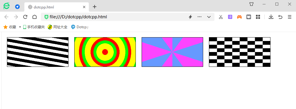
In CSS, you can also use functions such as repeating-linear-gradient(), repeating-radial-gradient(), and repeating-conic-gradient() to create repeating gradients of linear gradients, radial gradients, and conical gradients respectively, so-called Repeating gradient means repeating the gradient process multiple times to cover the entire element.
Tip: The syntax of the repeating-linear-gradient(), repeating-radial-gradient(), and repeating-conic-gradient() functions is the same as the syntax of the linear-gradient(), radial-gradient(), and conic-gradient() functions respectively. same.
[Example] Use the three functions repeating-linear-gradient(), repeating-radial-gradient() and repeating-conic-gradient() to define repeating gradients:
<!DOCTYPEhtml><html><head><style>div{width:210px;height:100px;float:left;margin:10px;border:1pxsolidblack;}.one{background:repeating-linear-gradien t(190deg,#0000px10px,#FFF10px20px);}.two{background:repeating-radial-gradient(circle100pxat50%,red0%10%,yellow10%30%,lime30%40%);}.three{background :repeating-conic-gradient(#69f036deg,#fd44ff36deg72deg);}.four{background:conic-gradient(#fff0.25turn,#0000.25turn0.5turn,#fff0.5turn0.75turn,#0000 .75turn)topleft/25%25%repeat;}</style></head><body><divclass=one></div><divclass=two></div><divclass=three></div> <divclass=four></div></body></html>Running results:
