2D transformations in CSS allow us to perform some basic transformation operations in two-dimensional space, such as moving, rotating, scaling or twisting, etc. The transformed elements are similar to absolutely positioned elements and will not affect surrounding elements, but can be combined with Surrounding elements overlap. The difference is that the converted element will still occupy the space before the conversion on the page.
Let's introduce 2D conversion:
1. Move translate()
According to the parameters given by the left (X-axis) and top (Y-axis) positions, moving from the current element position can change the position of the element on the page, similar to positioning.
1. Grammar:
transform:translate(x,y);
Or you can write them separately
transform:translateX(n);transform:translateY(n);
2. Key points:
(1) Define movement in 2D transformation, and move elements along the X and Y axes;
(2) The biggest advantage of translate is that it will not affect the position of other elements;
(3) The percentage of translate itself is relative to its own element translate (50%, 50%);
(4) It has no effect on inline tags;
Example:
<!DOCTYPEhtml><html><head><style>div{width:100px;height:100px;background-color:#CCC;transform:translate(100px,10px);}</style></head><body ><div></div></body></html>Running results:

2. Rotate rotate()
The rotate() method rotates an element clockwise by a given degree. Negative values are allowed, which causes the element to be rotated counterclockwise.
Syntax: transfrom:rotate (degree of rotation)
Key points:
rotate (degree), the unit is deg. For example: rotate(45deg);
If the angle is positive, it is clockwise, if it is negative, it is counterclockwise;
By default, the clockwise center point is the center point of the element;
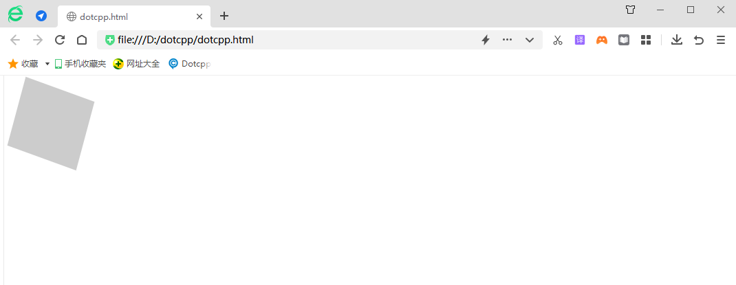
Example:
<!DOCTYPEhtml><html><head><style>div{width:100px;height:100px;background-color:#CCC;margin:20px0px0px20px;transform:rotate(45deg);}</style></head> <body><div></div></body></html>Running results:

3. 2D transformation center point transform-origin:
grammar:
transform-origin:xy;
Key points:
(1) Note that x and y are separated by spaces;
(2) The default center point of xy is the center point of the element (50% 50%);
(3) You can also set pixels or direction nouns for xy (right left center bottom top);
4. Zoom scale()
scale() method, the size of the element increases or decreases, depending on the width (X-axis) and height (Y-axis) parameters:
(1) Modify the size of the element, enlarge or reduce the element
(2) If it is a negative number, it will be reversed.
(3) The syntax format of the function is as follows:
scale(sx,sy)
Where sx represents the scaling ratio in the horizontal direction, and sy represents the scaling ratio in the vertical direction. In addition, the parameter sy can be omitted, and its default value is equal to sx.
Example:
<!DOCTYPEhtml><html><head><style>div{width:100px;height:100px;background-color:#CCC;transform:scale(0.7);}</style></head><body>< div></div></body></html>Running results:

5. Skew()
Contains two parameter values, indicating the tilt angle of the X-axis and Y-axis respectively. If the second parameter is empty, it defaults to 0. A negative parameter means tilting in the opposite direction.
(1) skewX(<angle>); means tilting only in the X-axis (horizontal direction).
(2) skewY(<angle>); means tilting only in the Y axis (vertical direction).
(3) Make elements tilt in different directions.
(4) skew(a) is equal to skew(a,0)
(5)skew(x,y)
(6) Unit angle deg
Example:
<!DOCTYPEhtml><html><head><style>div{width:100px;height:100px;background-color:#CCC;margin:20px0px0px10px;transform:skew(-15deg,20deg);}</style>< /head><body><div></div></body></html>Running results:

6. matrix()
The matrix() function can be regarded as the abbreviation of several functions: skew(), scale(), rotate() and translate(). All 2D conversion operations can be defined at the same time through the matrix() function. The syntax format of the function is as follows:
matrix(a,b,c,d,tx,ty)
The six parameters in the matrix() function correspond to scaleX(), skewY(), skewX(), scaleY(), translateX(), and translateY() respectively. You can use matrix() to implement various 2D conversions. Operations, such as:
translate(tx,ty)=matrix(1,0,0,1,tx,ty);:
where tx and ty are the horizontal and vertical translation values;
rotate(a)=matrix(cos(a),sin(a),-sin(a),cos(a),0,0);
where a is the value of degree. You can reverse the rotation by swapping the sin(a) and -sin(a) values;
scale(sx,sy)=matrix(sx,0,0,sy,0,0);
where sx and sy are the horizontal and vertical scaling values;
skew(ax,ay)=matrix(1,tan(ay),tan(ay),1,0,0);
where ax and ay are the horizontal and vertical values in deg.
Example:
<!DOCTYPEhtml><html><head><style>div{width:100px;height:100px;background-color:#CCC;margin:20px0px0px10px;float:left;}.on e{transform:matrix(0.866,0.5,-0.5,0.866,0,0);}.two{margin-left:35px;transform:matrix(0.586,0.8,-0.8,0.686,0,0);}. three{mar gin-left:40px;margin-top:25px;transform:matrix(0.586,0.8,-0.8,0.866,0,0);}.four{transform:matrix(0.586,0.8,-0.8,0.586,40,3 0);}</style></head><body><divclass=one></div><divclass=two></div><divclass=three></div><divclass=four></div ></body></html>Running results:

The matrix() method and the 2D transformation method are merged into one.
The matrix method has six parameters, including rotation, scaling, movement (translation) and tilt functions.
Use a matrix to express the transformation amount matrix(a,b,c,d,x,y)
●acx
●bdy
●0 0 1
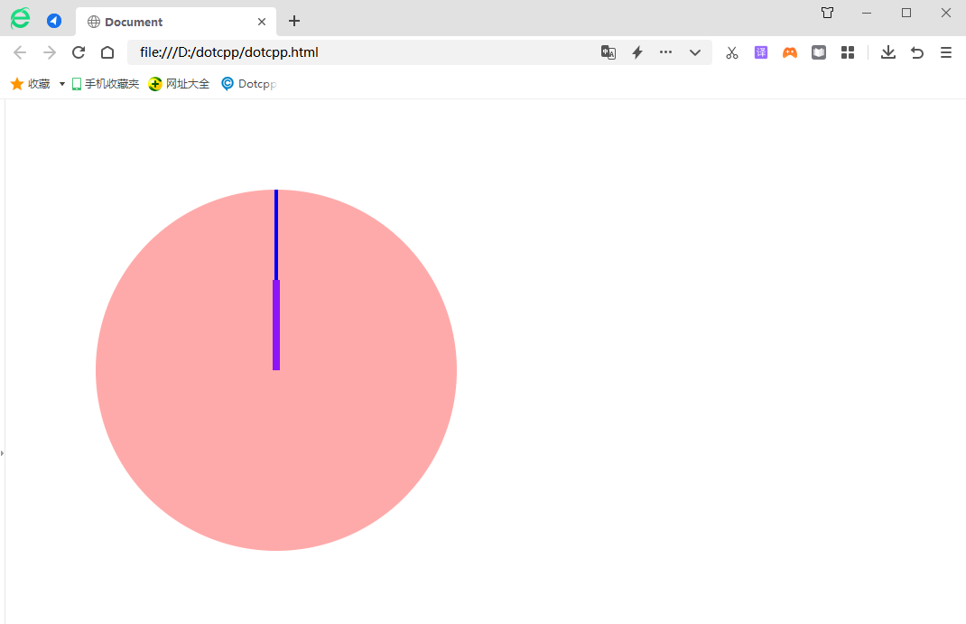
Let’s practice it using a specific case:
The code is as follows:
<!DOCTYPEhtml><html><head><metacharset=UTF-8><metahttp-equiv=X-UA-Compatiblecontent=IE=edge><metaname=viewportcontent=width=device-width,initial-scale=1 .0><title>Document</title><style>body{margin:100px;}.transformElement{width:200px;height:200px;background-color:red;transition:all1slinear;float:left;po sition:relative;left:0;color:#FFF;/*transform-origin:lefttop;*/}.transformElement2{width:200px;height:200px;background-color:blue;transition:all1slinear ;float:left;}.transformElement:hover{/*transform:translate(200px,0)rotate(360deg)scale(2);*//*left:100px;*//*transform:scale(2,0.5) */transform:skew(-45d eg,45deg);}.clock{width:400px;height:400px;border-radius:50%;background-color:#Faa;position:relative;}.stick{width:4px;height:200px;background-color :blu e;position:absolute;left:198px;top:0;transition:all12slinear;transform-origin:centerbottom;}.stickshort{width:8px;height:100px;background-color:rgb(142, 21,248);position:absolute;left:196px;top:100px;transition:all12slinear;transform-origin:centerbottom;z-index:2;}.clock:hover.stick{transform:rotate(4320 deg);}.clock:hover.stickshort{transform:rotate(360deg);}</style></head><body><!--<div></div><div></div>-- ><div><div></div><div></div></div></body></html>Running results:
