I received a request today to use the Gaussian blur effect to blur a page. I just took this opportunity to sort out the two APIs of Gaussian blur in CSS3.
illustrate:
This API is a filter that can not only achieve Gaussian blur, but also many other things such as color offset, saturation, grayscale, etc.
grammar:
 // Use spaces to separate multiple filters filter: none;
//Gaussian blur filter: blur(4px);
//Linear brightness filter: brightness();
// Contrast filter: contrast();
// Shadow effect filter: drop-shadow();
//Grayscale filter: grayscale();
// Hue rotation filter: hue-rotate();
//Invert image filter: invert();
//Convert transparency filter: opacity();
// Saturation filter: saturate();
// brown filter: sepia();
// SVG filter filter: url();
Among them Gaussian blur filter: blur();
illustrate:
When you create an element and add this attribute, it will add effects (such as blur or color shift) to the area behind the element.
contrast:
The filter attribute must be loaded on the image or background image, while the background-filter only needs to be an element.
grammar:
 backdrop-filter: blur(2px);
backdrop-filter: brightness(60%);
backdrop-filter: contrast(40%);
backdrop-filter: drop-shadow(4px 4px 10px blue);
backdrop-filter: grayscale(30%);
backdrop-filter: hue-rotate(120deg);
backdrop-filter: invert(70%);
backdrop-filter: opacity(20%);
backdrop-filter: sepia(90%);
backdrop-filter: saturate(80%);
 <!DOCTYPE html>
<html lang="en">
  <head>
    <style>
      .wrapBox2 {
        width: 800px;
        height: 300px;
        overflow: hidden;
        position: relative;
        background-image: url("./win.jpeg");
        background-size: 100% 100%;
        background-repeat: no-repeat;
        filter: blur(10px);
      }
      .subBox {
        position: absolute;
        width: calc(100% - 100px);
        height: calc(100% - 100px);
        z-index: 2;
      }
      .text {
        position: relative;
        /* z-index: 10; */
        font-size: 40px;
        font-weight: bold;
        color: #f00;
      }
    </style>
  </head>
  <body>
    <div class="wrapBox2">
      <div class="subBox"></div>
      <div class="text">Blur all</div>
    </div>
  </body>
</html> 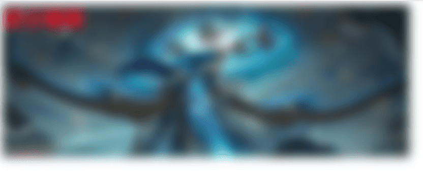
One thing to note here is that after adding blur, the actual size will exceed the width and height we set because of the surrounding burr effect. You can wrap a layer outside and set overflow: hidden;
 <!DOCTYPE html>
<html lang="en">
  <head>
    <style>
      .wrapBox2 {
        width: 800px;
        height: 300px;
        /* overflow: hidden; */
        position: relative;
      }
      .subBox {
        width: 100%;
        height: 100%;
        position: absolute;
        width: calc(100% - 100px);
        height: calc(100% - 100px);
        z-index: 2;
        filter: blur(10px);
      }
      .text {
        position: relative;
        /* z-index: 10; */
        font-size: 40px;
        font-weight: bold;
        color: #f00;
      }
    </style>
  </head>
  <body>
    <div class="wrapBox2">
      <img src="./win.jpeg" class="subBox" />
      <div class="text">Blur all</div>
    </div>
  </body>
</html> 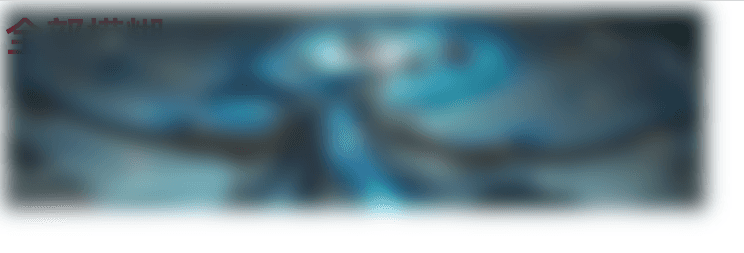
In this way, since the text and the picture are at the same level, the text is either below the picture or above the picture (controlled according to z-index) without blurring the text.
 <!DOCTYPE html>
<html lang="en">
  <head>
    <style>
      .wrapBox2 {
        width: 800px;
        height: 300px;
        overflow: hidden;
        position: relative;
        background-image: url("./win.jpeg");
        background-size: 100% 100%;
        background-repeat: no-repeat;
      }
      .subBox {
        position: absolute;
        width: calc(100% - 100px);
        height: calc(100% - 100px);
        z-index: 2;
        backdrop-filter: blur(10px);
        /* top: 100px; */
      }
      .text {
        position: relative;
        /* z-index: 10; */
        font-size: 40px;
        font-weight: bold;
        color: #f00;
      }
    </style>
  </head>
  <body>
    <div class="wrapBox2">
      <div class="subBox"></div>
      <div class="text">Partially blurred</div>
    </div>
  </body>
</html> 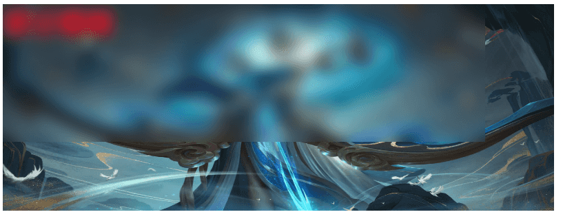
As you can see, the background-filter attribute does not need to be set on a picture element, but on any element. I think this method is more flexible.
Of course, using backdrop-filter can also satisfy the first scenario.
This concludes this article about CSS using filter and background-filter to achieve Gaussian blur effect (sample code). For more related CSS Gaussian blur content, please search previous articles on downcodes.com or continue to browse the related articles below. , I hope you will support downcodes.com more in the future!