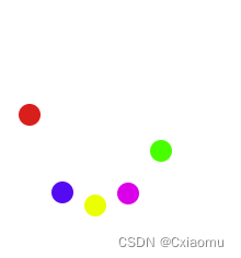
During my previous internship, I had a requirement to embed an H5 page on the Android side to realize voice input and include animation and jumping balls during input. By consulting various materials and based on actual demand scenarios, its function was finally realized. Let’s review and record it here.
First, realize the beating of a single ball.
Analysis: The ball starts at the top, reaches the bottom in the middle period, and finally returns to the top, and it is an infinite loop. Achieved by combining relative positioning with CSS3 keyframes.
<div class="ball"></div>
 .ball {
  width: 20px;
  height: 20px;
  border-radius: 50%;
  position: relative;
  animation-name: bouncing; // Animation name animation-duration: 1.6s; // Single animation duration animation-iteration-count: infinite; // Animation infinite loop background: rgb(244, 7, 7); // Ball background color}
//Keyframe animation @keyframes bouncing {
  0% {
    top: 0px; //Initially at the top}
  50% {
    top: 100px; // middle at bottom}
  100% {
    top: 0px; // Finally return to the top}
}Analysis: Multiple balls jump at the same time, and the relative positioning needs to be different. Secondly, there is a time difference in the beginning of each ball animation, and the second is the color of the ball.
 /** balls = [1,2,3,4,5] multiple balls*/
<div v-for="ball in balls" :key="ball" :class="['ball', `ball${ball}`]"></div>
//Public style extraction.ball {
width: 20px;
height: 20px;
border-radius: 50%;
position: relative;
animation-name: bouncing; // Animation name animation-duration: 1.6s; // Single animation duration animation-iteration-count: infinite; // Animation infinite loop}
.ball1 {
@extend .ball;
left: 0;
background: rgb(244, 7, 7);
}
.ball2 {
@extend .ball;
animation-delay: 0.25s; // Animation delay left: 30px;
background: rgb(16, 106, 241);
}
.ball3 {
@extend .ball;
animation-delay: 0.5s; // animation delay left: 60px;
background: rgb(251, 236, 13);
}
.ball4 {
@extend .ball;
animation-delay: 0.75s; // Animation delay left: 90px;
background: rgb(233, 23, 233);
}
.ball5 {
@extend .ball;
animation-delay: 1.0s; // Animation delay left: 120px;
background: rgb(6, 247, 6);
}
//Keyframe animation @keyframes bouncing {
0% {
top: 0px; //Initially at the top}
50% {
top: 100px; // middle at bottom}
100% {
top: 0px; // Finally return to the top}
}Demo
Analysis: Bind event monitoring, the button long press animation is displayed, and the button release animation is hidden.
Finally, it is time to put it into use and see the effect achieved.

 <el-button id="bouncingBallBtn">Voice input</el-button>
 <bouncing-ball v-if="showBouncing" />
 /** data showBouncing: false */
mounted() {
	let theBouncingBtn = document.getElementById("bouncingBallBtn");
	//Mobile terminal theBouncingBtn.addEventListener("touchstart", this.startBouncing, false);
	theBouncingBtn.addEventListener("touchend", this.endBouncing, false);
	// PC side theBouncingBtn.addEventListener("mousedown", this.startBouncing, false);
	theBouncingBtn.addEventListener("mouseup", this.endBouncing, false);
}
  /** Animation display*/
 startBouncing(event) {
   event.preventDefault();
   this.showBouncing = true;
 },
 /** Animation hiding*/
 endBouncing(event) {
   event.preventDefault();
   this.showBouncing = false;
 },
This concludes this article about CSS3 animation to implement multiple bouncing balls (voice input animation). For more information about CSS3 bouncing balls, please search previous articles on downcodes.com or continue to browse the related articles below. I hope you will support downcodes.com more in the future!