Design background:
Users are all personalized, on the premise of meeting functional needs. More and more users are choosing to change themes for their software. When the functions are perfected to a certain extent, personalization will be another direction of product development. Simply put, changing the theme can relax the user's recognition of the software. No matter how simple the analysis is, it can be said to be a change in usage mode, from passive use to active use.

Need points:
360 Secure Desktop is a system software that integrates "community chat, video, music, news, games" and other daily essential software. Its purpose is to simplify system operations so that users can use the computer for work or entertainment more simply. In order to allow users to use this product more freely, the one-click skin change function has been put on the agenda in the development of this new version. Changing the theme is a reflection of mood. People are emotional creatures. The same person's preferences and choices will have subtle deviations in different moods. Changing the theme is actually changing a different mood. So this is not so much a function as it is a kind of consideration, a kind of silent consideration from developers to users.
Creative ideas:
As a desktop product that is closest to users, the inspiration for this theme comes from this simple and warm memory~
A warm memory from life. We hope that this skin can make our products closer to users, which is also our ultimate goal in always designing products.
Photos are a record of our life memories, the warmth of saving that moment in a photo and then sticking the photos one by one in the album. Every time you open the photo album, you will feel the warm memories.
The biggest reason why we set our direction in the "Memories" part is that we want this theme to be gentle. Like a friend to share with.
Visual design:
The birth story of Icon - a process from scratch

Considering the original design intention of the theme, I found that the right-angled outer frame of traditional photos seemed too "sharp". In order to better match the theme style and better reflect the branding, the design of the unified icon border is inspired by the evolution of the 360 text logo. The rounded shape makes the icon feel softer. While deducting the title, it further reflects the unity of the product.
The design of the icon part only took a week from the draft stage to the final first version of the renderings, and the task was very urgent. From the draft to the first version, it was initially positioned as a design that favored the default style. Later, after discussion, it was discovered that this solution was not suitable as a theme because it was too featureless. Therefore, after the second re-melting, the entire style design was more personalized. After determining the general direction, some details of the design were refined again.

Folder expansion animation - the most friendly interactions often come from the reality of life.
The first impression the folder gave me was like an old photo album I used before. Therefore, the interactive design of the folder imitates the feeling of opening an old photo album. It's the kind that has a self-adhesive back panel covered with a transparent film.
Slowly uncovering the sealed memories, slowly splicing the memories of those scenes together in my mind. The memories are all wonderful, because the wonderful things are all the journeys before reaching the result.

Interface design If we want to design a theme, we must first understand the scope of the theme, the audience and what necessary elements are included, which elements can be personalized and which must strictly abide by the specifications.
The early conception is very important. It directly affects the later shaping. This stage will take no less than 20% of the entire project cycle.
For a rich interface, if you want to have a clear vision, the sense of space is very important. This includes: the ratio between the primary and secondary levels, the distance between each module, and the spacing of information in a single module. When you take off your heavy clothes, the lines of your body will naturally appear, but if you want to attract more attention, you have to train your "face" better.

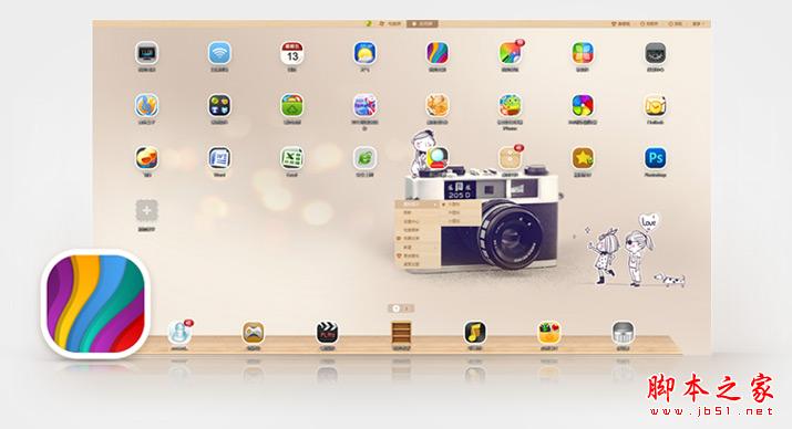
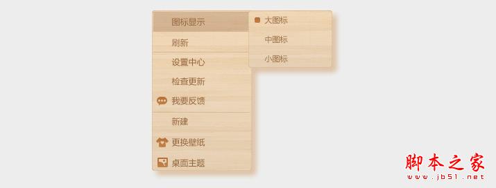
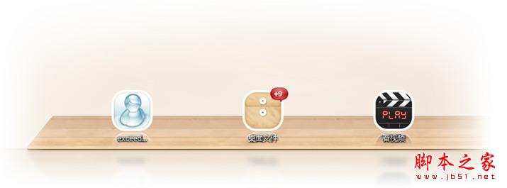
As a desktop product, to enrich its visual experience, we adopt warmth as the visual design direction for a style positioning. The intuitive feeling that "wood grain" gives us is natural and friendly. Since the positioning of the skin is based on the concept of "warmth", the overall color selection should also be closer to this point, so we use yellow as the overall theme color.

The style of the theme echoes the shape of the white rounded edges of the product icon. The combination of wood grain materials makes the design of this product concise rather than simple, with delicate detail processing, exquisite but not complicated and trivial, and a reasonable layout of the interface. The prominent focus of the desktop wallpaper display adds a bit of aura to the design of this product. The grasp of the interface design just shows the functionality and clever operability of the product, making the user experience a good one.