Throughout the development history of interaction design, it is a history of innovative interaction models being widely accepted and then becoming standards, while old interaction models are constantly being eliminated. Therefore, the development of interactive models is also a process of "natural selection, survival of the fittest". This article is a sharing made at the Carbonated Beverage Conference in 2009. What was innovative at that time has now been widely used. Because the theme is consistent with the current UX platform’s goal of encouraging innovation, I’ll post it again :)
Interaction design is a creative job, using innovative ways to solve product problems beautifully is a reflection of the value of an interaction designer. When innovative interaction designs are recognized by users and learned from peers in the industry, it is a great sense of professional satisfaction. This kind of innovation is not necessarily a revolutionary design that is earth-shattering. An innovation in a small interactive component can add a lot to the product experience. Today, I will talk about four common ways of innovating interactive components through some cases, and encourage everyone.
1. Innovation of scroll bars [Reconstruction method]
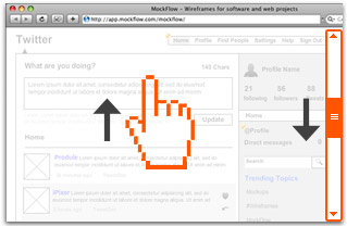
Let’s first recall the two scrolling methods for reading PDF documents: 1. Dragging with hand tools 2. Scroll bars.
To view the following information, drag upwards with the hand tool, and drag downwards with the scroll bar. What are the principles of the two methods of operation?
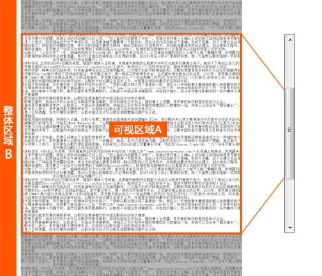
Divide the document into visible area A and overall area B. The scroll bar slider corresponds to the visible area A of the document. Therefore, the scroll bar drags the visual area A, while the hand tool drags the overall area B. The subjects dragged by the two operation methods are different, so the directions are exactly opposite.
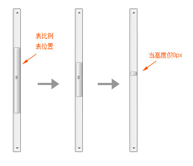
The scroll bar can be understood as a thumbnail of the document in the vertical direction. The slider can represent the current position of the visible area and the proportion of the visible area to the overall area. As the overall area of the document continues to increase, the proportion of the visible area becomes smaller, so the height of the slider keeps getting smaller. According to statistics on common software such as IE, FF, Office, etc., generally the slider will no longer shrink when the height reaches 8px. When the height of the slider is only 8px, the dragging experience of the scroll bar is quite poor.
Google wave has made bold innovations in scroll bars.
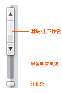
1. The up and down buttons are connected with the slider (benefits: the mouse movement distance from the slider to the up and down buttons is shortened; problem: the slider cannot follow the movement when the up and down buttons are clicked)
2. The height of the slider of the scroll bar is fixed (benefits: solves the problem of extremely small slider; problem: cannot express the proportion of the visible area)
These two modifications optimize the problems of traditional scroll bars, but cause problems with the basic properties of scroll bars ("position" and "proportion"). In order to solve the new problems caused, Google Wave's scroll bar introduces two new elements:
1. Translucent gray block (click the up and down buttons, the slider cannot follow the movement, then the translucent gray block will move - solve the position problem)
2. The termination bar (the content of the wave continues to increase, and the position of the termination bar continues downwards, which is used to indicate the overall height of the content - to solve the proportion problem. Unfortunately, the visual effect of this termination bar makes people think that it is draggable, which can easily cause confusion. )
Google Wave has put so much effort into innovating scroll bars, but it also faces problems with user habits caused by the complexity of scroll bars. Personally, I think this scroll bar innovation was made due to product needs. A wave page may have 4 scroll bars at the same time. When four traditional scroll bars appear on a page at the same time, the effect can be imagined. The Wave scroll bar is a very "light" design both visually and interactively, and is quite appropriate for the product as a whole.
================================================== ==
Apple's improvement to the scroll bar is simple and effective: adding anchor points.

Mac official website: Add an anchor point horizontal scroll bar, click the anchor point, and the slider scrolls to the corresponding position

iPhone music album list: scroll bar with anchor points, tap a letter, scroll the list to the corresponding position and add anchor points to the scroll bar to add navigation and accurate positioning functions, making it easier to use.
2. Innovation of combined search box [combination method]

A common conditional search box is composed of three controls: "input box + drop-down menu + button". A suitable combination of controls can bring better results.
1. [Input box + drop-down menu] combination
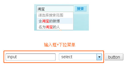
The search box of Sina Weibo integrates the drop-down options into the input box prompts, making the operation of selecting the search range more convenient.
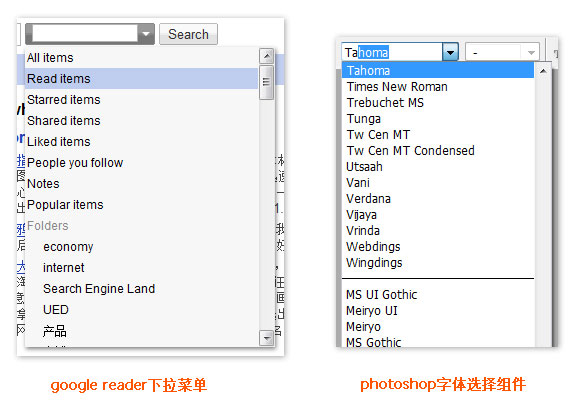
Drop-down menus with input operations like Google Reader make drop-down menus easier to use. (This kind of control combination is very common in word, photoshop and other software, such as font selection control)
2. [Button + drop-down menu] combination
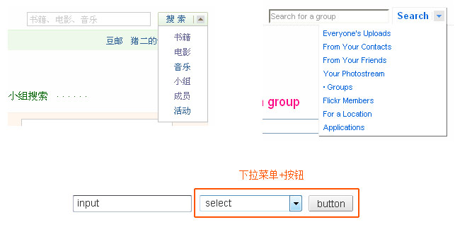
A drop-down arrow is added behind the search button of Douban and Flickr, and the button and the drop-down selection operation are combined into one (flickr’s design is consistent with the main navigation bar experience of its website, while Douban’s use of this design is slightly abrupt in the view of its entire site) )
3. Innovation of file upload components [slimming method]

The standard file upload component is composed of "input box (pseudo) + browse button + submit button". It is called a "pseudo input box" because it is mainly responsible for displaying file paths. Therefore, clicking on this input box in Firefox starts the file selection operation. Chrome even transformed the pseudo input box into a button to restore the final control. original role.

When using the standard file upload component, two submit buttons will often appear. Take the above picture as an example. The most common misoperation is: after selecting the file, directly click "Save Avatar Settings", which is a failure.
The design of Gmail attachment upload has undergone two slimming operations on the file upload component.
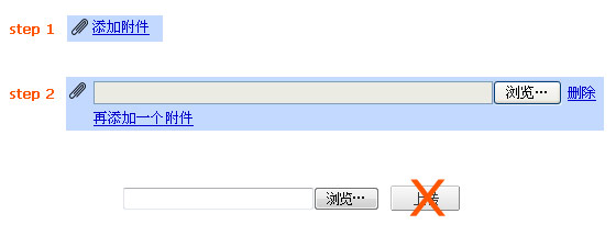
The steps for uploading attachments to Gmail in the past were: 1. Click "Add Attachment" (an upload component without a submit button will appear after clicking), 2. Select the file (upload will start automatically after selection). Removed the submit button.
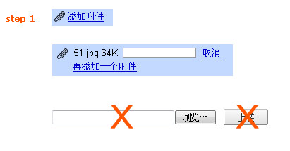
The current steps for uploading attachments to Gmail are: 1. Click "Add Attachment" (the upload will automatically start after clicking, and there will be an upload progress bar). The input box and submit button are removed, leaving only a browse button, and uploading only requires one click.
4. Page-turning innovation [alternative method]
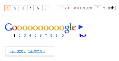
The traditional page turning method is "previous page + page number + next page", which is the most familiar design.
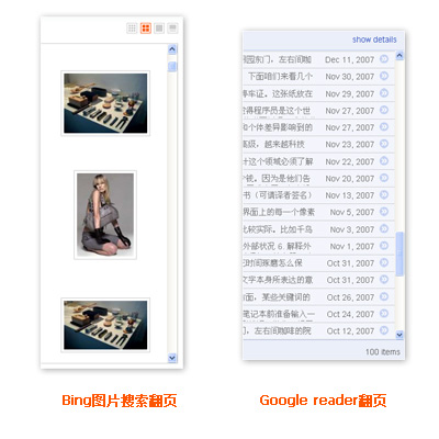
Bing image search
Google reader
See the picture and buy this "endless scrolling" page turning method that has emerged in recent years, that is, drag the scroll bar to the bottom and start loading the following content, instead of "previous page + page number + next page" Such links.
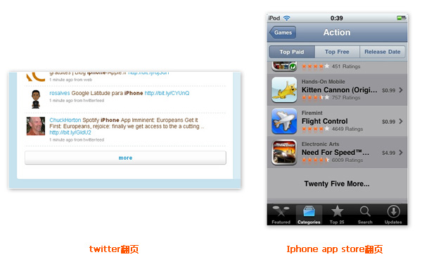
Relatively speaking, "progressive page turning" such as Twitter and Iphone app store are not so radical. They retain a page turning button, which is a compromise between traditional page turning and endless scrolling page turning.
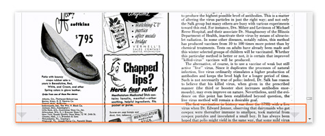
The picture above is a clever page turning design of Google book search. When the mouse is hovering over a local area at the bottom of the document (about 50px in height), a translucent layer will appear. Click on this layer to start page turning. This huge auxiliary page turning button greatly improves the convenience of page turning and has little impact on the interface.
The page-turning component innovation mentioned here is to replace the traditional page-turning component with a new page-turning method. From the perspective of the structure of information, traditional page turning divides information into segments, while "endless scrolling page turning" belongs to information scrolling. These two methods correspond to the prototypes in real life: books and movie films. Books divide the information into each page and flip it, while the information in the movie film scrolls frame by frame.
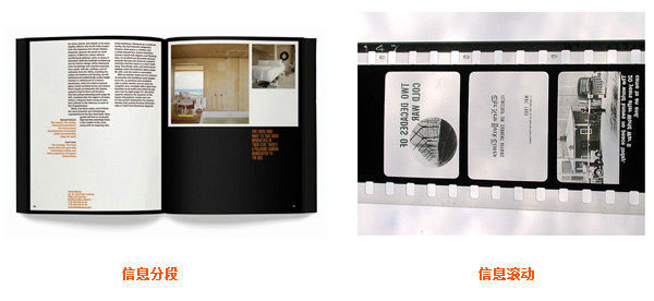
From the perspective of information flow speed and page turning convenience, "information scrolling" is far greater than "information segmentation". How should we choose between these two page turning methods? I think this should depend on the user's demand for subsequent content. In scenarios like the Google search results page, where the quality of information decreases as the page progresses, the user's demand for page turning is not that strong. . In scenarios like Google Reader, which is not sorted by information quality, it is relatively necessary to provide a high-speed page turning method. It should be noted that scrolling is not conducive to accurate content positioning and information retrieval.
The speed of information flow has a great impact on the mentality of the information recipient. The faster the flow speed, the smaller the amount of information absorbed. Therefore, reading PDF documents makes you feel more impatient than reading paper books. If you can't help but turn the pages, you are "scanning" instead of reading. "Reading" (personal subjective feelings, any similarities are purely inevitable)
This also extends to the point that in addition to structuring information, the interaction designer's job responsibilities should also control the flow speed and supply of information.
Summarize
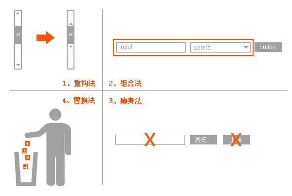
Finally, a picture is used to summarize the four ways of innovating interactive components. I hope it will inspire everyone.