The calendar control is a feature-rich network control that provides the following functions:
Show one month at a time
Choose a day, a week or a month
Select a day within a range
Move between months
Formatted control of display of days
The basic syntax of the calendar control is:
<asp:Calender ID = "Calendar1" runat = "server"></asp:Calender>The calendar control has many properties and events, using which you can customize operations and control the display. The following table provides some important properties of the calendar control:
| property | describe |
|---|---|
| Caption | Gets or sets the title of the calendar control. |
| CaptionAlign | Gets or sets the arrangement of titles. |
| CellPadding | Gets or sets the space between data and cell boundaries. |
| CellSpacing | Gets or sets the space between cells. |
| DayHeaderStyle | Gets style properties to display the day of the week. |
| DayNameFormat | Gets or sets the day of the week. |
| DayStyle | Gets the style properties to display the day of the month. |
| FirstDayOfWeek | Gets or sets the day of the week and displays it on the first line. |
| NextMonthText | Gets or sets the navigation text for the next month. The default value is >. |
| NextPrevFormat | Gets or sets the navigation control for the next or previous month. |
| OtherMonthDayStyle | Gets the style properties for days that do not appear in the month. |
| PrevMonthText | Gets or sets the navigation text of the previous month. The default value is <. |
| SelectedDate | Gets or sets the selected date. |
| SelectedDates | Gets a collection of DateTime objects representing the selected dates. |
| SelectedDayStyle | Get the style attributes of the selected date. |
| SelectionMode | Gets or sets the selection mode to specify whether the user can select a day, a week, or a month. |
| SelectMonthText | Gets or sets the text of the selected month element in the selector column. |
| SelectorStyle | Gets the style properties of the week or month selector column. |
| SelectWeekText | Gets or sets the text display of the week selection element in the selector column. |
| ShowDayHeader | Gets or sets a value indicating whether headers for days of the week are displayed. |
| ShowGridLines | Gets or sets whether the grid lines will be displayed. |
| ShowNextPrevMonth | Gets or sets a value that indicates whether navigation elements for the next month and previous month are displayed in the header section. |
| ShowTitle | Gets or sets a value indicating whether the title section is displayed. |
| TitleFormat | Gets or sets the format of the title. |
| Titlestyle | Gets the style property of the date control's title. |
| TodayDayStyle | Gets the style properties of today's date. |
| TodaysDate | Gets or sets the value of today's date. |
| UseAccessibleHeader | Gets or sets a value that displays whether to render the table title <th> HTML element to the date header instead of the table data <td> HTML element. |
| VisibleDate | Gets or sets the date of the specified month and displays it. |
| WeekendDayStyle | Gets or sets the style attribute for weekend dates. |
The date control has the following three most important events to allow developers to write date controls. They are:
| event | describe |
|---|---|
| SelectionChanged | It is triggered when a day, week or month is selected. |
| DayRender | It is triggered every time the calendar control's data cell is rendered. |
| VisibleMonthChanged | It is triggered when the user changes the month. |
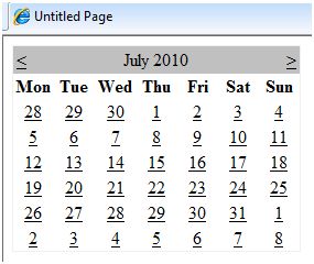
Use an initial calendar control without any code to provide the website with a valid calendar that displays the months and days of the year. It also contains navigation for the next month and the previous month.

The calendar control allows the user to select a day, a week, or an entire month. This is accomplished using the SelectionMode property. This attribute has the following values:
| property | describe |
|---|---|
| Day | Choose a day. |
| DayWeek | Choose a day or an entire week. |
| DayWeekMonth | Choose a day, a week or an entire month. |
| None | Nothing can be selected. |
Syntax for selecting dates:
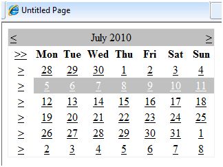
<asp:Calender ID = "Calendar1" runat = "server" SelectionMode="DayWeekMonth"></asp:Calender>When the selection mode is DayWeekMonth, an extra column marked with the symbol > appears to select the week, and the >> symbol appears to the left of the day name to select the month.

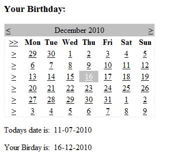
The following example demonstrates selecting a date and displaying it within a label:
The content file code is as follows:
<%@ Page Language="C#" AutoEventWireup="true" CodeBehind="Default.aspx.cs" Inherits="calendardemo._Default" %><!DOCTYPE html PUBLIC "-//W3C//DTD XHTML 1.0 Transitional//EN" "http://www.w3.org/TR/xhtml1/DTD/xhtml1-transitional.dtd"><html xmlns="http://www.w3.org/1999/xhtml" > <head runat="server"> <title> Untitled Page </title> </head> <body> <form id="form1" runat="server"> <div> <h3> Your Birthday:</h3> <asp:Calendar ID="Calendar1" runat="server SelectionMode="DayWeekMonth" onselectionchanged="Calendar1_SelectionChanged"> </asp:Calendar> </div> <p>Todays date is: <asp:Label ID="lblday" runat="server"></asp:Label> </p> <p>Your Birday is: <asp:Label ID="lblbday" runat="server"></asp:Label> </p> </form> </body></html>Event handler for event SelectionChanged:
protected void Calendar1_SelectionChanged(object sender, EventArgs e){ lblday.Text = Calendar1.TodaysDate.ToShortDateString(); lblbday.Text = Calendar1.SelectedDate.ToShortDateString();}When you run this file, it generates the following output:
