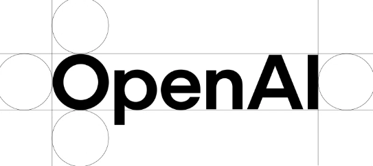
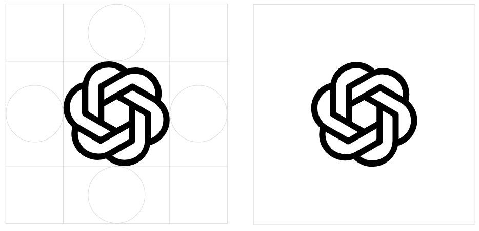
OpenAI has rebranded its logo, fonts and color schemes, aiming to create a more "organic" and "human" brand image. This revision is not a significant visual impact, but a meticulous crafting of details, reflecting OpenAI's pursuit of excellence in the brand image. On the basis of the original, the new logo has a larger center space, smoother lines and more visually affinity. The new font OpenAI Sans combines geometric accuracy and a rounded intimacy, complementing the new logo.
OpenAI carried out a comprehensive brand reshape, and launched a new logo, font and color scheme. According to an interview with Wallpaper, the purpose of this change is to make the brand image appear more "organic" and "human".

The difference between the new logo and the old version of the logo is not easy to detect, but by comparing side by side, you can find that the center space of the new version of the "flower" pattern is slightly larger and the lines are smoother.

The old logo was designed by OpenAI CEO Sam Altman and co-founder Ilya Sutskever, and this time the design was led by an in-house design team, team members Including Veit Moeller and Shannon Jager. They hope to create a brand image that is closer to human emotions through the new design.
While the new brand was launched, OpenAI also showed off a new font - OpenAI Sans. This font combines geometric precision and functionality with a round and approachable qualities. The "O" letters in the new OpenAI logo have a perfect and round appearance, while the interior is not so regular, thus offsetting the cold feeling of the mechanized design and making the brand more humane.
When asked if OpenAI's AI tools were used during the design process, such as ChatGPT, Moller said the team mainly used it to calculate the thickness of different fonts.
"We work with leading experts in photography, typography, motion and spatial design, while viewing AI tools such as DALL E, ChatGPT and Sora as partners in thought. This human intuition and AI generation potential The dual approach allows us to create a brand that is not only innovative but also deeply humanized.”
Points:
OpenAI has carried out a comprehensive brand reshaping, launching new logos and fonts, striving to make a more humane image.
Compared with the old logo, the new logo has a larger center space and smoother lines, reflecting the delicate design.
The team mainly uses AI tools to assist computing in design, rather than directly used in design, reflecting the concept of human-computer integration.
In short, OpenAI's brand reshaping is not only a visual update, but also a reflection of its brand philosophy and development direction. It tries to combine the rationality of technology with the sensibility of humanities to create a more affinity brand image for the future. Lay a good foundation for development. This update also demonstrates OpenAI's intention in brand building and its emphasis on user experience.