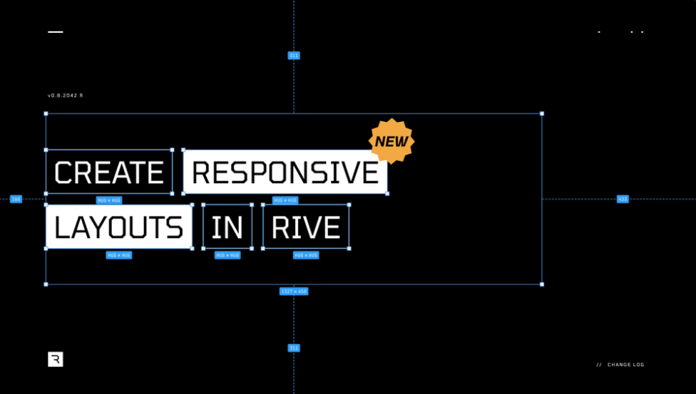
Rive has launched a new feature Layouts, which has completely changed the screen adaptation of animated graphics! Saying goodbye to the tedious adaptation work, designers and developers can easily create dynamic and responsive animations that can automatically adapt to a variety of screen sizes and devices, and always maintain Rive’s unique interactiveness and fluency. The Layouts feature is like a "universal layout artifact" that allows your animations to be perfectly presented on different platforms without having to create separate versions for each platform. It supports deep nesting and flexible layout, and can be combined with Rive's constraint system to achieve more refined and stable animation effects.
Designers and developers can finally get rid of the fear of being dominated by "screen adaptation"! Rive recently released a new feature called Layouts, allowing users to create dynamic and responsive animated graphics that can automatically adapt to different devices and screen size while maintaining Rive’s signature interactiveness and smooth animation effects.

What exactly is Layouts? Simply put, it is like a "universal layout artifact", which can automatically adapt to various screen sizes, and can also keep Rive's usual silky and smooth!
With Layouts, designers can easily create layouts that automatically adapt to the screen size, such as buttons, lists or menus that will be perfectly displayed on both phones and computers. Designers can freely choose which elements follow the layout rules and which ones can be displayed independently.
In addition, you can also add animations to the layout elements to make the interface more vivid and flexible. For example, a graphic can be designed that automatically resizes according to position, size, inner margins and outer margins to suit all devices. When using Layouts, the graphics can be scaled and re-aligned according to the screen size without losing animation effects.
A highlight of Layouts is cross-device compatibility. Graphics allow smooth transitions between the car’s dashboard and the smartphone, maintaining a consistent visual effect. The designer only needs to create the graphics once and it will automatically adjust on each platform without creating a separate version for each platform.
Layouts also supports multilinguals, and can automatically adjust the layout size according to the language length. For example, when the text is long, Layouts can rearrange or resize the text box to suit the display requirements of different languages. This ensures that all languages display consistently, and developers do not need to worry about the possible layout problems caused by different languages.
For designers who need to create complex layouts, Layouts offers options for deep nesting and flexible layouts. Designers can use the alignment, line break and spacing options to create complex UI layouts, such as multi-level UI elements, or complex structures that need to be adjusted on different screens.
Layouts also supports Breakpoints, which can trigger Rive's state machine based on changes in width, height, or proportion of components, and perform different animations or layout changes. For example, when the screen switches from landscape to portrait, Layouts can automatically switch to another layout or animation state.
Unlike other design tools, Rive Layouts allows designers to freely choose whether objects participate in the layout engine, and can break layout rules at any time and design freely. This means that designers can embed free elements such as highly animated characters into a more structured layout to achieve flexible design effects. Even when making layout adjustments, the character's animations can remain smooth and are not restricted by the layout engine.
In addition, Layouts also supports the integration with Rive's Constraints system, allowing for traditional hierarchical relationships in design. Even if the UI layout changes, animation can accurately and controllably maintain the original position and shape, ensuring the stability of the visual effect. For example, when the page layout changes, the constraint system will automatically adjust the relevant elements to avoid layout disorder.
Components in Layouts can be controlled through Rive's state machine, triggering different state changes based on the width, height or proportion of the component. This allows designers to add interactive animations to the layout, such as triggering different animation sequences or responsive effects depending on the device screen. Rive’s state machine also allows controlling every detail of the animation when layout adjustments, allowing designers to mix multiple responsive and interactive animations in one design, providing users with a richer visual experience.
Details: https://rive.app/blog/introducing-layouts
In short, the emergence of Rive Layouts has brought revolutionary changes to animation design, simplifying the screen adaptation process, giving designers and developers unprecedented freedom and creative space, making animation design more efficient, more convenient and more informative. creativity. Hurry up and experience Rive Layouts and start a new chapter in painting design!