今天接到一個需求是,使用高斯模糊的效果對一個頁面進行模糊處理,正好藉這個機會來整理一下css3 中高斯模糊的兩個API
說明:
該API 是一個過濾器,不僅能實現高斯模糊,還有很多例如顏色偏移、飽和度、灰度等等
文法:
 // 使用空格分隔多個濾鏡filter: none;
// 高斯模糊filter: blur(4px);
// 線性亮度filter: brightness();
// 對比filter: contrast();
// 陰影效果filter: drop-shadow();
// 灰階filter: grayscale();
// 色相旋轉filter: hue-rotate();
// 反轉影像filter: invert();
// 轉換透明度filter: opacity();
// 飽和度filter: saturate();
// 褐色filter: sepia();
// SVG濾鏡filter: url();
其中高斯模糊filter: blur();
說明:
當你創造一個元素加上這個屬性後,會讓這個元素後面的區域加入效果(如模糊或顏色偏移)
對比:
filter 屬性必須要載入映像上或背景圖上,而backdrop-filter 只要是一個元素就可以。
文法:
 backdrop-filter: blur(2px);
backdrop-filter: brightness(60%);
backdrop-filter: contrast(40%);
backdrop-filter: drop-shadow(4px 4px 10px blue);
backdrop-filter: grayscale(30%);
backdrop-filter: hue-rotate(120deg);
backdrop-filter: invert(70%);
backdrop-filter: opacity(20%);
backdrop-filter: sepia(90%);
backdrop-filter: saturate(80%);
<!DOCTYPE html>
<html lang="en">
  <head>
    <style>
      .wrapBox2 {
        width: 800px;
        height: 300px;
        overflow: hidden;
        position: relative;
        background-image: url("./win.jpeg");
        background-size: 100% 100%;
        background-repeat: no-repeat;
        filter: blur(10px);
      }
      .subBox {
        position: absolute;
        width: calc(100% - 100px);
        height: calc(100% - 100px);
        z-index: 2;
      }
      .text {
        position: relative;
        /* z-index: 10; */
        font-size: 40px;
        font-weight: bold;
        color: #f00;
      }
    </style>
  </head>
  <body>
    <div class="wrapBox2">
      <div class="subBox"></div>
      <div class="text">全部模糊</div>
    </div>
  </body>
</html> 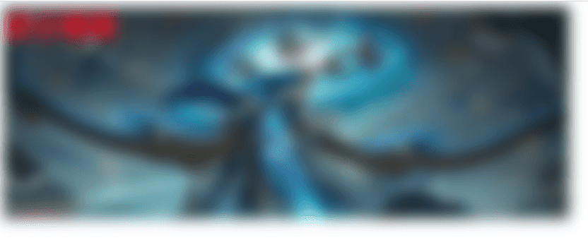
這裡要注意的一點是,添加模糊後,實際的大小會超出我們設定的寬高,因為周圍的毛邊效果,你可以在外麵包一層並設定overflow: hidden;
<!DOCTYPE html>
<html lang="en">
  <head>
    <style>
      .wrapBox2 {
        width: 800px;
        height: 300px;
        /* overflow: hidden; */
        position: relative;
      }
      .subBox {
        width: 100%;
        height: 100%;
        position: absolute;
        width: calc(100% - 100px);
        height: calc(100% - 100px);
        z-index: 2;
        filter: blur(10px);
      }
      .text {
        position: relative;
        /* z-index: 10; */
        font-size: 40px;
        font-weight: bold;
        color: #f00;
      }
    </style>
  </head>
  <body>
    <div class="wrapBox2">
      <img src="./win.jpeg" class="subBox" />
      <div class="text">全部模糊</div>
    </div>
  </body>
</html> 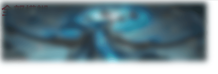
這種方式的話,文字和圖片由於是平級的,所以文字要么在圖片下方,要么在上方(根據z-index來控制),而不會對文字進行模糊。
<!DOCTYPE html>
<html lang="en">
  <head>
    <style>
      .wrapBox2 {
        width: 800px;
        height: 300px;
        overflow: hidden;
        position: relative;
        background-image: url("./win.jpeg");
        background-size: 100% 100%;
        background-repeat: no-repeat;
      }
      .subBox {
        position: absolute;
        width: calc(100% - 100px);
        height: calc(100% - 100px);
        z-index: 2;
        backdrop-filter: blur(10px);
        /* top: 100px; */
      }
      .text {
        position: relative;
        /* z-index: 10; */
        font-size: 40px;
        font-weight: bold;
        color: #f00;
      }
    </style>
  </head>
  <body>
    <div class="wrapBox2">
      <div class="subBox"></div>
      <div class="text">部分模糊</div>
    </div>
  </body>
</html> 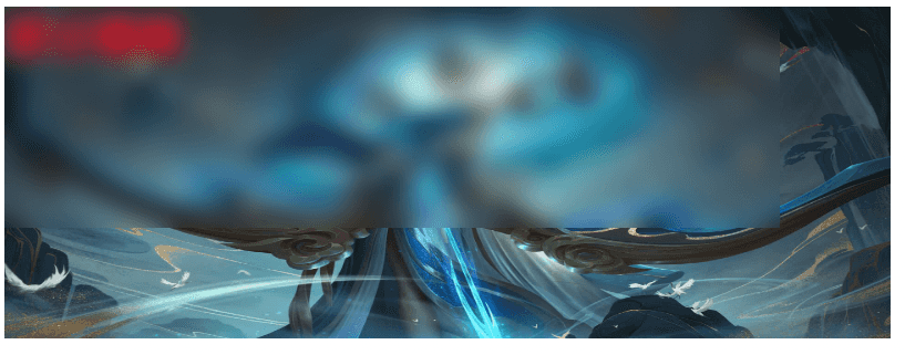
可以看到,backdrop-filter 屬性不必設定在一個圖片元素上面,而是任何元素上面就行,這種方式我覺得更靈活
當然,使用backdrop-filter 也可以滿足第一種場景。
到此這篇關於CSS使用filter和backdrop-filter實現高斯模糊效果(示例代碼)的文章就介紹到這了,更多相關css高斯模糊內容請搜索downcodes.com以前的文章或繼續瀏覽下面的相關文章,希望大家以後多多支持downcodes.com!