
A customizable and easy to use BottomBar navigation view with sleek animations, with support for ViewPager, ViewPager2, NavController, and badges.
By Joery Droppers


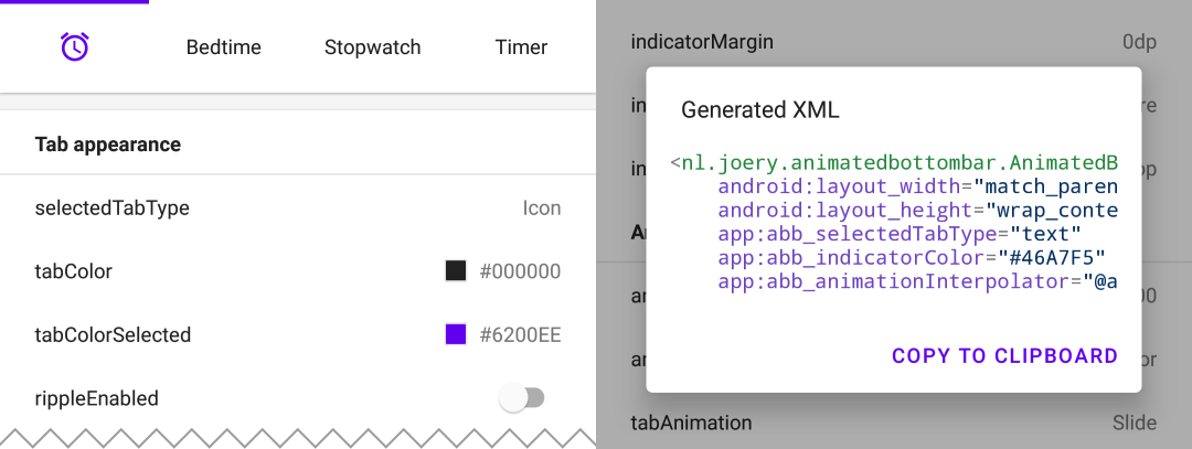
Download the playground app from Google Play, with this app you can try out all features and even generate XML with your selected configuration.
This library is available on Maven Central, install it by adding the following dependency to your build.gradle:
implementation 'nl.joery.animatedbottombar:library:1.1.0'Versions 1.0.x can only be used with jCenter, versions 1.1.x and up can be used with Maven Central.
Define AnimatedBottomBar in your XML layout with custom attributes.
<nl.joery.animatedbottombar.AnimatedBottomBar
    android:id="@+id/bottom_bar"
    android:background="#FFF"
    android:layout_width="match_parent"
    android:layout_height="wrap_content"
    app:abb_selectedTabType="text"
    app:abb_indicatorAppearance="round"
    app:abb_indicatorMargin="16dp"
    app:abb_indicatorHeight="4dp"
    app:abb_tabs="@menu/tabs"
    app:abb_selectedIndex="1" />
Create a file named tabs.xml in the res/menu/ resources folder:
<menu xmlns:android="http://schemas.android.com/apk/res/android">
    <item
        android:id="@+id/tab_home"
        android:icon="@drawable/home"
        android:title="@string/home" />
    <item
        android:id="@+id/tab_alarm"
        android:icon="@drawable/alarm"
        android:title="@string/alarm" />
    <item
        android:id="@+id/tab_bread"
        android:icon="@drawable/bread"
        android:title="@string/bread" />
    <item
        android:id="@+id/tab_cart"
        android:icon="@drawable/cart"
        android:title="@string/cart" />
</menu>
Get notified when the selected tab changes by setting callbacks:
bottom_bar.onTabSelected = {
    Log.d("bottom_bar", "Selected tab: " + it.title)
}
bottom_bar.onTabReselected = {
    Log.d("bottom_bar", "Reselected tab: " + it.title)
}
Or set a listener if you need more detailed information:
bottom_bar.setOnTabSelectListener(object : AnimatedBottomBar.OnTabSelectListener {
    override fun onTabSelected(
        lastIndex: Int,
        lastTab: AnimatedBottomBar.Tab?,
        newIndex: Int,
        newTab: AnimatedBottomBar.Tab
    ) {
        Log.d("bottom_bar", "Selected index: $newIndex, title: ${newTab.title}")
    }

    // An optional method that will be fired whenever an already selected tab has been selected again.
    override fun onTabReselected(index: Int, tab: AnimatedBottomBar.Tab) {
        Log.d("bottom_bar", "Reselected index: $index, title: ${tab.title}")
    }
})Short overview on how to manage tabs using code.
// Creating a tab by passing values
val bottomBarTab1 = AnimatedBottomBar.createTab(drawable, "Tab 1")

// Creating a tab by passing resources
val bottomBarTab2 = AnimatedBottomBar.createTab(R.drawable.ic_home, R.string.tab_2, R.id.tab_home)// Adding a tab at the end
AnimatedBottomBar.addTab(bottomBarTab1)
// Add a tab at a specific position
AnimatedBottomBar.addTabAt(1, bottomBarTab2)// Removing a tab by object reference
val tabToRemove = AnimatedBottomBar.tabs[1]
AnimatedBottomBar.removeTab(tabToRemove)
// Removing a tab at a specific position
AnimatedBottomBar.removeTabAt(tabPosition)
// Removing a tab by the given ID resource
AnimatedBottomBar.removeTabById(R.id.tab_home)// Selecting a tab by object reference
val tabToSelect = AnimatedBottomBar.tabs[1]
AnimatedBottomBar.selectTab(tabToSelect)
// Selecting a tab at a specific position
AnimatedBottomBar.selectTabAt(1)
// Selecting a tab by the given ID resource
AnimatedBottomBar.selectTabById(R.id.tab_home)// Disabling a tab by object reference
val tabToDisable = AnimatedBottomBar.tabs[1]
AnimatedBottomBar.setTabEnabled(tabToDisable, false) // Use true for re-enabling the tab
// Disabling a tab at a specific position
AnimatedBottomBar.setTabEnabledAt(1, false)
// Disabling a tab by the given ID resource
AnimatedBottomBar.setTabEnabledById(R.id.tab_home, false)This could be useful for example restricting access to a premium area. You can use a callback or a more detailed listener:
bottom_bar.onTabIntercepted = {
    if (newTab.id == R.id.tab_pro_feature && !hasProVersion) {
        // e.g. show a dialog
        false
    }
    true
}
Detailed listener:
bottom_bar.setOnTabInterceptListener(object : AnimatedBottomBar.OnTabInterceptListener {
    override fun onTabIntercepted(
        lastIndex: Int,
        lastTab: AnimatedBottomBar.Tab?,
        newIndex: Int,
        newTab: AnimatedBottomBar.Tab
    ): Boolean {
        if (newTab.id == R.id.tab_pro_feature && !hasProVersion) {
            // e.g. show a dialog
            return false
        }
        return true
    }
})Instructions on how to set badges for tabs, a AnimatedBottomBar.Badge object should be supplied to the BottomBar, note that it is also possible to add badges without text.
// Adding a badge by tab reference
val tabToAddBadgeAt = AnimatedBottomBar.tabs[1]
AnimatedBottomBar.setBadgeAtTab(tabToAddBadgeAt, AnimatedBottomBar.Badge("99"))

// Adding a badge at a specific position
AnimatedBottomBar.setBadgeAtTabIndex(1, AnimatedBottomBar.Badge("99"))

// Adding a badge at the given ID resource
AnimatedBottomBar.setBadgeAtTabId(R.id.tab_home, AnimatedBottomBar.Badge("99"))// Removing a badge by tab reference
val tabToRemoveBadgeFrom = AnimatedBottomBar.tabs[1]
AnimatedBottomBar.clearBadgeAtTab(tabToRemoveBadgeFrom)
// Removing a badge at a specific position
AnimatedBottomBar.clearBadgeAtTabIndex(1, AnimatedBottomBar.Badge("99"))
// removing a badge at the given ID resource
AnimatedBottomBar.clearBadgeAtTabId(R.id.tab_home, AnimatedBottomBar.Badge("99"))Additionally there is also the possibility to individually style badges.
AnimatedBottomBar.Badge(
    text = "99",
    backgroundColor = Color.RED,
    textColor = Color.GREEN,
    textSize =  12.spPx // in pixels
)It is easy to use the BottomBar with a ViewPager or ViewPager2, you can simply use the setupWithViewPager() method. Please note that the number of tabs and ViewPager pages need to be identical in order for it to function properly.
Usage
// For ViewPager use:
bottom_bar.setupWithViewPager(yourViewPager)

// For ViewPager2 use:
bottom_bar.setupWithViewPager2(yourViewPager2)An overview of all configuration options. All options can also be accessed and set programmatically, by their equivalent name.
| Attribute | Description | Default |
|---|---|---|
| abb_tabs | Tabs can be defined in a menu file (Menu resource), in the res/menu/ resource folder. The icon and title attribute are required. By default all tabs are enabled, set android:enabled to false to disable a tab. <menu xmlns:android="http://schemas.android.com/apk/res/android">
<item
android:id="@+id/tab_example"
android:icon="@drawable/ic_example"
android:title="@string/tab_example"
android:enabled="true|false" />
...etc
</menu> |
|
| abb_selectedIndex | Define the default selected tab index. | |
| abb_selectedTabId | Define the default selected tab by its ID, for example @id/tab_id |
| Attribute | Description | Default |
|---|---|---|
| abb_selectedTabType |
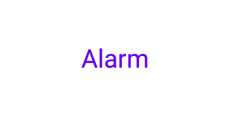
Determines whether the icon or text should be shown when a tab has been selected. icon  text  |
icon |
| abb_tabColor | The color of the icon or text when the tab is not selected. | @color/textColorPrimary |
| abb_tabColorSelected | The color of the icon or text when the tab is selected. | @color/colorPrimary |
| abb_tabColorDisabled | The color of the icon or text whenever the tab has been disabled. | @color/textColorSecondary |
| abb_textAppearance | Customize the look and feel of text in tabs, down below is an example of a custom text appearance. Define a new style in res/values/styles.xml: <style name="CustomText">
<item name="android:textAllCaps">true</item>
<item name="android:fontFamily">serif</item>
<item name="android:textSize">16sp</item>
<item name="android:textStyle">italic|bold</item>
</style>
|
|
| abb_textStyle | Style (normal, bold, italic, bold|italic) for the text. Use bottom_bar.typeface to programmatically set text style. |
normal |
| abb_textSize | Size of the text. Recommended dimension type for text is "sp" (scaled-pixels), for example: 14sp. | 14sp |
| abb_iconSize | Increase or decrease the size of the icon. | 24dp |
| abb_rippleEnabled | Enables the 'ripple' effect when selecting a tab.
|
false |
| abb_rippleColor | Change the color of the aforementioned ripple effect. | Default theme color |
| Attribute | Description | Default |
|---|---|---|
| abb_badgeBackgroundColor | The background color of the badges. | #ff0c10 (red) |
| abb_badgeTextColor | The text color of the text inside the badges. | #FFFFFF |
| abb_badgeTextSize | The text size of the text inside the badges. Recommended dimension type for text is "sp" (scaled-pixels), for example: 14sp. | 10sp |
| abb_badgeAnimation |
The enter and exit animation type for badges. none scale fade |
scale |
| abb_badgeAnimationDuration | The duration of the entry and exit animation of a badge. | 150 |
| Attribute | Description | Default |
|---|---|---|
| abb_animationDuration | The duration of all animations, including the indicator animation. | 400 |
| abb_tabAnimation |
The enter and exit animation style of the tabs which are not selected. none  slide  fade  |
fade |
| abb_tabAnimationSelected |
The enter and exit animation style of the selected tab. none  slide  fade  |
slide |
| abb_animationInterpolator |
The interpolator used for all animations. See "Android Interpolators: A Visual Guide" for more information on available interpolators. Example value: @android:anim/overshoot_interpolator 
|
FastOutSlowInInterpolator |
| Attribute | Description | Default |
|---|---|---|
| abb_indicatorColor | The color of the indicator. | @android/colorPrimary |
| abb_indicatorHeight | The height of the indicator. | 3dp |
| abb_indicatorMargin | The horizontal margin of the indicator. This determines the width of the indicator. | 0dp |
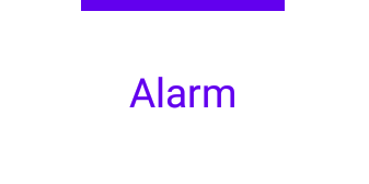
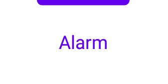
| abb_indicatorAppearance |
Configure the shape of the indicator either to be square or round. invisible  square  round  |
square |
| abb_indicatorLocation |
Configure the location of the selected tab indicator, top, bottom or invisible. top  bottom  |
top |
| abb_indicatorAnimation |
The animation type of the indicator when changing the selected tab. none  slide  fade 
|
slide |
MIT License

Copyright (c) 2021 Joery Droppers (https://github.com/Droppers)

Permission is hereby granted, free of charge, to any person obtaining a copy
of this software and associated documentation files (the "Software"), to deal
in the Software without restriction, including without limitation the rights
to use, copy, modify, merge, publish, distribute, sublicense, and/or sell
copies of the Software, and to permit persons to whom the Software is
furnished to do so, subject to the following conditions:

The above copyright notice and this permission notice shall be included in all
copies or substantial portions of the Software.

THE SOFTWARE IS PROVIDED "AS IS", WITHOUT WARRANTY OF ANY KIND, EXPRESS OR
IMPLIED, INCLUDING BUT NOT LIMITED TO THE WARRANTIES OF MERCHANTABILITY,
FITNESS FOR A PARTICULAR PURPOSE AND NONINFRINGEMENT. IN NO EVENT SHALL THE
AUTHORS OR COPYRIGHT HOLDERS BE LIABLE FOR ANY CLAIM, DAMAGES OR OTHER
LIABILITY, WHETHER IN AN ACTION OF CONTRACT, TORT OR OTHERWISE, ARISING FROM,
OUT OF OR IN CONNECTION WITH THE SOFTWARE OR THE USE OR OTHER DEALINGS IN THE
SOFTWARE.