vue search panel
1.0.0
English | 简体中文
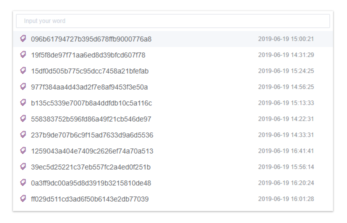
vue-search-panel is a search component with suggestions
Link: https://theoxiong.github.io/vue-search-panel/
$ npm install vue-search-panel --save
import VueSearchPanel from 'vue-search-panel'
Vue.use(VueSearchPanel)
<script>
export default {
  components: { VueSearchPanel }
}
</script>
show method to open panel.Sample code:
<template>
  <div class="demo-comp">
    <button @click="onOpen">Open Panel</button>
    <div>Selected: {{ selected }}</div>
    <vue-search-panel
      v-model="value"
      :fetch-suggestions="getSuggestions"
      @select="onSelect"
      ref="searchPanel"
    >
    </vue-search-panel>
  </div>
</template>

<script>
import VueSearchPanel from 'vue-search-panel'
const testData = [
  { key: 'test-data-1', value: 'test data 1' },
  { key: 'test-data-2', value: 'test data 2' },
  { key: 'test-data-3', value: 'test data 3' }
]

export default {
  name: 'DemoComp',
  data () {
    return {
      value: '',
      selected: ''
    }
  },
  methods: {
    onOpen () {
      this.$refs.searchPanel.show()
    },
    onSelect (item) {
      this.selected = item.value
    },
    getSuggestions (query, cb) {
      cb(query ? testData.filter(item => { return item.value.includes(query) }) : testData)
    }
  },
  components: { VueSearchPanel }
}
</script>
Customize suggestion's element by scoped slot, access the suggestion object via the item key.
Sample code:
<template>
  <div class="demo-comp">
    <button @click="onOpen">Open Panel</button>
    <div>Selected: {{ selected }}</div>
    <vue-search-panel
      v-model="value"
      :fetch-suggestions="getSuggestions"
      @select="onSelect"
      ref="searchPanel"
    >
      <div class="demo-search-item" slot-scope="{ item }">
        <span class="search-item-value">{{ item.value }}</span>
        <span class="search-item-time">{{ item.time }}</span>
      </div>
    </vue-search-panel>
  </div>
</template>

<script>
import VueSearchPanel from 'vue-search-panel'

export default {
  name: 'DemoComp',
  data () {
    return {
      value: '',
      selected: '',
      testData: []
    }
  },
  mounted () {
    for (let i = 0; i < 20; i++) {
      this.testData.push({
        key: `data-${i}`,
        value: `Test data ${i + 1}`,
        time: new Date(Math.random() * 1000000000000).toLocaleDateString()
      })
    }
  },
  methods: {
    onOpen () {
      this.$refs.searchPanel.show()
    },
    onSelect (item) {
      this.selected = item.value
    },
    getSuggestions (query, cb) {
      cb(query ? this.testData.filter(item => { return item.value.includes(query) }) : this.testData)
    }
  },
  components: { VueSearchPanel }
}
</script>

<style scoped>
.demo-search-item{
  display: flex;
  align-items: center;
  justify-content: space-between;
  height: 32px;
  padding: 0 20px;
}
.search-item-value{
  font-size: 14px;
  color: #555;
}
.search-item-time{
  font-size: 12px;
  color: #aaa;
  width: 80px;
}

</style>
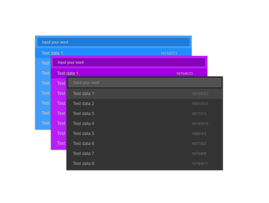
Customize UI by props.
The color/borderColor/backgroundColor/width/height can be configured.
For more details, see the API.
Sample code:
<template>
  <div class="demo-comp">
    <button @click="onOpen">Open Panel</button>
    <div>Selected: {{ selected }}</div>
    <vue-search-panel
      v-model="value"
      width="640px"
      height="400px"
      scrollBarColor="#aaaaaa"
      inputColor="#cccccc"
      inputBackground="#555555"
      inputBorderColor="#666666"
      inputBorderColorHovering="#999999"
      inputBorderColorFocused="#bbbbbb"
      placeholderEffect="dark"
      panelBackground="#333333"
      panelBoxShadow="rgba(0, 0, 0, 0.6)"
      highlightedColor="#444444"
      hoveredColor="#666666"
      :fetch-suggestions="getSuggestions"
      @select="onSelect"
      ref="searchPanel"
    >
      <div class="demo-search-item" slot-scope="{ item }">
        <span class="search-item-value">{{ item.value }}</span>
        <span class="search-item-time">{{ item.time }}</span>
      </div>
    </vue-search-panel>
  </div>
</template>

<script>
import VueSearchPanel from 'vue-search-panel'

export default {
  name: 'DemoComp',
  data () {
    return {
      value: '',
      selected: '',
      testData: []
    }
  },
  mounted () {
    for (let i = 0; i < 20; i++) {
      this.testData.push({
        key: `data-${i}`,
        value: `Test data ${i + 1}`,
        time: new Date(Math.random() * 1000000000000).toLocaleDateString()
      })
    }
  },
  methods: {
    onOpen () {
      this.$refs.searchPanel.show()
    },
    onSelect (item) {
      this.selected = item.value
    },
    getSuggestions (query, cb) {
      cb(query ? this.testData.filter(item => { return item.value.includes(query) }) : this.testData)
    }
  },
  components: { VueSearchPanel }
}
</script>

<style scoped>
.demo-search-item{
  display: flex;
  align-items: center;
  justify-content: space-between;
  height: 32px;
  padding: 0 20px;
}
.search-item-value{
  font-size: 14px;
  color: #999;
}
.search-item-time{
  font-size: 12px;
  color: #777;
  width: 80px;
}

</style>
fixed is used for position of panel, the panel is positioned relative to the viewport when the value is true, and the panel is positioned according to the normal flow of the document when the value is false.placement is used for specifying the placement of panel relative to the viewport, the optional vlaue is top/bottom/left/right
The placement prop is ignored when the fiexd value is false
Sample code:
<template>
  <div class="demo-comp">
    <button @click="onOpen('top')" :disabled="disabled" :class="{'is-disabled': disabled}">Open at top</button>
    <button @click="onOpen('bottom')" :disabled="disabled" :class="{'is-disabled': disabled}">Open at bottom</button>
    <button @click="onOpen('left')" :disabled="disabled" :class="{'is-disabled': disabled}">Open at left</button>
    <button @click="onOpen('right')" :disabled="disabled" :class="{'is-disabled': disabled}">Open at right</button>
    <button @click="onOpen('inner')" :disabled="disabled" :class="{'is-disabled': disabled}">Open at inner</button>
    <div>Selected: {{ selected }}</div>
    <vue-search-panel
      v-model="value"
      :placement="placement"
      :fixed="fixed"
      :fetch-suggestions="getSuggestions"
      @open="onPanelOpen"
      @closed="onPanelClosed"
      @select="onSelect"
      ref="searchPanel"
    >
    </vue-search-panel>
  </div>
</template>

<script>
import VueSearchPanel from 'vue-search-panel'
const testData = [
  { key: 'test-data-1', value: 'test data 1' },
  { key: 'test-data-2', value: 'test data 2' },
  { key: 'test-data-3', value: 'test data 3' }
]

export default {
  name: 'DemoComp',
  data () {
    return {
      value: '',
      selected: '',
      placement: 'top',
      fixed: true,
      disabled: false
    }
  },
  methods: {
    onOpen (position) {
      if (position === 'inner') {
        this.fixed = false
      } else {
        this.fixed = true
        this.placement = position
      }
      this.$refs.searchPanel.show()
    },
    onPanelOpen () {
      this.disabled = true
    },
    onPanelClosed () {
      this.disabled = false
    },
    onSelect (item) {
      this.selected = item.value
    },
    getSuggestions (query, cb) {
      cb(query ? testData.filter(item => { return item.value.includes(query) }) : testData)
    }
  },
  components: { VueSearchPanel }
}
</script>

<style scoped>
.demo-comp{
  margin: 20px;
  width: 600px;
}
.is-disabled,
.is-disabled:active,
.is-disabled:focus,
.is-disabled:hover{
  cursor:not-allowed;
  background-color:#e4e4ee;
}
</style>
It could be extended to multifunctional panel, such as search/recently/command, like VsCode
Live dome:https://theoxiong.github.io/vue-search-panel/
For dev:
npm install
npm run dev
| parameter | description | type | optional value | default value |
|---|---|---|---|---|
| value / v-model | two-way binding value | String | — | — |
| placeholder | the placeholder of input | String | — | — |
| width | the width of panel | String | — | 50% |
| height | the height of panel | String | — | 300px |
| top | the marginTop of panel | String | — | 0px |
| bottom | the marginBottom of panel | String | — | 0px |
| left | the marginLeft of panel | String | — | 0px |
| right | the marginRight of panel | String | — | 0px |
| fixed | whether positioned relative to the viewport | Boolean | — | true |
| placement | specifying the placement of panel relative to the viewport (ignored when the fiexd value is false) | String | top/bottom/left/right | top |
| fetchSuggestions | a method to fetch input suggestions. when suggestions are ready, invoke callback(data:[]) to return them | Function(queryString, cb) | — | — |
| closeOnPressEscape | whether close panel on press ESC | Boolean | — | true |
| closeOnSelect | whether close panel on select | Boolean | — | true |
| clearOnClose | whether clear input value when the panel closed | Boolean | — | true |
| selectWhenUnmatched | whether to emit a select event on enter when there is no match | Boolean | — | false |
| triggerOnFocus | whether show suggestions when input focus | Boolean | — | true |
| highlightFirstItem | whether to highlight first item | Boolean | — | true |
| valueColor | the color of suggestion item (when there is no scoped slot) | String | — | #606266 |
| scrollBarColor | the color of scroll bar | String | — | #DFDFDF |
| scrollBarOpacity | the opacity of scroll bar | Number | — | 0.8 |
| panelBackground | the background color of panel | String | — | #FFFFFF |
| panelBorderRadius | the border radius of panel | String | — | 0px |
| panelBoxShadow | the boxShadow color of panel | String | — | rgba(0, 0, 0, 0.3) |
| highlightedColor | the color of suggestion item when highlighted | String | — | #F5F7FA |
| hoveredColor | the color of suggestion item when hovered | String | — | #C5C7CA |
| placeholderEffect | the color of placeholder text | String | light/dark | light |
| inputColor | the color of input text | String | — | #606266 |
| inputBackground | the background color of input field | String | — | #FFFFFF |
| inputBorderColor | the border color of input field | String | — | #DCDFE6 |
| inputBorderColorHovering | the border color of input field when hovered | String | — | #B0B3BB |
| inputBorderColorFocused | the border color of input field when focused | String | — | #575F96 |
| method name | description | parameters |
|---|---|---|
| show | open the panel | — |
| close | close the panel | — |
| focusInput | focus the input element | — |
| getInputElement | get the input element | — |
| event name | description | parameters |
|---|---|---|
| open | triggers when the panel opens | — |
| opened | triggers when the panel opening animation ends | — |
| close | triggers when the panel closes | — |
| closed | triggers when the panel closing animation ends | — |
| focus | triggers when the input element focused | — |
| blur | triggers when the input element blurred | — |
| select | triggers when a suggestion is clicked | suggestion being clicked |
Custom content for input suggestions, the scope parameter is { item }
| name | description |
|---|---|
| upon-item | content on the top of suggestions |


