ngx mat select search
v7.0.0
https://github.com/bithost-gmbh/ngx-mat-select-search
Componente angular que proporciona un campo de entrada para buscar/filtrar las opciones MatSelect de la biblioteca Angular Material.
Véalo en acción en
https://stackblitz.com/github/bithost-gmbh/ngx-mat-select-search-example
ver código de ejemplo, compilaciones en el navegador, última versión, última versión del material
https://bithost-gmbh.github.io/ngx-mat-select-search/
prediseñado, última versión, versión de material anterior, funciona en dispositivos móviles
Nota importante : este proyecto pretende ser una implementación temporal de angular/components#5697. El objetivo es tener una implementación en el repositorio oficial de Angular Material, se creará un nuevo PR.
Las contribuciones son bienvenidas, abra un problema y preferiblemente presente una solicitud de extracción.
Nuestro objetivo es brindar el mejor servicio posible mejorando constantemente NgxMatSelectSearch y respondiendo rápidamente a los informes de errores. Hacemos esto totalmente gratis. Si cree que esta biblioteca le resultó útil y le ahorró a usted y a su empresa un tiempo precioso, considere hacer una donación para apoyar su mantenimiento y desarrollo posterior.
¡Muchas gracias a nuestros patrocinadores financieros!
Philip Viktor Schulz-Klingauf |
¡Muchas gracias a todos los contribuyentes de nuestra comunidad!
Esteban Gehring | Markus Machler | Tristán | sirh3e | Tony H. | Michał Stawicki |
Aleix Ferré | Nulo | Caminante de fuego | Cristian Raducanu | Damián Miranda | Dane Vanderbilt |
David Sansome | Edgar Scheiermann | Erendis | Gustavo Miranda | Henno Lauinger | Nulo |
Iblis Lin | Jean-François Cere | joe decock | Johny Jomal | Jonathan Kolberg | Kristof Gilis |
Melroy Van Den Berg | Muhammad Ahsan Ayaz | Ovidio Stukas | Ray Suelzer | Robert Pattis | Roland Broekema |
Sebastián Wierzbicki | Nulo | Stas Amasev | Thierry Nischelwitzer | Vlad Ioffe | Nulo |
Nulo | Josué | Nulo | Nulo |
Instale ngx-mat-select-search en su proyecto:
npm install ngx-mat-select-search
Importe NgxMatSelectSearchModule , por ejemplo, en su app.module.ts :
 import { MatSelectModule } from '@angular/material' ;
import { NgxMatSelectSearchModule } from 'ngx-mat-select-search' ;

@ NgModule ( {
  imports : [
    ...
    MatSelectModule ,
    NgxMatSelectSearchModule
  ] ,
} )
export class AppModule { }
Utilice el componente ngx-mat-select-search dentro de un elemento mat-select colocándolo dentro de un elemento <mat-option> :
< mat-form-field >
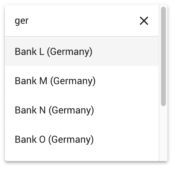
< mat-select [formControl] =" bankCtrl " placeholder =" Bank " #singleSelect >
< mat-option >
< ngx-mat-select-search [formControl] =" bankFilterCtrl " > </ ngx-mat-select-search >
</ mat-option >
< mat-option *ngFor =" let bank of filteredBanks | async " [value] =" bank " >
{{bank.name}}
</ mat-option >
</ mat-select >
</ mat-form-field > Vea los ejemplos en https://github.com/bithost-gmbh/ngx-mat-select-search/tree/master/src/app/examples sobre cómo conectar ngx-mat-select-search y filtrar las opciones disponibles. O eche un vistazo a https://github.com/bithost-gmbh/ngx-mat-select-search-example para verlo en una aplicación independiente.
Alternativamente, puede usarlo con formularios basados en plantillas de la siguiente manera:
< ngx-mat-select-search ngModel (ngModelChange) =" filterMyOptions($event) " >Para cambiar las etiquetas, utilice las entradas especificadas en la sección API de la siguiente manera:
 < ngx-mat-select-search [formControl] =" bankFilterCtrl "
                       placeholderLabel =" Find bank... "
                       noEntriesFoundLabel =" 'no matching bank found' " > </ ngx-mat-select-search >
Para utilizar la API i18n para la traducción de las etiquetas, agregue los atributos i18n-... correspondientes:
 < ngx-mat-select-search [formControl] =" bankFilterCtrl "
                       placeholderLabel =" Find bank... "
                       i18n-placeholderLabel
                       noEntriesFoundLabel =" 'no matching bank found' "
i18n-noEntriesFoundLabel > </ ngx-mat-select-search >@angular/core : ^15.0.0 || ^16.0.0 || ^17.0.0 || ^18.0.0 || ^19.0.0@angular/material : ^15.0.0 || ^16.0.0 || ^17.0.0 || ^18.0.0 || ^19.0.0 con MatSelectModule ( @angular/material/select ) 6.0.0@angular/core : ^15.0.0@angular/material : ^15.0.0 con MatLegacySelectModule ( @angular/material/legacy-select ) 5.0.0@angular/core : ^12.0.0 || ^13.0.0 || ^14.0.0@angular/material : ^12.0.0 || ^13.0.0 || ^14.0.0 3.3.3@angular/core : ^8.0.0 || ^9.0.0 || ^10.0.0 || ^11.0.0 || ^12.0.0 || ^13.0.0@angular/material : ^8.0.0 || ^9.0.0 || ^10.0.0 || ^11.0.0 || ^12.0.0 || ^13.0.0 1.8.0@angular/core : ^5.0.0 || ^6.0.0 || ^7.0.0 || ^8.0.0@angular/material : ^5.0.0 || ^6.0.0 || ^7.0.0 || ^8.0.0 MatSelectSearchComponent implementa la interfaz ControlValueAccessor. Además, proporciona los siguientes insumos:
  /** Label of the search placeholder */
  @ Input ( ) placeholderLabel = 'Suche' ;

  /** Type of the search input field */
  @ Input ( ) type = 'text' ;

  /** Font-based icon used for displaying Close-Icon */
  @ Input ( ) closeIcon = 'close' ;

  /** SVG-based icon used for displaying Close-Icon. If set, closeIcon is overridden */
  @ Input ( ) closeSvgIcon ?: string ;

  /** Label to be shown when no entries are found. Set to null if no message should be shown. */
  @ Input ( ) noEntriesFoundLabel = 'Keine Optionen gefunden' ;

  /**
   * Whether the search field should be cleared after the dropdown menu is closed.
   * Useful for server-side filtering. See [#3](https://github.com/bithost-gmbh/ngx-mat-select-search/issues/3)
   */
  @ Input ( ) clearSearchInput = true ;

  /** Whether to show the search-in-progress indicator */
  @ Input ( ) searching = false ;

  /** Disables initial focusing of the input field */
  @ Input ( ) disableInitialFocus = false ;

  /** Enable clear input on escape pressed */
  @ Input ( ) enableClearOnEscapePressed = false ;

  /**
   * Prevents home / end key being propagated to mat-select,
   * allowing to move the cursor within the search input instead of navigating the options
   */
  @ Input ( ) preventHomeEndKeyPropagation = false ;

  /** Disables scrolling to active options when option list changes. Useful for server-side search */
  @ Input ( ) disableScrollToActiveOnOptionsChanged = false ;

  /** Adds 508 screen reader support for search box */
  @ Input ( ) ariaLabel = 'dropdown search' ;

  /** Whether to show Select All Checkbox (for mat-select[multi=true]) */
  @ Input ( ) showToggleAllCheckbox = false ;

  /** Select all checkbox checked state */
  @ Input ( ) toggleAllCheckboxChecked = false ;

  /** select all checkbox indeterminate state */
  @ Input ( ) toggleAllCheckboxIndeterminate = false ;

  /** Display a message in a tooltip on the toggle-all checkbox */
  @ Input ( ) toggleAllCheckboxTooltipMessage = '' ;

  /** Define the position of the tooltip on the toggle-all checkbox. */
  @ Input ( ) toggleAllCheckboxTooltipPosition: 'left' | 'right' | 'above' | 'below' | 'before' | 'after' = 'below' ;

  /** Show/Hide the search clear button of the search input */
  @ Input ( ) hideClearSearchButton = false ;

  /**
   * Always restore selected options on selectionChange for mode multi (e.g. for lazy loading/infinity scrolling).
   * Defaults to false, so selected options are only restored while filtering is active.
   */
  @ Input ( ) alwaysRestoreSelectedOptionsMulti = false ;

  /**
   * Recreate array of selected values for multi-selects.
   *
   * This is useful if the selected values are stored in an immutable data structure.
   */
  @ Input ( ) recreateValuesArray = false ;

  /** Output emitter to send to parent component with the toggle all boolean */
  @ Output ( ) toggleAll = new EventEmitter < boolean > ( ) ;
Para personalizar el ícono de búsqueda, agregue ngxMatSelectSearchClear a su elemento de borrado personalizado (un mat-icon o cualquier otro elemento) y colóquelo dentro del componente ngx-mat-select-search :
 < ngx-mat-select-search >
   < mat-icon ngxMatSelectSearchClear > delete </ mat-icon >
</ ngx-mat-select-search >
Si solo se debe cambiar el ícono, se pueden usar las entradas closeIcon y closeSvgIcon .
Para personalizar el elemento no se encontraron entradas, agregue ngxMatSelectNoEntriesFound a su elemento personalizado (un mat-icon, span, button o cualquier otro elemento) y colóquelo dentro del componente ngx-mat-select-search :
 < ngx-mat-select-search >
  < span ngxMatSelectNoEntriesFound >
    No entries found
    < button mat-button color =" primary " >
      Add < mat-icon > add </ mat-icon >
    </ button >
</ span >
</ ngx-mat-select-search > El contenido personalizado con la clase CSS mat-select-search-custom-header-content se puede transcluir de la siguiente manera:
 < ngx-mat-select-search >
   < div class =" mat-select-search-custom-header-content " > something special </ div >
</ ngx-mat-select-search > Al proporcionar MAT_SELECTSEARCH_DEFAULT_OPTIONS InjectionToken, los valores predeterminados de varias propiedades @Input() se pueden configurar globalmente. Consulte la documentación de las propiedades @Input() correspondientes de MatSelectSearchComponent .
Ejemplo:
 import { MAT_SELECTSEARCH_DEFAULT_OPTIONS , MatSelectSearchOptions } from 'ngx-mat-select-search' ;

@ NgModule ( {
  ...
  providers : [
    {
      provide : MAT_SELECTSEARCH_DEFAULT_OPTIONS ,
      useValue : < MatSelectSearchOptions > {
        closeIcon : 'delete' ,
        noEntriesFoundLabel : 'No options found' ,
      }
    }
  ]
} )
class AppModule { } Este proyecto se generó con Angular CLI versión 1.7.1.
Ejecute ng serve para un servidor de desarrollo. Navegue hasta http://localhost:4200/ . La aplicación se recargará automáticamente si cambia alguno de los archivos fuente.
Ejecute ng build para construir el proyecto. Los artefactos de compilación se almacenarán en el directorio dist/ . Utilice el indicador -prod para una compilación de producción.
Ejecute npm run build-lib para construir la biblioteca y generar un paquete NPM. Los artefactos de compilación se almacenarán en la carpeta dist-lib/ .
Para publicarlo, ejecute cd dist-lib/ && npm publish .
Ejecute npm run test para ejecutar las pruebas unitarias a través de Karma.


