ngx mat select search
v7.0.0
https://github.com/bithost-gmbh/ngx-mat-select-search
Composant angulaire fournissant un champ de saisie pour rechercher/filtrer les options MatSelect de la bibliothèque de matériaux angulaires.
Voyez-le en action sur
https://stackblitz.com/github/bithost-gmbh/ngx-mat-select-search-example
voir exemple de code, builds dans le navigateur, dernière version, dernière version matérielle
https://bithost-gmbh.github.io/ngx-mat-select-search/
pré-construit, dernière version, ancienne version matérielle, fonctionne sur mobile
Remarque importante : ce projet est conçu comme une implémentation temporaire de angulaire/components#5697. Le but est d'avoir une implémentation dans le référentiel officiel Angular Material, un nouveau PR sera créé.
Les contributions sont les bienvenues, veuillez ouvrir un numéro et déposer de préférence une pull request.
Notre objectif est de fournir le meilleur service possible en améliorant constamment NgxMatSelectSearch et en répondant rapidement aux rapports de bogues. Nous le faisons entièrement gratuitement. Si vous pensez que cette bibliothèque vous a été utile et vous a fait gagner, à vous et à votre entreprise, un temps précieux, pensez à faire un don pour soutenir sa maintenance et son développement ultérieur.
Merci beaucoup à nos soutiens financiers !
Philippe Viktor Schulz-Klingauf |
Merci beaucoup à tous les contributeurs de notre communauté !
Esteban Gehring | Markus Machler | Tristan | Sirh3e | Tony H. | Michael Stawicki |
Aleix Ferré | Nul | Blaze Walker | Cristian Raducanu | Damien Miranda | Danois Vanderbilt |
David Sansome | Edgar Scheiermann | Érendis | Gustavo Miranda | Henno Lauinger | Nul |
Iblis Lin | Jean-François Céré | Joe DeCock | Jomal Johny | Jonathan Kolberg | Kristof Gilis |
Melroy Van Den Berg | Muhammad Ahsan Ayaz | Ovidijus Stukas | Ray Suelzer | Robert Pattis | Roland Broekema |
Sébastien Wierzbicki | Nul | Stas Amasev | Thierry Nischelwitzer | Vlad Ioffé | Nul |
Nul | Josué | Nul | Nul |
Installez ngx-mat-select-search dans votre projet :
npm install ngx-mat-select-search
Importez le NgxMatSelectSearchModule par exemple dans votre app.module.ts :
 import { MatSelectModule } from '@angular/material' ;
import { NgxMatSelectSearchModule } from 'ngx-mat-select-search' ;

@ NgModule ( {
  imports : [
    ...
    MatSelectModule ,
    NgxMatSelectSearchModule
  ] ,
} )
export class AppModule { }
Utilisez le composant ngx-mat-select-search à l'intérieur d'un élément mat-select en le plaçant dans un élément <mat-option> :
< mat-form-field >
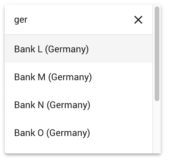
< mat-select [formControl] =" bankCtrl " placeholder =" Bank " #singleSelect >
< mat-option >
< ngx-mat-select-search [formControl] =" bankFilterCtrl " > </ ngx-mat-select-search >
</ mat-option >
< mat-option *ngFor =" let bank of filteredBanks | async " [value] =" bank " >
{{bank.name}}
</ mat-option >
</ mat-select >
</ mat-form-field > Voir les exemples dans https://github.com/bithost-gmbh/ngx-mat-select-search/tree/master/src/app/examples comment câbler le ngx-mat-select-search et filtrer les options disponibles. Ou jetez un œil à https://github.com/bithost-gmbh/ngx-mat-select-search-example pour le voir dans une application autonome.
Vous pouvez également l'utiliser avec des formulaires basés sur des modèles comme suit :
< ngx-mat-select-search ngModel (ngModelChange) =" filterMyOptions($event) " >Afin de modifier les étiquettes, utilisez les entrées spécifiées dans la section API comme suit :
 < ngx-mat-select-search [formControl] =" bankFilterCtrl "
                       placeholderLabel =" Find bank... "
                       noEntriesFoundLabel =" 'no matching bank found' " > </ ngx-mat-select-search >
Pour utiliser l'API i18n pour la traduction des étiquettes, ajoutez les attributs i18n-... correspondants :
 < ngx-mat-select-search [formControl] =" bankFilterCtrl "
                       placeholderLabel =" Find bank... "
                       i18n-placeholderLabel
                       noEntriesFoundLabel =" 'no matching bank found' "
i18n-noEntriesFoundLabel > </ ngx-mat-select-search >@angular/core : ^15.0.0 || ^16.0.0 || ^17.0.0 || ^18.0.0 || ^19.0.0@angular/material : ^15.0.0 || ^16.0.0 || ^17.0.0 || ^18.0.0 || ^19.0.0 avec MatSelectModule ( @angular/material/select ) 6.0.0@angular/core : ^15.0.0@angular/material : ^15.0.0 avec MatLegacySelectModule ( @angular/material/legacy-select ) 5.0.0@angular/core : ^12.0.0 || ^13.0.0 || ^14.0.0@angular/material : ^12.0.0 || ^13.0.0 || ^14.0.0 3.3.3@angular/core : ^8.0.0 || ^9.0.0 || ^10.0.0 || ^11.0.0 || ^12.0.0 || ^13.0.0@angular/material : ^8.0.0 || ^9.0.0 || ^10.0.0 || ^11.0.0 || ^12.0.0 || ^13.0.0 1.8.0@angular/core : ^5.0.0 || ^6.0.0 || ^7.0.0 || ^8.0.0@angular/material : ^5.0.0 || ^6.0.0 || ^7.0.0 || ^8.0.0 Le MatSelectSearchComponent implémente l'interface ControlValueAccessor. De plus, il fournit les entrées suivantes :
  /** Label of the search placeholder */
  @ Input ( ) placeholderLabel = 'Suche' ;

  /** Type of the search input field */
  @ Input ( ) type = 'text' ;

  /** Font-based icon used for displaying Close-Icon */
  @ Input ( ) closeIcon = 'close' ;

  /** SVG-based icon used for displaying Close-Icon. If set, closeIcon is overridden */
  @ Input ( ) closeSvgIcon ?: string ;

  /** Label to be shown when no entries are found. Set to null if no message should be shown. */
  @ Input ( ) noEntriesFoundLabel = 'Keine Optionen gefunden' ;

  /**
   * Whether the search field should be cleared after the dropdown menu is closed.
   * Useful for server-side filtering. See [#3](https://github.com/bithost-gmbh/ngx-mat-select-search/issues/3)
   */
  @ Input ( ) clearSearchInput = true ;

  /** Whether to show the search-in-progress indicator */
  @ Input ( ) searching = false ;

  /** Disables initial focusing of the input field */
  @ Input ( ) disableInitialFocus = false ;

  /** Enable clear input on escape pressed */
  @ Input ( ) enableClearOnEscapePressed = false ;

  /**
   * Prevents home / end key being propagated to mat-select,
   * allowing to move the cursor within the search input instead of navigating the options
   */
  @ Input ( ) preventHomeEndKeyPropagation = false ;

  /** Disables scrolling to active options when option list changes. Useful for server-side search */
  @ Input ( ) disableScrollToActiveOnOptionsChanged = false ;

  /** Adds 508 screen reader support for search box */
  @ Input ( ) ariaLabel = 'dropdown search' ;

  /** Whether to show Select All Checkbox (for mat-select[multi=true]) */
  @ Input ( ) showToggleAllCheckbox = false ;

  /** Select all checkbox checked state */
  @ Input ( ) toggleAllCheckboxChecked = false ;

  /** select all checkbox indeterminate state */
  @ Input ( ) toggleAllCheckboxIndeterminate = false ;

  /** Display a message in a tooltip on the toggle-all checkbox */
  @ Input ( ) toggleAllCheckboxTooltipMessage = '' ;

  /** Define the position of the tooltip on the toggle-all checkbox. */
  @ Input ( ) toggleAllCheckboxTooltipPosition: 'left' | 'right' | 'above' | 'below' | 'before' | 'after' = 'below' ;

  /** Show/Hide the search clear button of the search input */
  @ Input ( ) hideClearSearchButton = false ;

  /**
   * Always restore selected options on selectionChange for mode multi (e.g. for lazy loading/infinity scrolling).
   * Defaults to false, so selected options are only restored while filtering is active.
   */
  @ Input ( ) alwaysRestoreSelectedOptionsMulti = false ;

  /**
   * Recreate array of selected values for multi-selects.
   *
   * This is useful if the selected values are stored in an immutable data structure.
   */
  @ Input ( ) recreateValuesArray = false ;

  /** Output emitter to send to parent component with the toggle all boolean */
  @ Output ( ) toggleAll = new EventEmitter < boolean > ( ) ;
Afin de personnaliser l'icône de recherche, ajoutez le ngxMatSelectSearchClear à votre élément d'effacement personnalisé (une mat-icon ou tout autre élément) et placez-le dans le composant ngx-mat-select-search :
 < ngx-mat-select-search >
   < mat-icon ngxMatSelectSearchClear > delete </ mat-icon >
</ ngx-mat-select-search >
Si seule l'icône doit être modifiée, les entrées closeIcon et closeSvgIcon peuvent être utilisées.
Afin de personnaliser l'élément Aucune entrée trouvée, ajoutez le ngxMatSelectNoEntriesFound à votre élément personnalisé (une mat-icon, span, button ou tout autre élément) et placez-le dans le composant ngx-mat-select-search :
 < ngx-mat-select-search >
  < span ngxMatSelectNoEntriesFound >
    No entries found
    < button mat-button color =" primary " >
      Add < mat-icon > add </ mat-icon >
    </ button >
</ span >
</ ngx-mat-select-search > Le contenu personnalisé avec la classe CSS mat-select-search-custom-header-content peut être transclus comme suit :
 < ngx-mat-select-search >
   < div class =" mat-select-search-custom-header-content " > something special </ div >
</ ngx-mat-select-search > En fournissant le MAT_SELECTSEARCH_DEFAULT_OPTIONS InjectionToken, les valeurs par défaut de plusieurs propriétés @Input() peuvent être définies globalement. Consultez la documentation des propriétés @Input() correspondantes de MatSelectSearchComponent .
Exemple:
 import { MAT_SELECTSEARCH_DEFAULT_OPTIONS , MatSelectSearchOptions } from 'ngx-mat-select-search' ;

@ NgModule ( {
  ...
  providers : [
    {
      provide : MAT_SELECTSEARCH_DEFAULT_OPTIONS ,
      useValue : < MatSelectSearchOptions > {
        closeIcon : 'delete' ,
        noEntriesFoundLabel : 'No options found' ,
      }
    }
  ]
} )
class AppModule { } Ce projet a été généré avec Angular CLI version 1.7.1.
Exécutez ng serve pour un serveur de développement. Accédez à http://localhost:4200/ . L'application se rechargera automatiquement si vous modifiez l'un des fichiers source.
Exécutez ng build pour construire le projet. Les artefacts de build seront stockés dans le répertoire dist/ . Utilisez l'indicateur -prod pour une version de production.
Exécutez npm run build-lib pour créer la bibliothèque et générer un package NPM. Les artefacts de build seront stockés dans le dossier dist-lib/ .
Pour publier, exécutez cd dist-lib/ && npm publish .
Exécutez npm run test pour exécuter les tests unitaires via Karma.


