vue search panel
1.0.0
영어 | 简体中文
vue-search-panel은 제안이 포함된 검색 구성 요소입니다.
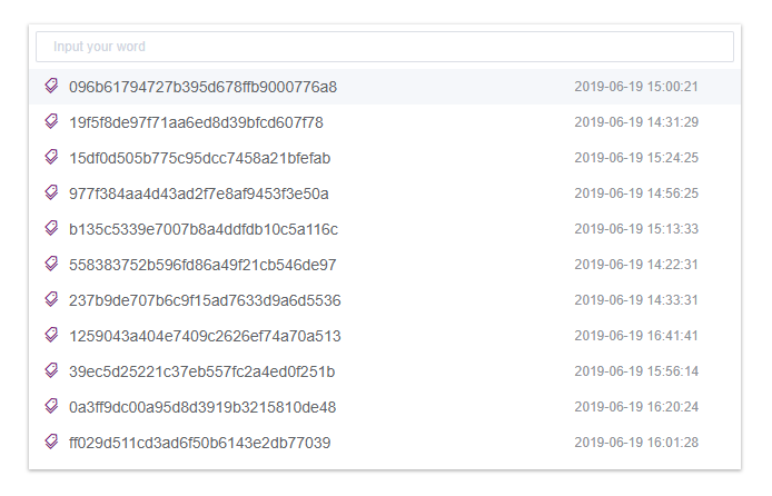
링크: https://theoxiong.github.io/vue-search-panel/
$ npm install vue-search-panel --save
import VueSearchPanel from 'vue-search-panel'
Vue.use(VueSearchPanel)
 <script>
export default {
  components: { VueSearchPanel }
}
</script>
show 메소드를 호출하여 패널을 엽니다.샘플 코드:
 <template>
  <div class="demo-comp">
    <button @click="onOpen">Open Panel</button>
    <div>Selected: {{ selected }}</div>
    <vue-search-panel
      v-model="value"
      :fetch-suggestions="getSuggestions"
      @select="onSelect"
      ref="searchPanel"
    >
    </vue-search-panel>
  </div>
</template>

<script>
import VueSearchPanel from 'vue-search-panel'
const testData = [
  { key: 'test-data-1', value: 'test data 1' },
  { key: 'test-data-2', value: 'test data 2' },
  { key: 'test-data-3', value: 'test data 3' }
]

export default {
  name: 'DemoComp',
  data () {
    return {
      value: '',
      selected: ''
    }
  },
  methods: {
    onOpen () {
      this.$refs.searchPanel.show()
    },
    onSelect (item) {
      this.selected = item.value
    },
    getSuggestions (query, cb) {
      cb(query ? testData.filter(item => { return item.value.includes(query) }) : testData)
    }
  },
  components: { VueSearchPanel }
}
</script>
scoped slot 으로 제안 요소를 맞춤설정하고 item 키를 통해 제안 개체에 액세스하세요.
샘플 코드:
 <template>
  <div class="demo-comp">
    <button @click="onOpen">Open Panel</button>
    <div>Selected: {{ selected }}</div>
    <vue-search-panel
      v-model="value"
      :fetch-suggestions="getSuggestions"
      @select="onSelect"
      ref="searchPanel"
    >
      <div class="demo-search-item" slot-scope="{ item }">
        <span class="search-item-value">{{ item.value }}</span>
        <span class="search-item-time">{{ item.time }}</span>
      </div>
    </vue-search-panel>
  </div>
</template>

<script>
import VueSearchPanel from 'vue-search-panel'

export default {
  name: 'DemoComp',
  data () {
    return {
      value: '',
      selected: '',
      testData: []
    }
  },
  mounted () {
    for (let i = 0; i < 20; i++) {
      this.testData.push({
        key: `data-${i}`,
        value: `Test data ${i + 1}`,
        time: new Date(Math.random() * 1000000000000).toLocaleDateString()
      })
    }
  },
  methods: {
    onOpen () {
      this.$refs.searchPanel.show()
    },
    onSelect (item) {
      this.selected = item.value
    },
    getSuggestions (query, cb) {
      cb(query ? this.testData.filter(item => { return item.value.includes(query) }) : this.testData)
    }
  },
  components: { VueSearchPanel }
}
</script>

<style scoped>
.demo-search-item{
  display: flex;
  align-items: center;
  justify-content: space-between;
  height: 32px;
  padding: 0 20px;
}
.search-item-value{
  font-size: 14px;
  color: #555;
}
.search-item-time{
  font-size: 12px;
  color: #aaa;
  width: 80px;
}

</style>
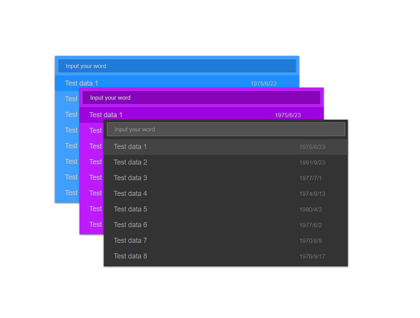
소품으로 UI를 맞춤설정하세요.
색상/테두리색상/배경색상/너비/높이를 구성할 수 있습니다.
자세한 내용은 API를 참조하세요.
샘플 코드:
 <template>
  <div class="demo-comp">
    <button @click="onOpen">Open Panel</button>
    <div>Selected: {{ selected }}</div>
    <vue-search-panel
      v-model="value"
      width="640px"
      height="400px"
      scrollBarColor="#aaaaaa"
      inputColor="#cccccc"
      inputBackground="#555555"
      inputBorderColor="#666666"
      inputBorderColorHovering="#999999"
      inputBorderColorFocused="#bbbbbb"
      placeholderEffect="dark"
      panelBackground="#333333"
      panelBoxShadow="rgba(0, 0, 0, 0.6)"
      highlightedColor="#444444"
      hoveredColor="#666666"
      :fetch-suggestions="getSuggestions"
      @select="onSelect"
      ref="searchPanel"
    >
      <div class="demo-search-item" slot-scope="{ item }">
        <span class="search-item-value">{{ item.value }}</span>
        <span class="search-item-time">{{ item.time }}</span>
      </div>
    </vue-search-panel>
  </div>
</template>

<script>
import VueSearchPanel from 'vue-search-panel'

export default {
  name: 'DemoComp',
  data () {
    return {
      value: '',
      selected: '',
      testData: []
    }
  },
  mounted () {
    for (let i = 0; i < 20; i++) {
      this.testData.push({
        key: `data-${i}`,
        value: `Test data ${i + 1}`,
        time: new Date(Math.random() * 1000000000000).toLocaleDateString()
      })
    }
  },
  methods: {
    onOpen () {
      this.$refs.searchPanel.show()
    },
    onSelect (item) {
      this.selected = item.value
    },
    getSuggestions (query, cb) {
      cb(query ? this.testData.filter(item => { return item.value.includes(query) }) : this.testData)
    }
  },
  components: { VueSearchPanel }
}
</script>

<style scoped>
.demo-search-item{
  display: flex;
  align-items: center;
  justify-content: space-between;
  height: 32px;
  padding: 0 20px;
}
.search-item-value{
  font-size: 14px;
  color: #999;
}
.search-item-time{
  font-size: 12px;
  color: #777;
  width: 80px;
}

</style>
fixed 속성은 패널 위치에 사용되며, 값이 true 이면 패널은 뷰포트를 기준으로 위치가 지정되고, 값이 false 이면 패널은 문서의 일반적인 흐름에 따라 위치가 지정됩니다.placement 소품은 뷰포트를 기준으로 패널 배치를 지정하는 데 사용되며 선택적 값은 top/bottom/left/right 입니다.fiexd 값이 false이면 배치 소품이 무시됩니다.
샘플 코드:
 <template>
  <div class="demo-comp">
    <button @click="onOpen('top')" :disabled="disabled" :class="{'is-disabled': disabled}">Open at top</button>
    <button @click="onOpen('bottom')" :disabled="disabled" :class="{'is-disabled': disabled}">Open at bottom</button>
    <button @click="onOpen('left')" :disabled="disabled" :class="{'is-disabled': disabled}">Open at left</button>
    <button @click="onOpen('right')" :disabled="disabled" :class="{'is-disabled': disabled}">Open at right</button>
    <button @click="onOpen('inner')" :disabled="disabled" :class="{'is-disabled': disabled}">Open at inner</button>
    <div>Selected: {{ selected }}</div>
    <vue-search-panel
      v-model="value"
      :placement="placement"
      :fixed="fixed"
      :fetch-suggestions="getSuggestions"
      @open="onPanelOpen"
      @closed="onPanelClosed"
      @select="onSelect"
      ref="searchPanel"
    >
    </vue-search-panel>
  </div>
</template>

<script>
import VueSearchPanel from 'vue-search-panel'
const testData = [
  { key: 'test-data-1', value: 'test data 1' },
  { key: 'test-data-2', value: 'test data 2' },
  { key: 'test-data-3', value: 'test data 3' }
]

export default {
  name: 'DemoComp',
  data () {
    return {
      value: '',
      selected: '',
      placement: 'top',
      fixed: true,
      disabled: false
    }
  },
  methods: {
    onOpen (position) {
      if (position === 'inner') {
        this.fixed = false
      } else {
        this.fixed = true
        this.placement = position
      }
      this.$refs.searchPanel.show()
    },
    onPanelOpen () {
      this.disabled = true
    },
    onPanelClosed () {
      this.disabled = false
    },
    onSelect (item) {
      this.selected = item.value
    },
    getSuggestions (query, cb) {
      cb(query ? testData.filter(item => { return item.value.includes(query) }) : testData)
    }
  },
  components: { VueSearchPanel }
}
</script>

<style scoped>
.demo-comp{
  margin: 20px;
  width: 600px;
}
.is-disabled,
.is-disabled:active,
.is-disabled:focus,
.is-disabled:hover{
  cursor:not-allowed;
  background-color:#e4e4ee;
}
</style>
VsCode처럼 검색/최근/명령 등 다기능 패널로 확장 가능
라이브 돔: https://theoxiong.github.io/vue-search-panel/
개발자용:
 npm install
npm run dev
| 매개변수 | 설명 | 유형 | 선택적 값 | 기본값 |
|---|---|---|---|---|
| 가치 / v-모델 | 양방향 바인딩 값 | 끈 | — | — |
| 자리 표시자 | 입력 자리 표시자 | 끈 | — | — |
| 너비 | 패널의 폭 | 끈 | — | 50% |
| 키 | 패널의 높이 | 끈 | — | 300px |
| 맨 위 | 여백패널 상단 | 끈 | — | 0px |
| 맨 아래 | 여백패널 하단 | 끈 | — | 0px |
| 왼쪽 | 패널의 여백왼쪽 | 끈 | — | 0px |
| 오른쪽 | 패널의 여백 오른쪽 | 끈 | — | 0px |
| 결정된 | 뷰포트를 기준으로 배치되었는지 여부 | 부울 | — | 진실 |
| 놓기 | 뷰포트를 기준으로 패널 배치 지정(fiexd 값이 false인 경우 무시됨) | 끈 | 위/아래/왼쪽/오른쪽 | 맨 위 |
| 가져오기 제안 | 입력 제안을 가져오는 방법. 제안이 준비되면 callback(data:[])을 호출하여 제안을 반환합니다. | 함수(쿼리문자열, cb) | — | — |
| closeOnPressEscape | ESC 키를 눌러 패널을 닫을지 여부 | 부울 | — | 진실 |
| closeOnSelect | 선택 시 패널을 닫을지 여부 | 부울 | — | 진실 |
| 클리어온클로즈 | 패널이 닫힐 때 입력 값을 지울지 여부 | 부울 | — | 진실 |
| 일치하지 않을 때 선택 | 일치하는 항목이 없을 때 입력 시 선택 이벤트를 내보낼지 여부 | 부울 | — | 거짓 |
| 트리거온포커스 | 입력 포커스 시 제안 표시 여부 | 부울 | — | 진실 |
| 하이라이트첫 번째 항목 | 첫 번째 항목을 강조할지 여부 | 부울 | — | 진실 |
| 값색상 | 제안 항목의 색상(범위가 지정된 슬롯이 없는 경우) | 끈 | — | #606266 |
| 스크롤바색상 | 스크롤바의 색상 | 끈 | — | #DFDFDF |
| 스크롤바불투명도 | 스크롤바의 불투명도 | 숫자 | — | 0.8 |
| 패널배경 | 패널의 배경색 | 끈 | — | #FFFFFF |
| 패널경계 반경 | 패널의 경계 반경 | 끈 | — | 0px |
| 패널상자그림자 | 패널의 boxShadow 색상 | 끈 | — | RGBA(0, 0, 0, 0.3) |
| 강조표시된 색상 | 강조표시된 제안 항목의 색상 | 끈 | — | #F5F7FA |
| hovered색상 | 마우스를 올렸을 때 제안 항목의 색상 | 끈 | — | #C5C7CA |
| 자리표시자효과 | 자리 표시자 텍스트의 색상 | 끈 | 밝음/어두움 | 빛 |
| 입력색상 | 입력 텍스트의 색상 | 끈 | — | #606266 |
| 입력배경 | 입력 필드의 배경색 | 끈 | — | #FFFFFF |
| 입력경계색상 | 입력 필드의 테두리 색상 | 끈 | — | #DCDFE6 |
| inputBorderColorHovering | 마우스를 올렸을 때 입력 필드의 테두리 색상 | 끈 | — | #B0B3BB |
| 입력경계색상집중 | 초점이 맞춰졌을 때 입력 필드의 테두리 색상 | 끈 | — | #575F96 |
| 메소드 이름 | 설명 | 매개변수 |
|---|---|---|
| 보여주다 | 패널을 열어 | — |
| 닫다 | 패널을 닫아 | — |
| 포커스입력 | 입력 요소에 초점을 맞춥니다 | — |
| getInputElement | 입력 요소를 가져옵니다 | — |
| 이벤트 이름 | 설명 | 매개변수 |
|---|---|---|
| 열려 있는 | 패널이 열릴 때 트리거됩니다. | — |
| 열었다 | 패널 열기 애니메이션이 끝날 때 트리거됩니다. | — |
| 닫다 | 패널이 닫힐 때 트리거됩니다. | — |
| 닫은 | 패널 닫기 애니메이션이 끝날 때 트리거됩니다. | — |
| 집중하다 | 입력 요소에 초점이 맞춰지면 트리거됩니다. | — |
| 흐림 | 입력 요소가 흐려질 때 트리거됩니다. | — |
| 선택하다 | 제안을 클릭하면 트리거됩니다. | 클릭 중인 제안 |
입력 제안을 위한 맞춤 콘텐츠, 범위 매개변수는 { item }
| 이름 | 설명 |
|---|---|
| 항목에 따라 | 제안 상단의 콘텐츠 |


