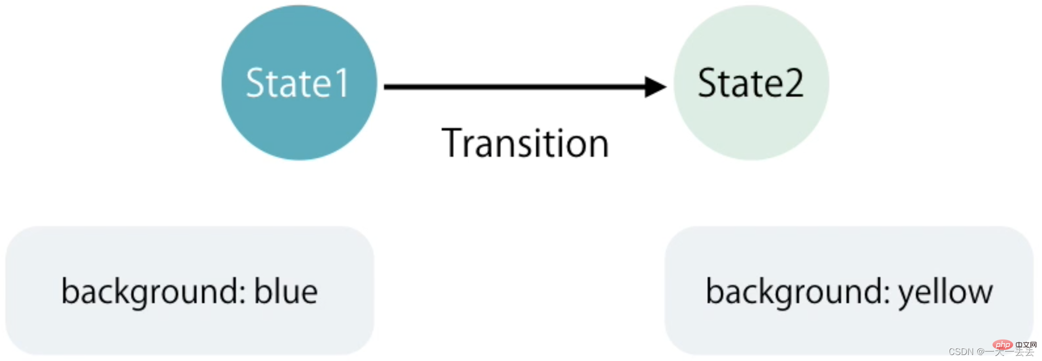
1. What is the state
? The state represents the style of the element to be moved at different stages of the movement. [Recommended related tutorials: "angular tutorial"]

2. Types of states
In Angular, there are three types of states: void , * , custom
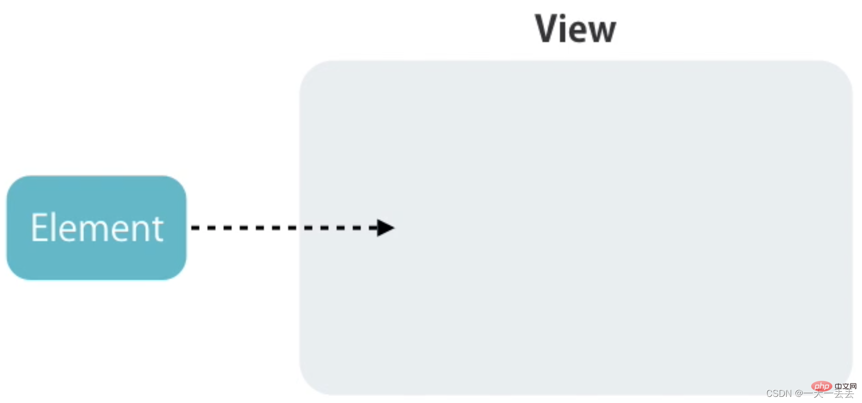
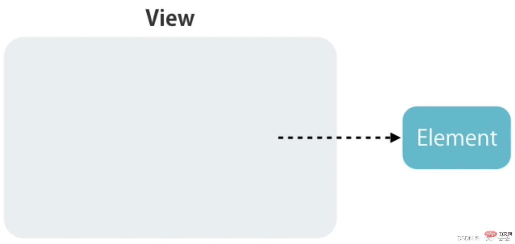
void : This state occurs when the element is created in memory but has not yet been added to the DOM or the element is removed from the DOM
* : The state after the element is inserted into the DOM tree, or is an element already in the DOM tree State, also called default state
custom : custom state, the element is on the page by default and moves from one state to another, such as folding and expanding the panel.
3. Entry and exit animation.
Entry animation means that the element appears in front of the user in the form of animation after it is created. The state of the entry animation is represented by void => * , and the alias is :enter

The exit animation refers to a farewell animation performed before the element is deleted. The status of the exit animation is * => void , and the alias is :leave

1. Before using the animation function, you need to introduce the animation module, namely BrowserAnimationsModule
import { BrowserAnimationsModule } from "@angular/platform-browser/animations"

@NgModule({
  imports: [BrowserAnimationsModule],
})
export class AppModule {}
2. Default code analysis, todo deletion task and adding task
<!-- Introducing bootstrap.min.css in the index.html file -->
<link rel="stylesheet" href="https://cdn.jsdelivr.net/npm/[email protected]/dist/css/bootstrap.min.css" />
<div class="container">
  <h2>Todos</h2>
  <div class="form-group">
    <input (keyup.enter)="addItem(input)" #input type="text" class="form-control" placeholder="add todos" />
  </div>
  <ul class="list-group">
    <li (click)="removeItem(i)" *ngFor="let item of todos; let i = index" class="list-group-item">
      {{ item }}
    </li>
  </ul>
</div>
import { Component } from "@angular/core"
@Component({
selector: "app-root",
templateUrl: "./app.component.html",
styles: []
})
export class AppComponent {
// todo list todos: string[] = ["Learn Angular", "Learn RxJS", "Learn NgRx"]
// add todo
addItem(input: HTMLInputElement) {
this.todos.push(input.value)
input.value = ""
}
// Delete todo
removeItem(index: number) {
this.todos.splice(index, 1)
}
} 3. Create animation.
The trigger method is used to create animation, and
the transition method is used to specify the animation name. The transition method is used to specify the motion state of the animation, exit animation or entry animation, or custom state animation.
The style method is used to set the style corresponding to the element in different states.
The animate method is used to set motion parameters, such as animation motion time, delayed events, and motion forms
@Component({
  animations: [
    //Create animation, animation name is slide
    trigger("slide", [
      //Specify entrance animation. Note: There cannot be spaces on both sides of the string, and there may or may not be spaces on both sides of the arrow. // void => * can be replaced with: enter
      transition("void => *", [
        // Specify the style of the element before it enters style({ opacity: 0, transform: "translateY(40px)" }),
        //Specify the style and motion parameters of the element after entering the scene animate(250, style({ opacity: 1, transform: "translateY(0)" }))
      ]),
      //Specify exit animation// * => void can be replaced with:leave
      transition("* => void", [
        //Specify the style and motion parameters of the element after it appears animate(600, style({ opacity: 0, transform: "translateX(100%)" }))
      ])
    ])
  ]
})
Note: You do not need to specify the default state of the element in the entrance animation. Angular will clear the void state as the default state
trigger("slide", [
  transition(":enter", [
    style({ opacity: 0, transform: "translateY(40px)" }),
    animate(250)
  ]),
  transition(":leave", [
 		animate(600, style({ opacity: 0, transform: "translateX(100%)" }))
  ])
])
Note: To set the motion parameters of animation, you need to change one parameter of the animate method to a string type
// total animation execution time delay time (optional) motion form (optional)
animate("600ms 1s ease-out", style({ opacity: 0, transform: "translateX(100%)" })) Keyframe animation is defined using the keyframes method
transition(":leave", [
  animate(
    600,
    keyframes([
      style({ offset: 0.3, transform: "translateX(-80px)" }),
      style({ offset: 1, transform: "translateX(100%)" })
    ])
  )
]) Angular provides two callback functions related to animation, respectively when the animation starts and after the animation is completed.
<li @slide (@slide.start)="start($event)" (@slide.done)="done($event)"></li>
import { AnimationEvent } from "@angular/animations"

start(event: AnimationEvent) {
  console.log(event)
}
done(event: AnimationEvent) {
  console.log(event)
} 1. Place the animation definition in a separate file to facilitate multiple component calls.
import { animate, keyframes, style, transition, trigger } from "@angular/animations"

export const slide = trigger("slide", [
  transition(":enter", [
    style({ opacity: 0, transform: "translateY(40px)" }),
    animate(250)
  ]),
  transition(":leave", [
    animate(
      600,
      keyframes([
        style({ offset: 0.3, transform: "translateX(-80px)" }),
        style({ offset: 1, transform: "translateX(100%)" })
      ])
    )
  ])
])
import { slide } from "./animations"
@Component({
animations: [slide]
}) 2. Extract specific animation definitions to facilitate multiple animation calls.
import {animate, animation, keyframes, style, transition, trigger, useAnimation} from "@angular/animations"

export const slideInUp = animation([
  style({ opacity: 0, transform: "translateY(40px)" }),
  animate(250)
])

export const slideOutLeft = animation([
  animate(
    600,
    keyframes([
      style({ offset: 0.3, transform: "translateX(-80px)" }),
      style({ offset: 1, transform: "translateX(100%)" })
    ])
  )
])

export const slide = trigger("slide", [
  transition(":enter", useAnimation(slideInUp)),
  transition(":leave", useAnimation(slideOutLeft))
])
3. When calling animation, transfer the total motion time, delay time, and motion form
export const slideInUp = animation(
  [
    style({ opacity: 0, transform: "translateY(40px)" }),
    animate("{{ duration }} {{ delay }} {{ easing }}")
  ],
  {
    params: {
      duration: "400ms",
      delay: "0s",
      easing: "ease-out"
    }
  }
)
transition(":enter", useAnimation(slideInUp, {params: {delay: "1s"}})) Angular provides query method to find elements and create animations for them
import { slide } from "./animations"

animations: [
  slide,
  trigger("todoAnimations", [
    transition(":enter", [
      query("h2", [
        style({ transform: "translateY(-30px)" }),
        animate(300)
      ]),
      // Query the child animation to execute query("@slide", animateChild())
    ])
  ])
]
<div class="container" @todoAnimations>
<h2>Todos</h2>
<ul class="list-group">
<li
@slide
(click)="removeItem(i)"
*ngFor="let item of todos; let i = index"
class="list-group-item"
>
{{ item }}
</li>
</ul>
</div> By default, parent animation and child animation are executed in order. The parent animation is executed first, and then the child animation is executed. You can use the group method to make it parallel
trigger("todoAnimations", [
  transition(":enter", [
    group([
      query("h2", [
        style({ transform: "translateY(-30px)" }),
        animate(300)
      ]),
      query("@slide", animateChild())
    ])
  ])
]) Angular provides the stagger method to delay the execution of each element's animation in turn when multiple elements execute the same animation at the same time.
transition(":enter", [
  group([
    query("h2", [
      style({ transform: "translateY(-30px)" }),
      animate(300)
    ]),
    query("@slide", stagger(200, animateChild()))
  ])
])
Note: The stagger method can only use inside the query method.
Angular provides the state method for defining state.

1. Default code analysis
<div class="container">
  <div class="panel panel-default">
    <div class="panel-heading" (click)="toggle()">
      One framework, multiple platforms, mobile & desktop</div>
    <div class="panel-body">
      <p>
        Use simple declarative templates to quickly implement various features. Extend the template language with custom components and a wide range of existing components. Get support for Angular in almost any IDE
        for instant help and feedback. All of this is to help you write beautiful applications, rather than racking your brains to make the code "work".
      </p>
      <p>
        From prototype to global deployment, Angular can bring you support for Google
        Highly scalable infrastructure and technologies for large-scale applications.
      </p>
      <p>
        Reach the web today (and tomorrow) with Web Workers and server-side rendering
        The highest speed achievable on the platform. Angular gives you effective control over scalability. Based on RxJS, Immutable.js and other push models, it can adapt to massive data requirements.
      </p>
      <p>
        Learn to use Angular
        Build applications and then reuse these code and capabilities in applications on many different platforms -
        Web, mobile web, mobile apps, native apps, and desktop native apps.
      </p>
    </div>
  </div>
</div>
<style>
  .container {
    margin-top: 100px;
  }
  .panel-heading {
    cursor: pointer;
  }
</style>
import { Component } from "@angular/core"
@Component({
selector: "app-root",
templateUrl: "./app.component.html",
styles: []
})
export class AppComponent {
isExpended: boolean = false
toggle() {
this.isExpended = !this.isExpended
}
} 2. Create animation
trigger("expandCollapse", [
  // Use the state method to define the style corresponding to the folded state element state(
    "collapsed",
    style({
      height: 0,
      overflow: "hidden",
      paddingTop: 0,
      paddingBottom: 0
    })
  ),
  // Use the state method to define the style corresponding to the expanded state element state("expanded", style({ height: "*", overflow: "auto" })),
  // Define the expansion animation transition("collapsed => expanded", animate("400ms ease-out")),
  // Define the folding animation transition("expanded => collapsed", animate("400ms ease-in"))
])
<div class="panel-body" [@expandCollapse]="isExpended ? 'expanded' : 'collapsed'"></div>

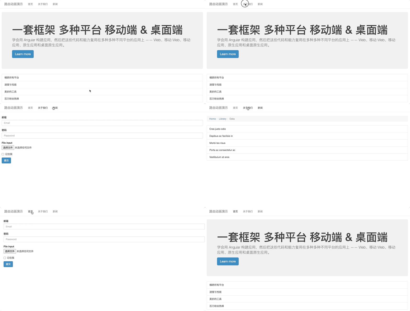
1. Add a status identifier to the route. This identifier is the custom state when the route performs animation
const routes: Routes = [
  {
    path: "",
    component: HomeComponent,
    pathMatch: "full",
    data: {
      animation: "one"
    }
  },
  {
    path: "about",
    component: AboutComponent,
    data: {
      animation: "two"
    }
  },
  {
    path: "news",
    component: NewsComponent,
    data: {
      animation: "three"
    }
  }
]
2. Obtain the routing status identifier through the routing socket object, and pass the identifier to the caller of the animation to let the animation execute what is the current state to be executed
<div class="routerContainer" [@routerAnimations]="prepareRoute(outlet)" >
  <router-outlet #outlet="outlet"></router-outlet>
</div>
import { RouterOutlet } from "@angular/router"

export class AppComponent {
  prepareRoute(outlet: RouterOutlet) {
    return (
      outlet &&
      outlet.activatedRouteData &&
      outlet.activatedRouteData.animation
    )
  }
}
3. Set routerContainer to relative positioning, and set its direct first-level child elements to absolute positioning
/* styles.css */
.routerContainer {
  position: relative;
}

.routerContainer > * {
  position: absolute;
  left: 0;
  top: 0;
  width: 100%;
}
4. Create animation
trigger("routerAnimations", [
  transition("one => two, one => three, two => three", [
    query(":enter", style({ transform: "translateX(100%)", opacity: 0 })),
    group([
      query(
        ":enter",
        animate(
          "0.4s ease-in",
          style({ transform: "translateX(0)", opacity: 1 })
        )
      ),
      query(
        ":leave",
        animate(
          "0.4s ease-out",
          style({
            transform: "translateX(-100%)",
            Opacity: 0
          })
        )
      )
    ])
  ]),
  transition("three => two, three => one, two => one", [
    query(
      ":enter",
      style({ transform: "translateX(-100%)", opacity: 0 })
    ),
    group([
      query(
        ":enter",
        animate(
          "0.4s ease-in",
          style({ transform: "translateX(0)", opacity: 1 })
        )
      ),
      query(
        ":leave",
        animate(
          "0.4s ease-out",
          style({
            transform: "translateX(100%)",
            Opacity: 0
          })
        )
      )
    ])
  ])
])
For more programming-related knowledge, please visit: Programming Video! !
The above is what is status? Learn more about animation in Angular. For more information, please pay attention to other related articles on the PHP Chinese website!