
When you see this title, you may think that there is another typo, responsive height design? Are you serious? Because "responsive web design" typically checks browsers on multiple widths and device sizes. We generally adjust horizontal responsiveness by reducing the width, but I rarely see consideration of vertical responsiveness by reducing the browser height. At this time, Zhimimi may have a slight fluctuation in his heart, with some questions: Do we need to lower the height of the browser? Yeah, let's keep talking about it.
When we are designing a website, it is not good to make assumptions without relying on actual data. The responsibility of horizontal and vertical testing is also very important.
For a designer, an unreasonable assumption is one of the important factors that ruins a website design. For example, it is incorrect to assume that users must be browsing a website by using the full width and height of the screen. Instead, we need to consider the worst-case scenario.

Zhimi, do you understand? The reality is that not all users use browsers the way we expect them to. I find that the website looks terrible when I lower the browser height.
Resizing the browser (vertically) is not the only way to change the viewport height. When we open the browser DevTools, it will also occupy the height of the browser.
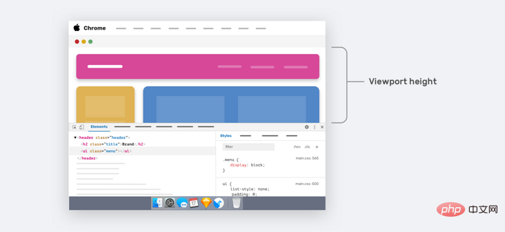
The arrow area in the image above represents the height of the current viewport. For smaller laptop screens, we will only see a small part of the web page.
The real question is: can we enhance the user experience when the viewport height is smaller? Yes, it's possible, let's take a look.
As designers and developers, some of us only focus on the width changes of the design and ignore the viewport height changes. For example, in development, the UI provides variations of specific components across different viewport widths. But what about different viewport heights?
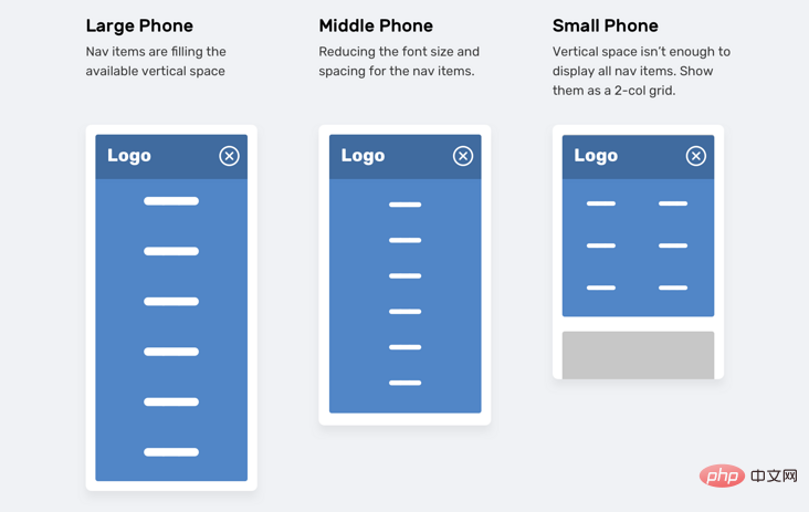
In the image above, we have a navigation menu that adjusts based on the height of the viewport. . If the viewport size is small (e.g., iPhone 5), navigation items will appear as a two-column grid. This way of thinking is often abandoned, or optimized until someone says it should be done.
There are two different ways to achieve the above requirements in CSS:
Vertical media queriesViewport unitsZhimimi definitely knows how to use width media queries in CSS.
@media (min-width: 700px) { .element { /* do something.. */ }}Less commonly used is the vertical media query, which checks the viewport height.
@media (min-height: 500px) { .element { /* do something.. */ }}/* or */@media (orientation: landscape) { .element { /* do something.. */ }}Using viewport units can help provide a better experience for users. For example, control the vertical spacing between elements based on the viewport height.
.hero__title { margin-bottom: calc(10px + 5vh);}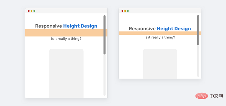
As shown above, for larger screens (such as iMac 27 inches), the bottom margin will become very large. We have two ways to solve the problem of excessive margins.
Media queriesCSS comparison functionThe first way (media queries) is more supported. If the screen is large, we need to set a maximum value for the bottom margin.
@media (min-width: 2200px) { .hero__title { margin-bottom: 40px; }}Another method is to use the CSS clamp() comparison function. The function of the clamp() function is to return a range of values.
.hero__title { margin-bottom: clamp(10px, 5vh, 40px);}In this example, there is a section area with sections for titles and illustrations, and the section height is equal to 100% of the viewport height.
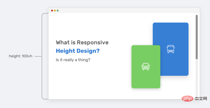
Everything looks fine until the viewport height gets smaller. The height of the section will not be enough to accommodate the illustrations and text content. Therefore, it will overlap other parts on the page.
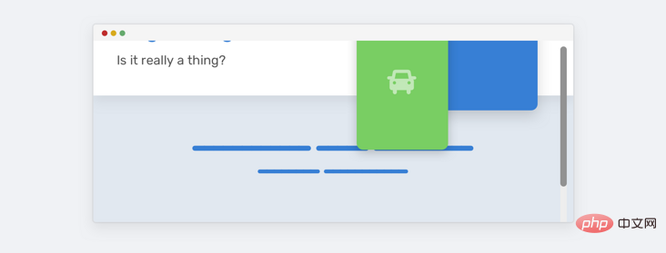
Notice how the illustration overlaps the section below. This happens because there is enough vertical space. Take a look at HTML and CSS.
<p class="hero"> <p class="hero__wrapper"> <p class="hero__content"><!-- content --></p> <img class="hero__thumb" src="figure.png" alt="" /> </p></p>css
.hero { height: 100vh;}.hero__thumb { flex: 0 0 550px; width: 550px;}Here are several solutions to solve such problems:
Set a fixed size (width and height) for the illustration instead of just the width, the lack of height will continue to have this problem. height: 100vh only if viewport height is greater than 700px (media query value may vary depending on context).We can combine the two to get a more powerful solution.
.hero__thumb { width: 400px; height: 300px; object-fit: contain; /* To avoid compressing the image */}@media (min-height: 700px) { .hero { height: 100vh; }Okay, now we agree that using vertical media queries is better. However, using 100vh is risky because even if we limit the size of the illustration, we may not be able to do the same with the text content. If the text content becomes longer, the same problem will occur again, see the figure below:
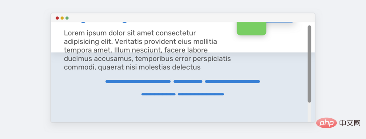
To solve this problem, we can use min-height instead of height. This way, if the content gets longer, the height will expand and not overlap.
@media (min-height: 700px) { .hero { min-height: 100vh; }}Pinning the title while scrolling is not a bad thing, however, we want to make sure that we only pin the title when the vertical space is good enough so that the experience is good.
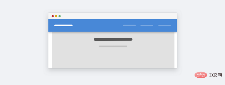
This is a website about landscapes. Here we can see that when the height is too small, the fixed height will take up a lot of space as a whole. Is this really important to users? In most cases it is not important, because the average user will not zoom out to see a website like this. Currently, if we want to optimize, we can do it. The idea is to use vertical media query to change the fixed positioning to static positioning when it is judged that the height is less than a certain height.
@media (min-height: 700px) { .site-header { /* position: fixed or position: sticky */ }}I noticed this pattern on Twitter.com's navigation bar. The idea is to combine vertical media queries with the Priority+ pattern.
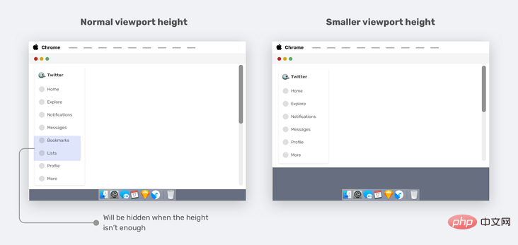
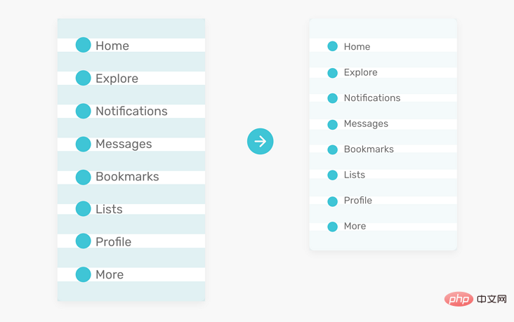
When the viewport height is resized, the less important elements (bookmarks and lists) are removed and appended to the More menu, which is a good use case for vertical media queries.
.nav__item--secondary { display: none;}@media (min-height: 700px) { .nav__item--secondary { display: block; }}If our website has a sidebar or sidebar, when the viewport height is small, we can reduce the vertical spacing between some navigation items, which will also enhance the overall design.
We know that the modal box should be at least horizontally centered. However, sometimes we also need to center it vertically. We generally use the following solution:
.modal__body { position: absolute; left: 50%; top: 50%; transform: translate(-50%, -50%); width: 500px;}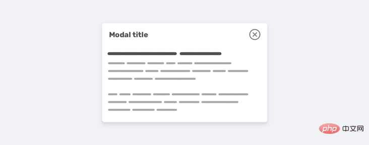
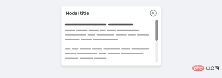
However, there is a problem when the content becomes long, the modal will fill the screen vertically and the user will not be able to scroll it.

There are several reasons for this situation:
The modal box has no height and the modal is vertically centered (this will cause the problem to occur faster)Here is the repaired css:
.modal__body { position: absolute; left: 50%; top: 3rem; transform: translateX(-50%); width: 500px; min-height: 200px; max-height: 500px; overflow-y: auto;}@media (min-height: 700px) { .modal__body { top: 50%; transform: translate(-50%, -50%); }}Note that I used min-height and max-height. min-height is about keeping the modal looking good even if the content is short, max-height is about limiting its height using a specific value instead of adding a fixed height.
When designing an experience, it’s best to think in terms of width and height. Resizing your browser vertically may be a little strange, but it has its advantages. In this article, we discuss the importance of vertical testing and how we conduct vertical testing. Finally, we propose some examples and use cases that we hope will be useful to smartmi users.
The above is about the height design in responsive web pages. Do you need to lower the height of the browser? For more details, please pay attention to other related articles on this site!