Requirements: We will encounter the use of various progress bars during development, because there are various progress bars in current plug-ins. In order to facilitate our customized development and convenient modification of styles, we use HTML and CSS styles here. Develop the progress bar function .
Through this article, we will understand how to use HTML/CSS to create various basic progress bars and fancy progress bars and their animations.
Create a progress bar through the HTML tag meter. Create a progress bar through the HTML tag progress. HTML Implement the limitations of the progress bar. Use CSS percentages and gradients to create ordinary progress bars and their animations. Use CSS to create a donut-shaped progress bar. Use CSS to create a spherical progress bar.
The most common progress bar we encounter is the horizontal progress bar. This is the most common, mainly using HTML5 to provide two native tags and to implement the progress bar.
Specific examples of meter are as follows:

 <p>
<span>Completeness:</span>
<meter min="0" max="500" value="350">350 degrees</meter>
</p>
Among them, min, max, and value represent the maximum value, minimum value, and current value respectively.
Let’s take a look at the usage of tags:

 <p>
<label for="file">Completeness:</label>
<progress max="100" value="70"> 70% </progress>
</p>
Among them, the max attribute describes the total amount of work that needs to be completed for the task represented by the progress element, and the value attribute is used to specify the amount of work that has been completed by the progress bar.
The differences between the two are as follows: So the question is, judging from the above demo, the effects of the two labels are exactly the same, so what is the difference between them? Why are there two seemingly identical labels? The biggest difference between these two elements is the semantic difference. Meter represents a scalar measurement value or fractional value within a known range. Progress represents the completion progress of a task. For example, the current completion level of a requirement should be used, and if you want to display the current speed value on a car dashboard, meter should be used.
Limitations of meter & progress Of course, in actual business requirements or production environments, you will almost never see the meter and progress labels. We cannot effectively modify the styles of meter and progress labels, such as background color, progress foreground color, etc. And, the most fatal thing is that the performance of browser default styles is inconsistent between different browsers. This is a catastrophic shortcoming for a business that pursues stability and consistent UI performance! We cannot add some animation effects and interactive effects to it, because in some actual application scenarios, it is definitely not a simple display of a progress bar and nothing more. Use CSS to implement the progress bar.
Therefore, at this stage, more CSS methods are used to implement the progress bar.
(1) One of the most common ways to use percentages to implement a progress bar is to use a background color combined with a percentage to create a progress bar with a gradient. The simplest DEMO example is as follows:

 <div class="g-container">
<div class="g-progress"></div>
</div>
<div class="g-progress"></div>
Similarly, we can use the HTML style attribute to fill in the complete background value and pass the actual percentage. Of course, it is more recommended to use CSS custom attributes to pass the value. In order to achieve the animation effect, we can use CSS @property to transform our code:

 <div class="g-progress" style="--progress: 70%"></div>
@property --progress {
syntax: '<percentage>';
inherits: false;
initial-value: 0%;
}
.g-progress {
margin: auto;
width: 240px;
height: 25px;
border-radius: 25px;
background: linear-gradient(90deg, #0f0, #0ff var(--progress), transparent 0);
border: 1px solid #eee;
transition: .3s --progress;
}The core is to use angular gradient background: conic-gradient(): The example effect is as follows:
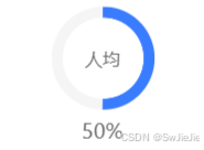
The code is as follows:
 <div class="progress-circle"
	v-for="(item,index) in progressList" :key="index"
:style="{
background: `radial-gradient(#fff 55%, transparent 56%), conic-gradient(#3A7CFF ${item.rate}%, #f5f5f5 ${ item.rate && item.rate > 0 ? item.rate + 0.4 : 0 }%),radial-gradient(#fff 60%, #F1F3FC 0%);`
}
">
<span class="progress-value" >{{item.name}}</span>
<div class="totalvalbox" >
{{ item.rate }}%
</div>
</div>
<style lang="scss" scoped>
.progress-circle {
position: relative;
width: 149rpx;
height: 149rpx;
font-family: PingFang SC;
border-radius: 50%;
display: flex;
align-items: center;
justify-content: center;
}
	.progress-value {
	position: absolute;
	text-align: center;
	line-height: 50rpx;
	width: 100%;
	font-weight: 400;
font-size: 26rpx;
}
	.totalvalbox {
min-width: 217rpx;
text-align: center;
position: absolute;
bottom: -50rpx;
font-weight: 400;
font-size: 30rpx;
}
</style>
The optimization problem is as follows:
The problems that tend to arise here are as follows: The limitations of realizing arc progress bars with angular gradients. Of course, this method has two disadvantages. Of course, when the progress percentage is not numbers like 0°, 90°, 180°, 270°, 360°, when using angular gradients, there will be obvious jagged edges at the connections between different colors. Take an example conic-gradient(#FFCDB2 0, #FFCDB2 27%, #B5838D 27%, #B5838D):
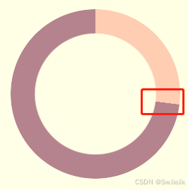
The solution to such problems is to leave some gradient space at the connection point. Let's simply transform the above angular gradient code:
 {
- background: conic-gradient(#FFCDB2 0, #FFCDB2 27%, #B5838D 27%, #B5838D)`
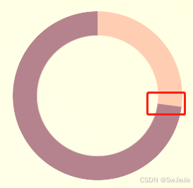
+ background: conic-gradient(#FFCDB2 0, #FFCDB2 27%, #B5838D 27.2%, #B5838D)`
}
Look carefully at the above code. The change from 27% to 27% is changed from 27% to 27.2%. The extra 0.2% is to eliminate aliasing. The actual effect after the change:
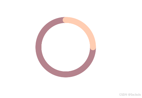
In some cases, we will encounter a progress bar with rounded corners at the end of the progress bar. Of course, this situation can also be solved if the color of the progress bar is a solid color. We can achieve this effect by superimposing two small circles at the beginning and end. If the progress bar is a gradient color, this progress bar needs to be implemented with the help of SVG/Canvas
Examples are as follows:
html
 <div class="g-progress"></div>
<div class="g-container">
<div class="g-progress"></div>
<div class="g-circle"></div>
</div>
css
 body, html {
width: 100%;
height: 100%;
display: flex;
}
.g-container {
position: relative;
margin: auto;
width: 200px;
height: 200px;
}
.g-progress {
position: relative;
margin: auto;
width: 200px;
height: 200px;
border-radius: 50%;
background: conic-gradient(#FFCDB2 0, #FFCDB2 25%, #B5838D 25%, #B5838D);
mask: radial-gradient(transparent, transparent 80px, #000 80.5px, #000 0);
}
.g-circle {
position: absolute;
top: 0;
left: 0;
&::before,
&::after {
content: "";
position: absolute;
top: 90px;
left: 90px;
width: 20px;
height: 20px;
border-radius: 50%;
background: #FFCDB2;
z-index: 1;
}
&::before {
transform: translate(0, -90px);
}
&::after {
transform: rotate(90deg) translate(0, -90px);
}
}
Based on this expansion, you can also implement a multi-color arc-shaped progress bar: (This may not look like a progress bar, but more similar to a pie chart )
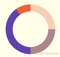
 .g-progress {
width: 160px;
height: 160px;
border-radius: 50%;
mask: radial-gradient(transparent, transparent 50%, #000 51%, #000 0);
background:
conic-gradient(
#FFCDB2 0, #FFCDB2 25%,
#B5838D 25%, #B5838D 50%,
#673ab7 50%, #673ab7 90%,
#ff5722 90.2%, #ff5722 100%
);
}Spherical progress bars are also relatively common, similar to the following:
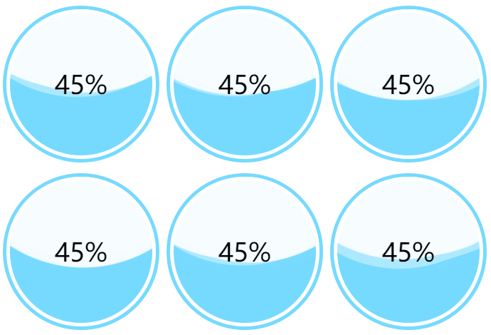
The core code is as follows: Just control the height of the wave when the spherical container indicates progress 0% - 100%. We can get the animation effect from 0% - 100%
 <div class="container">
<div class="wave-change"></div>
<div class="wave"></div>
</div>
.container {
width: 200px;
height: 200px;
border: 5px solid rgb(118, 218, 255);
border-radius: 50%;
overflow: hidden;
}
.wave-change {
position: absolute;
width: 200px;
height: 200px;
left: 0;
top: 0;
animation: change 12s infinite linear;
&::before,
&::after{
content: "";
position: absolute;
width: 400px;
height: 400px;
top: 0;
left: 50%;
background-color: rgba(255, 255, 255, .6);
border-radius: 45% 47% 43% 46%;
transform: translate(-50%, -70%) rotate(0);
animation: rotate 7s linear infinite;
z-index: 1;
}
&::after {
border-radius: 47% 42% 46% 44%;
background-color: rgba(255, 255, 255, .8);
transform: translate(-50%, -70%) rotate(0);
animation: rotate 9s linear -4s infinite;
z-index: 2;
}
}
.wave {
position: relative;
width: 200px;
height: 200px;
background-color: rgb(118, 218, 255);
border-radius: 50%;
}
p {
position: absolute;
top: 50%;
left: 50%;
transform: translate(-50%, -50%);
font-size: 36px;
color: #000;
z-index: 10;
}
@keyframes rotate {
to {
transform: translate(-50%, -70%) rotate(360deg);
}
}
@keyframes change {
from {
top: 80px;
}
to {
top: -120px;
}
}Of course, CSS is ever-changing, and the types of progress bars are definitely not limited to the above categories. For example, we can use filters to imitate the charging animation of Huawei mobile phones, which is also a way of presenting a progress bar and can also be implemented using pure CSS:
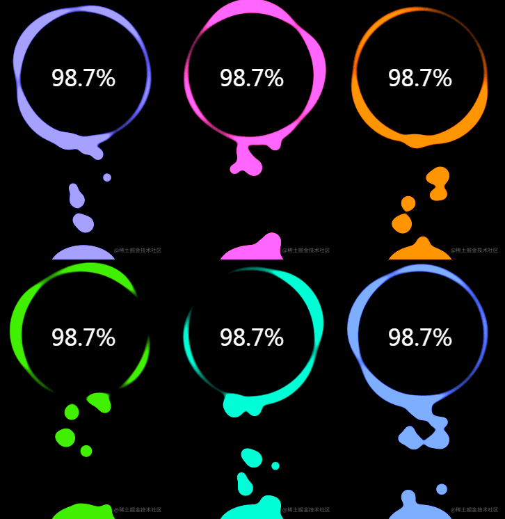
The core code is as follows
 <div class="g-container">
<div class="g-number">98.7%</div>
<div class="g-contrast">
<div class="g-circle"></div>
<ul class="g-bubbles">
<li></li>
<li></li>
<li></li>
<li></li>
<li></li>
<li></li>
<li></li>
<li></li>
<li></li>
<li></li>
<li></li>
<li></li>
<li></li>
<li></li>
<li></li>
</ul>
</div>
</div>
html,
body {
width: 100%;
height: 100%;
display: flex;
background: #000;
overflow: hidden;
}
.g-number {
position: absolute;
width: 300px;
top: 27%;
text-align: center;
font-size: 32px;
z-index: 10;
color: #fff;
}
.g-container {
position: relative;
width: 300px;
height: 400px;
margin: auto;
}
.g-contrast {
filter: contrast(10) hue-rotate(0);
width: 300px;
height: 400px;
background-color: #000;
overflow: hidden;
animation: hueRotate 10s infinite linear;
}
.g-circle {
position: relative;
width: 300px;
height: 300px;
box-sizing: border-box;
filter: blur(8px);
&::after {
content: "";
position: absolute;
top: 40%;
left: 50%;
transform: translate(-50%, -50%) rotate(0);
width: 200px;
height: 200px;
background-color: #00ff6f;
border-radius: 42% 38% 62% 49% / 45%;
animation: rotate 10s infinite linear;
}
&::before {
content: "";
position: absolute;
width: 176px;
height: 176px;
top: 40%;
left: 50%;
transform: translate(-50%, -50%);
border-radius: 50%;
background-color: #000;
z-index: 10;
}
}
.g-bubbles {
position: absolute;
left: 50%;
bottom: 0;
width: 100px;
height: 40px;
transform: translate(-50%, 0);
border-radius: 100px 100px 0 0;
background-color: #00ff6f;
filter: blur(5px);
}
li {
position: absolute;
border-radius: 50%;
background: #00ff6f;
}
@for $i from 0 through 15 {
li:nth-child(#{$i}) {
$width: 15 + random(15) + px;
left: 15 + random(70) + px;
top: 50%;
transform: translate(-50%, -50%);
width: $width;
height: $width;
animation: moveToTop #{random(6) + 3}s ease-in-out -#{random(5000)/1000}s infinite;
}
}
@keyframes rotate {
50% {
border-radius: 45% / 42% 38% 58% 49%;
}
100% {
transform: translate(-50%, -50%) rotate(720deg);
}
}
@keyframes moveToTop {
90% {
opacity: 1;
}
100% {
opacity: .1;
transform: translate(-50%, -180px);
}
}
@keyframes hueRotate {
100% {
filter: contrast(15) hue-rotate(360deg);
}
}Finally, I recommend several good, high-quality and cool progress bars.
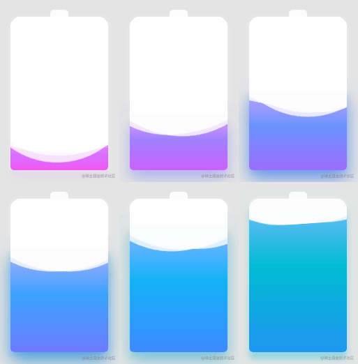
The complete implementation of the above effects can be clicked - cleverly use CSS to achieve cool charging animations

This concludes this article on how to implement various progress bar functions through HTML/CSS. That’s it for the introduction of the article. For more related html css progress bar content, please search the previous articles of downcodes.com or continue to browse the related articles below. I hope you will support downcodes.com in the future!