Using the CSS3 border-radius property, you can make "rounded corners" for any element. With the border-radius property, you can use the following rules:
(1) Four values: the first value is the upper left corner, the second value is the upper right corner, the third value is the lower right corner, and the fourth value is the lower left corner (2) Three values: the first value is The upper left corner, the second value is the upper right corner and the lower left corner, the third value is the lower right corner (3) Two values: the first value is the upper left corner and the lower right corner, the second value is the upper right corner and the lower left corner ( 4) One value: the four fillet values are the same
If you want the graphics to have a rounded corner effect, you only need to add one attribute, the border-radius attribute. If you want it to be very round, then increase this value.
 <!DOCTYPE html>
<html>
<head>
    <meta charset="UTF-8">
    <title>Homepage</title>
    <style>
       div{
            width: 100px;
            height: 100px;
            background-color: rgb(151, 26, 49);
            border-radius: 10px;
       }
       img{
        width: 100px;
        height: 100px;
        border-radius: 10px;
       }
    </style>
</head>
<body>
   <div>
    <img src="../vue/1.jpg">
   </div>
</body>
</html>
If you want it to be round, just write 100%.
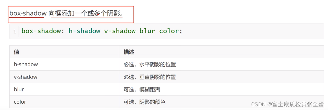
box-shadow shadow effect

margin: 0 auto: There is no need to control the top and bottom. Auto allows the left and right spaces to be evenly distributed, and then puts the box in the middle. This is centering. Letting the gaps between the left and right spaces be evenly distributed is what auto does.
0 means no shadow in the horizontal direction, the second 0 means no shadow in the vertical direction, and the third is the blur of the shadow.
 <!DOCTYPE html>
<html>
<head>
    <meta charset="UTF-8">
    <title>Homepage</title>
    <link href="" type="text/css" rel="stylesheet"/>
    <style type="text/css">
        div{
            width: 500px;
            height: 500px;
            background-color: greenyellow;
            margin: 0 auto;
            box-shadow: 0 0 50px rgba(0, 0, 0, 0.5);
        }
    </style>
</head>
<body>
    <div class="d1">
    </div>
</body>
</html>
This concludes this article about the new CSS3 features box-shadow shadow effect and rounded border-radius. For more information about the new CSS3 feature box-shadow, please search previous articles on downcodes.com or continue browsing below. Related articles, I hope you will support downcodes.com more in the future!