The css shadow effect is a css property we often use, but have you ever carefully understood it? Do you just need to copy it directly from Blue Lake when using it? Do you understand each of its parameters? What beautiful effects can be achieved using shadows?
Shadow effects are often used in web design. Shadow effects can highlight an element. Before the advent of CSS3, if we wanted to add shadow effects to text or elements, we needed to use images to achieve it, which was very inconvenient. After the emergence of CSS3, we can add shadow effects to text or elements through the two properties of text-shadow and box-shadow, without using any images.
1. text-shadow
Using the text-shadow property of CSS we can set a shadow effect for text. The syntax of the property is as follows:
text-shadow:offset-xoffset-yblurcolor;
The syntax is explained as follows:
(1) offset-x: required parameter, sets the horizontal offset of the shadow, which can be a negative value;
(2) offset-y: required parameter, sets the vertical offset of the shadow, which can be a negative value;
(3) blur: Optional parameter, set the radius of blur. The larger the value, the greater the blur, and the blurr the edge of the shadow. Negative values are not allowed;
(4) color: Optional parameter, set the color of the shadow. If the value is omitted or not specified, the value of the color attribute is used.
Tip: Use the text-shadow attribute to set multiple groups of shadow effects at the same time. Use commas to separate each group. The defined groups of shadow effects will be listed in order of definition, with the first shadow at the top, and so on. In addition, if you want to cancel the shadow effect of the text, you can set the value of the text-shadow attribute to none.
[Example] Use the text-shadow attribute to add a shadow effect to text:
<!doctypehtml><html><head><metacharset=UTF-8><metahttp-equiv=X-UA-Compatiblecontent=ie=edge><title>text-shadow</title></head><style>div :first-child{text-shadow:5px8px3pxred;}</style><body><div>Text-shadow</div></body></html>Running results:

Analysis: text-shadow: 5px 8px 3px red; Parameter description
2.box-shadow
Using the box-shadow property of CSS we can set the shadow effect for HTML elements. The syntax of the property is as follows:
box-shadow:h-shadowv-shadowblurspreadcolorinset;
The syntax is explained as follows:
(1) h-shadow: required parameter, sets the offset in the horizontal direction of the shadow, which can be a negative value;
(2) v-shadow: required parameter, sets the offset in the vertical direction of the shadow, which can be a negative value;
(3) blur: Optional parameter, set the radius of blur. The larger the value, the greater the blur, and the blurr the edge of the shadow. Negative values are not allowed;
(4) spread: optional parameter, set the size of the shadow;
(5) color: optional parameter, set the color of the shadow;
(6) inset: optional parameter, changes the default outer shadow (outset) to inner shadow.
Tip: Similar to the text-shadow attribute, the box-shadow attribute can also set multiple groups of shadow effects at the same time. Use commas to separate each group. The multiple groups of shadow effects defined will be listed in order of definition, with the first shadow at the end. Above, and so on.
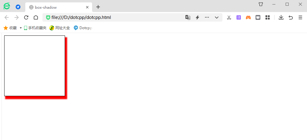
[Example] Use the box-shadow attribute to add a shadow effect to text:
<!doctypehtml><html><head><metacharset=UTF-8><metahttp-equiv=X-UA-Compatiblecontent=ie=edge><title>box-shadow</title></head><style >div:first-child{width:200px;height:200px;border:1pxsolidblack;box-shadow:5px8px3px2pxred;}</style><body><div></div></body></html>Running results:

Analysis: box-shadow: 5px 8px 3px 2px red; parameter description