1. Introduction to mix-blend-mode attribute 2. Common attribute values of mix-blend-mode 3. Mix-blend-mode attribute application 1. Application effect 2. Related code 4. Text intelligent adaptation background 1. Original style 2. Add Mix 3. Implementation code
The [ mix-blend-mode attribute ] in CSS describes how the content of an element should be blended with the content of the element's immediate parent element and the element's background ;
Used to set the blending mode between the background and foreground of an element; can be applied to any element; can be used with the background-image attribute to create a variety of different visual effects;
| serial number | attribute value | Blending modes and instructions |
|---|---|---|
| 1 | mix-blend-mode: normal ; | Normal: This property does not apply any blending; |
| 2 | mix-blend-mode: multiply ; | Multiply: The element is multiplied by the background and replaces the background color. The resulting color is always as dark as the background; |
| 3 | mix-blend-mode: overlay ; | Overlay: Multiplies or masks content based on background color, as opposed to Hard Light blending mode; |
| 4 | mix-blend-mode: screen ; | Screen: Multiply the background and content, then supplement the result. This will result in the content being lighter than the background color; |
| 5 | mix-blend-mode: darken ; | Darken ; when the content is darkened, the background will be replaced with the content, otherwise it will remain as is; |
| 6 | mix-blend-mode: lighten ; | Lighten: The background is replaced with lighter content; |
| 7 | mix-blend-mode: color-dodge ; | Color Lighten: This property lightens the background color to reflect the color of the content; |
| 8 | mix-blend-mode: color-burn ; | Color Lightening: This darkens the background to reflect the natural color of the content; |
| 9 | mix-blend-mode: hard-light ; | Hard light: Depending on the color of the content, this property will filter or multiply it; |
| 10 | mix-blend-mode: soft-light ; | Soft Light: Depending on the color of the content, this will darken or lighten it; |
| 11 | mix-blend-mode: difference ; | Difference : This will subtract the darker of the two colors from the lightest color; |
| 12 | mix-blend-mode: exclusion ; | Exclude : Similar to Difference, but with lower contrast; |
| 13 | mix-blend-mode: hue ; | Hue : Creates color by combining the hue of the content with the saturation and brightness of the background; |
| 14 | mix-blend-mode: saturation ; | Saturation : Creates color through the saturation of the content and the hue and brightness of the background; |
| 15 | mix-blend-mode: color ; | Color blending: Create colors based on the hue and saturation of the content and the brightness of the background; |
| 16 | mix-blend-mode: luminosity ; | Luminosity : Creates colors based on the luminosity of the content and the hue and saturation of the background. This is the opposite of the color property; |
normal : this attribute applies no blending whatsoever.multiply : the element is multiplied by the background and replaces the background color. The resulting color is always as dark as the background.screen : multiplies the background and the content then complements the result. This will result in content which is brighter than the background-color.overlay : multiplies or screens the content depending on the background color. This is the inverse of the hard-light blend mode.darken : the background is replaced with the content where the content is darker, otherwise, it is left as it was.lighten : the background is replaced with the content where the content is lighter.color-dodge : this attribute brightens the background color to reflect the color of the content.color-burn : this darkens the background to reflect the content's natural color.hard-light : depending on the color of the content this attribute will screen or multiply it.soft-light : depending on the color of the content this will darken or lighten it.difference : this subtracts the darker of the two colors from the lightest color.exclusion : similar to difference but with lower contrast.hue : creates a color with the hue of the content combined with the saturation and luminosity of the background.saturation : creates a color with the saturation of the content combined with the hue and luminosity of the background.color : creates a color with the hue and saturation of the content and the luminosity of the background.luminosity : creates a color with the luminosity of the content and the hue and saturation of the background. This is the inverse of the color attribute.
Effect display click
Application of mix-blend-mode attribute
<!DOCTYPE html>
<html lang="en">
<head>
<meta charset="UTF-8">
<meta name="viewport" content="width=device-width, initial-scale=1.0">
<title>Application of mix-blend-mode attribute</title>
<style>
* {
margin: 0;
padding: 0;
}
.container {
/* Define variables */
--mix-blend-mode: normal;
position: relative;
width: 300px;
height: 400px;
margin: 60px;
padding: 20px;
box-shadow: 0 0 6px 1px #999;
border-radius: 6px;
caret-color: transparent;
}
h3,
h4 {
margin-bottom: 10px;
}
.info-box {
width: 100%;
height: 24px;
line-height: 24px;
}
.circle {
position: absolute;
width: 200px;
height: 200px;
border-radius: 50%;
mix-blend-mode: var(--mix-blend-mode);
}
.red-box {
left: 70px;
top: 160px;
background-color: red;
}
.green-box {
left: 30px;
top: 220px;
background-color: lightgreen;
}
.blue-box {
left: 110px;
top: 220px;
background-color: blue;
}
</style>
</head>
<body>
<div class="container">
<h3>Application of mix-blend-mode attribute</h3>
<h4 class="value-box"></h4>
<div class="info-box"></div>
<div class="circle red-box"></div>
<div class="circle green-box"></div>
<div class="circle blue-box"></div>
</div>
</body>
<script>
// Get elements var container = document.querySelector(".container");
var valueBox = document.querySelector(".value-box");
var infoBox = document.querySelector(".info-box");
//The value list and description of the mix-blend-mode attribute;
var values = [
{
id: 1,
name: "normal",
value: "normal",
info: "This property does not apply any blending;"
},
{
id: 2,
name: "multiply",
value: "multiply",
info: "The element is multiplied by the background and replaces the background color. The resulting color is always as dark as the background;"
},
{
id: 3,
name: "overlay",
value: "overlay",
info: "Multiply or mask content based on background color; this is the opposite of hard light blending mode;"
},
{
ID: 4,
name: "screen",
value: "screen",
info: "Multiply the background and content and then supplement the result. This will result in the content being lighter than the background color;"
},
{
id: 5,
name: "Dark",
value: "darken",
info: "When the content is darkened, the background will be replaced with the content, otherwise it will remain as is;"
},
{
id: 6,
name: "brighten",
value: "lighten",
info: "The background is replaced with lighter content;"
},
{
id: 7,
name: "Color fades",
value: "color-dodge",
info: "This property lightens the background color to reflect the color of the content;"
},
{
id: 8,
name: "Color fades",
value: "color-burn",
info: "This darkens the background to reflect the natural color of the content;"
},
{
id: 9,
name: "hard light",
value: "hard-light",
info: "This property will filter or multiply the content based on its color."
},
{
id: 10,
name: "soft light",
value: "soft-light",
info: "Depending on the color of the content, this will darken or lighten it;"
},
{
id: 11,
name: "Difference",
value: "difference",
info: "This will subtract the darker of the two colors from the lightest color;"
}, {
id: 12,
name: "exclude",
value: "exclusion",
info: "Similar to difference, but with lower contrast;"
},
{
id: 13,
name: "Hue",
value: "hue",
info: "Create color by combining the hue of the content with the saturation and brightness of the background;"
},
{
id: 14,
name: "saturation",
value: "saturation",
info: "Create color from the saturation of the content and the hue and brightness of the background;"
},
{
id: 15,
name: "Color Mix",
value: "color",
info: "Create a color based on the hue and saturation of the content and the brightness of the background;"
},
{
id: 16,
name: "brightness",
value: "luminosity",
info: "Creates a color based on the luminosity of the content and the hue and saturation of the background. This is the opposite of a color property;"
}
]
changeMode();
//Change mix-blend-mode
function changeMode() {
let index = 0;
modAttr(index);
let timerId = setInterval(() => {
if (index >= values.length) {
clearInterval(timerId);
return;
}
index++;
modAttr(index)
}, 3000)
}
function modAttr(index) {
//Set the property value of mix-blend-mode container.style.setProperty('--mix-blend-mode', values[index].value);
valueBox.innerHTML = `mix-blend-mode : ${values[index].value};`;
infoBox.innerHTML = `${values[index].name}(${values[index].value}): ${values[index].info}`
}
</script>
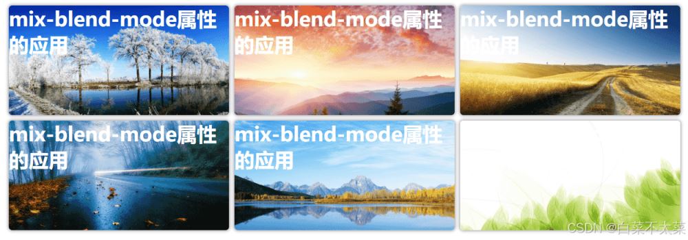
</html>Many times, text needs to be displayed next to the picture. If the color of the text and the picture are close, readability will be seriously affected;
How can I make text automatically adapt to the background?
You can use the mix-blend-mode attribute to set the color mixture of text and background to achieve the effect of text adapting to the background;
Text color is white; readability is poor on some images;
 .grid-item > h3 {
color: rgb(255, 255, 255);
...
}
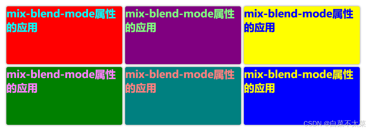
Set the mix-blend-mode attribute to difference ;
The initial value of the text color is white, but the difference will be calculated with the color value of each pixel corresponding to the background of the parent element to obtain a new color value;
Text color value - background color value = mixed pixel value; (each pixel)
For example: text color (255, 255, 255), background color (255, 255, 255), calculated value (0, 0, 0), displayed in black;
 .grid-item>h3 {
color: rgb(255, 255, 255);
/* Set blending mode -- calculate difference */
mix-blend-mode: difference;
...
}
Note: The difference blending mode here is applied to text;


 <!DOCTYPE html>
<html lang="en">
<head>
<meta charset="UTF-8">
<meta name="viewport" content="width=device-width, initial-scale=1.0">
<title>Text intelligently adapts to background</title>
<style>
* {
margin: 0;
padding: 0;
}
.container {
display: flex;
width: 100vw;
height: 60vh;
justify-content: center;
align-items: center;
}
.grid-container {
display: grid;
grid-template-columns: 400px 400px 400px;
grid-template-rows: 200px 200px;
gap: 10px;
}
.grid-item {
background-repeat: no-repeat;
background-size: cover;
border-radius: 6px;
box-shadow: 0 0 6px 1px #999;
}
.grid-item>h3 {
color: rgb(255, 255, 255);
font-size: 36px;
/* Set blending mode -- calculate difference */
mix-blend-mode: difference;
}
.grid-item:nth-child(1) {
/* background-image: url("D:\test\zyl-img\bg_1.jpg"); */
background-color: red
}
.grid-item:nth-child(2) {
/* background-image: url("D:\test\zyl-img\bg_2.jpg"); */
background-color: purple;
}
.grid-item:nth-child(3) {
/* background-image: url("D:\test\zyl-img\bg_3.jpg"); */
background-color: yellow;
}
.grid-item:nth-child(4) {
/* background-image: url("D:\test\zyl-img\bg_4.jpg"); */
background-color: green;
}
.grid-item:nth-child(5) {
/* background-image: url("D:\test\zyl-img\bg_5.jpg"); */
background-color: teal;
}
.grid-item:nth-child(6) {
/* background-image: url("D:\test\zyl-img\bg_6.jpg"); */
background-color: blue;
}
</style>
</head>
<body>
<div class="container">
<div class="grid-container">
<div class="grid-item">
<h3>Application of mix-blend-mode attribute</h3>
</div>
<div class="grid-item">
<h3>Application of mix-blend-mode attribute</h3>
</div>
<div class="grid-item">
<h3>Application of mix-blend-mode attribute</h3>
</div>
<div class="grid-item">
<h3>Application of mix-blend-mode attribute</h3>
</div>
<div class="grid-item">
<h3>Application of mix-blend-mode attribute</h3>
</div>
<div class="grid-item">
<h3>Application of mix-blend-mode attribute</h3>
</div>
</div>
</div>
</body>
</html>
This concludes this article about the detailed explanation of the mix-blend-mode attribute in CSS (setting the mix mode of an element). For more information about the css mix-blend-mode attribute, please search previous articles on downcodes.com or Continue to browse the relevant articles below, and I hope you will support downcodes.com in the future!