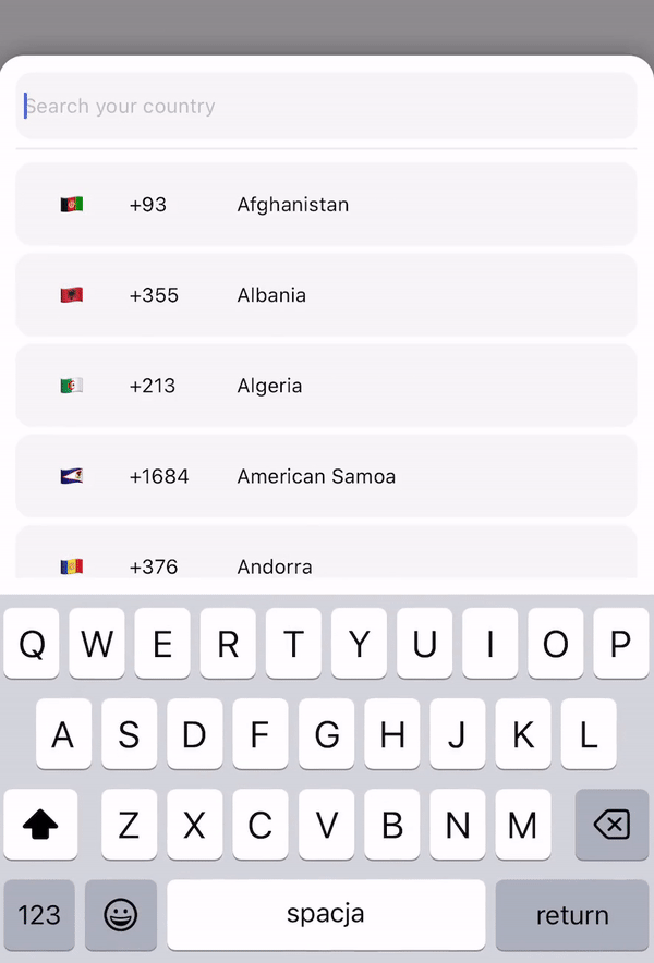
react native country codes picker
v2.3.2
⚡ ⚡ ⚡ 这个库。提供多语言。具有搜索功能的国家/地区选择器或国家/地区列表。完全跨平台,并支持 React-native 和 expo。没有找到您的国家?只需添加所需的国家或地区并创建 PR。 ⚡ ⚡ ⚡
我正在寻求增强这个库,并且很想听听您对希望在下一版本中看到哪些功能的想法。目前,我正在为即将发布的react-native-country-codes-picker 起草路线图。
考虑下一个版本是否应该基于重新启动的 v3 以提高性能,或者是否最好引入灵活的钩子而不是新组件。您的意见对于指导开发至关重要,因此请分享您对您希望看到的最有价值的添加或更改的想法。
如果你有什么有趣的事情!请写信给我们:)
世博会: expo install react-native-country-codes-picker
npm: npm i react-native-country-codes-picker
纱线: yarn add react-native-country-codes-picker
 import { CountryPicker } from "react-native-country-codes-picker" ;

export default function App ( ) {
  const [ show , setShow ] = useState ( false ) ;
  const [ countryCode , setCountryCode ] = useState ( '' ) ;

  return (
    < View style = { styles . container } >
      < TouchableOpacity
        onPress = { ( ) => setShow ( true ) }
        style = { {
            width : '80%' ,
            height : 60 ,
            backgroundColor : 'black' ,
            padding : 10 ,
        } }
      >
        < Text style = { {
            color : 'white' ,
            fontSize : 20
        } } >
            { countryCode }
        < / Text >
      < / TouchableOpacity >

      // For showing picker just put show state to show prop
      < CountryPicker
        show = { show }
        // when picker button press you will get the country object with dial code
        pickerButtonOnPress = { ( item ) => {
          setCountryCode ( item . dial_code ) ;
          setShow ( false ) ;
        } }
      / >
    < / View >
  ) ;
} import { CountryPicker } from "react-native-country-codes-picker" ;
function ListHeaderComponent ( { countries , lang , onPress } ) {
return (
< View
style = { {
paddingBottom : 20 ,
} }
>
< Text >
Popular countries
< / Text >
{ countries ?. map ( ( country , index ) => {
return (
< CountryButton key = { index } item = { country } name = { country ?. name ?. [ lang || 'en' ] } onPress = { ( ) => onPress ( country ) } / >
)
} ) }
< / View >
)
}
export default function App ( ) {
const [ show , setShow ] = useState ( false ) ;
const [ countryCode , setCountryCode ] = useState ( '' ) ;
return (
< View style = { styles . container } >
< TouchableOpacity
onPress = { ( ) => setShow ( true ) }
style = { {
width : '80%' ,
height : 60 ,
backgroundColor : 'black' ,
padding : 10 ,
} }
>
< Text style = { {
color : 'white' ,
fontSize : 20
} } >
{ countryCode }
< / Text >
< / TouchableOpacity >
// For showing picker just put show state to show prop
< CountryPicker
show = { show }
// when picker button press you will get the country object with dial code
pickerButtonOnPress = { ( item ) => {
setCountryCode ( item . dial_code ) ;
setShow ( false ) ;
} }
ListHeaderComponent = { ListHeaderComponent }
popularCountries = { [ 'en' , 'ua' , 'pl' ] }
/ >
< / View >
) ;
} import { CountryList } from "react-native-country-codes-picker" ;
export default function App ( ) {
const [ countryCode , setCountryCode ] = useState ( '' ) ;
return (
< View style = { styles . container } >
< View
style = { {
width : '80%' ,
height : 60 ,
backgroundColor : 'black' ,
padding : 10 ,
} }
>
< Text style = { {
color : 'white' ,
fontSize : 20
} } >
{ countryCode }
< / Text >
< / TouchableOpacity >
// All props the same as for picker
< CountryList
lang = { 'pl' }
pickerButtonOnPress = { ( item ) => {
setCountryCode ( item . dial_code ) ;
} }
/ >
< / View >
) ;
}以下是您可以传递给 React 组件的 props。
| 支柱 | 类型 | 默认 | 例子 | 描述 |
|---|---|---|---|---|
| 展示 | 布尔值 | 该道具用于显示模态。将您的演出状态放在这里。 | ||
| 按下选择器按钮 | 功能 | (国家/地区) => setCode(国家/地区.dial_code) | 将您的一个或多个函数放在这里,以便从选择器获取国家/地区数据。 | |
| 输入占位符 | 细绳 | inputPlaceholder={'您的占位符'} | 如果您的输入需要自定义占位符,您可能需要此道具。 | |
| 搜索留言 | 细绳 | searchMessage={'这里有一些搜索消息'} | 如果您想自定义搜索消息,只需使用此道具。 | |
| 郎 | 细绳 | '恩' | 郎={'pl'} | 如果您需要更改语言。只需输入支持的语言之一即可。或者,如果您没有找到所需的语言,只需添加它们并创建 PR :) |
| 启用模态避免 | 布尔值 | 错误的 | 启用ModalAvoiding={true} | 模态是否应该避免键盘?在 android 上工作需要与带有值平移的 androidWindowSoftInputMode 一起使用,默认情况下 android 将避免使用键盘 |
| androidWindow软输入模式 | 细绳 | androidWindowSoftInputMode={'平移'} | 基本上android本身会避免键盘,如果你想使用自定义避免你可以使用这个道具 | |
| 项目模板 | 反应节点 | 国家按钮 | itemTemplate={您的TemplateComponentsHere} | 此参数获取一个 React Node 元素,将其呈现为列表中每个项目的模板。这些属性被发送到项目:key、item、style、name 和 onPress |
| 风格 | 目的 | 风格={{yoursStylesHere}} | 如果您想更改组件的样式,您可能需要这个道具。您可以检查下面的样式部分。 | |
| 禁用背景 | 布尔值 | 错误的 | 禁用背景 | 如果你不想显示模态背景,请传递此道具。 |
| 背景按下 | 功能 | 无效的 | onBackdropPress={() => setShow(false)} | 如果您想在用户点击模态背景时关闭模态。 |
| 初始状态 | 细绳 | 初始状态={'+380'} | 有时您需要预先选择国家/地区,例如按用户当前位置,以便您可以使用此道具。 | |
| 排除国家 | 大批 | 排除的国家/地区={['RU', 'BY']} | 在此属性中,您可以通过添加代码来定义要删除的国家/地区列表。 | |
| 只显示 | 大批 | showOnly={['UA', 'EN']} | 此属性允许您配置要显示的国家/地区。 | |
| 热门国家 | 大批 | 流行国家={['UA', 'EN']} | 此属性允许您将流行国家/地区数组发送到 ListHeaderComponent。 | |
| 列表头组件 | JSX.Element | ListHeaderComponent={ListHeaderComponent} | 该道具允许您创建标题组件以在列表顶部显示热门国家/地区!使用 ListHeaderComponent 检查示例部分 |
❕ 如果需要,您还可以使用所有其他 FlatList 和 TextInput 道具。 ❕
 < CountryPicker
    show = { show }
    lang = { 'cz' }
    style = { {
        // Styles for whole modal [View]
        modal : {
            height : 500 ,
            backgroundColor : 'red'
        } ,
        // Styles for modal backdrop [View]
        backdrop : {

        } ,
        // Styles for bottom input line [View]
        line : {

        } ,
        // Styles for list of countries [FlatList]
        itemsList : {

        } ,
        // Styles for input [TextInput]
        textInput : {
              height : 80 ,
              borderRadius : 0 ,
        } ,
        // Styles for country button [TouchableOpacity]
        countryButtonStyles : {
              height : 80
        } ,
        // Styles for search message [Text]
        searchMessageText : {

        } ,
        // Styles for search message container [View]
        countryMessageContainer : {

        } ,
        // Flag styles [Text]
        flag : {

        } ,
        // Dial code styles [Text]
        dialCode : {

        } ,
        // Country name styles [Text]
        countryName : {

        }
    } }
    pickerButtonOnPress = { ( item ) => {
        setCountryCode ( item . dial_code ) ;
        setShow ( false ) ;
    } }
/ > "name" : {
"en" : "English" ,
"ru" : "Russian" ,
"pl" : "Polish" ,
"ua" : "Ukrainian" ,
"cz" : "Czech" ,
"by" : "Belarusian" ,
"pt" : "Portuguese" ,
"es" : "Espanol" ,
"ro" : "Romanian" ,
"bg" : "Bulgarian" ,
"de" : "German" ,
"fr" : "French" ,
"nl" : "Dutch" ,
"it" : "Italian" ,
"cn" : "Chinese" ,
"ee" : "Estonian" ,
"jp" : "Japanese" ,
"he" : "Hebrew" ,
"tr" : "Turkish"
} ,您可以添加您的语言。如果你需要的话!但之后请做一个 PR,这会对其他人有所帮助。
如果您正在使用此包并且需要在自动化测试中定位其中一个组件,我们目前确实为以下组件提供了testID :
FlatList组件:'countryCodesPickerFlatList'TextInput组件: 'countryCodesPickerSearchInput'TouchableOpacity ) 组件: 'countryCodesPickerCountryButton'

