ngx mat select search
v7.0.0
https://github.com/bithost-gmbh/ngx-mat-select-search
Angular 组件提供一个输入字段,用于搜索/过滤 Angular 材质库的 MatSelect 选项。
请参阅以下网址的实际操作:
https://stackblitz.com/github/bithost-gmbh/ngx-mat-select-search-example
请参阅示例代码、在浏览器中构建、最新版本、最新材料版本
https://bithost-gmbh.github.io/ngx-mat-select-search/
预构建,最新版本,旧材料版本,适用于移动设备
重要提示:该项目是 Angular/Components#5697 的临时实现。目标是在官方 Angular Material 存储库中实现,将创建一个新的 PR。
欢迎贡献,请打开问题并最好提交拉取请求。
我们的目标是通过不断改进NgxMatSelectSearch并快速响应错误报告来提供尽可能最好的服务。我们完全免费这样做。如果您觉得这个库对您有用并为您和您的企业节省了一些宝贵的时间,请考虑捐赠以支持其维护和进一步发展。
非常感谢我们的资金支持!
菲利普·维克托·舒尔茨-克林高夫 |
非常感谢我们所有的社区贡献者!
埃斯特万·格林 | 马库斯·马赫勒 | 特里斯坦 | 爵士3e | 托尼·H | 米哈乌·斯塔维奇 |
阿莱克斯·费雷 | 无效的 | 火焰行者 | 克里斯蒂安·拉杜卡努 | 达米安·米兰达 | 戴恩·范德比尔特 |
大卫·桑索姆 | 埃德加·谢尔曼 | 埃仁迪斯 | 古斯塔沃·米兰达 | 亨诺·劳因格 | 无效的 |
林宜比利斯 | 让-弗朗索瓦·塞雷 | 乔·德科克 | 乔马尔·约翰尼 | 乔纳森·科尔伯格 | 克里斯托夫·吉利斯 |
梅尔罗伊·范登伯格 | 穆罕默德·阿赫桑·阿亚兹 | 奥维迪尤斯·斯图卡斯 | 雷·苏尔泽 | 罗伯特·帕蒂斯 | 罗兰·布罗克玛 |
塞巴斯蒂安·威尔兹比基 | 无效的 | 斯塔斯·阿马塞夫 | 蒂埃里·尼谢尔维泽 | 弗拉德·约夫 | 无效的 |
无效的 | 约书亚 | 无效的 | 无效的 |
在您的项目中安装ngx-mat-select-search :
npm install ngx-mat-select-search
在您的app.module.ts中导入NgxMatSelectSearchModule例如:
 import { MatSelectModule } from '@angular/material' ;
import { NgxMatSelectSearchModule } from 'ngx-mat-select-search' ;

@ NgModule ( {
  imports : [
    ...
    MatSelectModule ,
    NgxMatSelectSearchModule
  ] ,
} )
export class AppModule { }通过将ngx-mat-select-search组件放置在<mat-option>元素内,可以在mat-select元素内使用 ngx-mat-select-search 组件:
< mat-form-field >
< mat-select [formControl] =" bankCtrl " placeholder =" Bank " #singleSelect >
< mat-option >
< ngx-mat-select-search [formControl] =" bankFilterCtrl " > </ ngx-mat-select-search >
</ mat-option >
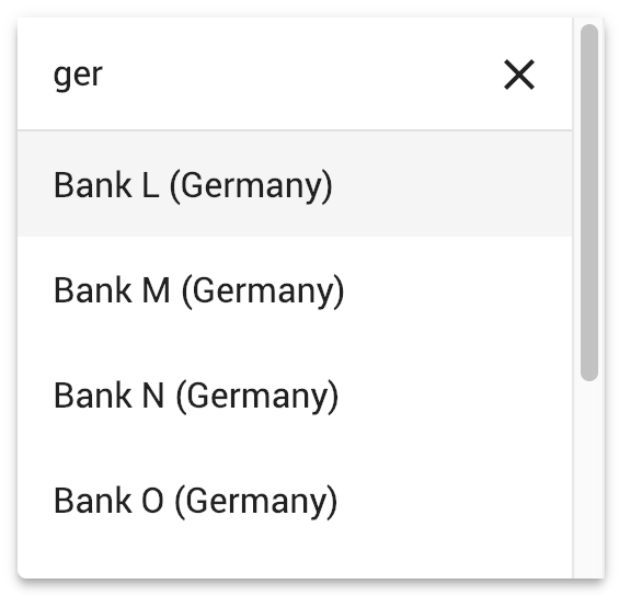
< mat-option *ngFor =" let bank of filteredBanks | async " [value] =" bank " >
{{bank.name}}
</ mat-option >
</ mat-select >
</ mat-form-field >请参阅 https://github.com/bithost-gmbh/ngx-mat-select-search/tree/master/src/app/examples 中的示例,了解如何连接ngx-mat-select-search并过滤可用选项。或者查看 https://github.com/bithost-gmbh/ngx-mat-select-search-example 在独立应用程序中查看它。
您也可以将其与模板驱动的表单一起使用,如下所示:
< ngx-mat-select-search ngModel (ngModelChange) =" filterMyOptions($event) " >要更改标签,请使用 API 部分中指定的输入,如下所示:
 < ngx-mat-select-search [formControl] =" bankFilterCtrl "
                       placeholderLabel =" Find bank... "
                       noEntriesFoundLabel =" 'no matching bank found' " > </ ngx-mat-select-search >
要使用 i18n API 翻译标签,请添加相应的i18n-...属性:
 < ngx-mat-select-search [formControl] =" bankFilterCtrl "
                       placeholderLabel =" Find bank... "
                       i18n-placeholderLabel
                       noEntriesFoundLabel =" 'no matching bank found' "
i18n-noEntriesFoundLabel > </ ngx-mat-select-search >@angular/core : ^15.0.0 || ^16.0.0 || ^17.0.0 || ^18.0.0 || ^19.0.0@angular/material : ^15.0.0 || ^16.0.0 || ^17.0.0 || ^18.0.0 || ^19.0.0与MatSelectModule ( @angular/material/select ) 6.0.0@angular/core : ^15.0.0@angular/material : ^15.0.0与MatLegacySelectModule ( @angular/material/legacy-select ) 5.0.0@angular/core : ^12.0.0 || ^13.0.0 || ^14.0.0@angular/material : ^12.0.0 || ^13.0.0 || ^14.0.0 3.3.3@angular/core : ^8.0.0 || ^9.0.0 || ^10.0.0 || ^11.0.0 || ^12.0.0 || ^13.0.0@angular/material : ^8.0.0 || ^9.0.0 || ^10.0.0 || ^11.0.0 || ^12.0.0 || ^13.0.0 1.8.0@angular/core : ^5.0.0 || ^6.0.0 || ^7.0.0 || ^8.0.0@angular/material : ^5.0.0 || ^6.0.0 || ^7.0.0 || ^8.0.0MatSelectSearchComponent实现 ControlValueAccessor 接口。此外,它还提供以下输入:
  /** Label of the search placeholder */
  @ Input ( ) placeholderLabel = 'Suche' ;

  /** Type of the search input field */
  @ Input ( ) type = 'text' ;

  /** Font-based icon used for displaying Close-Icon */
  @ Input ( ) closeIcon = 'close' ;

  /** SVG-based icon used for displaying Close-Icon. If set, closeIcon is overridden */
  @ Input ( ) closeSvgIcon ?: string ;

  /** Label to be shown when no entries are found. Set to null if no message should be shown. */
  @ Input ( ) noEntriesFoundLabel = 'Keine Optionen gefunden' ;

  /**
   * Whether the search field should be cleared after the dropdown menu is closed.
   * Useful for server-side filtering. See [#3](https://github.com/bithost-gmbh/ngx-mat-select-search/issues/3)
   */
  @ Input ( ) clearSearchInput = true ;

  /** Whether to show the search-in-progress indicator */
  @ Input ( ) searching = false ;

  /** Disables initial focusing of the input field */
  @ Input ( ) disableInitialFocus = false ;

  /** Enable clear input on escape pressed */
  @ Input ( ) enableClearOnEscapePressed = false ;

  /**
   * Prevents home / end key being propagated to mat-select,
   * allowing to move the cursor within the search input instead of navigating the options
   */
  @ Input ( ) preventHomeEndKeyPropagation = false ;

  /** Disables scrolling to active options when option list changes. Useful for server-side search */
  @ Input ( ) disableScrollToActiveOnOptionsChanged = false ;

  /** Adds 508 screen reader support for search box */
  @ Input ( ) ariaLabel = 'dropdown search' ;

  /** Whether to show Select All Checkbox (for mat-select[multi=true]) */
  @ Input ( ) showToggleAllCheckbox = false ;

  /** Select all checkbox checked state */
  @ Input ( ) toggleAllCheckboxChecked = false ;

  /** select all checkbox indeterminate state */
  @ Input ( ) toggleAllCheckboxIndeterminate = false ;

  /** Display a message in a tooltip on the toggle-all checkbox */
  @ Input ( ) toggleAllCheckboxTooltipMessage = '' ;

  /** Define the position of the tooltip on the toggle-all checkbox. */
  @ Input ( ) toggleAllCheckboxTooltipPosition: 'left' | 'right' | 'above' | 'below' | 'before' | 'after' = 'below' ;

  /** Show/Hide the search clear button of the search input */
  @ Input ( ) hideClearSearchButton = false ;

  /**
   * Always restore selected options on selectionChange for mode multi (e.g. for lazy loading/infinity scrolling).
   * Defaults to false, so selected options are only restored while filtering is active.
   */
  @ Input ( ) alwaysRestoreSelectedOptionsMulti = false ;

  /**
   * Recreate array of selected values for multi-selects.
   *
   * This is useful if the selected values are stored in an immutable data structure.
   */
  @ Input ( ) recreateValuesArray = false ;

  /** Output emitter to send to parent component with the toggle all boolean */
  @ Output ( ) toggleAll = new EventEmitter < boolean > ( ) ;
为了自定义搜索图标,请将ngxMatSelectSearchClear添加到自定义清除项( mat-icon或任何其他元素)并将其放置在ngx-mat-select-search组件内:
 < ngx-mat-select-search >
   < mat-icon ngxMatSelectSearchClear > delete </ mat-icon >
</ ngx-mat-select-search >如果只需要更改图标,则可以使用输入closeIcon和closeSvgIcon 。
为了自定义 no items found 元素,请将ngxMatSelectNoEntriesFound添加到您的自定义项( mat-icon, span, button或任何其他元素)并将其放置在ngx-mat-select-search组件中:
 < ngx-mat-select-search >
  < span ngxMatSelectNoEntriesFound >
    No entries found
    < button mat-button color =" primary " >
      Add < mat-icon > add </ mat-icon >
    </ button >
</ span >
</ ngx-mat-select-search > 可以按如下方式嵌入 CSS 类mat-select-search-custom-header-content自定义内容:
 < ngx-mat-select-search >
   < div class =" mat-select-search-custom-header-content " > something special </ div >
</ ngx-mat-select-search > 提供MAT_SELECTSEARCH_DEFAULT_OPTIONS InjectionToken,可以全局设置多个@Input()属性的默认值。请参阅MatSelectSearchComponent相应@Input()属性的文档。
例子:
 import { MAT_SELECTSEARCH_DEFAULT_OPTIONS , MatSelectSearchOptions } from 'ngx-mat-select-search' ;

@ NgModule ( {
  ...
  providers : [
    {
      provide : MAT_SELECTSEARCH_DEFAULT_OPTIONS ,
      useValue : < MatSelectSearchOptions > {
        closeIcon : 'delete' ,
        noEntriesFoundLabel : 'No options found' ,
      }
    }
  ]
} )
class AppModule { } 该项目是使用 Angular CLI 版本 1.7.1 生成的。
为开发服务器运行ng serve 。导航到http://localhost:4200/ 。如果您更改任何源文件,该应用程序将自动重新加载。
运行ng build来构建项目。构建工件将存储在dist/目录中。使用-prod标志进行生产构建。
运行npm run build-lib来构建库并生成 NPM 包。构建工件将存储在dist-lib/文件夹中。
要发布,请运行cd dist-lib/ && npm publish 。
运行npm run test以通过 Karma 执行单元测试。


