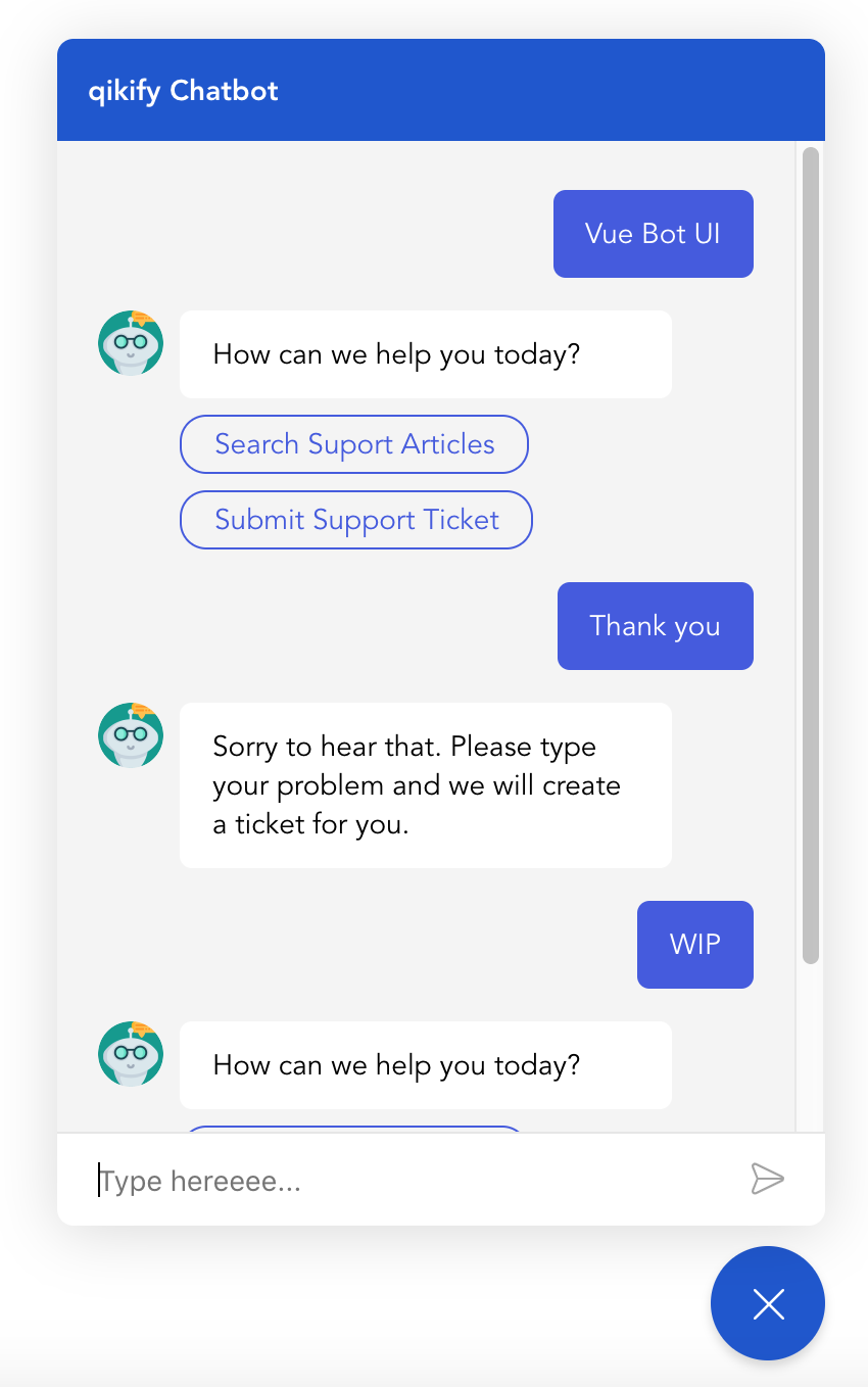
I build for my private project, but I tried to bring as many options as I think someone need it, so feel free to use it.
Demo page is coming soon.

npm install vue-bot-ui

// or
yarn add vue-bot-uiImport & register the component
import { VueBotUI } from 'vue-bot-ui'

export default {
  components: {
    VueBotUI,
  },
  ...
}
And use it:
<VueBotUI
  :messages="data"
  :options="botOptions"
  @msg-send="messageSendHandler"
/>
data () {
return {
data: [], // See Data example below
botOptions: {
// See the list of options below
}
}
}List of available props to use in the component:
| Name | Type | Default | Description |
|---|---|---|---|
messages |
Array | [] | Required. Data of Messages |
options |
Object | see below | Some options to customize UI |
bot-typing |
Boolean | false | If true, the bot typing indicator will show |
input-disable |
Boolean | false | If true, message input will be disabled |
is-open |
Boolean | false | If true, the board will open from init |
open-delay |
Number | undefined | Delay before opening from init (in ms). Requires is-open to be true
|
List of available options to customize UI:
| Name | Type | Default | Description |
|---|---|---|---|
botTitle |
String | 'Chatbot' | The bot name that will be shown on header of the board |
colorScheme |
String | '#1b53d0' | Background color of bubble button & board header |
textColor |
String | '#fff' | Color of bubble button icon & board header title |
bubbleBtnSize |
Number | 56 | Size of bubble button (px) |
animation |
Boolean | true | Set to false to disable animation of bubble button icon & board showing |
boardContentBg |
String | '#fff' | Background color of board messages box |
botAvatarSize |
Number | 32 | Size of bot avatar (px) |
botAvatarImg |
String | 'http://placehold.it/200x200' | Avatar image |
msgBubbleBgBot |
String | '#f0f0f0' | Background color of Bot message |
msgBubbleColorBot |
String | '#000' | Text color of Bot message |
msgBubbleBgUser |
String | '#4356e0' | Background color of user message |
msgBubbleColorUser |
String | '#fff' | Text color of user message |
inputPlaceholder |
String | 'Message' | The placeholder for message input |
inputDisableBg |
String | '#fff' | Background color for the disabled input, mixed with opacity: 0.2
|
inputDisablePlaceholder |
String | null | Placeholder message for disabled input |
This is the most important part you need to know, because you need these to integrate your bot API.
Take a look my App.vue file if you need an example.
| Name | Params | Description |
|---|---|---|
init |
Fire everytime the board is opened | |
msg-send |
value (Object) | Fire when user hit Send or select an option |
destroy |
Fire when board is closed |
Use msg-send to get the message from user and trigger request to bot API.
Trigger Events:
| Name | Description |
|---|---|
botui-open |
To open the board |
botui-close |
To close the board |
botui-toggle |
To toggle open/close the board |
Common pattern / Example data:
const messages = [
  {
    agent: 'bot', // Required. 'bot' or 'user'
    type: 'text', // Required. Bubble message component type: 'text' / 'button'
    text: 'Hello. How can I help you', // Required. The message
    disableInput: false, // Disable message input or not
    ...
  },
  {
    agent: 'user',
    type: 'text', // always
    text: 'I need a new laptop',
  },
  ...
]
Component list:
Current components supported by this package, path to files: components/MessageBubble/..
type: 'text'
{
  agent: 'bot',
  type: 'text',
  text: 'Hello. How can I help you',
  disableInput: false,
}type: 'button'
{
  agent: 'bot',
  type: 'button',
  text: 'Select the option below',
  disableInput: true,
  options: [
    {
      text: 'Open Google',
      value: 'https://google.com',
      action: 'url'
    },
    {
      text: 'Submit Support Ticket',
      value: 'submit_ticket',
      action: 'postback' // Request to API
    },
    ...
  ],
}List of available slots:
| Name | Description |
|---|---|
header |
Board header, that contains Bot name. |
actions |
The slot beside Send button in the input message. You can add extra actions here (emoji, attach,...) |
sendButton |
Send button icon, you can change it to text. |
bubbleButton |
Bubble button that contains BubbleIcon & CloseIcon as default. |
botTyping |
Bot Typing message bubble that contains 3 dots indicator as default. |
You can overwrite the CSS by class name. Each type and state has separate class for you to customize.
Feature request: Feel free to open an issue to ask for a new feature.
# Clone repo
git clone https://github.com/JuzSer/vue-bot-ui

# Install packages
yarn

# Development & Demo - http://localhost:1901
yarn serve

# Build main library
yarn build-bundleMany things...
target of button optionsThank you! ?