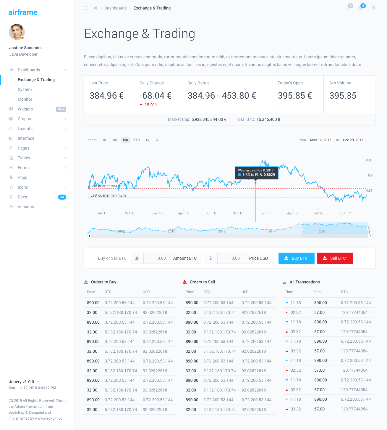
Note Version HTML/CSS is available here: https://github.com/0wczar/airframe
High Quality Dashboard / Admin / Analytics template that works great on any smartphone, tablet or desktop. Available as Open Source as MIT license.

Airframe Dashboard with a minimalist design and innovative Light UI will let you build an amazing and powerful application with great UI. Perfectly designed for large scale applications, with detailed step by step documentation.
This Airframe project is a typical Webpack based React app, React Router also included together with customised reactstrap. This project has all of it's few dependencies up to date and it will be updated on a regular basis. This project doesn't support SSR. If you need it - use the NextJs based version.
Airframe Dashboard has a huge collection of components that can be used in a great number of combinations and variations. It can be used in all types of custom web applications such as CRMs, CMSs, Admin Panels, Admin Dashboards, Analytics, etc.
Tomasz Owczarczyk:
You need to have NodeJs (>= 10.0.0) installed on your local machine, before attempting to run a dev environment.
npm install.Make sure you have a file called .npmrc in the extracted directory. Those files are typically hidden in Unix based systems.
To start the development environment type npm start in the console. This will start a development server with hot reloading enabled.
To create a production build type npm run build:prod. After the process is complete you can copy the output from the /dist/ directory. The output files are minified and ready to be used in a production environment.
You can customize the build to suit your specific needs by adjusting the Webpack configuration files. Those files can be found in the /build directory. For more details checkout the documentation of WebPack.
Some points of interest about the project project structure:
app/components - custom React components should go hereapp/styles - styles added here won't be treated as CSS Modules, so any global classes or library styles should go hereapp/layout - the AppLayout component can be found here which hosts page contents within itself; additional sidebars and navbars should be placed in ./components/ subdir.app/colors.js - exports an object with all of the defined colors by the Dashboard. Useful for styling JS based components - for example charts.app/routes - PageComponents should be defined here, and imported via index.js. More details on that later.Route components should be placed in separate directories inside the /routes/ directory. Next you should open /routes/index.js file and attach the component. You can do this in two diffrent ways:
Pages imported statically will be loaded eagerly on PageLoad with all of the other content. There will be no additional loads when navigating to such pages BUT the initial app load time will also be longer. To add a statically imported page it should be done like this:
// Import the default component
import SomePage from './SomePage';
// ...
export const RoutedContent = () => {
    return (
        <Switch>
            { /* ... */ }
            { /* Define the route for a specific path */ }
            <Route path="/some-page" exact component={SomePage} />
            { /* ... */ }
        </Switch>
    );
}Dynamically imported pages will only be loaded when they are needed. This will decrease the size of the initial page load and make the App load faster. You can use React.Suspense to achieve this. Example:
// Create a Lazy Loaded Page Component Import
const SomeAsyncPage = React.lazy(() => import('./SomeAsyncPage'));
// ...
export const RoutedContent = () => {
    return (
        <Switch>
            { /* ... */ }
            { /*
                Define the route and wrap the component in a React.Suspense loader.
                The fallback prop might contain a component which will be displayed
                when the page is loading.
            */ }
            <Route path="/some-async-page">
                <React.Suspense fallback={ <PageLoader /> }>
                    <SomeAsyncPage />
                </React.Suspense>
            </Route>
        </Switch>
    );
}Sometimes you might want to display additional content in the Navbar or the Sidebar. To do this you should define a customized Navbar/Sidebar component and attach it to a particular route. Example:
import { SidebarAlternative } from './../layout/SidebarAlternative';
import { NavbarAlternative } from './../layout/NavbarAlternative';
// ...
export const RoutedNavbars  = () => (
    <Switch>
        { /* Other Navbars: */}
        <Route
            component={ NavbarAlternative }
            path="/some-custom-navbar-route"
        />
        { /* Default Navbar: */}
        <Route
            component={ DefaultNavbar }
        />
    </Switch>
);

export const RoutedSidebars = () => (
    <Switch>
        { /* Other Sidebars: */}
        <Route
            component={ SidebarAlternative }
            path="/some-custom-sidebar-route"
        />
        { /* Default Sidebar: */}
        <Route
            component={ DefaultSidebar }
        />
    </Switch>
);You can set the color scheme for the sidebar and navbar by providing initialStyle and initialColor to the <ThemeProvider> component which should be wrapping the <Layout> component.
Possible initialStyle values:
lightdarkcolorPossible initialColor values:
primarysuccessinfowarningdangerindigopurplepinkyellowYou can change the color scheme on runtime by using the ThemeConsumer from the components. Example:
// ...
import { ThemeContext } from './../components';
// ...
const ThemeSwitcher = () => (
    <ThemeConsumer>
        ({ onChangeTheme }) => (
            <React.Fragment>
                <Button onClick={() => onThemeChange({ style: 'light' })}>
                    Switch to Light
                </Button>
                <Button onClick={() => onThemeChange({ style: 'dark' })}>
                    Switch to Dark
                </Button>
            </React.Fragment>
        )
    </ThemeConsumer>
);
Options provided by the ThemeConsumer:
Used plugins in this dashboard: