ngx mat select search
v7.0.0
https://github.com/bithost-gmbh/ngx-mat-select-search
Angular Material 라이브러리의 MatSelect 옵션을 검색/필터링하기 위한 입력 필드를 제공하는 Angular 구성 요소입니다.
실제 작동 모습을 확인하세요.
https://stackblitz.com/github/bithost-gmbh/ngx-mat-select-search-example
예제 코드 보기, 브라우저에서 빌드, 최신 버전, 최신 자료 버전
https://bithost-gmbh.github.io/ngx-mat-select-search/
사전 제작, 최신 버전, 이전 자료 버전, 모바일에서 작동
중요 참고 사항 : 이 프로젝트는 각도/컴포넌트#5697의 임시 구현을 의미합니다. 목표는 공식 Angular Material 저장소에 구현하는 것이며 새로운 PR이 생성됩니다.
기여를 환영합니다. 이슈를 열고 풀 요청(Pull Request)을 제출하는 것이 좋습니다.
우리는 NgxMatSelectSearch 지속적으로 개선하고 버그 보고서에 빠르게 대응하여 가능한 최고의 서비스를 제공하는 것을 목표로 합니다. 우리는 이 작업을 완전히 무료로 수행합니다. 이 라이브러리가 귀하에게 유용하고 귀하와 귀하의 비즈니스에 귀중한 시간을 절약해 주었다고 생각하신다면, 유지 관리 및 추가 개발을 지원하기 위해 기부하는 것을 고려해 보십시오.
재정 후원자 여러분께 진심으로 감사드립니다!
필립 빅터 슐츠-클링가우프 |
모든 커뮤니티 기여자 여러분께 진심으로 감사드립니다!
에스테반 게링 | 마르쿠스 메흘러 | 트리스탄 | Sirh3e | 토니 H | 미하우 스타비키 |
알렉스 페레 | 널 | 블레이즈 워커 | 크리스티안 라두카누 | 데미안 미란다 | 데인 밴더빌트 |
데이비드 샌섬(David Sansome) | 에드가 샤이어만 | 에렌디스 | 구스타보 미란다 | 헤노 라우잉거 | 널 |
이블리스 린 | 장 프랑수아 세레 | 조 디콕 | 조말 조니 | 조나단 콜버그 | 크리스토프 길리스 |
멜로이 반 덴 버그 | 무함마드 아산 아야즈 | 오비디유스 스투카스 | 레이 수엘저 | 로버트 패티스 | 롤랜드 브로케마 |
세바스티안 비에르츠비키 | 널 | 스타스 아마세프 | 티에리 니셀비처 | 블라드 이오페 | 널 |
널 | 여호수아 | 널 | 널 |
프로젝트에 ngx-mat-select-search 설치합니다.
npm install ngx-mat-select-search
예를 들어 app.module.ts 에서 NgxMatSelectSearchModule 을 가져옵니다.
import { MatSelectModule } from '@angular/material' ;
import { NgxMatSelectSearchModule } from 'ngx-mat-select-search' ;
@ NgModule ( {
imports : [
...
MatSelectModule ,
NgxMatSelectSearchModule
] ,
} )
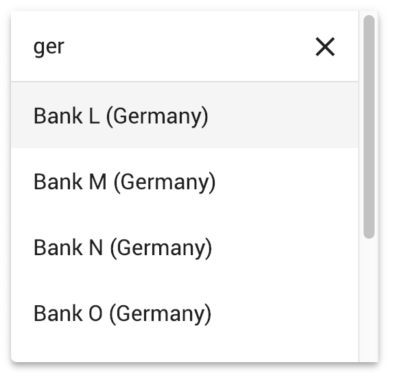
export class AppModule { } mat-select 요소 내에서 ngx-mat-select-search 구성 요소를 <mat-option> 요소 안에 배치하여 사용합니다.
 < mat-form-field >
  < mat-select [formControl] =" bankCtrl " placeholder =" Bank " #singleSelect >
    < mat-option >
      < ngx-mat-select-search [formControl] =" bankFilterCtrl " > </ ngx-mat-select-search >
    </ mat-option >
    < mat-option *ngFor =" let bank of filteredBanks | async " [value] =" bank " >
      {{bank.name}}
    </ mat-option >
  </ mat-select >
</ mat-form-field >
ngx-mat-select-search 연결하고 사용 가능한 옵션을 필터링하는 방법은 https://github.com/bithost-gmbh/ngx-mat-select-search/tree/master/src/app/examples의 예를 참조하세요. 또는 독립형 앱에서 보려면 https://github.com/bithost-gmbh/ngx-mat-select-search-example을 살펴보세요.
또는 다음과 같이 템플릿 기반 양식과 함께 사용할 수도 있습니다.
< ngx-mat-select-search ngModel (ngModelChange) =" filterMyOptions($event) " >라벨을 변경하려면 다음과 같이 API 섹션에 지정된 입력을 사용하세요.
 < ngx-mat-select-search [formControl] =" bankFilterCtrl "
                       placeholderLabel =" Find bank... "
                       noEntriesFoundLabel =" 'no matching bank found' " > </ ngx-mat-select-search >
라벨 번역에 i18n API를 사용하려면 해당 i18n-... 속성을 추가하세요.
 < ngx-mat-select-search [formControl] =" bankFilterCtrl "
                       placeholderLabel =" Find bank... "
                       i18n-placeholderLabel
                       noEntriesFoundLabel =" 'no matching bank found' "
i18n-noEntriesFoundLabel > </ ngx-mat-select-search >@angular/core : ^15.0.0 || ^16.0.0 || ^17.0.0 || ^18.0.0 || ^19.0.0@angular/material : ^15.0.0 || ^16.0.0 || ^17.0.0 || ^18.0.0 || ^19.0.0 MatSelectModule 사용한 ^15.0.0 || ^16.0.0 || ^17.0.0 || ^18.0.0 || ^19.0.0 ( @angular/material/select ) 6.0.0@angular/core : ^15.0.0@angular/material : MatLegacySelectModule 사용한 ^15.0.0 ( @angular/material/legacy-select ) 5.0.0@angular/core : ^12.0.0 || ^13.0.0 || ^14.0.0@angular/material : ^12.0.0 || ^13.0.0 || ^14.0.0 3.3.3@angular/core : ^8.0.0 || ^9.0.0 || ^10.0.0 || ^11.0.0 || ^12.0.0 || ^13.0.0@angular/material : ^8.0.0 || ^9.0.0 || ^10.0.0 || ^11.0.0 || ^12.0.0 || ^13.0.0 1.8.0@angular/core : ^5.0.0 || ^6.0.0 || ^7.0.0 || ^8.0.0@angular/material : ^5.0.0 || ^6.0.0 || ^7.0.0 || ^8.0.0 MatSelectSearchComponent 는 ControlValueAccessor 인터페이스를 구현합니다. 또한 다음과 같은 입력을 제공합니다.
  /** Label of the search placeholder */
  @ Input ( ) placeholderLabel = 'Suche' ;

  /** Type of the search input field */
  @ Input ( ) type = 'text' ;

  /** Font-based icon used for displaying Close-Icon */
  @ Input ( ) closeIcon = 'close' ;

  /** SVG-based icon used for displaying Close-Icon. If set, closeIcon is overridden */
  @ Input ( ) closeSvgIcon ?: string ;

  /** Label to be shown when no entries are found. Set to null if no message should be shown. */
  @ Input ( ) noEntriesFoundLabel = 'Keine Optionen gefunden' ;

  /**
   * Whether the search field should be cleared after the dropdown menu is closed.
   * Useful for server-side filtering. See [#3](https://github.com/bithost-gmbh/ngx-mat-select-search/issues/3)
   */
  @ Input ( ) clearSearchInput = true ;

  /** Whether to show the search-in-progress indicator */
  @ Input ( ) searching = false ;

  /** Disables initial focusing of the input field */
  @ Input ( ) disableInitialFocus = false ;

  /** Enable clear input on escape pressed */
  @ Input ( ) enableClearOnEscapePressed = false ;

  /**
   * Prevents home / end key being propagated to mat-select,
   * allowing to move the cursor within the search input instead of navigating the options
   */
  @ Input ( ) preventHomeEndKeyPropagation = false ;

  /** Disables scrolling to active options when option list changes. Useful for server-side search */
  @ Input ( ) disableScrollToActiveOnOptionsChanged = false ;

  /** Adds 508 screen reader support for search box */
  @ Input ( ) ariaLabel = 'dropdown search' ;

  /** Whether to show Select All Checkbox (for mat-select[multi=true]) */
  @ Input ( ) showToggleAllCheckbox = false ;

  /** Select all checkbox checked state */
  @ Input ( ) toggleAllCheckboxChecked = false ;

  /** select all checkbox indeterminate state */
  @ Input ( ) toggleAllCheckboxIndeterminate = false ;

  /** Display a message in a tooltip on the toggle-all checkbox */
  @ Input ( ) toggleAllCheckboxTooltipMessage = '' ;

  /** Define the position of the tooltip on the toggle-all checkbox. */
  @ Input ( ) toggleAllCheckboxTooltipPosition: 'left' | 'right' | 'above' | 'below' | 'before' | 'after' = 'below' ;

  /** Show/Hide the search clear button of the search input */
  @ Input ( ) hideClearSearchButton = false ;

  /**
   * Always restore selected options on selectionChange for mode multi (e.g. for lazy loading/infinity scrolling).
   * Defaults to false, so selected options are only restored while filtering is active.
   */
  @ Input ( ) alwaysRestoreSelectedOptionsMulti = false ;

  /**
   * Recreate array of selected values for multi-selects.
   *
   * This is useful if the selected values are stored in an immutable data structure.
   */
  @ Input ( ) recreateValuesArray = false ;

  /** Output emitter to send to parent component with the toggle all boolean */
  @ Output ( ) toggleAll = new EventEmitter < boolean > ( ) ;
검색 아이콘을 사용자 정의하려면 사용자 정의 지우기 항목( mat-icon 또는 기타 요소)에 ngxMatSelectSearchClear 를 추가하고 ngx-mat-select-search 구성 요소 내에 배치하세요.
 < ngx-mat-select-search >
   < mat-icon ngxMatSelectSearchClear > delete </ mat-icon >
</ ngx-mat-select-search >
아이콘만 변경해야 하는 경우 closeIcon 및 closeSvgIcon 입력을 사용할 수 있습니다.
항목을 찾을 수 없음 요소를 사용자 정의하려면 사용자 정의 항목( mat-icon, span, button 또는 기타 요소)에 ngxMatSelectNoEntriesFound 를 추가하고 ngx-mat-select-search 구성 요소 내에 배치합니다.
 < ngx-mat-select-search >
  < span ngxMatSelectNoEntriesFound >
    No entries found
    < button mat-button color =" primary " >
      Add < mat-icon > add </ mat-icon >
    </ button >
</ span >
</ ngx-mat-select-search > CSS 클래스 mat-select-search-custom-header-content 있는 사용자 정의 콘텐츠는 다음과 같이 포함될 수 있습니다.
 < ngx-mat-select-search >
   < div class =" mat-select-search-custom-header-content " > something special </ div >
</ ngx-mat-select-search > MAT_SELECTSEARCH_DEFAULT_OPTIONS 주입 토큰을 제공하면 여러 @Input() 속성의 기본값을 전역적으로 설정할 수 있습니다. MatSelectSearchComponent 의 해당 @Input() 속성에 대한 문서를 참조하세요.
예:
 import { MAT_SELECTSEARCH_DEFAULT_OPTIONS , MatSelectSearchOptions } from 'ngx-mat-select-search' ;

@ NgModule ( {
  ...
  providers : [
    {
      provide : MAT_SELECTSEARCH_DEFAULT_OPTIONS ,
      useValue : < MatSelectSearchOptions > {
        closeIcon : 'delete' ,
        noEntriesFoundLabel : 'No options found' ,
      }
    }
  ]
} )
class AppModule { } 이 프로젝트는 Angular CLI 버전 1.7.1로 생성되었습니다.
개발 서버에 대해 ng serve 실행합니다. http://localhost:4200/ 으로 이동합니다. 소스 파일을 변경하면 앱이 자동으로 다시 로드됩니다.
ng build 실행하여 프로젝트를 빌드합니다. 빌드 아티팩트는 dist/ 디렉터리에 저장됩니다. 프로덕션 빌드에는 -prod 플래그를 사용하십시오.
npm run build-lib 실행하여 라이브러리를 빌드하고 NPM 패키지를 생성합니다. 빌드 아티팩트는 dist-lib/ 폴더에 저장됩니다.
릴리스하려면 cd dist-lib/ && npm publish 실행하세요.
Karma를 통해 단위 테스트를 실행하려면 npm run test 실행하세요.


