vscode element helper
1.0.0
VSCode-Element-Helper เป็นส่วนขยาย VS Code สำหรับ Element-UI หากคุณใช้โปรแกรมแก้ไข ATOM โปรดไปที่เวอร์ชัน ATOM
Element-UI เป็นห้องสมุดที่ยอดเยี่ยม มีโครงการใช้มันมากขึ้นเรื่อยๆ ดังนั้น เพื่อช่วยให้นักพัฒนาเขียนได้อย่างมีประสิทธิภาพมากขึ้นด้วย Element-UI VSCode-Element-Helper จึงถือกำเนิดขึ้น
เอกสาร
เติมข้อความอัตโนมัติ
รองรับภาษา vue, html และ jade/pug
ตัวอย่าง
1 - เลื่อนเคอร์เซอร์ไปที่แท็ก Element-UI หรือเลือก
2 - กดปุ่มลัดเริ่มต้น ctrl + cmd + z (windows: ctrl + win + z ) หรือกด ⇧⌘P เพื่อเปิด Command Palette ขึ้นมา จากนั้นป้อน element-helper.search
3 - แสดงมุมมองเอกสาร หากตรงกันหรือคุณควรเลือกแท็กที่คุณต้องการค้นหา
4 - ป้อนและทริกเกอร์เบราว์เซอร์เอกสาร
1 - เข้าสู่ Preferences -> setting หรือทางลัด cmd + ,
2 - แก้ไขภาษา เวอร์ชัน หรือขนาดการเยื้อง
  "element-helper.language" : "zh-CN" ,
  "element-helper.version" : "1.3" ,
  "element-helper.indent-size" : 2 ,
  "element-helper.quotes" : "double" ,    // html vue qoutes
"element-helper.pug-quotes" : "single" // jade/pug quotesเอกสารเป็นแบบออฟไลน์และซิงโครไนซ์อัตโนมัติกับเว็บไซต์อย่างเป็นทางการของ Element-UI
ปุ่มลัดเริ่มต้นคือ ctrl + cmd + z ( windows: ctrl + win + z ) หากขัดแย้งกับฮอตคีย์ของซอฟต์แวร์อื่น คุณสามารถปรับแต่งมันได้ ดูการผูกปุ่ม
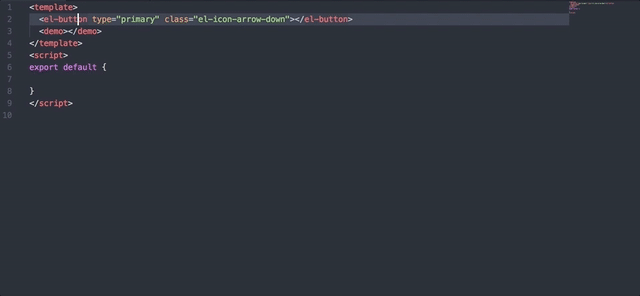
แยกแยะและเติมคุณสมบัติและวิธีการให้สมบูรณ์อัตโนมัติสำหรับแท็ก Element-UI ทุกแท็ก
แสดงค่าเมื่อค่าเป็นประเภทพิเศษ เช่น Boolean หรือ ICON
รายการตัวอย่างการสนับสนุน:
msg
 this.$message({
  message: '',
  type: ''
})
alert
 this.$alert('', '', {
  confirmButtonText: '',
  callback: () => {}
});
confirm
 this.$confirm('', '', {
  confirmButtonText: '',
  cancelButtonText: '',
  type: ''
}).then(() => {})
  .catch(() => {});
prompt
 this.$prompt('', '', {
  confirmButtonText: '',
  cancelButtonText: '',
  inputPattern: //,
  inputErrorMessage: ''
}).then(({ value }) => {})
  .catch(() => {});
msgb
 this.$msgbox({
  title: '',
  message: '',
  showCancelButton: '',
  confirmButtonText: '',
  cancelButtonText: '',
  beforeClose: (action, instance, done) => {}
}).then(action => {});
notify
 this.$notify({
  title: '',
  message: ''
});
คำขอดึงของคุณจะทำให้ VSCode-Element-Helper ดีขึ้น
เอ็มไอที


