该存储库的目的是跟踪我学到的一些整洁的GGPLOT2技巧。这假设您已经熟悉GGPLOT2的基础知识,并且可以构建自己的一些不错的图。如果没有,请在您的leasure中仔细阅读这本书。
我并不是很光荣地排版地块和专业的主题和调色板,所以您必须原谅我。 mpg数据集的绘图非常通用,因此您会在阅读时看到很多。扩展程序包很棒,我已经涉足自己,但是我会尝试将自己限制在这里的Vanilla GGPLOT2技巧。
目前,这主要是只读的技巧,但我稍后可能会决定将它们放入其他文件中的单独组中。
通过加载库并设置绘图主题。这里的第一个技巧是使用theme_set()为整个文档中的所有图设置主题。如果您发现自己为每个情节设置一个非常冗长的主题,那么这里是设置所有常见设置的地方。然后再也不会写一本主题元素的小说1 !
library( ggplot2 )
library( scales )

theme_set(
  # Pick a starting theme
  theme_gray() +
  # Add your favourite elements
  theme(
    axis.line        = element_line(),
    panel.background = element_rect( fill = " white " ),
    panel.grid.major = element_line( " grey95 " , linewidth = 0.25 ),
    legend.key       = element_rect( fill = NA )
  )
)?aes文档没有告诉您,但是您可以将mapping参数拼写为ggplot2。这意味着什么?好吧,这意味着您可以在旅途中撰写mapping论点!!! 。如果您需要偶尔需要回收美学,这一点尤其令人讨厌。
 my_mapping <- aes( x = foo , y = bar )

aes( colour = qux , !!! my_mapping )
# > Aesthetic mapping:
# > * `x`      -> `foo`
# > * `y`      -> `bar`
# > * `colour` -> `qux`我个人最喜欢的用途是使fill颜色与colour相匹配,但略带2 。在这种情况下,我们将使用延迟的评估系统, after_scale() ,在此之后的部分中您会看到更多。在本文档中,我将重复几次此技巧。
 my_fill <- aes( fill = after_scale(alpha( colour , 0.3 )))

ggplot( mpg , aes( displ , hwy )) +
  geom_point(aes( colour = factor ( cyl ), !!! my_fill ), shape = 21 )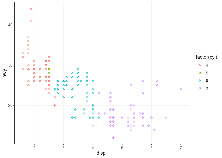
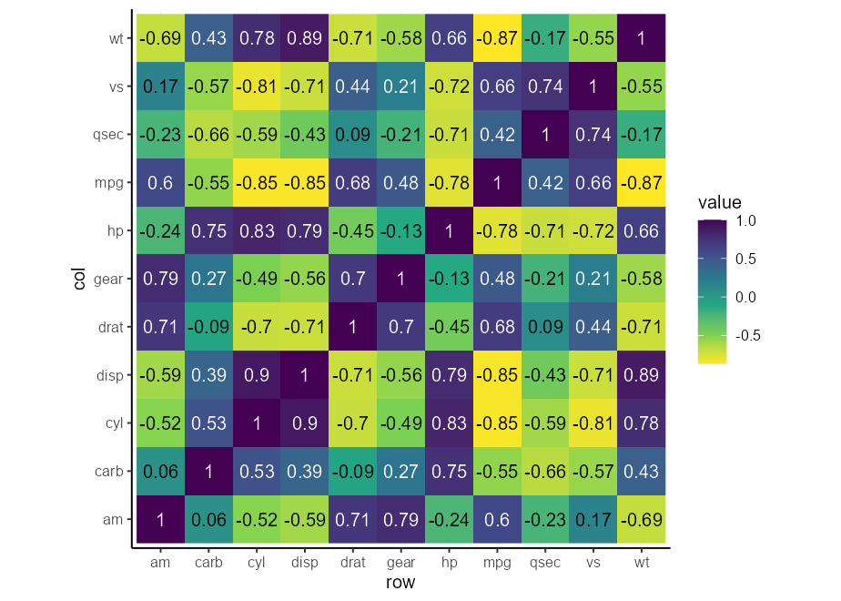
您可能会发现自己在某种情况下被要求进行少量变量的热图。通常,顺序尺度从光到黑暗,反之亦然,这使得文字很难阅读。我们可以设计一种方法,可以在黑暗的背景上自动以白色写文本,而在光背景上为黑色。下面的功能考虑了颜色的轻度值,并根据该轻度返回黑色或白色。
 contrast <- function ( colour ) {
  out   <- rep( " black " , length( colour ))
  light <- farver :: get_channel( colour , " l " , space = " hcl " )
  out [ light < 50 ] <- " white "
  out
}现在,我们可以使美学按需要插入图层的mapping参数中。
autocontrast <- aes( colour = after_scale(contrast( fill )))最后,我们可以测试自动对比度。您可能会注意到它适应了比例,因此您无需为此做很多条件格式。
 cors <- cor( mtcars )

# Melt matrix
df <- data.frame (
  col = colnames( cors )[as.vector(col( cors ))],
  row = rownames( cors )[as.vector(row( cors ))],
  value = as.vector( cors )
)

# Basic plot
p <- ggplot( df , aes( row , col , fill = value )) +
  geom_raster() +
  geom_text(aes( label = round( value , 2 ), !!! autocontrast )) +
  coord_equal()

p + scale_fill_viridis_c( direction =  1 )
p + scale_fill_viridis_c( direction = - 1 )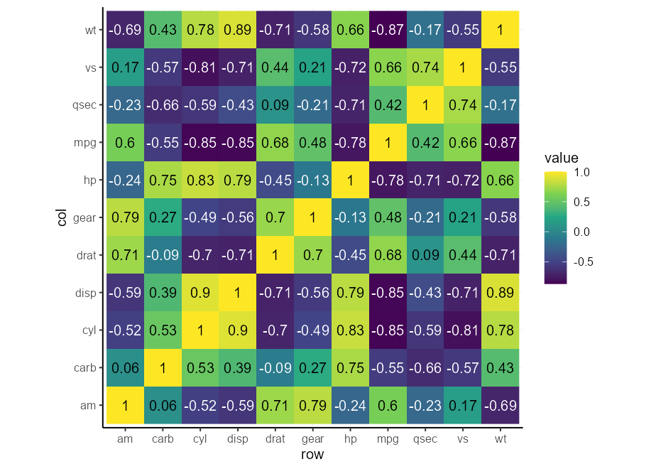
有一些扩展名提供了一半的事物版本。在我所知道的那些人中,Ghalves和See Package提供了一些半geoms。
这是滥用延迟评估系统以制造自己的方法。如果您不愿意仅仅对此功能承担额外的依赖,那么这可能会派上用场。
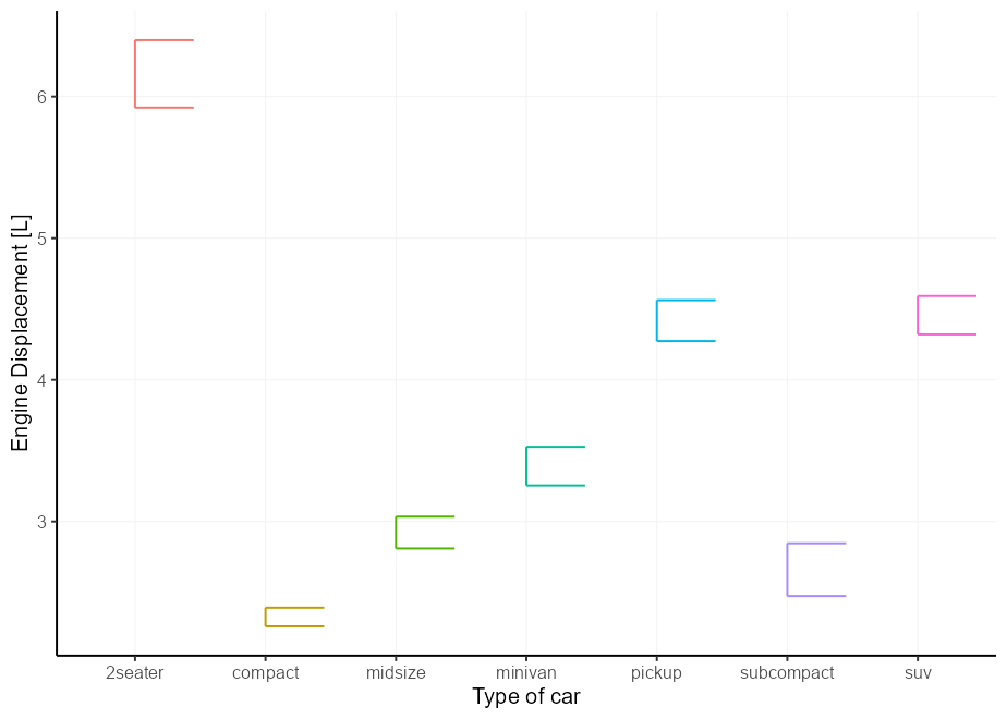
简单的盒子是框图。您可以将xmin或xmax设置为after_scale(x)以分别保留Boxplot的左右部分。这仍然可以与position = "dodge"效果很好。
 # A basic plot to reuse for examples
p <- ggplot( mpg , aes( class , displ , colour = class , !!! my_fill )) +
  guides( colour = " none " , fill = " none " ) +
  labs( y = " Engine Displacement [L] " , x = " Type of car " )

p + geom_boxplot(aes( xmin = after_scale( x )))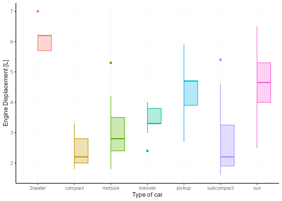
适用于盒子图的同一件事也适用于错误栏。
 p + geom_errorbar(
  stat = " summary " ,
  fun.data = mean_se ,
  aes( xmin = after_scale( x ))
)
我们可以再次为小提琴图做同样的事情,但是该层抱怨不知道xmin美学。它确实使用了这种美学,但只有在设置了数据之后,因此它不打算是用户可访问的美学。我们可以通过将xmin默认值更新为NULL来使警告保持沉默,这意味着它不会抱怨,但如果不存在,也不会使用它。
update_geom_defaults( " violin " , list ( xmin = NULL ))

p + geom_violin(aes( xmin = after_scale( x )))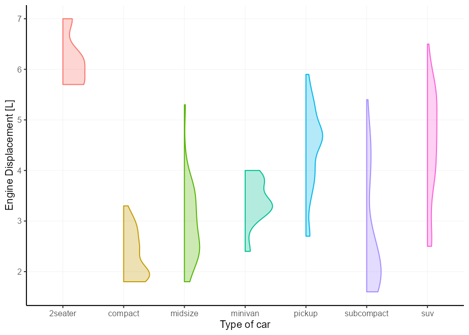
这次不是作为读者的练习,但是我只是想展示如果您将两半结合并希望它们彼此相抵消,它将如何工作。我们将滥用错误栏作为框图的主食。
 # A small nudge offset
offset <- 0.025

# We can pre-specify the mappings if we plan on recycling some
right_nudge <- aes(
  xmin = after_scale( x ),
  x = stage( class , after_stat = x + offset )
)
left_nudge  <- aes(
  xmax = after_scale( x ),
  x = stage( class , after_stat = x - offset )
)

# Combining
p +
  geom_violin( right_nudge ) +
  geom_boxplot( left_nudge ) +
  geom_errorbar( left_nudge , stat = " boxplot " , width = 0.3 )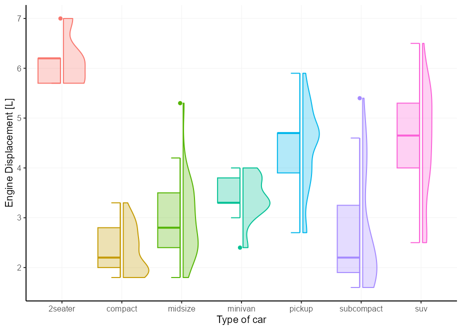
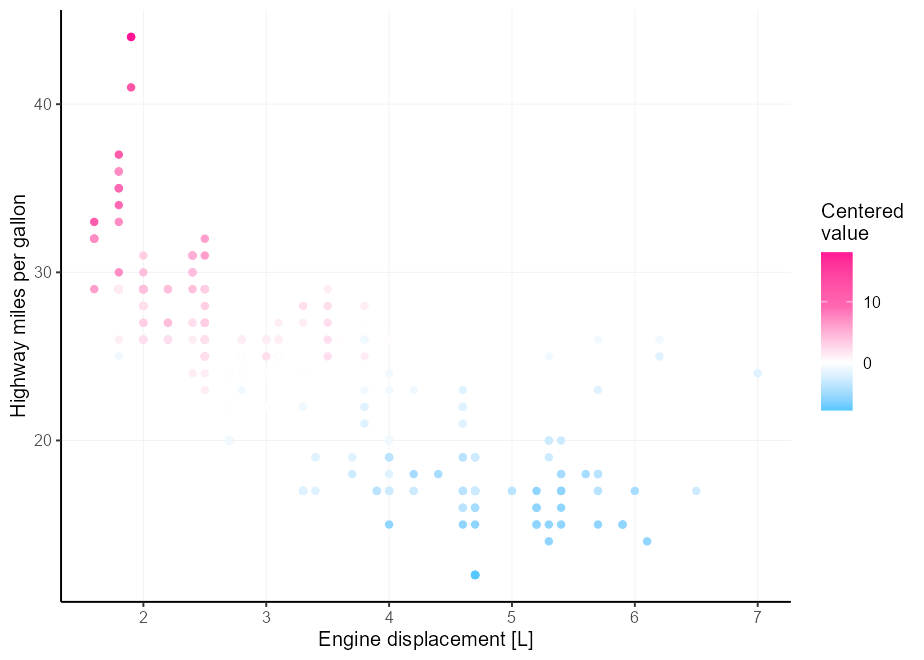
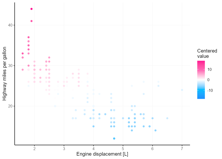
假设您的颜色直觉比我拥有的更好,而三种颜色不足以满足您的不同调色板需求。一个痛苦的地方是,如果您的极限并不完美地围绕它,那么获得中点很棘手。使用scales::rescale_mid()输入联盟中的rescaler论点。
 my_palette <- c( " dodgerblue " , " deepskyblue " , " white " , " hotpink " , " deeppink " )

p <- ggplot( mpg , aes( displ , hwy , colour = cty - mean( cty ))) +
  geom_point() +
  labs(
    x = " Engine displacement [L] " ,
    y = " Highway miles per gallon " ,
    colour = " Centered n value "
  )

p +
  scale_colour_gradientn(
    colours = my_palette ,
    rescaler = ~ rescale_mid( .x , mid = 0 )
  )
另一种选择是简单地将限制置于x上。我们可以通过为量表的限制提供功能来做到这一点。
 p +
  scale_colour_gradientn(
    colours = my_palette ,
    limits = ~ c( - 1 , 1 ) * max(abs( .x ))
  )
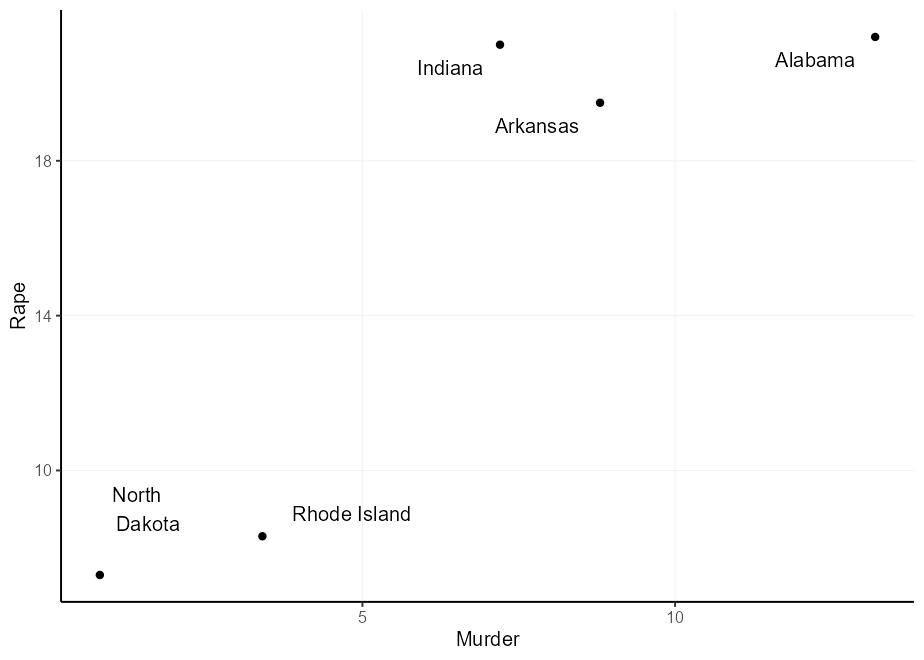
您可以用geom_text()标记点,但是潜在的问题是文本和指向重叠。
set.seed( 0 )
df <- USArrests [sample(nrow( USArrests ), 5 ), ]
df $ state <- rownames( df )

q <- ggplot( df , aes( Murder , Rape , label = state )) +
  geom_point()
q + geom_text()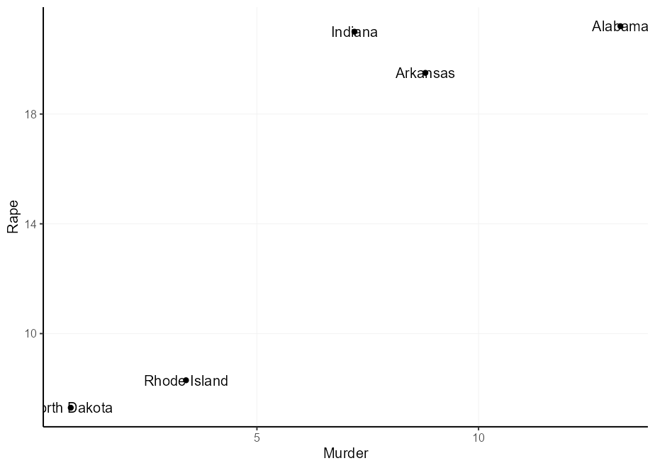
这个问题有几种典型的解决方案,它们都有缺点:
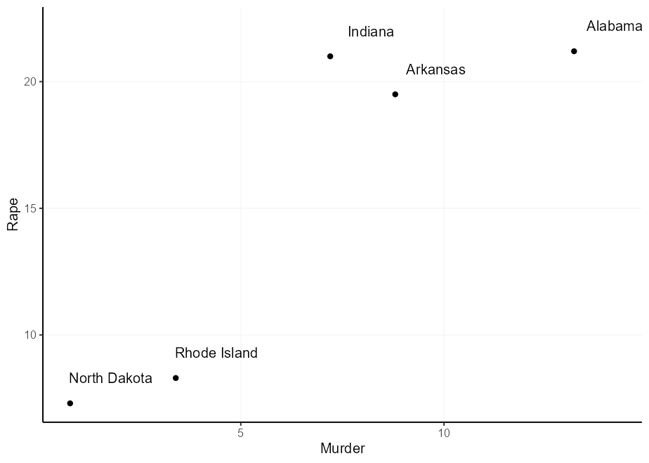
nudge_x和nudge_y参数。这里的问题是这些是在数据单元中定义的,因此间距是不可预测的,并且无法将其取决于原始位置。hjust和vjust美学。它使您可以依靠原始位置,但是它们没有天然偏移。这是行动中的选项2和3:
 q + geom_text( nudge_x = 1 , nudge_y = 1 )

q + geom_text(aes(
  hjust = Murder > mean( Murder ),
  vjust = Rape > mean( Rape )
))
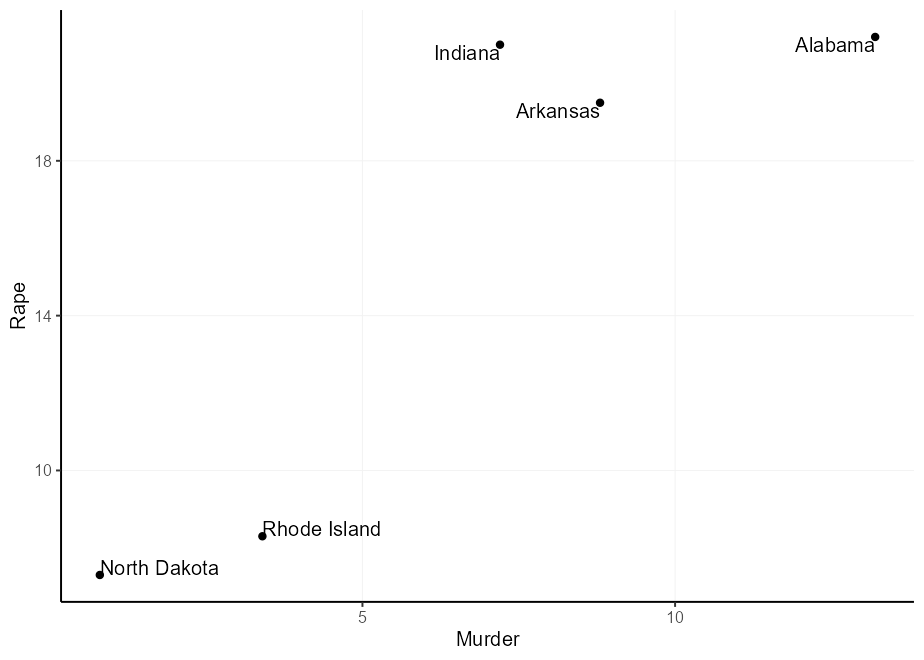
您可能会想:“我可以将理由倍增以获得更广泛的偏移”,而您是对的。但是,由于理由取决于文本的大小,因此您可能会获得不平等的偏移。请注意,在下面的情节中,“北达科他州”在Y方向上的偏见和X方向的“罗德岛”过于偏见。
 q + geom_text(aes(
  label = gsub( " North Dakota " , " North n Dakota " , state ),
  hjust = (( Murder > mean( Murder )) - 0.5 ) * 1.5 + 0.5 ,
  vjust = (( Rape > mean( Rape )) - 0.5 ) * 3 + 0.5
))
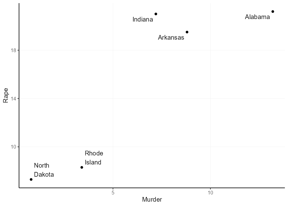
geom_label()的好处是您可以关闭标签框并保留文本。这样,您可以继续使用其他有用的东西,例如label.padding设置,以使文本从文本到标签的绝对(数据无关)偏移。
 q + geom_label(
  aes(
    label = gsub( " " , " n " , state ),
    hjust = Murder > mean( Murder ),
    vjust = Rape > mean( Rape )
  ),
  label.padding = unit( 5 , " pt " ),
  label.size = NA , fill = NA
)
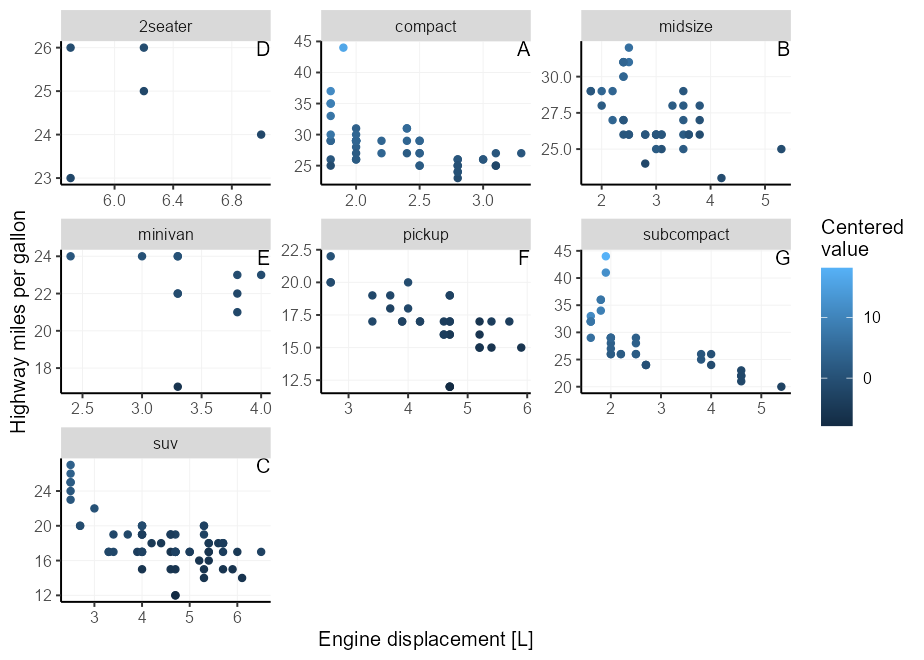
这曾经是将刻面标签放入面板中的提示,曾经很复杂。使用GGPLOT2 3.5.0,您不再需要摆弄设置无限位置并调整hjust或vjust参数。现在,您可以使用x = I(0.95), y = I(0.95)将文本放在右上角。打开细节以查看旧提示。
将文本注释放在刻面图上是一个痛苦,因为限制可能会在每面板上有所不同,因此很难找到正确的位置。探索减轻这种痛苦的扩展是标记延伸,但我们可以在Vanilla GGPLOT2中做类似的事情。
幸运的是,GGPLOT2的位置轴中有一个机械师,让我们的-Inf和Inf分别解释为量表的最小和最大极限3 。您可以通过选择x = Inf, y = Inf将标签放在角落中来利用这一点。您也可以使用-Inf而不是Inf放置在底部而不是顶部,也可以将其放在左上而不是右。
我们需要将hjust / vjust参数与情节侧面匹配。对于x/y = Inf ,它们需要为hjust/vjust = 1 ,对于x/y = -Inf它们需要为hjust/vjust = 0 。
 p + facet_wrap( ~ class , scales = " free " ) +
  geom_text(
    # We only need 1 row per facet, so we deduplicate the facetting variable
    data = ~ subset( .x , ! duplicated( class )),
    aes( x = Inf , y = Inf , label = LETTERS [seq_along( class )]),
    hjust = 1 , vjust = 1 ,
    colour = " black "
  )
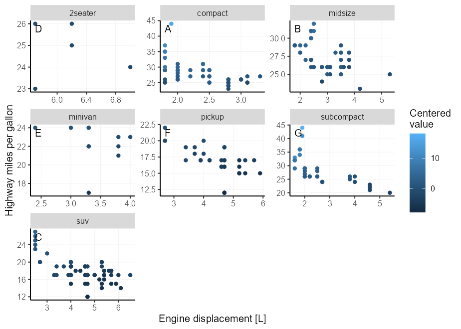
不幸的是,这将文字直接放在面板的边界,这可能会冒犯我们的美丽感。通过使用geom_label() ,我们可以变得更加典型,这使我们可以通过设置label.padding参数来精确地控制文本和面板边界之间的间距。
此外,我们可以使用label.size = NA, fill = NA隐藏GEOM的文本框部分。出于插图目的,我们现在将标签放在左上角而不是右上角。
 p + facet_wrap( ~ class , scales = " free " ) +
  geom_label(
    data = ~ subset( .x , ! duplicated( class )),
    aes( x = - Inf , y = Inf , label = LETTERS [seq_along( class )]),
    hjust = 0 , vjust = 1 , label.size = NA , fill = NA ,
    label.padding = unit( 5 , " pt " ),
    colour = " black "
  )
假设我们的任务是制作一堆类似的图,并具有不同的数据集和列。例如,我们可能想用一些特定的预设制作一系列的小花4 :我们希望条能触摸X轴而不是绘制垂直网格线。
制作一堆类似地块的一种众所周知的方法是将情节构造包裹在一个功能中。这样,您可以在功能中使用所需的所有预设。
我的情况您可能不知道,使用aes()函数进行编程的各种方法,而使用{{ }} (curly-curly)是更灵活的方法5 。
 barplot_fun <- function ( data , x ) {
  ggplot( data , aes( x = {{ x }})) +
    geom_bar( width = 0.618 ) +
    scale_y_continuous( expand = c( 0 , 0 , 0.05 , 0 )) +
    theme( panel.grid.major.x = element_blank())
}

barplot_fun( mpg , class )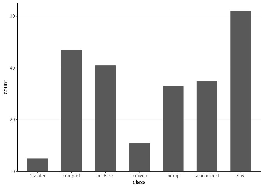
这种方法的一个缺点是,您可以在函数参数中锁定任何美学。为了解决这个问题,更简单的方法就是简单地将...直接传递到aes() 。
 barplot_fun <- function ( data , ... ) {
  ggplot( data , aes( ... )) +
    geom_bar( width = 0.618 ) +
    scale_y_continuous( expand = c( 0 , 0 , 0.1 , 0 )) +
    theme( panel.grid.major.x = element_blank())
}

barplot_fun( mpg , class , colour = factor ( cyl ), !!! my_fill )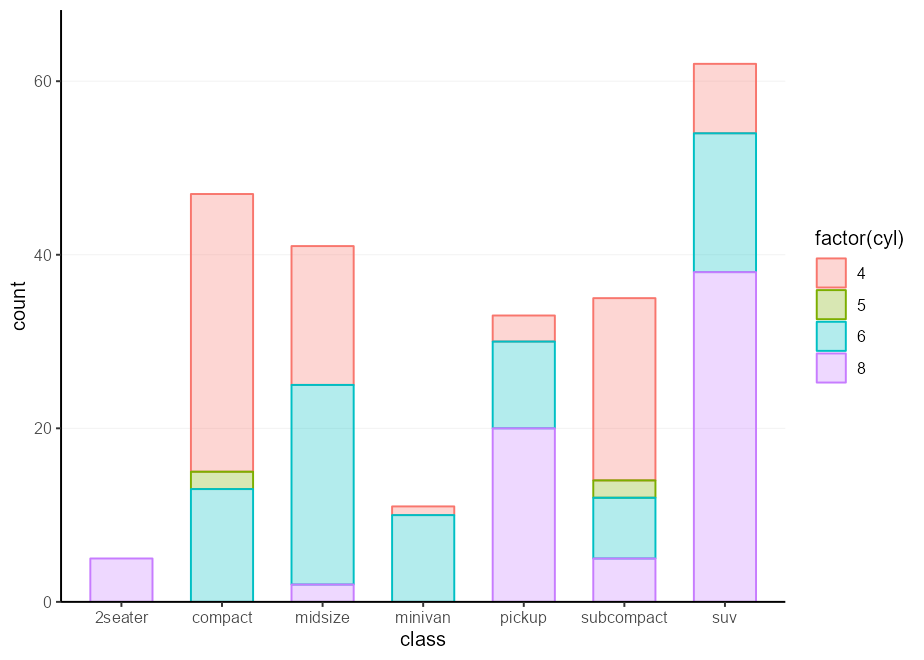
做非常相似的方法是使用“骨架”。骨骼背后的想法是,您可以在有或没有任何data参数的情况下构建绘图,并以后添加细节。然后,当您实际想制作绘图时,可以使用%+%填充或替换数据集,以及+ aes(...)来设置相关的美学。
 barplot_skelly <- ggplot() +
  geom_bar( width = 0.618 ) +
  scale_y_continuous( expand = c( 0 , 0 , 0.1 , 0 )) +
  theme( panel.grid.major.x = element_blank())

my_plot <- barplot_skelly % + % mpg +
  aes( class , colour = factor ( cyl ), !!! my_fill )
my_plot 
关于这些骨架的一件事是,即使您已经填写了data和mapping参数,也可以一次又一次地替换它们。
 my_plot % + % mtcars +
  aes( factor ( carb ), colour = factor ( cyl ), !!! my_fill )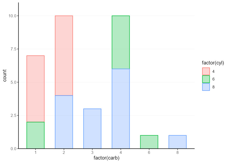
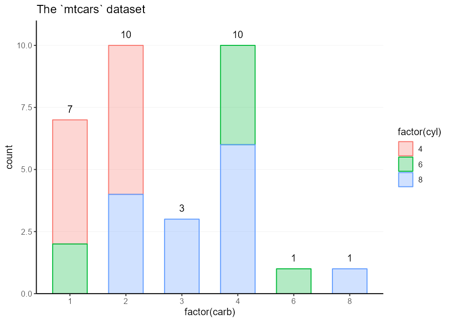
这里的想法是不是要骨骼整个图,而只是一组经常使用的零件。例如,我们可能想标记您的小号,并将所有构成标记为Barplot的东西打包在一起。诀窍是不要将这些组件与+一起添加在一起,而只是将它们放入list() 。然后,您可以+您的列表以及主绘图调用。
 labelled_bars <- list (
  geom_bar( my_fill , width = 0.618 ),
  geom_text(
    stat = " count " ,
    aes( y     = after_stat( count ),
        label = after_stat( count ),
        fill  = NULL , colour = NULL ),
    vjust = - 1 , show.legend = FALSE
  ),
  scale_y_continuous( expand = c( 0 , 0 , 0.1 , 0 )),
  theme( panel.grid.major.x = element_blank())
)

ggplot( mpg , aes( class , colour = factor ( cyl ))) +
  labelled_bars +
  ggtitle( " The `mpg` dataset " )

ggplot( mtcars , aes( factor ( carb ), colour = factor ( cyl ))) +
  labelled_bars +
  ggtitle( " The `mtcars` dataset " )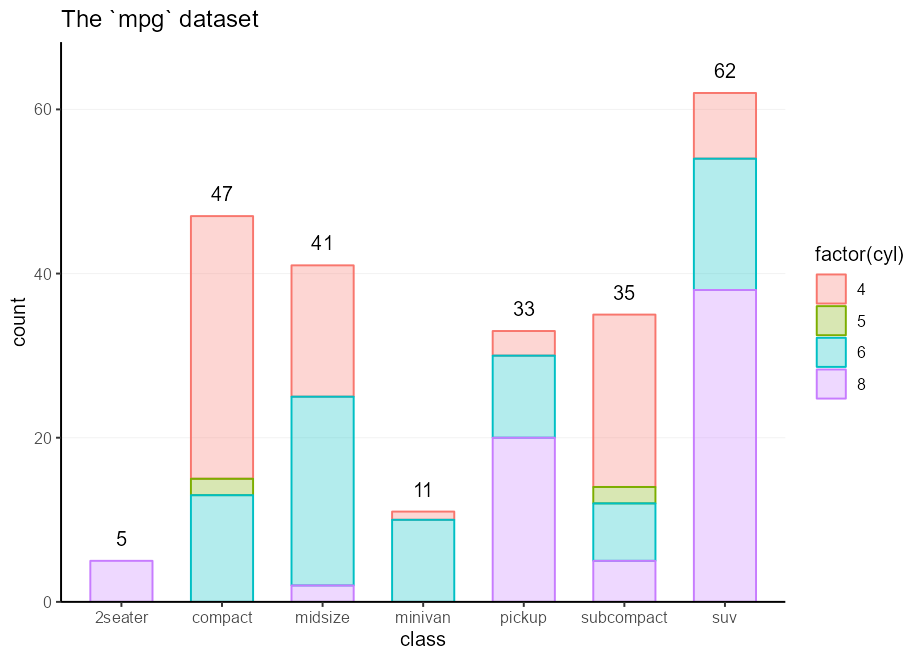
 #> ─ Session info ───────────────────────────────────────────────────────────────
#>  setting  value
#>  version  R version 4.3.2 (2023-10-31 ucrt)
#>  os       Windows 11 x64 (build 22631)
#>  system   x86_64, mingw32
#>  ui       RTerm
#>  language (EN)
#>  collate  English_Netherlands.utf8
#>  ctype    English_Netherlands.utf8
#>  tz       Europe/Amsterdam
#>  date     2024-02-27
#>  pandoc   3.1.1
#>
#> ─ Packages ───────────────────────────────────────────────────────────────────
#>  package     * version    date (UTC) lib source
#>  cli           3.6.2      2023-12-11 []  CRAN (R 4.3.2)
#>  colorspace    2.1-0      2023-01-23 []  CRAN (R 4.3.2)
#>  digest        0.6.34     2024-01-11 []  CRAN (R 4.3.2)
#>  dplyr         1.1.4      2023-11-17 []  CRAN (R 4.3.2)
#>  evaluate      0.23       2023-11-01 []  CRAN (R 4.3.2)
#>  fansi         1.0.6      2023-12-08 []  CRAN (R 4.3.2)
#>  farver        2.1.1      2022-07-06 []  CRAN (R 4.3.2)
#>  fastmap       1.1.1      2023-02-24 []  CRAN (R 4.3.2)
#>  generics      0.1.3      2022-07-05 []  CRAN (R 4.3.2)
#>  ggplot2     * 3.5.0.9000 2024-02-27 []  local
#>  glue          1.7.0      2024-01-09 []  CRAN (R 4.3.2)
#>  gtable        0.3.4      2023-08-21 []  CRAN (R 4.3.2)
#>  highr         0.10       2022-12-22 []  CRAN (R 4.3.2)
#>  htmltools     0.5.7      2023-11-03 []  CRAN (R 4.3.2)
#>  knitr         1.45       2023-10-30 []  CRAN (R 4.3.2)
#>  labeling      0.4.3      2023-08-29 []  CRAN (R 4.3.1)
#>  lifecycle     1.0.4      2023-11-07 []  CRAN (R 4.3.2)
#>  magrittr      2.0.3      2022-03-30 []  CRAN (R 4.3.2)
#>  munsell       0.5.0      2018-06-12 []  CRAN (R 4.3.2)
#>  pillar        1.9.0      2023-03-22 []  CRAN (R 4.3.2)
#>  pkgconfig     2.0.3      2019-09-22 []  CRAN (R 4.3.2)
#>  R6            2.5.1      2021-08-19 []  CRAN (R 4.3.2)
#>  ragg          1.2.7      2023-12-11 []  CRAN (R 4.3.2)
#>  rlang         1.1.3      2024-01-10 []  CRAN (R 4.3.2)
#>  rmarkdown     2.25       2023-09-18 []  CRAN (R 4.3.2)
#>  rstudioapi    0.15.0     2023-07-07 []  CRAN (R 4.3.2)
#>  scales      * 1.3.0      2023-11-28 []  CRAN (R 4.3.2)
#>  sessioninfo   1.2.2      2021-12-06 []  CRAN (R 4.3.2)
#>  systemfonts   1.0.5      2023-10-09 []  CRAN (R 4.3.2)
#>  textshaping   0.3.7      2023-10-09 []  CRAN (R 4.3.2)
#>  tibble        3.2.1      2023-03-20 []  CRAN (R 4.3.2)
#>  tidyselect    1.2.0      2022-10-10 []  CRAN (R 4.3.2)
#>  utf8          1.2.4      2023-10-22 []  CRAN (R 4.3.2)
#>  vctrs         0.6.5      2023-12-01 []  CRAN (R 4.3.2)
#>  viridisLite   0.4.2      2023-05-02 []  CRAN (R 4.3.2)
#>  withr         3.0.0      2024-01-16 []  CRAN (R 4.3.2)
#>  xfun          0.41       2023-11-01 []  CRAN (R 4.3.2)
#>  yaml          2.3.8      2023-12-11 []  CRAN (R 4.3.2)
#>
#>
#> ──────────────────────────────────────────────────────────────────────────────
好吧,您需要在文档开始时进行一次。但是再也不会!除了您的下一个文档。只需在您的文档中编写一个plot_defaults.R脚本和source()即可。每个项目的复制脚本。然后,确实,再也不会再:心:。 ↩
这是一个谎言。实际上,我使用aes(colour = after_scale(colorspace::darken(fill, 0.3)))而不是减轻填充。不过,我不希望此读数对{Colorspace}具有依赖性。 ↩
除非您通过设置oob = scales::oob_censor_any来自我破坏图,否则在刻度中。 ↩
在您的灵魂中,您真的想制作一堆小花吗? ↩
另一种选择是使用.data代词,如果要提前锁定该列,则可以是.data[[var]] .data$var ,或者当var作为字符传递时。 ↩
这个位最初称为“部分骨架”,但由于胸腔是骨骼的一部分,因此这个标题听起来更令人回味。 ↩


