Starting from this week, we will summarize one of the web design questions answered by readers in the QQ communication group every day, and compile them into articles according to a weekly cycle. They will be published on the blog every Friday and shared in the group for everyone to read and reference. Compared with the design tutorials we often publish, this kind of Q&A is more targeted to individuals and closer to our daily design work. I personally also have this experience. Sometimes one or two problems stay in my mind for a long time and cannot be solved. By chance, I come across an article that just touches on this aspect, and I feel suddenly enlightened. So this form is also very valuable. Below are all the questions and answers from week 1. I hope it will be helpful to everyone in the design.
1. The expression of texture and the evaluation of the quality of the work (Xiao Li Feidao on Friday, August 24)
How to express texture in the website? It’s very clean and shocking. ‏I would like the group owner to give you an answer. It is best to be more specific. For example, there are several ways to express the bright feeling of navigation. How should the layout be arranged? How do you know whether the work you make is good or bad, such as the posters in the poster supermarket. How can I improve? I feel like my question is too broad, or maybe I didn’t explain it clearly. Anyway, I hope the group owner can hear my voice. I have encountered a bottleneck and I don’t know what a good work is when it comes to posters.
Answer: There are many styles of bright-feel designs, but in fact it mainly depends on the changes in details. If you want to ask how many design styles there are, it can be said that they are endless. The key is to look at the structure of the elements and the changes in highlights and shadows. Different element structures and light effects can produce different element styles. Just give a few examples to illustrate:

Due to the differences in structure and light, the differences between the above four elements should be said to be very obvious. The specific style and color you should use in your design must be related to the information content of the design and can create visual associations. For example, if you want to design a design about a car rally, obviously, this clean and bright style is not suitable. Instead, you should consider a rough, original, and natural visual experience. You may need to use more It has more of a rough brush effect than the design styles above.
To answer your second question, about how to evaluate the quality of a work. Some people say that this is entirely a matter of opinion, and there is no standard at all. I personally feel that this statement is only correct in part, but cannot be said to summarize the whole thing. Good design should have certain standards. For example, are the characteristics of the product to be displayed or a certain concept expressed well reflected in the design? Is the important information visually reflected? Is the secondary information treated as secondary? Does the color scheme match the product? Is the entire design atmosphere enough? I think there should be some relatively consistent views on these issues.
2. Resource classification, improvement when encountering bottlenecks (Weison on Monday, August 27, 2012)
Hello Brother Feiyu! I have listened to several of your lectures and read your blog, and I feel that you are very professional. I am a design student who has graduated for more than two months, and I plan to engage in web design-related work (interface design). Now I would like to ask you a few questions:
1. In my daily life, I will collect some pictures and websites that I find interesting and high-quality, but it is inconvenient to find and manage them once there are too many. I would like to ask how to classify them?
2. I am already very proficient in PS technology, but I feel that the designed works are not of high quality and cannot impress people. I just feel like "Wow, this is really good" after reading it. , I would like to ask, what should I do to achieve this effect?
3. I feel that my design thinking is not broad enough. Although I have seen many other people’s designs, when it comes to actual work, I can only add some gradients, projections, highlights, etc. What should I do to be creative? ? Attached is my work, looking forward to your advice, thank you!
Answer: Let me answer each question one by one.
1. In my personal experience, the best classification method is to classify according to the industries involved in design, such as hotels, education, design studios, etc. Create folders according to these names and put related design works into categories. I have classified them according to styles before, such as Chinese style, web2.0 style, etc., but I found that it is not easy to find when needed, because when we want to refer to other works, our idea is usually "Let me take a look." What kind of hotel-related websites have others made?" So at this time we only need to find the hotel's folder, which is very convenient.
2. In fact, this is the goal pursued by all designers. After reading the personal works you sent me, I suggest you work on the following two points. The first is the details of the design. We can observe that all works that make us involuntarily shout "Wow, that's great!" can be said to be impeccable in terms of details. Taking your work as an example, I personally feel that the details still need to be improved. Let me give you two simple examples, such as:
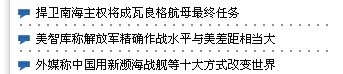
On the China Navy website, the distance between the project list and the left side of the page is too small, making the page look full and somewhat crowded. The contrast between the black text and the white background is too great. If there are too many texts, the whole page will look dirty. It is recommended to adjust it to gray while ensuring readability. The dotted dividing line is obviously a secondary element compared to the text, so don’t make it so conspicuous. It would be better to deal with it in a low-key manner.
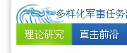
The wave icon on the left side of the title Diversified Military Mission does not fit well with the content of the title. The icon itself is not clear enough. You can’t tell what it is at a glance. The style does not match the style of the entire page, so you can see that just There are a lot of things to consider when using an icon, and these can be said to be details. When these issues are taken into consideration, the level of design will be improved. In addition, the places where the green background color of theoretical research and the blue background color of direct contact look blurry, which makes people feel that the design is not careful enough. In web design, places like these 1 pixel are often the embodiment of design beauty. Out of the place.
After considering the details, the next step is to design the atmosphere. Atmosphere is something that is difficult to explain clearly. My personal understanding is that the overall atmosphere of web design is created by the unity of the visual style of each element. To ensure that the overall atmosphere is sufficient, there must be unity in the design direction. For example, look at the picture below:
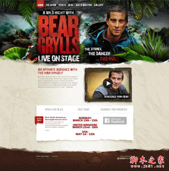
This is a special page of Bell, the host of wilderness survival that everyone is familiar with. You can observe that no matter which element on the page, the navigation written on the stone, the worn and worn text kv, and the content drawn with rough brushstrokes The content background composed of dividing lines and torn paper is different in visual style but unified in direction. So when you open this page, you will be greeted by the original, natural, and wild atmosphere. This is a noteworthy aspect of our efforts to create in-depth scenes in our design.
3. This question shows that you have not done and seen enough, and your expression techniques are lacking and inadequate. Take the page above as an example. If you were asked to make this page, you could think of using navigation written on stone, worn-out text kv, content dividing lines drawn with rough strokes, and torn paper to complete each page. Can part of the information content not only allow them to perform their original functions, but also ensure the visual experience? This is a level that can only be achieved after a lot of practice, so as the old saying goes, it is always right to learn more and do more. Regarding the techniques you mentioned such as adding gradients and highlights, they only represent one type of design style. Seeing the wild design page above, I think we can understand our limitations right away.
3. Quick layout using css framework (ds on Tuesday, August 28, 2012)
Hello! Teacher. I would like to ask the teacher how I can build my div+css layout framework faster and layout the page faster. Do you have a mature div+css framework system? Share some of your structures with us. Also, do you have any good suggestions for me?
Answer: I don’t have any urgent requirements for speed when using CSS for typesetting, so I always use EditPlus for handwriting. If you need some kind of ready-made framework to improve layout efficiency, you can try the 960 grid system. The 960 grid system not only provides the psd template files needed for design, but also supports early code. Although using frames can improve the efficiency of early design and typesetting, the prerequisite is that you must be familiar with the structure and default values of the frame. The basic typesetting code of the 960 grid system is as follows:
<div class="container_12"> /*Indicates a total of 12 columns within 960 pixels*/
<div class="grid_7 prefix_1"> /*A total of 7 columns, with 1 column reserved in front*/
<div class="grid_2 alpha"> /*Occupies 2 columns in total, the first class selector in the first row needs to add the alpha class*/
</div>
<div class="grid_3">
</div>
<div class="grid_2 omega"> /*Occupies 2 columns in total, the last class selector in the first line needs to add the omega class*/
</div>
</div>
<div class="grid_3 suffix_1"> /*Occupies 7 columns in total, leaving 1 column behind*/
</div>
</div>
4. Are there so-called design industry standards? (LoidCo on Wednesday, August 29, 2012)
I would like to ask everyone, in web design, are there any so-called design industry standards? For example, fonts generally use Song Dynasty even-numbered font sizes by default, or in the past, many website logo designs included icons + Chinese + domain names. How should the selected state in the navigation bar below be designed to comply with industry standards? If the selected state in the navigation bar like petals is red, then if my logo color is blue, is it appropriate to use blue?
Answer: I personally believe that there is no so-called industry standard, and any design will do. The key considerations are whether the information is expressed clearly, whether the user experience is good, and whether it is visually comfortable. The so-called design rules can only be said to be commonly used by everyone. Over time, they seem to have become design rules. In fact, these so-called design rules can be broken at any time. For example, when people use Chinese fonts, they use 12 pixels and 14 pixels. The reason is that these two font sizes ensure readability and look beautiful, but as a title, the 14-pixel text sometimes seems too small. In this case, the 22 or 24-pixel size may More suitable. For another example, boldface is rarely used in text compared to Arial font. The reason is that the readability of 14-pixel boldface in general text is not as good as Arial font. However, if it is used in the design of certain promotional slogans, boldface may be more suitable. So it depends on the situation. There is no need to deliberately break these habits, let alone be bound by these habits. For English, web design often involves sans-serif fonts such as Arial, Tahoma, and Verdana, and serif fonts such as Georgia fonts. These are frequently used fonts.
5. Website trust and anxiety in adjusting the design (Xi on Thursday, August 30, 2012)
1. How to give people a sense of security in the design? For example: online banking/Alipay payment page? Color matching or solid composition?
2. How to guide users to have more desire to continue watching? Or how to set suspense in the composition?
3. How to regulate your emotions about design burnout? In this period, you will always be inexplicably manic...
Answer: First question. The question you want to ask should be how a website can give visitors a sense of trust? How can visitors feel confident filling in personal information and performing operations on sensitive financial information? This is indeed a question. However, there are many factors that affect a visitor's trust in a website. The visual factors you mentioned, such as color matching, composition and other factors, are only one aspect, and may be a small aspect. But this does not mean that the visual aspect is not important. Think about a website with a hideous face and full of advertisements, can people operate sensitive information on it? But the following factors may give us more trust:
1. Brand awareness. My personal online account operations are basically completed using Alipay, but if Apple or Microsoft launches a local third-party payment service, I think I will feel free to try it.
2. Excellent service. Fast and hassle-free payment experience, fast cash withdrawal, transfer, credit card repayment and other functions.
3. Good user experience. This is reflected in every detail of the website. For example, when filling in a credit card number, the credit card number is automatically broken into groups of four, or clear and concise form description text, etc. It is often the details of the website that retain people the most. .
4. Comfortable visual experience. This is the color matching, composition and other elements you mentioned above.
There are many things that a good website needs to do. The visual aspects are what we feel most intuitively, but compared to the information and functions of the website, they are not the most important aspects. It is these things that we should pay most attention to. place.
Second question. I personally don’t think it’s that mysterious. When I make things, I never have the awareness to set up suspense in the composition. Haha, maybe the level is not good enough. I think users will naturally have the desire to watch the things once they are done.
The third question. This should be a relatively common problem. Everyone should feel this way during the design process. Especially when the task is heavy and the time is tight, they will be even more anxious. I grab a handful here and there. As soon as an idea comes up, I quickly implement it without taking two steps. As soon as I encounter a place that requires patience and slow work, I immediately change to another plan. After doing two steps, I feel No, the more I do, the more anxious I become, and the more anxious I become, the less I perform, which becomes a vicious cycle. In order to avoid this situation, I personally feel that no matter how tight the time is, it is better not to rush into action. Preliminary considerations and sketches are absolutely necessary. You must restrain your desire to open PS, do it bit by bit and follow the direction you have considered. Implement it resolutely. I think this can not only ensure the quality of the work, but also make the design process less painful. If you are really anxious, taking a break and doing something else is a good way.