Flex is the abbreviation of flexible box, which is translated as "flexible layout". It is used to provide the maximum flexibility for the box model. Any container can be designated as a flex layout. You only need to set "display:flex"; inline elements can be set by "display:inline-flex" is implemented; it should be noted that if the flex layout is set, the float, clear and vertical-align attributes of the child elements will be invalid.
1. Basic concepts
Flex layout is a layout model, often called flexbox. After using flex layout, it will provide powerful space allocation and alignment capabilities for child elements.
Before using flex layout, commonly used layouts include: fluid layout, floating layout, positioning layout, etc. The disadvantage is that the child element needs to control its position in the parent element, and also pay attention to the height collapse of the parent element.
The advantage of flex is to avoid inflexible layout forms, create more layout modes for you to choose from, and solve problems such as alignment, distribution and responsiveness of sub-elements. The disadvantage is that it can only rely on its own layout mode, and it cannot be changed if there is a slight change.
Elements that use flex layout are called flex containers, or "containers" for short. All its child elements automatically generate container members, called flex items (flex items), referred to as "items";
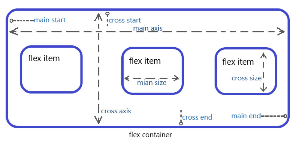
The container has two main axes by default: the horizontal main axis (main axis) and the vertical cross axis (cross axis). The starting position of the main axis (that is, the intersection of the borders) is called main start, and the end position is called main end; the starting position of the cross axis It's called cross start, and the end position is called cross end. Items are arranged along the main axis by default. The main axis space occupied by a single item is called main size, and the cross axis space occupied by a single item is called cross size.
The following properties are provided in CSS to implement Flex layout:
According to different scopes, these properties can be divided into two categories: container properties (flex-direction, flex-wrap, flex-flow, justify-content, align-items, align-content) and item properties (order, align -self, flex, flex-grow, flex-shrink, flex-basis). Let's introduce the use of these attributes.
2. Container properties
(1) flex-direction : Specify the arrangement direction of sub-elements in the flexible box;
Optional values for the attribute are as follows:
The flex-direction property determines the direction of the main axis (that is, the arrangement direction of items);
.box{flex-direction:row|row-reverse|column|column-reverse;}This attribute has 4 values
● row (default value): the main axis is horizontal and the starting point is at the left end;
●row-reverse: The main axis is horizontal and the starting point is at the right end;
●column: The main axis is vertical, and the starting point is on the upper edge;
●column-reverse: The main axis is vertical and the starting point is at the lower edge;
The above effect is shown in the figure below:

(2) flex-wrap : Specify the wrapping method of sub-elements in the flexible box;
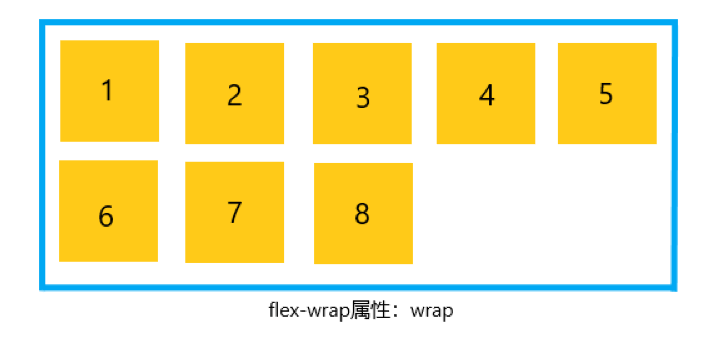
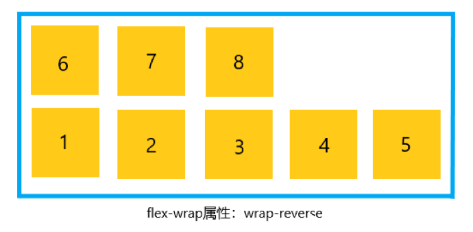
By default, items are arranged on a line (also called "axis"). The flex-wrap attribute defines how to wrap the line if an axis cannot be arranged. There are three values:
.box{flex-wrap:nowrap|wrap|wrap-reverse}● nowrap (default): no line wrapping, the arrangement effect is as follows:

●wrap: wrap, the first line is at the top, the arrangement effect is as follows:
●wrap-reverse: wrap, the first line is at the bottom, the arrangement effect is as follows:
(3) flex-flow : This property acts on the flex box container and is used to control the arrangement direction and line wrapping of elements in the container. This property is a composite property consisting of flex-direction and flex-wrap;
.box{flex-flow:<flex-direction><flex-wrap>;}(4) justify-content : This attribute acts on the sub-elements in the flexible box container and is used to control the distribution of the sub-elements themselves in the arrangement direction;
The justify-content property defines the alignment of the item on the main axis
.box{justify-content:flex-start|flex-end|center|space-between|space-around;}This attribute has 5 values:
● flex-start (default value): left aligned;
●flex-end: right aligned;
●center: centered;
●space-between: Align both ends, and the intervals between items are equal;
●space-around: The spacing on both sides of each item is equal, so the spacing between items is twice as large as the spacing between the item and the border;
The above effect is shown in the figure below:

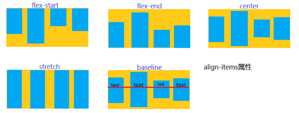
(5) align-items : This attribute acts on the flexible box container and is used to control the alignment of all sub-elements in the flexible box in the vertical direction of the arrangement direction;
The align-item property defines how items are aligned on the cross axis
.box{align-items:flex-start|flex-end|center|baseline|stretch;}This attribute has 5 values. The specific alignment is related to the direction of the cross axis. It is assumed that the cross axis is from top to bottom:
●flex-start: align the starting point of the cross axis;
●flex-end: align the midpoint of the cross axis;
●center: align the midpoint of the cross axis;
●baseline: the baseline alignment of the first line of text of the item;
●stretch (default value): If the item does not set a height or is set to auto, it will occupy the entire height of the container;
The above effect is shown in the figure below:
3. Project properties
(1) order attribute
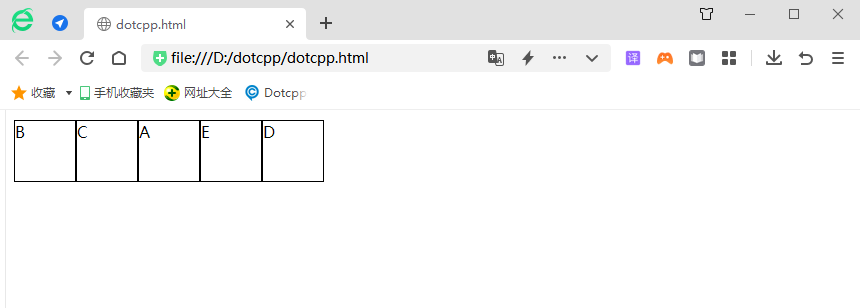
The order attribute is used to set the order in which items appear in the container. You can define the position of the item in the container through specific values. The syntax format of the attribute is as follows:
order:number;
Where number is the position of the item in the container, and the default value is 0.
Example:
<!DOCTYPEhtml><html><head><style>.flex{display:flex;flex-flow:rowwrap;margin-top:10px;}.flexdiv{width:60px;height:60px;margin-bottom:5px; border:1pxsolidblack;}.flexdiv:nth-child(1){order:3;}.flexdiv:nth-child(2){order:1;}.flexdiv:nth-child(3){order:2;} .flexdiv:nth-child(4){order:5;}.flexdiv:nth-child(5){order:4;</style></head><body><div><div>A</div ><div>B</div><div>C</div><div>D</div><div>E</div></div></body></html>Running results:
(2) align-self attribute
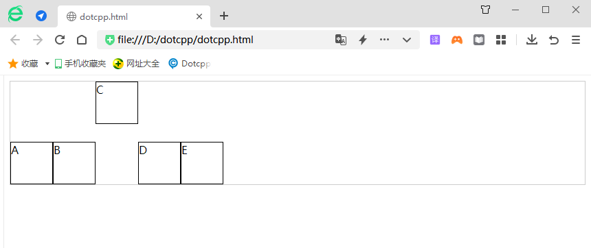
The align-s elf attribute allows you to set a different alignment for an item than other items. This attribute can override the value of the align-items attribute. Optional values for the align-self attribute are as follows:
Example:
<!DOCTYPEhtml><html><head><style>.flex{display:flex;flex-flow:rowwrap;align-items:flex-end;border:1pxsolid#CCC;height:150px;}.flexdiv{width: 60px;height:60px;border:1pxsolidblack;}.flexdiv:nth-child(3){align-self:flex-start;}</style></head><body><div><div>A</ div><div>B</div><div>C</div><div>D</div><div>E</div></div></body></html>Running results:
(3)flex attribute
The flex attribute is the abbreviation of the three attributes flex-grow, flex-shrink and flex-basis. The syntax format is as follows:
flex:flex-growflex-shrinkflex-basis;
Parameter description is as follows:
● flex-grow: (required parameter) a number used to set the growth amount of the item relative to other items, the default value is 0;
●flex-shrink: (optional parameter) a number used to set the shrinkage of an item relative to other items. The default value is 1;
●flex-basis: (optional parameter) The length of the item, legal values are auto (default value, indicating automatic), inherit (indicating inheriting the value of this attribute from the parent element) or adding %, px, em, etc. to a specific value The form of the unit.
In addition, the flex attribute has two shortcut values, namely auto (1 1 auto) and none (0 0 auto).
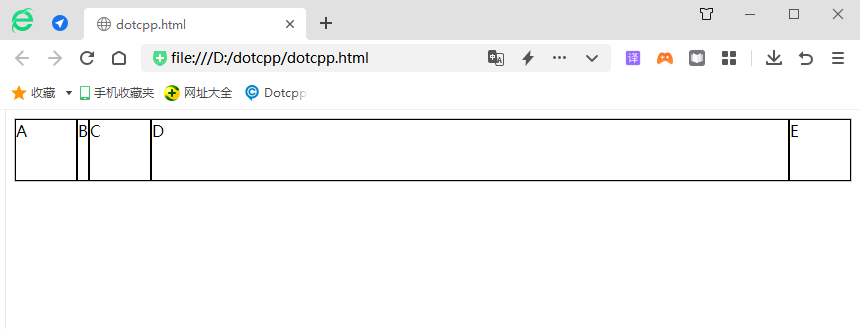
The sample code is as follows:
<!DOCTYPEhtml><html><head><style>.flex{display:flex;flex-flow:rowwrap;align-items:flex-end;border:1pxsolid#CCC;}.flexdiv{width:60px;height: 60px;border:1pxsolidblack;}.flexdiv:nth-child(2){flex:0;}.flexdiv:nth-child(4){flex:11auto;}</style></head><body><div ><div>A</div><div>B</div><div>C</div><div>D</div><div>E</div></div></body>< /html>Running results:
