In the process of making web pages, sometimes we may need to achieve the effect of rounded corners. The previous method was to cut the design draft into pictures that can be easily made into pages and use multiple background images to achieve rounded corners. After the emergence of CSS3, there is no need to have such trouble. CSS3 provides a series of properties to set the rounded corner effect of elements, as shown below:
The optional values of the above functions are shown in the following table:
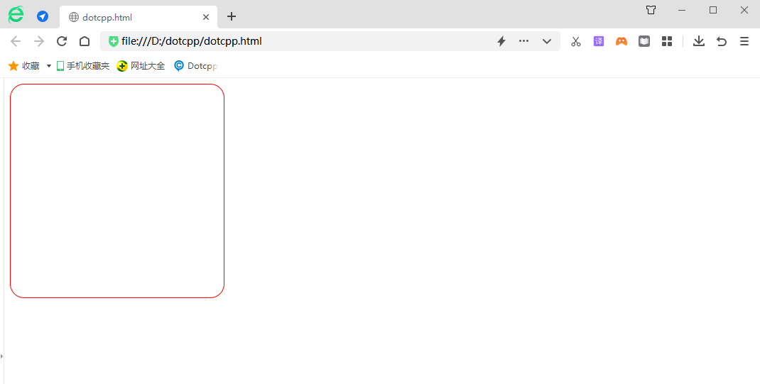
border-radius is used to implement rounded borders.
Example:
<html><head><style>div{width:300px;height:300px;border:1pxsolidred;border-radius:20px;}</style></head><body><div></div></ body></html>Running results:

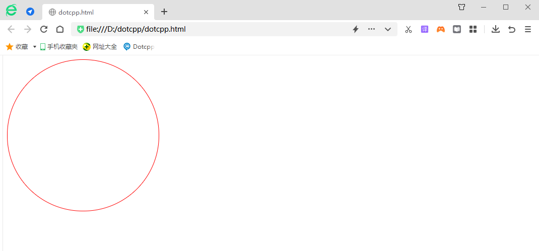
But if I set border-radius to 150px, it will become a circular border
<html><head><style>div{width:300px;height:300px;border:1pxsolidred;border-radius:150px;}</style></head><body><div></div></ body></html>Running results:

For convenience, just set border-radius to 50%. The effect is the same.
But if you want to draw a circle, width and height must be equal.
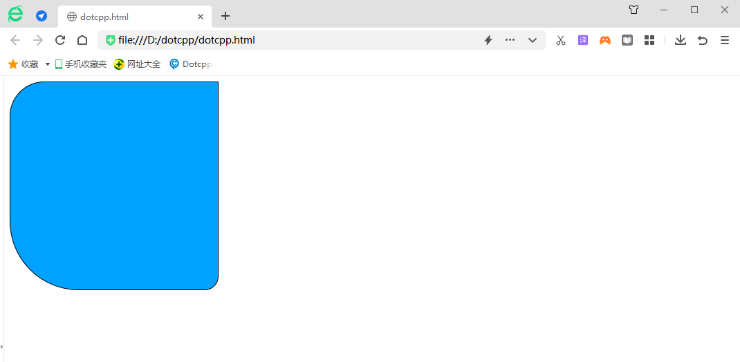
In fact, multiple attribute values can be connected after border-radius. For an attribute value like the one above, the four corners will default to this attribute value. If the four attribute values are obviously relative to the four corners, what is the relative method? Starting from the upper left corner and going clockwise.
Example:
<html><head><style>div{width:300px;height:300px;border:1pxsolidblack;background:rgb(0,162,255);border-radius:50px0px20px100px;}</style></head><body><div ></div></body></html>Running results:

For example, let’s draw an egg:
<html><head><style>div{width:80px;height:100px;border:1pxsolidblack;background:rgb(0,162,255);border-radius:40px40px40px40px/60px60px40px40px;}</style></head><body> <div></div></body></html>Running results:
