1. Length unit in CSS
In CSS, many values use length as the value. The attributes of the box model are some obvious value attributes: width, height, margin, padding, and border. In addition , there are many CSS attributes whose values are also length values, such as offset offset, box-shadow size or font size, spacing, etc. There are many length units in CSS. We will discuss them below. Let’s talk about length units and their uses.
2. A brief introduction (what are the units of length:)
There are two types of length units in CSS: absolute length and relative length .
Absolute length: px, in, cm, mm, pt, pc;
Relative length: em, rem, ex, vh, vw, vmin, vmax, %, fr.
3. Detailed introduction
1. Absolute unit of length
The absolute length unit represents a real physical size. Its size is fixed and will not change due to changes in the size of other elements. The following table lists the absolute length units supported in CSS.
px: represents pixels. Pixels are relative to the screen resolution. The page is displayed in precise pixels and will not change due to changes in the size of other elements. Pixels are still the most typical measurement unit, for example: for windows The resolution used by Mac users is 96 pixels/inch, while the resolution used by mac users is generally 72 pixels/inch. The unit in the general JavaScript language is the pixel used.
div{width:200px;}in: inch is a physical measurement file, but in the CSS field, inch is just mapped directly into pixels. (1in == 2.54cm == 96px)
div{width:2in;}c m: Centimeter is a familiar and useful unit of physical measurement. It is also mapped into pixels. (1cm == 37.8px)
div{width:20cm;}mm: Millimeter is a physical unit of measurement of a small order of magnitude. (1mm == 0.1cm == 3.78px )
div{width:200mm;}p t: Points are also physical units of length. (1pt == 1/72in == 96/72px)
div{width:20pt;}pc: Pica is the same as points, except (1pc == 12pt).
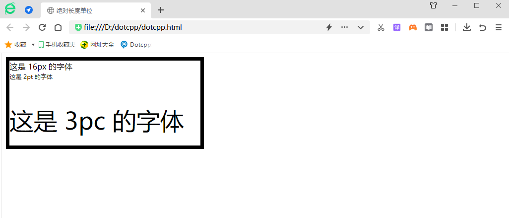
div{width:20pt;}Example:
<!DOCTYPEhtml><html><head><title>Absolute length unit</title><style>.box{width:4in;height:4.5cm;border:2mmsolidblack;font-size:16px;}.pt{font{font -size:2pt;}.pc{font-size:3pc;}</style></head><body><divclass=box>This is a 16px font<pclass=pt>This is a 2pt font</p ><pclass=pc>This is the font of 3pc</p></div></body></html>The results presented are as follows:

2. Relative length unit
The relative length unit means that this unit does not have a fixed value. Its value is affected by other element attributes (such as the size of the browser window and the size of the parent element). The relative length unit is very suitable for responsive layout. The following The table lists the relative length units supported in CSS.
em: em is a relative unit, relative to the font size of the text within the current object. If the font size within the current row has not been set, it is relative to the browser's default font size. Initially, the typesetting measurement is based on the size of the capital letter M of the current font. When the font-family is changed, its size will not change, but when the font-size is changed, its size will. will change, em will inherit the font size of the parent element. (There are examples of em and rem below)
Without any CSS rules: (1em == 16px == 0.17in == 12pt == 1pc == 4.2mm == 0.42cm)
div{width:40em;}re em: rem is a relative unit like em, but unlike em, rem is always relative to the root element (such as: root{}), unlike em, which uses the cascade method to calculate Size. This relative unit is simpler to use.
div{width:40rem;}ex: Relative length unit, relative to the height of the character Default font size. Unlike em, em will not change when the font-family is changed, but the ex unit will change because the value of a unit and that font have a special constraint relationship.
div{width:40ex;}ch: The connotation of ch is similar to the height of ex relative to x, except that ch is based on the width of character 0 instead of the height of character x. 1ch is the width of the number 0. When the fontfamily changes, ch will also change.
div{width:40ch;}vw: vw (viewpoint width) is the visual width unit (window width). 1vw is equal to one percent of the width of the visual area. The vw unit is very similar to the percentage. The difference is that all values of vw apply to all elements. The same, regardless of their parent element or the width of the parent element, a bit like rem units are always relative to the root element. (There are examples of vh and vw below)
div{width:40vw;}vh: The units of vh (viewport height) and vw (viewport width) are the same. The different vh is relative to the height of the visual area (window height).
div{width:40vh;}vmin: The value of vmin is the smaller value among the current vw and vh. In the standard size type usage example, compared with the vw and vh units that determine the screen size by yourself, vmin is a more useful one. metrics.
div{width:40vmin;}vmax: The value of vmax is the larger value between vw and vh.
div{width:40vmax;}%: Percent, the length value in percentage is based on the length value of the parent element with the same attribute. For example: if the width of an element is 450px and the width of the child element is set to 50%, then the child element is rendered The width is 225px. (If no specific value is set for all parent elements, setting the percentage height will cause the value of all elements to be 0).
div{width:40%;}fr: A length unit used in grid layout. In grid layout, we often use fr for calculation.
The following statement declares a grid with three lines. The height of the first line is 30px, the height of the second line is also 30px, and the height of the third line is 60px.
grid-template-rows:30px1fr2fr;
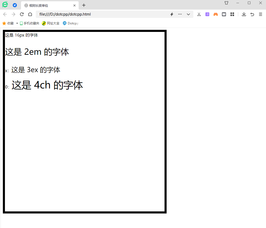
Example:
<!DOCTYPEhtml><html><head><title>Relative length unit</title><style>.box{width:60vw;height:88vh;border:1exsolidblack;font-size:16px;}.info{font- size:2em;}.ex>span{font-size:3ex;}.ch>span{font-size:4ch;}</style></head><body><divclass=box>This is a 16px font <pclass=info>This is the font of 2em</p><pclass=ex>x: <span>This is the font of 3ex</span></p><pclass=ch>0: <span>This is 4ch font</span></p></div></body></html>Shown below:

3. Summary of length units:
(1) First of all, we need to understand one thing, that is, what exactly is the screen resolution? We know that under different resolutions, the size of pixels is different, so the same web page uses px as the length unit At the same time, the display size is different at different resolutions. At low resolution, the pixels are larger and the details are not clear enough. Although the displayed page is also large, it is blurry.
(2) In fact, all units, whether relative or absolute units, (when displayed on the screen) are eventually converted into px units, so generally speaking, when making web pages, the basic unit Choose px instead of pt, because pt is also converted to px for display through the browser's DPI (for example, the DPI of FireFox is 96, then 9pt = 12px). Not only pt, cm, in, mm and other units are also converted into px, so whether it is absolute or relative, it will change at different resolutions. Don’t think that if the length is set to 3cm, it will change at different resolutions. The resolution remains unchanged at 3cm.
(3) I think pt is still a very useful unit, especially when printing. Now some web pages have been implemented to display one page and print in another way. I want to print Let’s use pt above, because for different resolutions, the printed pages are the same size. This is the first characteristic of the absolute unit, but you still have to remember that on the display, this unit represents is not the real physical length, it also needs to be adjusted according to the actual size of the pixel (this is related to the resolution).
(4) In fact, we can understand it this way, regard px as an absolute unit (absolute unit on the display), and other units are based on it, such as em, which is the height relative to the current text font (Suppose the current text font size is 12px, and we set the new font to 1.5em, then the new font size is converted to 12 * 1.5 = 18px). What you need to remember is that em is the height relative to the parent element. degree, assuming that we set the font to 12px in the first div, 1.5em in the second level, and 1.5em in the third level. In fact, the font display is: 12px in the first level, 18px in the second level, and 1.5em in the third level. Level 3 18 * 1.5 = 27px.